Fields in Odoo specify the format of data models and specify the kinds of data that each record can hold. Date and Datetime fields are among the most important field types for managing time-sensitive tasks, including project tracking, deadline management, and scheduling.
Thanks to improved widgets that enhance the way date and time values are shown and interacted with in the user interface, these fields have become even more dynamic in Odoo 19.
This blog will walk through Odoo 19's Date and Datetime field types and their useful widgets.
Date:
The Date field type is used to store only the date portion (without time). It displays a calendar picker that allows users to choose a date effortlessly.
Python Definition:
published_date = fields.Date(string="Published Date")
Xml usage:
<field name="published_date"/>
This creates a date field named Published Date that stores values in the YYYY-MM-DD format.
Widgets
- remaining_days
The remaining_days widget displays how many days remain until the selected date, based on today’s date.
This is very useful for expiry tracking, project deadlines, or reminder-based workflows.
<field name="published_date" widget="remaining_days"/>
If today’s date is October 18, 2025, and the selected date is October 22, 2025, the field will display:
“In 4 days”
If the selected date has already passed, it will show:
“2 days ago”
This widget automatically calculates the difference between the current date and the field value, offering quick visual insight without additional computations.
(Insert screenshot showing the remaining_days widget output)
Datetime:
When you need to capture both date and time, Odoo provides the Datetime field type. This field is ideal for logging events, recording timestamps, or managing time-based records such as orders, meetings, or shifts.
Python Definition:
order_date = fields.Datetime(string="Order Date")
This allows users to pick both a date and time from a single field.
Widgets
- date
The date widget can be applied to a Datetime field to display only the date portion, hiding the time value.
This is helpful when the backend needs to store time but the end user only needs to see the date.
<field name="order_date" widget="date"/>
- remaining_days
Just like with Date fields, the remaining_days widget can also be applied to Datetime fields.
<field name="order_date" widget="remaining_days"/>
This widget is the same as for the date field. This widget calculates the difference between the current date and the stored datetime value, then displays it in a human-readable format such as: “In 3 days” or “5 days ago”
The daterange widget is a convenient way to allow users to select a start and end date or datetime range directly within the form. This is especially useful for project durations, leave applications, booking systems, or reporting filters.
<field name="date_begin" widget="daterange" string="From"
       class="oe_inline" options="{'related_end_date': 'date_end'}"/>
<field name="date_end" widget="daterange" string="To"
       class="oe_inline" options="{'related_start_date': 'date_begin'}"/>
Here, the first field (date_begin) is linked to the second field (date_end) through widget options, ensuring a consistent range selection.
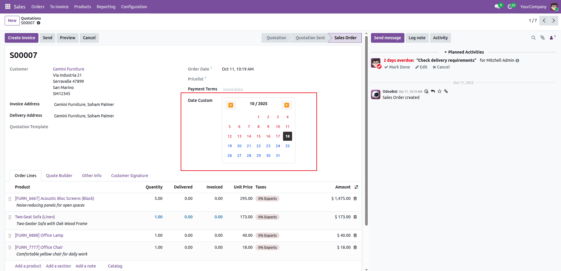
Creating a custom date widget
Now we are going to create a custom inline calendar date widget. Display an inline calendar directly within a form. Make it visually appealing and user-friendly.
Step 1: Create the JS Widget
Create a new js file under:
custom_module/static/src/js/inline_calendar_widget.js
** @odoo-module **/
import { Component, useState } from "@odoo/owl";
import { registry } from "@web/core/registry";
import { standardFieldProps } from "@web/views/fields/standard_field_props";
import { parseDate } from "@web/core/l10n/dates";
export class InlineCalendar extends Component {
   static template = "inline_calendar.Template";
   static props = { ...standardFieldProps };
   setup() {
       const today = new Date();
       this.state = useState({
           month: today.getMonth(),
           year: today.getFullYear(),
       });
   }
   get days() {
       const firstDay = new Date(this.state.year, this.state.month, 1).getDay();
       const totalDays = new Date(this.state.year, this.state.month + 1, 0).getDate();
       const days = [];
       for (let i = 0; i < firstDay; i++) days.push(null);
       for (let i = 1; i <= totalDays; i++) days.push(i);
       return days;
   }
   get selected() {
       const val = this.props.record.data[this.props.name];
       if (!val || !val.toFormat) return null;
       const dateStr = val.toFormat('yyyy-MM-dd');
       const date = new Date(dateStr);
       if (date.getMonth() === this.state.month && date.getFullYear() === this.state.year) {
           return date.getDate();
       }
       return null;
   }
   getClass(day) {
       if (!day) return 'empty';
       const today = new Date();
       const date = new Date(this.state.year, this.state.month, day);
       today.setHours(0, 0, 0, 0);
       date.setHours(0, 0, 0, 0);
       let cls = 'day';
       if (day === this.selected) cls += ' selected';
       if (date.getTime() === today.getTime()) cls += ' today';
       if (date < today) cls += ' past';
       if (date > today) cls += ' future';
       return cls;
   }
   select(day) {
       if (!day || this.props.readonly) return;
       const dateStr = `${this.state.year}-${String(this.state.month + 1).padStart(2, '0')}-${String(day).padStart(2, '0')}`;
       this.props.record.update({ [this.props.name]: parseDate(dateStr) });
   }
   prev() {
       this.state.month === 0 ? (this.state.month = 11, this.state.year--) : this.state.month--;
   }
   next() {
       this.state.month === 11 ? (this.state.month = 0, this.state.year++) : this.state.month++;
   }
}
registry.category("fields").add("inline_calendar", {
   component: InlineCalendar,
   supportedTypes: ["date"],
});
Step 2: Create the QWeb Template
Create an Xml file under:
custom_module/static/src/xml/inline_calendar_widget.xml
<?xml version="1.0" encoding="UTF-8"?>
<templates>
   <t t-name="inline_calendar.Template">
       <div class="simple-color-date">
           <div class="header">
               <button t-on-click="prev">?</button>
               <span><t t-esc="state.month + 1"/> / <t t-esc="state.year"/></span>
               <button t-on-click="next">?</button>
           </div>
           <div class="grid">
               <t t-foreach="days" t-as="d" t-key="d_index">
                   <div t-att-class="getClass(d)" t-on-click="() => this.select(d)">
                       <t t-if="d" t-esc="d"/>
                   </div>
               </t>
           </div>
       </div>
   </t>
Step 3: Creating CSS
We can also style our widget using css. For that, we can add a file under
custom_module/static/src/cssl/inline_calendar_widget.css
.simple-color-date {
   width: 250px;
   padding: 10px;
   border: 1px solid #ddd;
   border-radius: 4px;
   background: white;
}
.header {
   display: flex;
   justify-content: space-between;
   margin-bottom: 10px;
   font-weight: bold;
}
.header button {
   border: none;
   background: #f5f5f5;
   padding: 5px 10px;
   cursor: pointer;
   border-radius: 3px;
}
.grid {
   display: grid;
   grid-template-columns: repeat(7, 1fr);
   gap: 2px;
}
.day {
   aspect-ratio: 1;
   display: flex;
   align-items: center;
   justify-content: center;
   cursor: pointer;
   font-size: 13px;
   border-radius: 3px;
}
.day:hover {
   background: #f0f0f0;
}
.day.empty {
   cursor: default;
}
.day.today {
   color: #28a745;
   font-weight: bold;
}
.day.past {
   color: #dc3545;
}
.day.future {
   color: #007bff;
}
.day.selected {
   background: #333;
   color: white;
}
*/
Step 4: Register the Widget in Manifest
"assets": {
       "web.assets_backend": [
           "custom_module/static/src/js/inline_calendar_widget.js",
           "custom_module/static/src/xml/inline_calendar_widget.xml",
           "custom_module/static/src/css/inline_calendar_widget.css",
       ],
   },
Odoo 19 continues to refine the user experience with smarter and more interactive field widgets.
The remaining_days widget is a simple yet powerful addition for instantly tracking deadlines and future events, while the daterange widget simplifies selecting date intervals for planning and reporting.
By effectively using these widgets, developers and functional consultants can create more intuitive and insightful views, helping users manage their time-based data efficiently.
To read more about How to create a view widget in Odoo 18, refer to our blog How to create a view widget in Odoo 18.