A dashboard can be termed as an information tool for the management of the visual tracks that analyze, monitor, and displays the data points to monitor the business processes. A dashboard helps us to connect files, attachments, services, data tables, and charts. It is an efficient way to track performance and real-time monitoring that helps us to reduce the time for analyzing.
With the help of this blog, you will be able to understand how to create dashboards using highchart JS.
We can add items as per our requirement into the dashboard and access that data.
For creating and setting dashboards we need the following folders and files.
Let us take a look at the basic setups which are quired for building an Odoo Dashboard that contains the below-given folders and files.
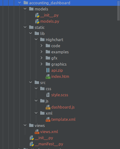
Create a folder name as the above accounting_dashboard and this will be used as the technical name(module name) of the dashboard. Here I am explaining this process with the help of an accounting dashboard. As per the above file, you need to create folders and files like that.
In addition to that, I have added a library of Highchart Js in the lib folder of the static folder.
If you are using Highchart Js for your personal use such as for personal websites or in a non-profit organization you will get a free non-commercial license. Otherwise, if you are using it for commercial projects then you need to buy a license as per your usage.
For non-commercial usage, you can set the code as following methods.
You can download the library as a zip file from the website and then unzip the file and place those files in the lib of the static folder in your custom dashboard folder.
The second method is by using CDN instead of downloading but you need internet access always if you are using this.
CDN: <script src="https://code.highcharts.com/highcharts.src.js"></script>
The third method is by installing highcharts with NPM.
Command: npm install highcharts --save
If you are downloading the Highchart Js and unzip it in your folder you need to give the path of assets of js.
<odoo>
   <data>
       <record id="action_account_dashboard" model="ir.actions.client">
           <field name="name">Accounting Dashboard</field>
           <field name="tag">account_dashboard</field>
       </record>
       <!-- menu categories -->
       <menuitem name="Accounting Dashboard" id="accounting_dashboard" parent="account.menu_finance"
                 sequence="1"
                 groups="account.group_account_manager"
                 action="action_account_dashboard"/>
   </data>
   <template id="assets_account_dashboard" name="Account Dashboard" inherit_id="web.assets_backend">
       <xpath expr="." position="inside">
           <link href="https://fonts.googleapis.com/css?family=Source+Sans+Pro:300,400,400i,700" rel="stylesheet"/>
           <script type="text/javascript" src="/accounting_dashboard/static/src/js/dashboard.js"/>
           <script type="text/javascript" src="accounting_dashboard/static/lib/Highchart/code/highcharts.js"/>
           <link rel="stylesheet" type="text/scss" href="/accounting_dashboard/static/src/css/style.scss"/>

       </xpath>
   </template>
</odoo>
In the above code, a red marked code represents adding highchart js to assets. With that, we can add a dashboard js file and style code.
This is the XML file to show the menu and add assets. The next step is to add the dashboard template code for displaying the data in the XML folder.
For example:
<templates id="template" xml:space="preserve">
  <t t-name="InvoiceDashboard">
     <div class="o_dashboards col-xs-12 col-sm-12 col-lg-12 col-md-12" style="background-color: #e1e1e1;overflow: scroll; !important; ">
        <div class="content-header">
           <div class="container-fluid">
              <div class="row mb-2">
                 <div class="col-sm-12">
                    <div class="dash-header">
                       <h1 class="dashboard-h1">Dashboard </h1>
                       <input type="checkbox" style="display:none" data-toggle="toggle" data-on="" data-off="">
                          <input type="checkbox" id="toggle-two"></input>
                       </input>
                    </div>
                 </div>
              </div>
           </div>
        </div>
     </div>
     <div class="col-xs-12 col-sm-12 col-lg-12 col-md-12">
        <div class="row" style="margin:0px">
           <div class="col-md-4" id="col-graph">
              <div class="card">
                 <div class="card-header">
                    <div class="card-title">
                       <b>
                          <h3>Income/Expense</h3>
                       </b>
                    </div>
                    <div class="card-tools">
                       <select>
                          <option  id="income_this_month">This Month</option>
                          <div role="separator" class="dropdown-divider" />
                          <option   id="income_this_year">This Year</option>
                       </select>
                    </div>
                 </div>
                 <div class="card-body mt-3" id="in_ex_body_hide">
                    <div class="row">
                       <div class="col-md-12">
                          <p id="myelement1"></p>
                          <div id="chart">
                             <div id="canvas" width="300" height="200"></div>
                          </div>
                       </div>
                    </div>
                 </div>
              </div>
           </div>
        </div>
     </div>
     <div class="container-fluid o_hr_dashboard">
        <div class="col-xs-12 col-sm-6 col-md-4 col-lg-3" id="invoice_graph" />
        <div class="dashboard-header-filter">
           <div class="manager_filter_class" /></div>
     </div>
     <div id="chart-container"></div>
  </t>
</templates>
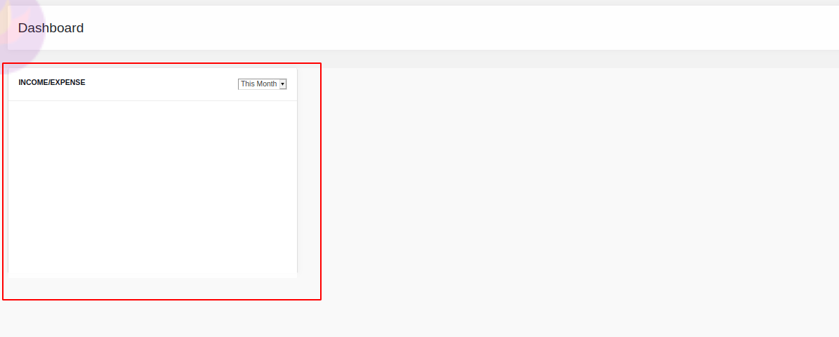
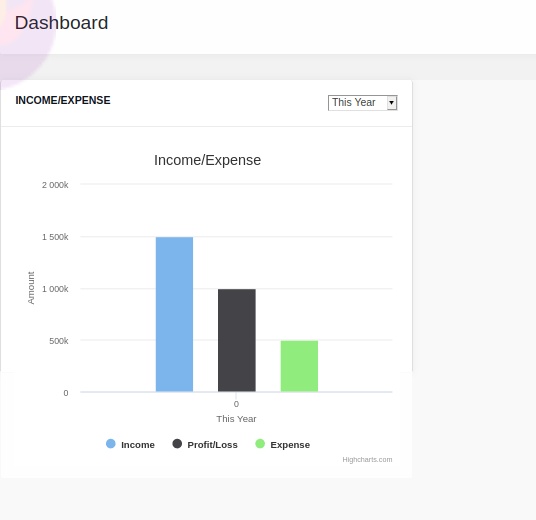
This will add one card like the following image.
Next, we need to add the JS code for this template by calling that template into the js file. Then you can do whatever data you require in the dashboard.
Here we have set up a drop-down called ‘This month’ & ‘Last month’ in the XML template.
<div class="card-tools">
         <select>
                 <option  id="income_this_month">This Month</option>
                  <div role="separator" class="dropdown-divider" />
                   <option   id="income_this_year">This Year</option>
         </select>
</div>
For the js side, we are adding functions for ‘This month’ & ‘Last month’ and a render function for showing data. So we gave the click event as a function for showing data when we click on that dashboard.
events: {
  'click .invoice_dashboard': 'onclick_dashboard',
  'click #income_this_month': 'onclick_income_this_month',
  'click #income_this_year': 'onclick_income_this_year',
},
So inside the JS function, we are calling values from python by using the RPC query for showing data into the graph by using Highchart JS.
onclick_income_this_month: function(ev) {
  ev.preventDefault();
  var selected = $('.btn.btn-tool.income');
  var data = $(selected[0]).data();
  var posted = false;
  if ($('#toggle-two')[0].checked == true) {
     posted = "posted"
  }
  rpc.query({
     model: 'account.move',
     method: 'get_income_this_month',
     args: [posted],
  }).then(function(result) {
     $('#net_profit_this_months').show();
     $('#net_profit_this_year').hide();
     var ctx = document.getElementById("chart");
     // Define the data
     var income = result.income; // Add data values to array
     var expense = result.expense;
     var profit = result.profit;
     var labels = result.date; // Add labels to array
     // End Defining data
     if (window.myCharts != undefined) window.myCharts.destroy();
     Highcharts.chart('chart', {
        chart: {
           type: 'column'
        },
        title: {
           text: 'Income/Expense'
        },
        xAxis: {
           min: 0,
           title: {
              text: 'This Month'
           }
        },
        yAxis: {
           min: 0,
           title: {
              text: 'Amount'
           }
        },
        tooltip: {
           headerFormat: '<span style="font-size:10px">{point.key}</span><table>',
           pointFormat: '<tr><td style="color:{series.color};padding:0">{series.name}: </td>' + '<td style="padding:0"><b>{point.y:.1f} mm</b></td></tr>',
           footerFormat: '</table>',
           shared: true,
           useHTML: true
        },
        plotOptions: {
           column: {
              pointPadding: 0.2,
              borderWidth: 0
           }
        },
        series: [{
           name: 'Income',
           data: [income]
        }, {
           name: 'Expense',
           data: [expense]
        }, {
           name: 'Profit/Loss',
           data: [profit]
        }]
     });
  })
},
In this code, there is a portion called rpc.query({ is calling the python function and return values as per python function.
In the code Highcharts.chart('chart', { is the format of highchart JS. Inside that function, you see that so many features can be added such as chart type, title, x-axis, y-axis, tool-tip, and series. Inside the series, you need to give data.
That data you need to take from python by using Highchart JS. Actually, so many charts are available on Highchart JS and you can choose the graph and need to customize the code as per your requirement.
Given below is a link for selecting highchart type.
On this page, you can choose as many charts as you want. The main categories are:
1. Gauges
2. 3D charts
3. Scatter and bubble charts
4. Combinations
5. Pie charts
6. Heat and treemaps
7. Dynamic charts
8. Area charts
9. Line charts
10. Column and bar charts
11. Accessible charts
There are some themes also available here from which you can choose the theme for your websites: The key themes are
1. Sand Signika
2. Dark Unica
3. Grid Light
You can get the js sample code by clicking the 3 buttons when you select the chart.
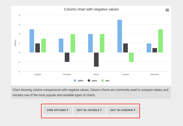
When you click the VIEW OPTIONS button you can get the following sample code.
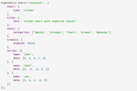
You only have to change the values you need in the x-axis, y-axis, and series. In the series section, you have to add the values that you want to show. They are the values that are returned from the python function and called using rpc query.
You need to add the division name of your division which is given in the XML template instead of “container” in “Highcharts.chart('container', { “. Otherwise, you need to give the division name as a container. In the sample code, I gave the div name as ‘chart’ and that div name is called inside the highchart js function.
 <div id="chart">
     <div id="canvas" width="300" height="200"></div>
 </div>
Highcharts.chart('chart', {
        chart: {
           type: 'column'
This is the format for the Highchart Js function.
The complete js code is here.
odoo.define('AccountingDashboard.AccountingDashboard', function(require) {
  'use strict';
  var AbstractAction = require('web.AbstractAction');
  var ajax = require('web.ajax');
  var core = require('web.core');
  var rpc = require('web.rpc');
  var session = require('web.session');
  var web_client = require('web.web_client');
  var _t = core._t;
  var QWeb = core.qweb;
  var self = this;
  var currency;
  var ActionMenu = AbstractAction.extend({
     template: 'InvoiceDashboard',
     events: {
        'click .account_dashboard: 'onclick_dashboard',
        'click #income_this_month': 'onclick_income_this_month',
        'click #income_this_year': 'onclick_income_this_year',
     },
onclick_toggle_two: function(ev) {
        this.onclick_income_this_month(ev);
        this.onclick_income_this_year(ev);
     },
     onclick_income_this_year: function(ev) {
        ev.preventDefault();
        var selected = $('.btn.btn-tool.income');
        var data = $(selected[0]).data();
        var posted = false;
        if ($('#toggle-two')[0].checked == true) {
           posted = "posted"
        }
        rpc.query({
           model: 'account.move',
           method: 'get_income_this_year',
           args: [posted],
        }).then(function(result) {
           $('#net_profit_this_months').hide();
           $('#net_profit_this_year').show();
           var ctx = document.getElementById("chart");
           // Define the data
           var income = result.income; // Add data values to array
           var expense = result.expense;
           var profit = result.profit;
           var labels = result.month; // Add labels to array

           // End Defining data
           if (window.myCharts != undefined) window.myCharts.destroy();
           Highcharts.chart('chart', {
              chart: {
                 type: 'column'
              },
              title: {
                 text: 'Income/Expense'
              },
              xAxis: {
                 min: 0,
                 title: {
                    text: 'This Year'
                 }
              },
              yAxis: {
                 min: 0,
                 title: {
                    text: 'Amount'
                 }
              },
              tooltip: {
                 headerFormat: '<span style="font-size:10px">{point.key}</span><table>',
                 pointFormat: '<tr><td style="color:{series.color};padding:0">{series.name}: </td>' + '<td style="padding:0"><b>{point.y:.1f} mm</b></td></tr>',
                 footerFormat: '</table>',
                 shared: true,
                 useHTML: true
              },
              plotOptions: {
                 column: {
                    pointPadding: 0.2,
                    borderWidth: 0
                 }
              },
              series: [{
                 name: 'Income',
                 data: [income]
              }, {
                 name: 'Profit/Loss',
                 data: [profit]
              }, {
                 name: 'Expense',
                 data: [expense]
              }]
           });
        })
     },
     onclick_income_this_month: function(ev) {
        ev.preventDefault();
        var selected = $('.btn.btn-tool.income');
        var data = $(selected[0]).data();
        var posted = false;
        if ($('#toggle-two')[0].checked == true) {
           posted = "posted"
        }
        rpc.query({
           model: 'account.move',
           method: 'get_income_this_month',
           args: [posted],
        }).then(function(result) {
           $('#net_profit_this_months').show();
           $('#net_profit_this_year').hide();
           var ctx = document.getElementById("chart");
           // Define the data
           var income = result.income; // Add data values to array
           var expense = result.expense;
           var profit = result.profit;
           var labels = result.date; // Add labels to array
           // End Defining data

           if (window.myCharts != undefined) window.myCharts.destroy();
           Highcharts.chart('chart', {
              chart: {
                 type: 'column'
              },
              title: {
                 text: 'Income/Expense'
              },
              xAxis: {
                 min: 0,
                 title: {
                    text: 'This Month'
                 }
              },
              yAxis: {
                 min: 0,
                 title: {
                    text: 'Amount'
                 }
              },
              tooltip: {
                 headerFormat: '<span style="font-size:10px">{point.key}</span><table>',
                 pointFormat: '<tr><td style="color:{series.color};padding:0">{series.name}: </td>' + '<td style="padding:0"><b>{point.y:.1f} mm</b></td></tr>',
                 footerFormat: '</table>',
                 shared: true,
                 useHTML: true
              },
              plotOptions: {
                 column: {
                    pointPadding: 0.2,
                    borderWidth: 0
                 }
              },
              series: [{
                 name: 'Income',
                 data: [income]
              }, {
                 name: 'Expense',
                 data: [expense]
              }, {
                 name: 'Profit/Loss',
                 data: [profit]
              }]
           });
        })
     },
     renderElement: function(ev) {
        $.when(this._super()).then(function(ev) {
           $('#toggle-two').bootstrapToggle({
              on: 'Posted Entries',
              off: 'All Entries'
           });
           var posted = false;
           if ($('#toggle-two')[0].checked == true) {
              posted = "posted"
           }

           rpc.query({
           model: 'account.move',
           method: 'get_income_this_month',
           args: [posted],
        }).then(function(result) {
           $('#net_profit_this_months').show();
           $('#net_profit_this_year').hide();
           var ctx = document.getElementById("chart");
           // Define the data
           var income = result.income; // Add data values to array
           var expense = result.expense;
           var profit = result.profit;
           var labels = result.date; // Add labels to array
           // End Defining data

           if (window.myCharts != undefined) window.myCharts.destroy();
           Highcharts.chart('chart', {
              chart: {
                 type: 'column'
              },
              title: {
                 text: 'Income/Expense'
              },
              xAxis: {
                 min: 0,
                 title: {
                    text: 'This Month'
                 }
              },
              yAxis: {
                 min: 0,
                 title: {
                    text: 'Amount'
                 }
              },
              tooltip: {
                 headerFormat: '<span style="font-size:10px">{point.key}</span><table>',
                 pointFormat: '<tr><td style="color:{series.color};padding:0">{series.name}: </td>' + '<td style="padding:0"><b>{point.y:.1f} mm</b></td></tr>',
                 footerFormat: '</table>',
                 shared: true,
                 useHTML: true
              },
              plotOptions: {
                 column: {
                    pointPadding: 0.2,
                    borderWidth: 0
                 }
              },
              series: [{
                 name: 'Income',
                 data: [income]
              }, {
                 name: 'Expense',
                 data: [expense]
              }, {
                 name: 'Profit/Loss',
                 data: [profit]
              }]
           });
        })
        });
     },
     willStart: function() {
        var self = this;
        self.drpdn_show = false;
        return Promise.all([ajax.loadLibs(this), this._super()]);
     },
  });
  core.action_registry.add('account_dashboard', ActionMenu);
});
After this code, you can install the module.
When you install this as perfect you can see in the accounting module the dashboard menu will appear and when you click on that module a dashboard chart like this can be seen.
Like this, you can add multiple divisions as rows and columns with your required data and your required type or format of charts which are available in the format of Highchart JS.