Odoo's backend interface includes a variety of widgets (such as one2many, many2many, and many2many_tags) that streamline tasks in selection fields. These widgets are powered by the Select2 JavaScript library, which enhances the user experience by making selection fields more dynamic and efficient. Replicating these advanced selection features without using external libraries like Select2 can be quite difficult. In simpler terms, it's not easy to recreate the same level of functionality without relying on tools like Select2.
This blog will explore the different types of selection fields offered by the Select2 library, highlighting how they simplify form building. It will also cover the relevant functions, implementation syntax, and provide practical examples to demonstrate their usage.
Basic Select2 field
A basic Select2 field is a dynamic dropdown list that allows users to select one or more options from a list. It enhances the traditional HTML <select> element with features such as search functionality, multi-selection, tagging, and improved styling.
In Odoo or other web applications, Select2 is commonly used to improve the user interface for selection fields. With Select2, users can quickly find options in a large list, select multiple options, or add new items if needed.
When implementing Select2 functionality in Odoo 18, you need to include the CDN links for the Select2 CSS in the web.assets_frontend section of the __manifest__.py file in your custom module to apply the Select2 styles.
'https://cdn.jsdelivr.net/npm/select2@4.1.0-rc.0/dist/css/select2.min.css',
In this case, the Select2 JavaScript library will be loaded directly into the custom JavaScript file using the CDN and loadJS.
loadJS("https://cdnjs.cloudflare.com/ajax/libs/select2/4.0.13/js/select2.min.js")Now create an XML file inside the your_custom_module/views and include the code given below
<select name="type"
       t-attf-class="form-control select2_box"
       required="">
   <option value="support">Support</option>
   <option value="feedback">Feedback</option>
   <option value="question">Question</option>
   <option value="complaint">Complaint</option>
   <option value="suggestion">Suggestion</option>
</select>
Next, we activate the Select2 plugin by using the 'advanced-select' class selector within the JavaScript file located in your_custom_module/static/src/js.
In this example, the Select2 JavaScript library is loaded directly into the JavaScript file using loadJS with a CDN.
/** @odoo-module **/
import publicWidget from "@web/legacy/js/public/public_widget";
import { loadJS } from "@web/core/assets";
publicWidget.registry.WebsiteCustomerContactRequestForm = publicWidget.Widget.extend({
   selector: ".s_website_form_required",
   init: function (parent, options) {
       this._super.apply(this, arguments);
      // Load Select2 dynamically (ensure it's included)
    loadJS("https://cdnjs.cloudflare.com/ajax/libs/select2/4.0.13/js/select2.min.js").then(() => {
           const selects = document.querySelectorAll('.s_website_form_required select');
          $(".s_website_form_required select").select2();
       }).catch(err => console.error("Error loading Select2:", err));
   },
});
Finally, include both files in the __manifest__.py file.
   'data': [
       'views/templates.xml',
   ],
   'assets': {
       'web.assets_frontend': [
           'https://cdn.jsdelivr.net/npm/select2@4.1.0-rc.0/dist/css/select2.min.css',
           'custom_contact_form/static/src/js/select2.js',  # Include select2 JS
       ],
   },
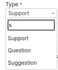
After implementing the Select2 enhancement, we have added a new Select field with real-time search filtering functionality, as shown in the image below.
Select2 with Grouping
Our next step is to create a Select2 field with grouped options, which is done using the <optgroup> tag
<select name="type"
       t-attf-class="form-control select2_box"
       required="">
   <optgroup label="Group1">
       <option value="support">Support</option>
       <option value="feedback">Feedback</option>
       <option value="question">Question</option>
   </optgroup>
   <optgroup label="Group2">
       <option value="complaint">Complaint</option>
       <option value="suggestion">Suggestion</option>
   </optgroup>
</select>
The improvements to the Select2 <select> tag are made possible through JavaScript, as demonstrated in the example below. In this case, the selector used is the ID of the <select> tag.
loadJS("https://cdnjs.cloudflare.com/ajax/libs/select2/4.0.13/js/select2.min.js").then(() => {
const selects = document.querySelectorAll('.s_website_form_required select');
$(".s_website_form_required select").select2();
}).catch(err => console.error("Error loading Select2:", err));
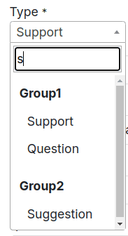
},The image below demonstrates an example of a Select2 field with grouped options.
Select2 with Clear Option Enabled
Next, we'll create a sample Select2 field with a clear option. To enable this feature, we use the 'allowClear: true' and ‘placeholder: "Select an option"’ attribute in the JavaScript file.
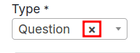
Enabling the Clear option allows users to remove the selected choice in the select field, leaving it empty if preferred.
$(".s_website_form_required select").select2({
        placeholder: "Select an option",
        allowClear: true
    });
The following example image shows how to deselect an option by clicking the 'x' icon next to the selected choice
Next, we are developing a Select2 field with multi-selection capabilities. By adding multiple options to the select tag, users can now choose several items from the list.
Below is a sample code snippet:
<select name="type"
       t-attf-class="form-control select2_box"
       required="" multiple="" style="width:300px;">
   <optgroup label="Group1">
       <option value="support">Support</option>
       <option value="feedback">Feedback</option>
       <option value="question">Question</option>
   </optgroup>
   <optgroup label="Group2">
       <option value="complaint">Complaint</option>
       <option value="suggestion">Suggestion</option>
   </optgroup>
</select>
Next, following the approach used in the basic Select2 example, we use JavaScript to link the Select2 functionality with the select tag.
$(".s_website_form_required select").select2({
        placeholder: "Select an option",
        allowClear: true
    });
Below is an example of Select2 with multiple selection enabled.

Select2 Placeholder
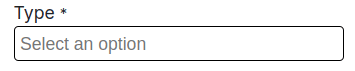
Next, we'll enable a placeholder for the Select2 field. This feature is activated in the JavaScript file using the placeholder attribute.
$(".s_website_form_required select").select2({
        placeholder: "Select an option",
    });
The placeholder text will be displayed in the Select2 dropdown area when no options are selected, as shown in the example image provided.
Select2 with Minimum/Maximum Search Input
Select2 provides the option to set minimum and maximum character lengths for the search input. This feature allows you to control when filtering is triggered based on the specified character limits. For large datasets, short search queries may not be effective for filtering, which makes the minimum length attribute especially useful.
The following code example demonstrates how to implement both minimum and maximum length restrictions for search input.
$(".s_website_form_required select").select2({
        minimumInputLength: 3,
        maximumInputLength: 10
    });
In this demonstration, filtering is activated only when the minimum input length requirement is satisfied. An example image showcasing the result is also included for better understanding.

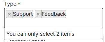
Select2 with Maximum Selection Limit
In this section, we will set an upper limit on the number of options that can be selected in the Select2 field while allowing multi-selection. This is accomplished using the maximumSelectionSize attribute in JavaScript, as shown in the example below.
$(".s_website_form_required select").select2({
         maximumSelectionLength: 2
   });
The select field enables users to select up to two options, as shown in the example above. As users make their selections, Select2 dynamically adjusts, as illustrated in the images below.
The Select2 JavaScript library offers a variety of properties and features to enhance select fields. Some of the key functionalities include:
* Width: Controls the width of the Select2 dropdown using the style attribute.
* Id: Retrieves the ID of the selected option, which can be useful for handling selections
* Locked: Prevents users from modifying the selected option, ensuring its status remains unchanged.
* Disabled: Disables specific options, making them unavailable for selection, thus preventing accidental choices.
* Tokenizer: Converts user input in the search field into selectable options, improving the search experience.
* Query: Allows for dynamic loading of results when data is fetched in real-time, ensuring the dropdown is always up to date.
When integrated with Odoo's native widgets, external libraries like Select2 provide developers with powerful tools to create highly customized selection fields. This collaboration enables the development of sophisticated, tailor-made user interfaces that align with the specific needs of the application. By combining Odoo's built-in features with external libraries, Odoo promotes flexibility and extensibility, laying the groundwork for customized solutions not just in selected fields but across various parts of the application.
To read more about how to create an Advanced Selection Field in Odoo 17 Website, refer to our blog How to Create an Advanced Selection Field in Odoo 17 Website.