Odoo offers a wide variety of field widgets, such as radio buttons, floats, percentages, color selectors, checkboxes, status bars, and URLs. By using different rendering templates, we can modify the view with the widget. It also assists us in designing with our needs in mind, which will streamline, accelerate, broaden, and improve the effectiveness of our development. In this blog we will discuss how to create a progress bar in Odoo 17.
A new template named "ProgressBarWidget" is defined in the "progress_bar_widget.xml" XML file, which we will create now. Progress_number and progress-bar-inner are the two classes. The class 'progress-bar-inner' defines the style of the progress bar, while the class 'progress_number' shows the percentage of progress. I've set the background color and height of the progress bar. Furthermore, all control over these style parameters is yours.
 <?xml version="1.0" encoding="utf-8"?>
<templates id="template" xml:space="preserve">
   <t t-name="ProgressBarWidget" owl="1">
       <div t-ref="ProgressBarWidget-root">
           <div class="progress_bar">
               <div class="pro-bar">
                   <span class="progress-bar-inner"/>
                   <span class="progress_number"/>
               </div>
           </div>
       </div>
   </t>
</templates>
.progress_bar .pro-bar {
   background: hsl(0, 0%, 97%);
   box-shadow: 0 1px 2px hsla(0, 0%, 0%, 0.1) inset;
   height: 4px;
   width: 200px;
   margin-bottom: 15px;
   margin-top: 10px;
   position: relative;
}
.progress_bar .progress_number {
   float: right;
   margin-top: -6px;
   margin-right: -50px;
}
.progress_bar .progress-bar-inner {
   background-color: green;
   display: block;
   width: 0;
   height: 100%;
   position: absolute;
   top: 0;
   left: 0;
   transition: width 1s linear 0s;
}
.progress_bar .progress-bar-inner:before {
   content: "";
   background-color: hsl(0, 0%, 100%);
   border-radius: 50%;
   width: 4px;
   height: 4px;
   position: absolute;
   right: 1px;
   top: 0;
   z-index: 1;
}
.progress_bar .progress-bar-inner:after {
   content: "";
   width: 14px;
   height: 14px;
   background-color: inherit;
   border-radius: 50%;
   position: absolute;
   right: -4px;
   top: -5px;
}
/** @odoo-module **/
import { registry } from "@web/core/registry";
import { standardFieldProps } from "@web/views/fields/standard_field_props";
import { Component, useRef, onMounted , onPatched} from "@odoo/owl";
export class ProgressBarWidget extends Component {
setup(){
this.root = useRef('ProgressBarWidget-root')
onMounted(this.onUpdateProgressBar)
onPatched(this.onUpdateProgressBar)
}
onUpdateProgressBar(){
if (this.props.value <= 100){
this.widthComplete = parseInt(this.props.value/100 * 100);
}else{
this.widthComplete = 100;
}
this.root.el.querySelector('.progress-bar-inner').style.width = this.widthComplete+'%'
this.root.el.querySelector('.progress_number').textContent = this.widthComplete+'%'
}
}
ProgressBarWidget.template = 'ProgressBarWidget';
ProgressBarWidget.props = standardFieldProps;
ProgressBarWidget.supportedTypes = ["float", "integer"];
registry.category("fields").add("progress_bar_widget", {
component: ProgressBarWidget,
});
One lifecycle method in Odoo components is the setup method. Using useRef to establish a reference to the root element, it initializes the component and attaches event handlers through the use of "onMounted" and "onPatched."The progress bar is updated by the "onUpdateProgressBar" method using the value that is supplied in the props. It updates the corresponding elements in the DOM and determines the width of the progress bar. Finally, add supported types, templates, and props to the progress bar. The ProgressBarWidget supports the following field types: "float" and "integer." Enter "progress_bar_widget" in the "fields" category of the Odoo registry to register the ProgressBarWidget. Assign in the manifest.
In the field, apply our "progress_bar_widget" widget.
<field name="progress" widget="progress_bar_widget"/>
Output is shown below.
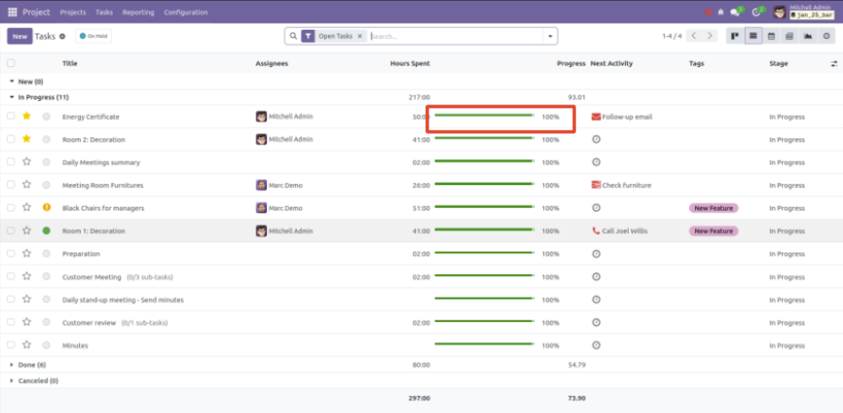
The smooth and graphical depiction of task completion is made possible by Odoo's automatic progress bar update, which is dependent on timesheet entries. Through the incorporation of both estimated and completed hours into the project task model, users can effortlessly track advancement without requiring manual assistance.