Bottom sheets are an essential UI pattern in modern web applications, providing a smooth way to display additional content without navigating away from the current context. In Odoo 19, implementing bottom sheets with OWL (Odoo Web Library) components is straightforward thanks to the built-in bottom sheet service.
In this tutorial, we'll create a complete working example that demonstrates how to integrate the bottom sheet service into your Odoo 19 module. We'll build a custom menu item that opens a client action, which renders an OWL component with a button to trigger the bottom sheet.
Understanding the Bottom Sheet Service
The bottom sheet service in Odoo 19 is already available in the core web module. It's a wrapper around the overlay service that manages the display and lifecycle of bottom sheet components. It handles:
- Adding and removing bottom sheets from the DOM
- Managing multiple bottom sheets simultaneously
- Applying appropriate CSS classes to the body element
- Handling close callbacks and cleanup
Note: You don't need to create the bottom sheet service yourself - it's already provided by Odoo 19's web module!
Module Structure
Let's create a module called bottom_sheet_demo with the following structure:
bottom_sheet_demo/
+-- __init__.py
+-- __manifest__.py
+-- static/
¦   +-- src/
¦       +-- components/
¦           +-- bottom_sheet_demo.js
¦           +-- bottom_sheet_demo.xml
¦           +-- bottom_sheet_content.js
¦           +-- bottom_sheet_content.xml
+-- views/
    +-- menu_views.xml
Step 1: Create the Manifest File
First, let's create the __manifest__.py file that defines our module:
{
    'name': 'Bottom Sheet Demo',
    'version': '19.0.1.0.0',
    'category': 'Tools',
    'summary': 'Demonstrate Bottom Sheet Service with OWL Components',
    'description': """
        This module demonstrates how to use the bottom sheet service
        in Odoo 19 with OWL components.
    """,
    'author': 'Your Name',
    'depends': ['web'],
    'data': [
        'views/menu_views.xml',
    ],
    'assets': {
        'web.assets_backend': [
            'bottom_sheet_demo/static/src/components/bottom_sheet_demo.js',
            'bottom_sheet_demo/static/src/components/bottom_sheet_demo.xml',
            'bottom_sheet_demo/static/src/components/bottom_sheet_content.js',
            'bottom_sheet_demo/static/src/components/bottom_sheet_content.xml',
        ],
    },
    'installable': True,
    'application': False,
    'license': 'LGPL-3',
}
The manifest file declares our dependency on the web module (which provides the bottom sheet service) and registers our JavaScript and XML template files in the backend assets bundle.
Step 2: Create Menu and Client Action
Create views/menu_views.xml to define the menu item and client action:
<?xml version="1.0" encoding="utf-8"?>
<odoo>
    <!-- Client Action Definition -->
    <record id="action_bottom_sheet_demo" model="ir.actions.client">
        <field name="name">Bottom Sheet Demo</field>
        <field name="tag">bottom_sheet_demo</field>
    </record>
    <!-- Menu Item -->
    <menuitem id="menu_bottom_sheet_demo_root"
              name="Bottom Sheet Demo"
              sequence="100"/>

    <menuitem id="menu_bottom_sheet_demo"
              name="Open Demo"
              parent="menu_bottom_sheet_demo_root"
              action="action_bottom_sheet_demo"
              sequence="10"/>
</odoo>
This XML file creates:
- A client action with the tag bottom_sheet_demo
- A root menu item called "Bottom Sheet Demo"
- A submenu item "Open Demo" that triggers the client action
Step 3: Create the Bottom Sheet Content Component
This component will be displayed inside the bottom sheet. Create static/src/components/bottom_sheet_content.js:
/** @odoo-module **/
import { Component } from "@odoo/owl";
export class BottomSheetContent extends Component {
    static template = "bottom_sheet_demo.BottomSheetContent";
    static props = {
        close: { type: Function, optional: true },
        title: { type: String, optional: true },
        message: { type: String, optional: true },
    };
    setup() {
        this.title = this.props.title || "Bottom Sheet Demo";
        this.message = this.props.message || "This is a sample bottom sheet content!";
    }
}
This component:
- Accepts close, title, and message as optional props
- Provides default values for title and message
- Has an onClose method to handle closing the bottom sheet
Now create the template file static/src/components/bottom_sheet_content.xml:
<?xml version="1.0" encoding="UTF-8"?>
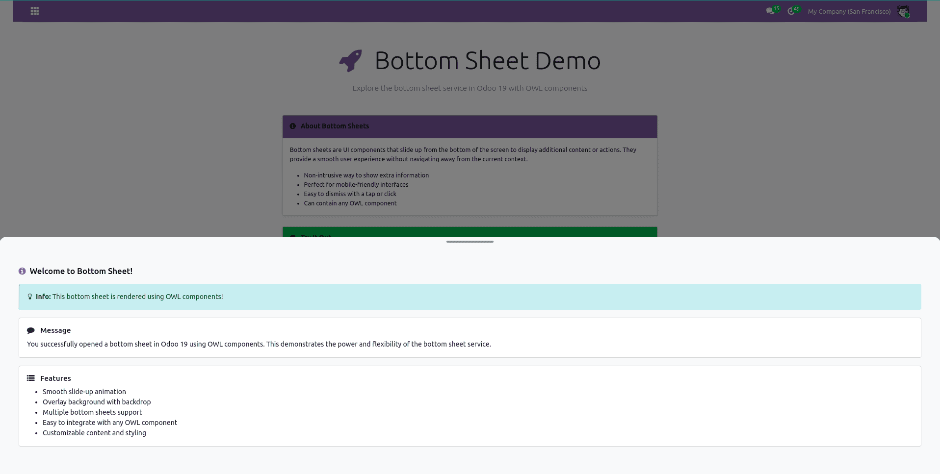
<templates xml:space="preserve">
<t t-name="bottom_sheet_demo.BottomSheetContent">
<div class="bottom-sheet-content p-4">
<div class="d-flex justify-content-between align-items-center mb-3">
<h4 class="mb-0">
<i class="fa fa-info-circle me-2 text-primary"/>
<t t-esc="title"/>
</h4>
</div>
<div class="alert alert-info mb-3">
<i class="fa fa-lightbulb-o me-2"/>
<strong>Info:</strong> This bottom sheet is rendered using OWL components!
</div>
<div class="card mb-3">
<div class="card-body">
<h5 class="card-title">
<i class="fa fa-comment me-2"/>
Message
</h5>
<p class="card-text" t-esc="message"/>
</div>
</div>
<div class="card mb-3">
<div class="card-body">
<h5 class="card-title">
<i class="fa fa-list me-2"/>
Features
</h5>
<ul class="mb-0">
<li>Smooth slide-up animation</li>
<li>Overlay background with backdrop</li>
<li>Multiple bottom sheets support</li>
<li>Easy to integrate with any OWL component</li>
<li>Customizable content and styling</li>
</ul>
</div>
</div>
</div>
</t>
</templates>
The template uses Bootstrap classes for styling and includes:
- A header with the title
- An info alert
- Two cards displaying the message and features list
Step 4: Create the Main Demo Component
This is the main component that renders when you click the menu. Create static/src/components/bottom_sheet_demo.js:
/** @odoo-module **/
import { Component } from "@odoo/owl";
import { registry } from "@web/core/registry";
import { useService } from "@web/core/utils/hooks";
import { BottomSheetContent } from "./bottom_sheet_content";
export class BottomSheetDemo extends Component {
    static template = "bottom_sheet_demo.BottomSheetDemo";
    setup() {
        this.bottomSheetService = useService("bottom_sheet");
    }
    openBottomSheet() {
        const closeBottomSheet = this.bottomSheetService.add(
            document.body,
            BottomSheetContent,
            {
                title: "Welcome to Bottom Sheet!",
                message: "You successfully opened a bottom sheet in Odoo 19 using OWL components. This demonstrates the power and flexibility of the bottom sheet service.",
            },
            {
                onClose: () => {
                    console.log("Bottom sheet closed!");
                },
            }
        );
    }
    openCustomBottomSheet() {
        const closeBottomSheet = this.bottomSheetService.add(
            document.body,
            BottomSheetContent,
            {
                title: "Custom Bottom Sheet",
                message: "This is a different bottom sheet with custom content. You can pass any props to customize the appearance and behavior.",
            },
            {
                onClose: () => {
                    console.log("Custom bottom sheet closed!");
                },
            }
        );
    }
}
registry.category("actions").add("bottom_sheet_demo", BottomSheetDemo);
Key points in this component:
- Uses useService("bottom_sheet") to access the bottom sheet service
- Registers itself as a client action with the tag bottom_sheet_demo
- Provides two methods to open bottom sheets with different content
- The bottomSheetService.add() method accepts:
- Target element (document.body)
- Component to render (BottomSheetContent)
- Props object to pass to the component
- Options object with callbacks like onClose
Now create the template file static/src/components/bottom_sheet_demo.xml:
<?xml version="1.0" encoding="UTF-8"?>
<templates xml:space="preserve">
    <t t-name="bottom_sheet_demo.BottomSheetDemo">
        <div class="o_action_manager">
            <div class="container mt-5">
                <div class="row justify-content-center">
                    <div class="col-lg-8">
                        <!-- Header Section -->
                        <div class="text-center mb-5">
                            <h1 class="display-4 mb-3">
                                <i class="fa fa-rocket text-primary me-3"/>
                                Bottom Sheet Demo
                            </h1>
                            <p class="lead text-muted">
                                Explore the bottom sheet service in Odoo 19 with OWL components
                            </p>
                        </div>
                        <!-- Information Card -->
                        <div class="card shadow-sm mb-4">
                            <div class="card-header bg-primary text-white">
                                <h5 class="mb-0">
                                    <i class="fa fa-info-circle me-2"/>
                                    About Bottom Sheets
                                </h5>
                            </div>
                            <div class="card-body">
                                <p>
                                    Bottom sheets are UI components that slide up from the bottom of the screen
                                    to display additional content or actions. They provide a smooth user experience
                                    without navigating away from the current context.
                                </p>
                                <ul class="mb-0">
                                    <li>Non-intrusive way to show extra information</li>
                                    <li>Perfect for mobile-friendly interfaces</li>
                                    <li>Easy to dismiss with a tap or click</li>
                                    <li>Can contain any OWL component</li>
                                </ul>
                            </div>
                        </div>
                        <!-- Action Buttons Card -->
                        <div class="card shadow-sm mb-4">
                            <div class="card-header bg-success text-white">
                                <h5 class="mb-0">
                                    <i class="fa fa-play-circle me-2"/>
                                    Try It Out
                                </h5>
                            </div>
                            <div class="card-body">
                                <p class="mb-3">
                                    Click the buttons below to open bottom sheets with different content:
                                </p>
                                <div class="d-grid gap-3">
                                    <button
                                        class="btn btn-lg btn-primary"
                                        t-on-click="openBottomSheet">
                                        <i class="fa fa-arrow-up me-2"/>
                                        Open Bottom Sheet
                                    </button>

                                    <button
                                        class="btn btn-lg btn-success"
                                        t-on-click="openCustomBottomSheet">
                                        <i class="fa fa-star me-2"/>
                                        Open Custom Bottom Sheet
                                    </button>
                                </div>
                            </div>
                        </div>
                        <!-- Code Example Card -->
                        <div class="card shadow-sm">
                            <div class="card-header bg-dark text-white">
                                <h5 class="mb-0">
                                    <i class="fa fa-code me-2"/>
                                    Implementation Details
                                </h5>
                            </div>
                            <div class="card-body">
                                <h6 class="text-primary">Key Points:</h6>
                                <ol>
                                    <li>Use the bottom sheet service from Odoo's web module</li>
                                    <li>Access it with <code>useService("bottom_sheet")</code></li>
                                    <li>Call <code>bottomSheetService.add()</code> to open a bottom sheet</li>
                                    <li>Pass your OWL component and props as parameters</li>
                                    <li>Handle the close callback if needed</li>
                                </ol>
                                <div class="alert alert-info mb-0 mt-3">
                                    <i class="fa fa-lightbulb-o me-2"/>
                                    <strong>Tip:</strong> You can open multiple bottom sheets simultaneously!
                                </div>
                            </div>
                        </div>
                    </div>
                </div>
            </div>
        </div>
    </t>
</templates>
How It Works
Let's walk through the flow:
- User clicks the menu: The menu item triggers the client action with tag bottom_sheet_demo
- Component renders: The BottomSheetDemo component displays with action buttons
- Button click: When "Open Bottom Sheet" is clicked, the openBottomSheet() method is called
- Service invocation: The method calls bottomSheetService.add() with:
- Target element: document.body
- Component: BottomSheetContent
- Props: { title: "...", message: "..." }
- Options: { onClose: () => {...} }
- Bottom sheet appears: The service creates the bottom sheet with a slide-up animation
- Cleanup: When closed, the service executes the onClose callback
Understanding the Bottom Sheet Service API
The bottom sheet service provides a simple add() method:
bottomSheetService.add(target, component, props, options)
Parameters:
- target (HTMLElement): The target element (usually document.body)
- component (Component): The OWL component to render inside the bottom sheet
- props (Object): Props to pass to the component
- options (Object): Configuration options
- onClose (Function): Callback executed when the bottom sheet is closed
- class (String): Additional CSS classes to apply
- role (String): ARIA role attribute
- env (Object): Custom environment for the component
Returns: A function that when called will close the bottom sheet
Customization Tips
Change the Animation or Styling
You can add custom CSS classes to your bottom sheet:
this.bottomSheetService.add(
    document.body,
    BottomSheetContent,
    { title: "Custom", message: "Test" },
    {
        class: "my-custom-class",
    }
);
Create Different Content Components
You can create multiple content components for different use cases:
import { ProductDetailsContent } from "./product_details_content";
import { OrderSummaryContent } from "./order_summary_content";
// Open product details
openProductDetails(productId) {
    this.bottomSheetService.add(
        document.body,
        ProductDetailsContent,
        { productId: productId }
    );
}
// Open order summary
openOrderSummary(orderId) {
    this.bottomSheetService.add(
        document.body,
        OrderSummaryContent,
        { orderId: orderId }
    );
}
Screenshot
Conclusion
The bottom sheet service in Odoo 19 provides a powerful, flexible way to display supplementary content in your applications. By leveraging OWL components and the service architecture, you can create rich, interactive experiences that enhance your Odoo interface without overwhelming users.
This tutorial has shown you:
- How to access and use the built-in bottom sheet service
- How to create custom OWL components for bottom sheet content
- How to register client actions and menu items
- How to pass props and handle callbacks
The example provided serves as a solid foundation that you can build upon for your specific use cases. Whether you're displaying product details, order summaries, quick actions, or any other supplementary content, bottom sheets offer an elegant solution that keeps users engaged and productive.
To read more about How to use Bottom Sheet Service in Odoo 19 Website, refer to our blog How to use Bottom Sheet Service in Odoo 19 Website.