When developing mobile applications, loading states are inevitable. Whether it’s fetching data from an API, uploading a file, syncing information, or performing background operations, users often find themselves waiting for processes to complete. While the default ‘CircularProgressIndicator’ in Flutter does the job, it’s often too plain for modern, visually appealing apps.
That’s where the ‘loading_animation_widget’ package comes in. This package offers a variety of beautifully crafted, pre-built animated loaders that are highly customizable and visually appealing. Instead of spending time designing custom animations from scratch, developers can use this package to quickly integrate stylish loaders, instantly elevating the overall UI and user experience of their apps.
In this blog, we’ll explore the package and its different types of loading animations, along with how you can use them in your Flutter projects.
Installing the Package
Specify the dependency in the ‘pubspec.yaml’ file and run ‘Pub get’ to fetch the package.
dependencies:
 flutter:
   sdk: flutter
 loading_animation_widget: ^1.2.1
Then import the package into your Dart file:
import 'package:loading_animation_widget/loading_animation_widget.dart';
Types of Loading Animations
The ‘loading_animation_widget’ package comes with a wide selection of animations, ranging from minimal to playful, geometric, and fluid motion designs. Below are all the available types with a short description and example code snippet:
1. TwistingDots
Two dots rotating around each other in a twisting, orbital motion. With customizable colors for each dot, this animation is perfect for modern and playful loading indicators.
LoadingAnimationWidget.twistingDots(
 leftDotColor: const Color(0xFF1A1A3F),
 rightDotColor: const Color(0xFFEA3799),
 size: 100,
),

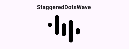
2. StaggeredDotsWave
Creates a wave-like bouncing effect by animating dots in a staggered sequence. The rhythmic flow makes it suitable for dynamic and lively designs.
LoadingAnimationWidget.staggeredDotsWave(
 color: Colors.black,
 size: 100,
),
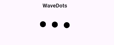
3. WaveDots
Offers a smoother variation of the wave effect, where dots move up and down continuously to simulate a flowing wave. This animation is ideal for calm and fluid UI transitions.
LoadingAnimationWidget.waveDots(
 color: Colors.black,
 size: 100,
),
4. InkDrop
Generates outward-moving ripples that resemble ink spreading through water, providing a sleek and subtle animation for minimal loading indicators.
LoadingAnimationWidget.inkDrop(
 color: Colors.black,
 size: 50,
),

5. ThreeRotatingDots
Three dots rotate around a central point, creating a balanced, classic loading animation style often seen in messaging or data-loading interfaces.
LoadingAnimationWidget.threeRotatingDots(
 color: Colors.black,
 size: 50,
),

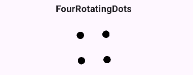
6. FourRotatingDots
Expands on this idea with four dots orbiting in a square or diamond path, adding a geometric feel that feels slightly more sophisticated.
LoadingAnimationWidget.fourRotatingDots(
 color: Colors.black,
 size: 100,
),
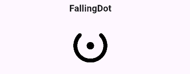
7. FallingDot
Depicts a single dot repeatedly falling and bouncing, creating a playful and simple loading effect that draws attention without overwhelming the design.
LoadingAnimationWidget.fallingDot(
 color: Colors.black,
 size: 100,
),
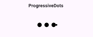
8. ProgressiveDots
Animates dots by making them grow and shrink sequentially, producing a progressive rhythm that gives users a sense of forward motion or progression.
LoadingAnimationWidget.progressiveDots(
 color: Colors.black,
 size: 100,
),
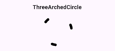
9. ThreeArchedCircle
Offers a circular rotation of three arcs, providing a sleek and continuous spinning effect perfect for minimalistic interfaces.
LoadingAnimationWidget.threeArchedCircle(
 color: Colors.black,
 size: 100,
),
10. BouncingBall
Focuses on a single ball bouncing repeatedly, ideal for simple apps that need a clear and eye-catching loading sign.
LoadingAnimationWidget.bouncingBall(
 color: Colors.black,
 size: 100,
),

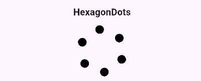
11. HexagonDots
Arranges dots in a hexagonal path, giving a structured and geometric motion. This animation works well in modern, futuristic, or tech-themed applications.
LoadingAnimationWidget.hexagonDots(
 color: Colors.black,
 size: 100,
),
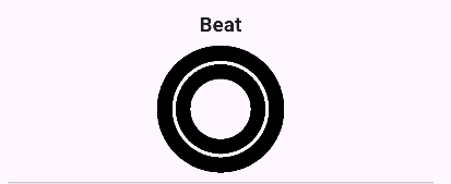
12. Beat
Simulates a heartbeat-like pulsing motion, perfect for health apps or designs that need a warm and lively touch.
LoadingAnimationWidget.beat(
 color: Colors.black,
 size: 100,
),
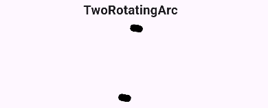
13. TwoRotatingArc
Displays two arcs rotating around each other in smooth synchronization, ideal for clean, professional designs.
LoadingAnimationWidget.twoRotatingArc(
 color: Colors.black,
 size: 100,
),
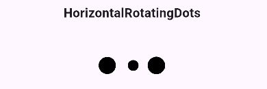
14. HorizontalRotatingDots
Rotates dots along a horizontal axis, creating a 3D illusion that adds depth to loading visuals.
LoadingAnimationWidget.horizontalRotatingDots(
 color: Colors.black,
 size: 100,
),
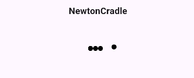
15. NewtonCradle
A row of dots moves side to side in a smooth, pendulum-like motion, inspired by real-world physics.
LoadingAnimationWidget.newtonCradle(
 color: Colors.black,
 size: 100,
),
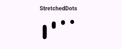
16. StretchedDots
Dots smoothly grow and shrink in both horizontal and vertical direction with a consistent, rhythmic motion.
LoadingAnimationWidget.stretchedDots(
 color: Colors.black,
 size: 100,
),
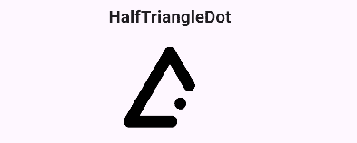
17. HalfTriangleDot
Dots arranged in a half-triangle pattern, bouncing in sequence to create a dynamic triangular loading effect.
LoadingAnimationWidget.halfTriangleDot(
 color: Colors.black,
 size: 100,
),
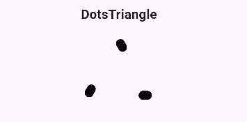
18. DotsTriangle
Dots form a complete triangle shape, animating in sequence to create a geometric, smooth loading effect.
LoadingAnimationWidget.dotsTriangle(
 color: Colors.black,
 size: 100,
),
The “loading_animation_widget” package makes it easy to add stylish and engaging loaders to Flutter apps without building animations from scratch. With its wide range of customizable options, it helps improve user experience while keeping the UI modern and visually appealing.
To read more about How to Add Smooth and Engaging Animations in Flutter, refer to our blog How to Add Smooth and Engaging Animations in Flutter