Animations play a key role in making Flutter apps feel lively, intuitive, and visually appealing. From subtle hover effects and smooth screen transitions to playful loading animations, they help guide users’ attention and create a delightful experience. Flutter provides a powerful animation framework and a wide range of ready-to-use widgets, allowing developers to build sleek, high-performance animations with ease.
Here’s a list of popular Flutter packages used for adding smooth and engaging animations to your apps. Five most commonly used Flutter animation packages.
| Packages | Highlights | Use Case |
| animations | Official Material motion animations | Page transitions, container effects |
| flutter_animate | Easy syntax, multiple effects | Quick custom animations |
| lottie | Pre-built JSON animations | Splash, onboarding, illustrations |
| rive | Interactive vector animations | Advanced, game-like UI |
| flutter_spinkit | Pre-made loading indicators | Loaders and progress UI |
Implicit animations
Implicit animations are animations that automatically animate changes to a widget’s properties when they change, without manually managing AnimationControllers or Tweens.
It will work if we just change a property (like size, color, opacity, alignment, etc.), and Flutter smoothly animates the change.
Common Implicit Animation Widgets:
| Widget | Animates |
| AnimatedContainer | Size, color, borderRadius, padding |
| AnimatedOpacity | Opacity (fade in/out) |
| AnimatedAlign | Alignment changes |
| AnimatedPadding | Padding changes |
| AnimatedPositioned | Position in a Stack |
| AnimatedSwitcher | Switches between widgets with anim |
| AnimatedDefaultTextStyle | Text style changes |
| TweenAnimationBuilder | Custom animations with Tween |
class _ImplicitAnimationExampleState extends State<ImplicitAnimationExample> {
bool isExpanded = false;
@override
Widget build(BuildContext context) {
return Scaffold(
appBar: AppBar(title: const Text("Implicit Animation Example")),
body: Center(
child: Column(
mainAxisAlignment: MainAxisAlignment.center,
children: [
GestureDetector(
onTap: () {
setState(() {
isExpanded = !isExpanded;
});
},
child: AnimatedContainer(
duration: const Duration(seconds: 1),
curve: Curves.easeInOut,
width: isExpanded ? 200 : 100,
height: isExpanded ? 200 : 100,
decoration: BoxDecoration(
color: isExpanded ? Colors.blue : Colors.red,
borderRadius: BorderRadius.circular(isExpanded ? 0 : 50),
),
child: const Center(
child: Text(
"Tap Me",
style: TextStyle(color: Colors.white, fontSize: 18),
),
),
),
),
],
),
),
);
}
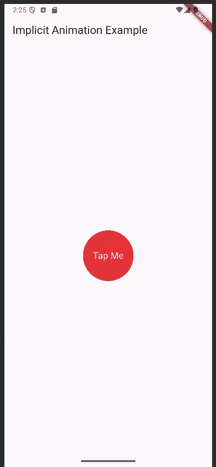
}This Flutter code demonstrates an implicit animation using AnimatedContainer, where size, color, and border radius change smoothly without needing an animation controller. Tapping the container toggles the isExpanded state, causing it to animate between a small red circle and a large blue square over one second with an ease-in-out curve. This provides an engaging and interactive UI effect with minimal code.
AnimatedContainer(
 duration: const Duration(seconds: 1),
 curve: Curves.easeInOut,
 width: isExpanded ? 200 : 100,
 height: isExpanded ? 200 : 100,
 decoration: BoxDecoration(
   color: isExpanded ? Colors.blue : Colors.red,
   borderRadius: BorderRadius.circular(isExpanded ? 0 : 50),
 ),
 child: const Center(
   child: Text(
     "Tap Me",
     style: TextStyle(color: Colors.white, fontSize: 18),
   ),
 ),
),
- AnimatedContainer()
- This is a Flutter widget that animates changes to its visual properties (size, color, border radius, etc.) without using an animation controller manually.
- Any property change triggers a smooth transition.
- duration: const Duration(seconds: 1),
- Sets how long the animation lasts when properties change.
- Here, all changes take 1 second to complete.
- curve: Curves.easeInOut,
- Defines the speed curve of the animation.
easeInOut creates a smooth, natural flow by gradually accelerating, reaching peak speed midway, and then gently decelerating. - width: isExpanded ? 200 : 100,
- Controls the width of the container.
- If isExpanded is true, width is 200; if false, width is 100.
- This change animates smoothly.
- height: isExpanded ? 200 : 100,
- Controls the height of the container.
- Animates between 100 and 200 based on isExpanded.
- decoration: BoxDecoration(...),
- Lets you style the container with colors, borders, and shapes.
- Inside BoxDecoration:
- color: isExpanded ? Colors.blue : Colors.red,
- Changes the background color between blue (expanded) and red (collapsed).
- borderRadius: BorderRadius.circular(isExpanded ? 0 : 50),
- Controls how rounded the corners are.
- 0 - sharp square edges.
- 50 - circular/rounded edges.
- child: const Center(...),
- Place a child widget (the text) in the center of the container.
- Text("Tap Me", style: ...)
- Displays "Tap Me" in white color and font size 18.
- The const makes this widget compile-time constant for better performance.
Explicit Animations
Explicit animation in Flutter is when you have full manual control over the animation’s behavior, such as its start, stop, speed, direction, and curve. Unlike implicit animations (which animate automatically when a property changes), explicit animations require an AnimationController, Tween, and Animation objects to define and control how values change over time. This approach is best for creating complex, sequenced, or highly customized animations where you need precise control.
class _ExplicitControllerDemoState extends State<ExplicitControllerDemo>
   with SingleTickerProviderStateMixin {
 late final AnimationController _controller;
 late final Animation<double> _scale;
 late final Animation<double> _rotation;
 late final Animation<Color?> _color;
 @override
 void initState() {
   super.initState();
   _controller = AnimationController(
     vsync: this,
     duration: const Duration(milliseconds: 1200),
   );
   _scale = Tween(begin: 0.85, end: 1.15).animate(
     CurvedAnimation(parent: _controller, curve: Curves.easeInOut),
   );
   _rotation = Tween(begin: 0.0, end: math.pi).animate(
     CurvedAnimation(parent: _controller, curve: Curves.easeInOutBack),
   );
   _color = ColorTween(begin: Colors.deepOrange, end: Colors.indigo)
       .animate(_controller);
   _controller.addStatusListener((status) {
     if (status == AnimationStatus.completed) {
       _controller.reverse();
     } else if (status == AnimationStatus.dismissed) {
       _controller.forward();
     }
   });
   _controller.forward();
 }

 void _togglePlay() {
   setState(() {
     if (_controller.isAnimating) {
       _controller.stop();
     } else {
       if (_controller.status == AnimationStatus.reverse) {
         _controller.reverse();
       } else {
         _controller.forward();
       }
     }
   });
 }
 @override
 Widget build(BuildContext context) {
   return Scaffold(
     appBar: AppBar(title: const Text('Explicit Animation (Controller + Tween)')),
     body: Center(
       child: AnimatedBuilder(
         animation: _controller,
         builder: (context, child) {
           return Transform.rotate(
             angle: _rotation.value,
             child: Transform.scale(
               scale: _scale.value,
               child: Container(
                 width: 160,
                 height: 160,
                 decoration: BoxDecoration(
                   color: _color.value,
                   borderRadius: BorderRadius.circular(24),
                 ),
                 child: const Center(
                   child: Text(
                     'Explicit',
                     style: TextStyle(color: Colors.white, fontSize: 18),
                   ),
                 ),
               ),
             ),
           );
         },
       ),
     ),
     floatingActionButton: FloatingActionButton(
       onPressed: _togglePlay,
       child: Icon(_controller.isAnimating ? Icons.pause : Icons.play_arrow),
     ),
   );
 }
}
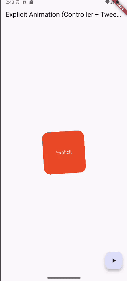
This code demonstrates explicit animation in Flutter using an AnimationController to manually control animation timing and direction. It animates a container’s scale, rotation, and color by defining Tweens and applying curves, while AnimatedBuilder rebuilds the UI each frame. A StatusListener makes the animation loop back and forth by reversing when completed or dismissed. The floating action button lets you pause and resume the animation dynamically.
Animation Variables
late final AnimationController _controller;
late final Animation<double> _scale;
late final Animation<double> _rotation;
late final Animation<Color?> _color;
- _controller: Controls time for all animations.
- _scale: Animation for resizing the box.
- _rotation: Animation for rotating the box.
- _color: Animation for smoothly changing the box color.
AnimationController
_controller = AnimationController( vsync: this, duration: const Duration(milliseconds: 1200),);
- Creates a controller with a 1.2-second animation duration.
- vsync: This ensures performance optimization by syncing with screen refresh rates.
Tween Animations
_scale = Tween(begin: 0.85, end: 1.15).animate( CurvedAnimation(parent: _controller, curve: Curves.easeInOut),);_rotation = Tween(begin: 0.0, end: math.pi).animate( CurvedAnimation(parent: _controller, curve: Curves.easeInOutBack),);_color = ColorTween(begin: Colors.deepOrange, end: Colors.indigo) .animate(_controller);
- Tween: Defines start and end values.
- Scale goes 0.85 > 1.15 (small to large).
- Rotation goes 0 > p radians (0° to 180°).
- Color transitions orange > indigo.
- CurvedAnimation: Adds smooth easing effects to scale and rotation.
Looping the Animation
_controller.addStatusListener((status) { if (status == AnimationStatus.completed) { _controller.reverse(); } else if (status == AnimationStatus.dismissed) { _controller.forward(); }}); - Listens for animation states:
- When finished (completed), reverse it.
- When back at the start (dismissed), forward it again.
- This creates a continuous back-and-forth loop.
Start Animation
_controller.forward();
- Starts playing the animation forward when the widget loads.
Toggle Function
void _togglePlay() { setState(() { if (_controller.isAnimating) { _controller.stop(); } else { if (_controller.status == AnimationStatus.reverse) { _controller.reverse(); } else { _controller.forward(); } } });} - This toggles animation play/pause when you press the Floating Action Button.
AnimatedBuilder
AnimatedBuilder( animation: _controller, builder: (context, child) { return Transform.rotate( angle: _rotation.value, child: Transform.scale( scale: _scale.value, child: Container( width: 160, height: 160, decoration: BoxDecoration( color: _color.value, borderRadius: BorderRadius.circular(24), ), child: const Center( child: Text( 'Explicit', style: TextStyle(color: Colors.white, fontSize: 18), ), ), ), ), ); },), - This AnimatedBuilder rebuilds the UI whenever _controller changes, applying the current animation values. It rotates, scales, and changes the color of a 160x160 container with rounded corners, showing the text "Explicit" at the center.
Hero Animation
A Hero Animation provides a fluid, continuous movement of a widget when navigating between two screens. When you navigate between routes, a widget (like an image or a card) “flies” from one page to the next, making navigation feel natural and connected. This is done using the Hero widget, which matches widgets across screens using the same tag.
class FirstPage extends StatelessWidget {
const FirstPage({super.key});
@override
Widget build(BuildContext context) {
return Scaffold(
appBar: AppBar(title: const Text('First Page')),
body: Center(
child: GestureDetector(
onTap: () {
Navigator.push(
context,
MaterialPageRoute(builder: (_) => const SecondPage()),
);
},
child: Hero(
tag: 'hero-image',
child: ClipRRect(
borderRadius: BorderRadius.circular(20),
child: Image.network(
'https://picsum.photos/200/300',
width: 150,
height: 150,
fit: BoxFit.cover,
),
),
),
),
),
);
}
}
class SecondPage extends StatelessWidget {
const SecondPage({super.key});
@override
Widget build(BuildContext context) {
return Scaffold(
appBar: AppBar(title: const Text('Second Page')),
body: Center(
child: Hero(
tag: 'hero-image',
child: ClipRRect(
borderRadius: BorderRadius.circular(20),
child: Image.network(
'https://picsum.photos/200/300',
width: 300,
height: 400,
fit: BoxFit.cover,
),
),
),
),
);
}
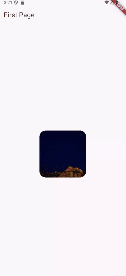
}The initial screen displays an image enclosed in a Hero widget, identified by the tag 'hero-image'. When the image is tapped, it opens the Second Page via Navigator.push. Since both pages share the same Hero tag, Flutter automatically animates the image, creating a smooth transition between the two screens.
GestureDetector(
 onTap: () {
   Navigator.push(
     context,
     MaterialPageRoute(builder: (_) => const SecondPage()),
   );
 },
 child: Hero(
   tag: 'hero-image',
   child: ClipRRect(
     borderRadius: BorderRadius.circular(20),
     child: Image.network(
       'https://picsum.photos/200/300',
       width: 150,
       height: 150,
       fit: BoxFit.cover,
     ),
   ),
 ),
),
- GestureDetector
- Wraps the image and detects user gestures (like tapping).
- onTap: When tapped, it navigates to SecondPage using Navigator.push.
- Navigator.push
- Pushes a new page onto the navigation stack.
- Creates a transition to SecondPage.
- Hero Widget
- Gives a shared element transition effect.
- Applies the tag 'hero-image' to connect this image with the corresponding Hero widget on the SecondPage.
- Flutter animates this widget’s position and size between pages.
- ClipRRect
- Rounds the image corners with a 20px radius to create a polished UI.
- Image.network
- Loads an image from a URL.
- Defines the size as 150x150 and uses BoxFit.cover to crop and fill the area neatly.
Physics-based Animation
Physics-based animation mimics real-world forces such as gravity, friction, velocity, and springs to produce realistic and natural motion in an app’s UI.
Instead of animating something linearly (just moving from point A to B over time), physics-based animations react dynamically, just like objects in the real world.
import 'package:flutter/physics.dart';
It imports Flutter’s built-in physics simulation library. It gives you tools to create animations and interactions that feel realistic, like springy motion or friction-based deceleration.
class _PhysicsAnimationDemoState extends State<PhysicsAnimationDemo>
   with TickerProviderStateMixin {
 late AnimationController _xController;
 late AnimationController _yController;
 @override
 void initState() {
   super.initState();
   _xController = AnimationController.unbounded(vsync: this);
   _yController = AnimationController.unbounded(vsync: this);
 }
 void _runSpringSimulation(
     AnimationController controller, double velocity, double target) {
   final spring = SpringDescription(
     mass: 1,
     stiffness: 100,
     damping: 10,
   );
   final simulation = SpringSimulation(
     spring,
     controller.value,
     target,
     velocity,
   );
   controller.animateWith(simulation);
 }
 @override
 Widget build(BuildContext context) {
   return Scaffold(
     appBar: AppBar(title: const Text("Physics Animation")),
     body: AnimatedBuilder(
       animation: Listenable.merge([_xController, _yController]),
       builder: (context, child) {
         return Center(
           child: Transform.translate(
             offset: Offset(_xController.value, _yController.value),
             child: GestureDetector(
               onPanUpdate: (details) {
                 // Move in both directions
                 _xController.value += details.delta.dx;
                 _yController.value += details.delta.dy;
               },
               onPanEnd: (details) {
                 final velocity = details.velocity.pixelsPerSecond;
                 // Animate both directions back to center
                 _runSpringSimulation(_xController, velocity.dx, 0.0);
                 _runSpringSimulation(_yController, velocity.dy, 0.0);
               },
               child: Container(
                 width: 100,
                 height: 100,
                 decoration: BoxDecoration(
                   color: Colors.blue,
                   borderRadius: BorderRadius.circular(16),
                 ),
                 alignment: Alignment.center,
                 child: const Text(
                   "Drag Me",
                   style: TextStyle(color: Colors.white, fontSize: 16),
                 ),
               ),
             ),
           ),
         );
       },
     ),
   );
 }
}
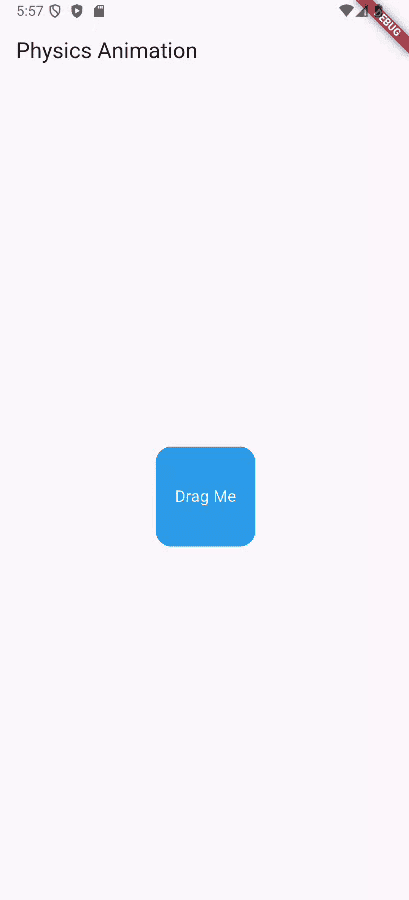
This widget generates a draggable box controlled by two unbounded animations and applies physics-based motion to snap it back to the center. When you drag the box, the 'onPanUpdate' callback updates the controllers’ values to follow your finger in both X and Y directions. When released, 'onPanEnd' calculates the drag velocity and calls '_runSpringSimulation', which uses 'SpringSimulation' to animate the box smoothly back to the origin. The AnimatedBuilder listens to controller updates and rebuilds the UI, while Transform.translate repositions the widget for fluid motion.
Unbounded AnimationControllers
_xController = AnimationController.unbounded(vsync: this);
_yController = AnimationController.unbounded(vsync: this);
- Separate controllers for X and Y positions.
- Unbounded allows values beyond the usual 0.0–1.0 range to track free movement.
Spring Simulation Setup
final spring = SpringDescription( mass: 1, stiffness: 100, damping: 10,);
- Defines spring physics:
- mass: How heavy the object feels.
- stiffness: Spring tightness.
- damping: How quickly it slows down.
Run Simulation
final simulation = SpringSimulation( spring, controller.value, target, velocity,);controller.animateWith(simulation);
- Starts a physics-based motion using the current position, target (0), and drag velocity.
- This creates natural spring-back motion.
Gesture Detection
onPanUpdate: (details) { _xController.value += details.delta.dx; _yController.value += details.delta.dy;},onPanEnd: (details) { final velocity = details.velocity.pixelsPerSecond; _runSpringSimulation(_xController, velocity.dx, 0.0); _runSpringSimulation(_yController, velocity.dy, 0.0);}, - Updates the box’s position as you drag it.
- When you release, the box springs back to the center using velocity-based physics.
AnimatedBuilder with Transform
Transform.translate(offset: Offset(_xController.value, _yController.value),child: Container(...),)
- Moves the box on the screen based on the animation values for X and Y.,
Staggered Animations
Staggered animations are animations where multiple visual changes (like opacity, size, position, or color) happen one after another with delays or overlaps, instead of all happening simultaneously. They’re useful when you want to create visually appealing sequences like animating widgets into view in a smooth, cascading effect.
class _StaggeredColorAnimationDemoState
extends State<StaggeredColorAnimationDemo>
with SingleTickerProviderStateMixin {
late AnimationController _controller;
late Animation<double> _opacity;
late Animation<double> _width;
late Animation<double> _height;
late Animation<Color?> _color;
@override
void initState() {
super.initState();
_controller = AnimationController(
duration: const Duration(seconds: 3),
vsync: this,
);
_opacity = Tween<double>(begin: 0.0, end: 1.0).animate(
CurvedAnimation(parent: _controller, curve: const Interval(0.0, 0.25)),
);
_width = Tween<double>(begin: 50.0, end: 200.0).animate(
CurvedAnimation(parent: _controller, curve: const Interval(0.25, 0.5)),
);
_height = Tween<double>(begin: 50.0, end: 200.0).animate(
CurvedAnimation(parent: _controller, curve: const Interval(0.5, 0.75)),
);
_color = ColorTween(begin: Colors.blue, end: Colors.orange).animate(
CurvedAnimation(parent: _controller, curve: const Interval(0.75, 1.0)),
);
_controller.forward();
}
@override
Widget build(BuildContext context) {
return Scaffold(
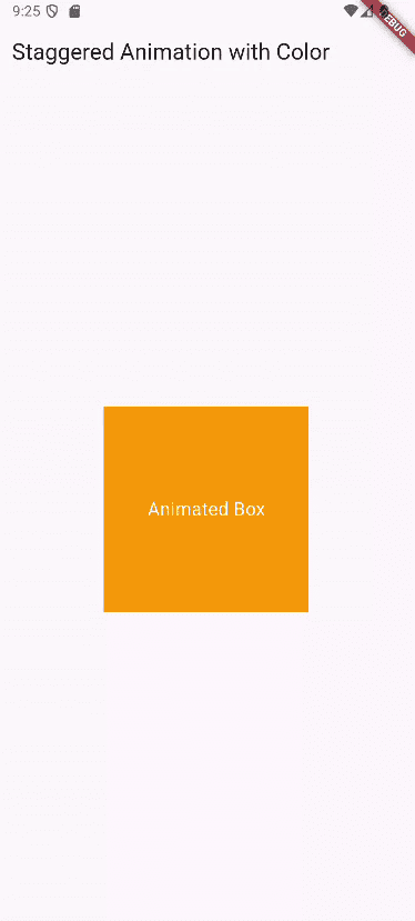
appBar: AppBar(title: const Text("Staggered Animation with Color")),
body: Center(
child: AnimatedBuilder(
animation: _controller,
builder: (context, child) {
return Opacity(
opacity: _opacity.value,
child: Container(
width: _width.value,
height: _height.value,
color: _color.value,
alignment: Alignment.center,
child: const Text(
"Animated Box",
style: TextStyle(color: Colors.white, fontSize: 18),
),
),
);
},
),
),
);
}
}
This code makes a box smoothly animate step by step: first it fades in, then its width grows, then its height grows, and finally its color changes from blue to orange. It uses an animation controller to run everything over three seconds, splitting the timeline so each effect happens one after another. The AnimatedBuilder updates the box’s look as the animation plays.
AnimatedBuilder(
 animation: _controller,
 builder: (context, child) {
   return Opacity(
     opacity: _opacity.value,
     child: Container(
       width: _width.value,
       height: _height.value,
       color: _color.value,
       alignment: Alignment.center,
       child: const Text(
         "Animated Box",
         style: TextStyle(color: Colors.white, fontSize: 18),
       ),
     ),
   );
 },
),
- Updates the UI frame-by-frame as the animation progresses.
- Reads animation values and applies them to the box.
Animations in Flutter make apps feel smooth, natural, and more enjoyable to use. With options like implicit and explicit animations, Hero transitions, physics-based effects, and staggered sequences, Flutter gives developers the flexibility to create anything from simple motion to advanced, interactive experiences. By combining built-in tools with popular packages, animations can greatly improve both the look and usability of any Flutter app.
To read more about How to Create a Flutter App With Shimmer Animation & Buttons, refer to our blog How to Create a Flutter App With Shimmer Animation & Buttons.