Odoo 18’s Point of Sale (POS) system offers a flexible and user-friendly environment for managing retail operations. Enhancing the POS with custom pop-ups can improve workflows by displaying important notifications, capturing additional customer details, or prompting users for specific inputs.
This tutorial will walk you through creating a custom pop-up in Odoo 18 POS using OWL (Odoo Web Library), replacing the outdated AbstractAwaitablePopup method.
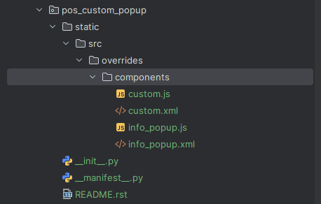
Creating a Custom Module
Before we begin, you must create a custom Odoo module following the proper module structure to integrate your custom pop-up seamlessly.
Adding a Custom Button to POS
To launch our custom pop-up, we'll first add a new button on the POS product screen.
To learn more about adding a button refer blog, How to add a custom button in Odoo18 POS
XML for the Custom Button
<?xml version="1.0" encoding="UTF-8"?>
<templates id="template" xml:space="preserve">
	<t t-name="pos_custom_popup.ControlButtons" t-inherit="point_of_sale.ControlButtons" t-inherit-mode="extension">
    	<xpath expr="//t[@t-if='props.showRemainingButtons']/div/OrderlineNoteButton" position="after">
         	<button class="btn btn-secondary btn-lg py-5" t-on-click="() => this.onClickPopup()">
             	<i class="fa fa-pencil-square me-1" role="img" aria-label="Custom Alert" title="Custom Alert"/>Custom PopUp
         	</button>
    	</xpath>
	</t>
</templates>
JavaScript for the Custom Button
/** @odoo-module */
import { ControlButtons } from "@point_of_sale/app/screens/product_screen/control_buttons/control_buttons";
import { InfoPopup } from "@pos_custom_popup/overrides/select_partner_button/info_popup";
import { makeAwaitable } from "@point_of_sale/app/store/make_awaitable_dialog";
import { patch } from "@web/core/utils/patch";
import { _t } from "@web/core/l10n/translation";
patch(ControlButtons.prototype, {
    async onClickPopup() {
        const order = this.pos.get_order();
        const payload = await makeAwaitable(this.dialog, InfoPopup, {
            title: _t("Custom Popup!"),
            order: order,
        });
    }
});
Creating the Custom Pop-up
Now that the button is ready, let’s create the pop-up component that it will trigger.
JavaScript for the Pop-up
/** @odoo-module */
import { Dialog } from "@web/core/dialog/dialog";
import { usePos } from "@point_of_sale/app/store/pos_hook";
import { Component, useState } from "@odoo/owl";
export class InfoPopup extends Component {
    static template = "pos_custom_popup.InfoPopup";
    static components = { Dialog };
    setup() {
        this.pos = usePos();
        const partner = this.props.order.get_partner?.() || {};
        this.state = useState({
            customer: partner.name ?? "",
            notes: this.props.order.general_note || "",
        });
    }
    async confirm() {
        this.props.getPayload(this.state);
        this.props.close();
    }
}
XML for the Pop-up
<?xml version="1.0" encoding="UTF-8"?>
<templates id="template" xml:space="preserve">
    <t t-name="pos_custom_popup.InfoPopup">
        <Dialog title.translate="Additional Information">
            <div class="mb-3">
                <label for="pe_refund_reason" class="form-label">Welcome:</label>
            </div>
            <div class="modal-body custom-form-view">
               <form>
                   <div class="col d-flex justify-content-between align-items-center p-3">
                        <label class="form-label label" for="customer">Customer</label>
                        <input t-model="state.customer" class="w-75 form-control" name="customer"/>
                    </div>
                   <div class="col d-flex justify-content-between align-items-center p-3">
                        <label class="form-label label" for="customer">Notes</label>
                        <input t-model="state.notes" type="text" class="w-75 form-control" name="notes"/>
                    </div>
                </form>
            </div>
            <t t-set-slot="footer">
                <button class="btn btn-primary o-default-button" t-on-click="confirm">Ok</button>
            </t>
        </Dialog>
    </t>
</templates>
So once you click the button, the pop-up will appear as shown below.
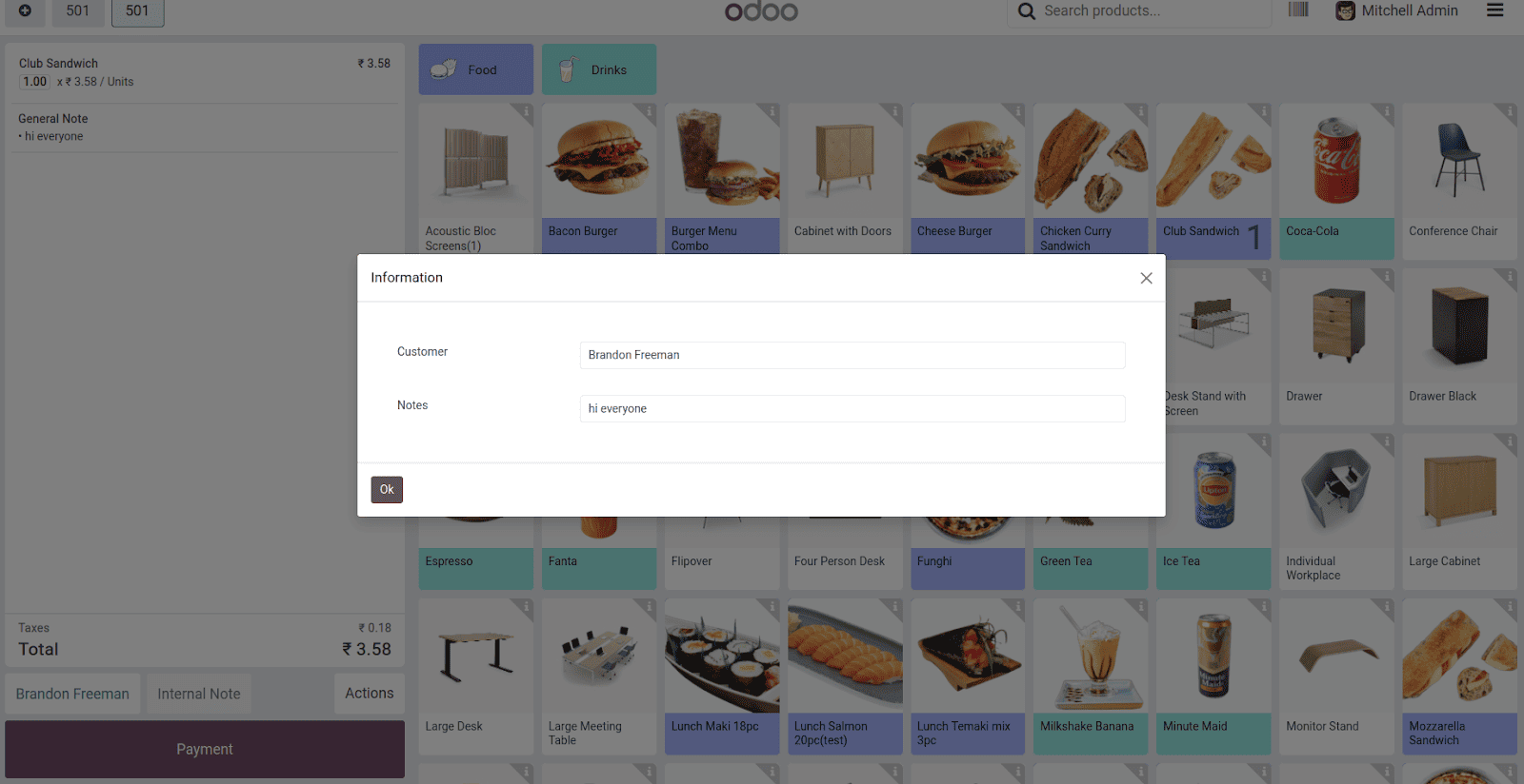
When users click the newly added button in the POS, the custom pop-up appears, displaying the current order’s customer name and any general notes associated with the order. After entering or modifying the information and confirming, the input is returned as a payload, which you can then use to further update the POS state or trigger additional actions.
Conclusion
By following this approach, you can extend Odoo 18 POS functionality with custom pop-ups using OWL’s modern component system. This method aligns with the latest development practices in Odoo, ensuring better maintainability and an enhanced user experience compared to older methods like AbstractAwaitablePopup.
To read more about how to create a Custom Pop-up in Odoo 17 POS, refer to our blog How to Create a Custom Pop-up in Odoo 17 POS.