Numerous field widgets, like status bar, checkboxes, radio button, float, percentages, color selector, URL, and many others, are available in Odoo.
The widget gives us the option to alter the view using various rendering templates.
Additionally, it enables us to design for our needs, which will speed up, simplify, scale, and improve the effectiveness of our development.
Now let us see How to create a Field Widget in Odoo 16.
As the first step, we create a widget. Then register the widget in the field category and add it to the view.
In the below example, we are going to create a new widget and add it in a form view. Now we are creating a date picker widget in which we can add multiple dates. Now we can go through the steps to create a widget.
At first, we are creating a JS file for creating a widget
date_picker.js
/** @odoo-module **/
import { registry } from "@web/core/registry";
import { useInputField } from "@web/views/fields/input_field_hook";
import time from 'web.time';
var translation = require('web.translation');
var _t = translation._t;
const { Component,useRef} = owl;
export class DomainSelectorTextField extends Component {
   static template = 'FieldDateMultipleDate'
   setup(){
       super.setup();
       this.input = useRef('inputdate')
       useInputField({ getValue: () => this.props.value || "", refName: "inputdate" });
   }
   _onSelectDateField(ev){
       var dateFormat = time.getLangDateFormat();
      if (dateFormat.includes('MMMM')){
         var dates = dateFormat.toLowerCase()
         var result = dates.replace(/mmmm/g, 'MM');
         dateFormat = result
     }
     else if (dateFormat.includes('MMM')) {
         var dates = dateFormat.toLowerCase()
         var result = dates.replace(/mmm/g, 'M');
         dateFormat = result
     }
     else if(dateFormat.includes('ddd')){
         var dates =new dateFormat.toLowerCase()
         var result = new dates.replace(/ddd/g, 'DD');
         dateFormat = result
     }
    else{
       dateFormat = dateFormat.toLowerCase()
    }
       if (this.input.el){
          this.props.update(this.input.el.value.replace(DomainSelectorTextField, ''));
           console.log('this',dateFormat)
           $(this.input.el).datepicker({
               multidate: true,
               format: dateFormat,
           }).trigger('focus');
       }
   }
}
registry.category("fields").add("multiple_datepicker", DomainSelectorTextField);
Then we create an XML file for the template of the widget setup. Here creating a date_picker.xml and add the following code in that file.
date_picker.xml :-
<templates>
   <t t-name="FieldDateMultipleDate" owl="1">
       <input type="text" class="input_datepicker" t-ref="inputdate"
              t-on-click="_onSelectDateField"/>
   </t>
</templates>
Then we need to add the scss file for styling the widget.
date_picker.scss : -
.datepicker-dropdown {
   top: 0;
   left: 0;
   padding: 4px
}
.datepicker table tr td,
.datepicker table tr th {
   text-align: center;
   width: 30px;
   height: 30px;
   border: none
}
.datepicker table tr td.day:hover,
.datepicker table tr td.focused {
   background: #eee;
   cursor: pointer;
   border-radius: 18px;
}
.datepicker table tr td.active.active,
.datepicker table tr td.active.highlighted.active,
.datepicker table tr td.active.highlighted:active,
.datepicker table tr td.active:active {
   color: #fff;
   background-color: #7C7BAD;
   border-radius:18px;
   border-color: #7C7BAD;
   background-radius:11px;
}
.datepicker table tr td span {
   display: block;
   width: 23%;
   height: 54px;
   line-height: 54px;
   float: left;
   margin: 1%;
   cursor: pointer;
}
.datepicker table tr td span.active,
.datepicker table tr td span.active.disabled,
.datepicker table tr td span.active.disabled:hover,
.datepicker table tr td span.active:hover {
   color: #fff;
   background-color: #7C7BAD;
   border-color: #2e6da4;
   text-shadow: 0 -1px 0 rgba(0, 0, 0, .25)
}
.datepicker .datepicker-switch {
   width: 145px;
   background:#7C7BAD;
   color:white;
}
.datepicker .datepicker-switch,
.datepicker .next,
.datepicker .prev,
.datepicker tfoot tr th {
   cursor: pointer;
   background:#7C7BAD;
   color:white;
}
Then load the added files into Assets and of the Odoo 16 asset files, we can add files to the manifest as shown below:
'assets': {
   'web.assets_backend': [
       '/date_picker_widget/static/src/scss/date_picker.scss',
       '/date_picker_widget/static/src/js/date_picker.js',
         '/date_picker_widget/static/src/js/lib/bootstrap-datepicker.min.js',
       '/date_picker_widget/static/src/xml/date_picker.xml',
   ],
},
Similarly, we can create a custom field widget in Odoo 16. Then we can add this widget in the field Char in the view.
<field name="test_field" widget="multiple_datepicker"/>
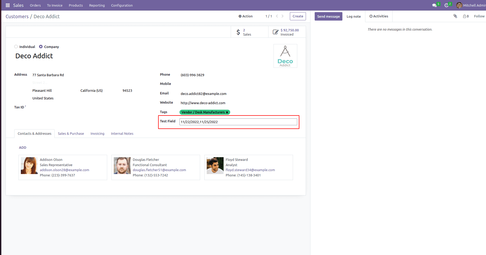
Then we can add multiple date picker in the char field. In this manner, we can create a custom field widget in Odoo which is useful for the functioning of the platform.