Creating a clear way to show progress inside Odoo can make forms much easier to read, especially when you’re dealing with percentages that change often, things like project milestones, task advancement, or any field that measures completion. Odoo 19 gives enough flexibility to build your own widget for this, so instead of displaying a plain number, you can show a clean, animated bar that updates automatically. Odoo offers a wide collection of field widgets: radio buttons, floats, percentages, color pickers, checkboxes, status indicators, URLs, and many more. These widgets enhance usability but also allow developers to shape interfaces that fit business needs. With the help of custom templates and reusable components, you can build clean and interactive UI elements that bring clarity to the user experience.
In this guide, we’ll walk through creating a simple yet elegant Progress Bar widget in Odoo 19, which you can plug into any form view to visually display progress values.
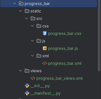
Module Structure
The image given below is the structure of the module.
Step 1: Create a template file for the progress bar
Create an XML file in the module under
progress_bar/static/src/xml/progress_bar.xml
<?xml version="1.0" encoding="utf-8"?>
<templates id="template" xml:space="preserve">
  <t t-name="ProgressBarWidget" owl="1">
      <div t-ref="ProgressBarWidget-root">
          <div class="progress_bar">
              <div class="pro-bar">
                  <span class="progress-bar-inner"/>
                  <span class="progress_number"/>
              </div>
          </div>
      </div>
  </t>
</templates>
After defining the XML template, the next step is to create the CSS file for styling the progress bar widget.
Step 2: CSS file for styling the progress bar
Create a file, a CSS file for styling under
progress_bar/static/src/css/progress_bar.css
.progress_bar .pro-bar {
  background: hsl(0, 0%, 97%);
  box-shadow: 0 1px 2px hsla(0, 0%, 0%, 0.1) inset;
  height: 4px;
  width: 200px;
  margin-bottom: 15px;
  margin-top: 10px;
  position: relative;
}
.progress_bar .progress_number {
  float: right;
  margin-top: -6px;
  margin-right: -50px;
}
.progress_bar .progress-bar-inner {
  background-color: green;
  display: block;
  width: 0;
  height: 100%;
  position: absolute;
  top: 0;
  left: 0;
  transition: width 1s linear 0s;
}
.progress_bar .progress-bar-inner:before {
  content: "";
  background-color: hsl(0, 0%, 100%);
  border-radius: 50%;
  width: 4px;
  height: 4px;
  position: absolute;
  right: 1px;
  top: 0;
  z-index: 1;
}
.progress_bar .progress-bar-inner:after {
  content: "";
  width: 14px;
  height: 14px;
  background-color: inherit;
  border-radius: 50%;
  position: absolute;
  right: -4px;
  top: -5px;
}
After creating the CSS file, the next step is to create the JS file to register the progress bar widget component in the registry.
Step 3: Create the JS file
Now we need to create the JS file to register the progress component. For that, create a file under
progress_bar/static/src/js/progress_bar.js
The setup method will initialize the component, and the onUpdateProgressBar function will update the progress bar. This function takes a given value-a number or a float-that will define the width of the bar:
/** @odoo-module **/
import { registry } from "@web/core/registry";
import { standardFieldProps } from "@web/views/fields/standard_field_props";
import { Component, useRef, onMounted, onPatched } from "@odoo/owl";
export class ProgressBarWidget extends Component {
   setup() {
       this.root = useRef('ProgressBarWidget-root');
       onMounted(this.onUpdateProgressBar);
       onPatched(this.onUpdateProgressBar);
   }
   onUpdateProgressBar() {
       if (this.props.record.data[this.props.name] <= 100) {
           this.widthComplete = parseInt(this.props.record.data[this.props.name] / 100 * 100);
       } else {
           this.widthComplete = 100;
       }
       this.root.el.querySelector('.progress-bar-inner').style.width = this.widthComplete + '%';
       this.root.el.querySelector('.progress_number').textContent = this.widthComplete + '%';
   }
}
ProgressBarWidget.template = 'ProgressBarWidget';
ProgressBarWidget.props = standardFieldProps;
ProgressBarWidget.supportedTypes = ["float", "integer"];
registry.category("fields").add("progress_bar_widget", {
   component: ProgressBarWidget,
});
Register this component in the Odoo field registry to access this component anywhere in the Odoo environment.
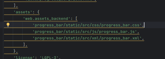
Now this progress bar widget is accessible in Odoo. We can add it to any fields that are of float or integer type in the form view. And also, we need to give these files in the assets in the manifest as shown below in the image.
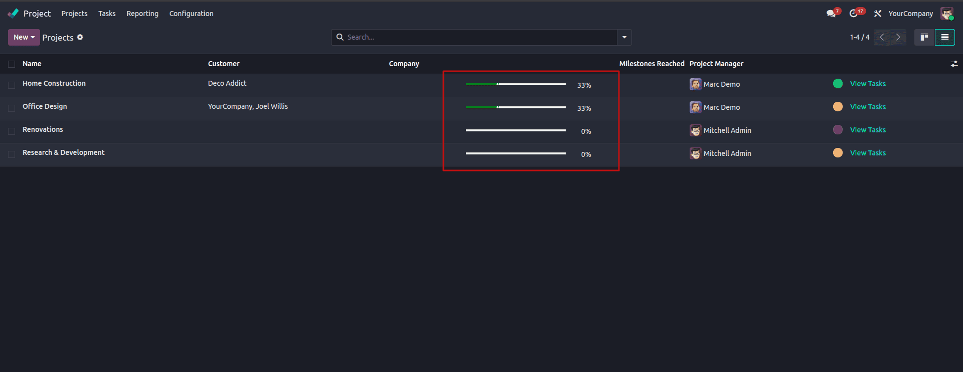
Now the widget is ready. Below is an example of the widget added to the “project.project” model
<odoo>
   <record id="view_project_form_inherit_progress" model="ir.ui.view">
       <field name="name">project.project.form.inherit.progress</field>
       <field name="model">project.project</field>
       <field name="inherit_id" ref="project.view_project" />
       <field name="arch" type="xml">
          <xpath expr="//field[@name='milestone_progress']" position="replace">
              <field name="milestone_progress" widget="progress_bar_widget"/>
          </xpath>
       </field>
   </record>
</odoo>
The result is now a visually appealing progress bar showing the milestone progress of a project in the project module.
We can add it to any field just by writing widget=”progress_bar_widget”
<field name="progress" widget="progress_bar_widget"/>
Building a custom progress bar in Odoo 19 is fairly straightforward once you understand how the XML template, CSS, and JavaScript work together. With just a few files, you get a widget that looks cleaner than a plain number and immediately tells the user how far along something is. The best part is that the widget can be reused anywhere in your module; any float or integer field can display a progress bar with a single attribute. This keeps your views consistent, easier to read, and more intuitive for users who prefer visual indicators over raw figures.
Whether you're tracking project stages, completion percentages, or any metric that grows over time, this widget fits naturally into Odoo’s form views without needing complicated logic. It’s a small addition, but it makes a noticeable difference in how information is presented.
To read more about How to Create a Progress Bar in Odoo 18, refer to our blog How to Create a Progress Bar in Odoo 18.