Animated toggle switches are a prevalent user interface element in numerous mobile and web applications, offering users a straightforward way to activate or deactivate specific features or settings.
This article will delve into the customization of animation transitions in Flutter.
Before delving into the coding process, initiating a new project and channel within Flutter is imperative.
Follow these steps to create a new Flutter project:
Navigate to File -> New -> New Flutter Project.
Upon project creation, it becomes necessary to establish a channel.
Generate a device by selecting Create Device in the left window.
Commence by establishing a variable symbol, and import the required items as follows:
import 'dart:math';
import 'package:animated_toggle_switch/animated_toggle_switch.dart';
import 'package:flutter/cupertino.dart';
import 'package:flutter/gestures.dart';
import 'package:flutter/material.dart';
import 'package:url_launcher/url_launcher.dart';
Create a new class that extends StatefulWidget
class HomePage extends StatefulWidget {
  HomePage({Key? key, required this.title}) : super(key: key);
  final String title;
  @override
  _HomePageState createState() => _HomePageState();
}
Inside StatefulWidget The createState method returns an instance of _HomePageState, which is the state associated with this widget.
Now create a new class that extends State<HomePage>
class _MyHomePageState extends State<MyHomePage> {
  int value = 0;
  int? nullableValue;
  bool positive = false;
  bool loading = false;
  @override
  Widget build(BuildContext context) {
    ThemeData theme = Theme.of(context);
    const green = Color(0xFF45CC0D);
    return Scaffold(
      appBar: AppBar(
        title: Text(widget.title),
      ),
      body: DefaultTextStyle(
        style: theme.textTheme.titleLarge!,
        textAlign: TextAlign.center,
        child: SingleChildScrollView(
          child: Column(
            mainAxisAlignment: MainAxisAlignment.center,
            children: [
                       ],
          ),
        ),
      ),
    );
  }
Now let's begin to create animated switches.
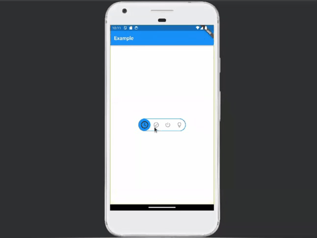
Animated switch 1:
To get this toggle icon add the below code inside children:[]
AnimatedToggleSwitch<bool>.dual(
current: positive,
first: false,
second: true,
spacing: 50.0,
style: const ToggleStyle(
borderColor: Colors.transparent,
boxShadow: const [
BoxShadow(
color: Colors.black26,
spreadRadius: 1,
blurRadius: 2,
offset: Offset(0, 1.5),
),
],
),
borderWidth: 5.0,
height: 55,
onChanged: (b) => setState(() => positive = b),
styleBuilder: (b) =>
ToggleStyle(indicatorColor: b ? Colors.red : Colors.green),
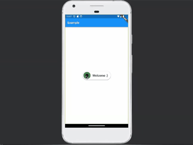
iconBuilder: (value) => value
? Icon(Icons.dark_mode_rounded)
: Icon(Icons.tag_faces_rounded),
textBuilder: (value) => value
? Center(child: Text('Bye bye...'))
: Center(child: Text('Welcome :)')),
),
AnimatedToggleSwitch<bool>.dual: This suggests that the widget is part of a custom AnimatedToggleSwitch class that takes a generic type parameter <bool>. The .dual indicates that this particular toggle switch has two states.
Also, some of the uses of parameters are given below:
current: Represents the current state of the toggle switch, initialized with positive.
first and second: Represent the two possible states of the toggle switch, initialized with false and true, respectively.
spacing: Specifies the spacing between the two states, set to 50.0.
style: Defines the overall visual style of the toggle switch, including the border color, box-shadow, etc.
borderWidth: Specifies the width of the border, set to 5.0.
height: Sets the height of the toggle switch to 55.
onChanged: The callback function is called when the state of the toggle switch changes. It sets the new state to the positive variable using setState.
styleBuilder: A function that takes a boolean value and returns a ToggleStyle for the indicator based on that value.
iconBuilder: A function that takes a boolean value and returns an icon widget based on that value (dark mode or tag faces).
textBuilder: A function that takes a boolean value and returns a text widget based on that value ('Bye bye...' or 'Welcome :)').
Animated switch 2:
AnimatedToggleSwitch<bool>.dual(
current: positive,
first: false,
second: true,
spacing: 50.0,
style: const ToggleStyle(
borderColor: Colors.transparent,
boxShadow: const [
BoxShadow(
color: Colors.black26,
spreadRadius: 1,
blurRadius: 2,
offset: Offset(0, 1.5),
),
],
),
borderWidth: 5.0,
height: 55,
onChanged: (b) => setState(() => positive = b),
styleBuilder: (b) => ToggleStyle(
backgroundColor: b ? Colors.white : Colors.black,
indicatorColor: b ? Colors.green : Colors.red,
borderRadius: const BorderRadius.horizontal(
left: Radius.circular(4.0), right: Radius.circular(50.0)),
indicatorBorderRadius: BorderRadius.circular(b ? 50.0 : 4.0),
),
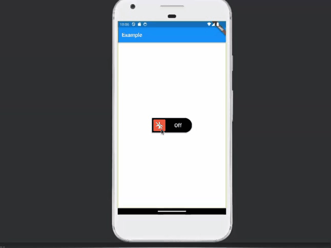
iconBuilder: (value) => Icon(
value
? Icons.airplanemode_active
: Icons.airplanemode_inactive,
size: 32.0,
color: value ? Colors.black : Colors.white,
),
textBuilder: (value) => value
? const Center(
child:
Text('On', style: TextStyle(color: Colors.black)))
: const Center(
child:
Text('Off', style: TextStyle(color: Colors.white))),
),
This code additionally uses backgroundColor,indicator color,border radius, and indicatorBorderRadius inside styleBuilder
backgroundColor: This property determines the background color of the toggle switch. If b is true, meaning the toggle switch is in the "on" state, it sets the background color to Colors.white; otherwise, if b is false (the "off" state), it sets the background color to Colors.black.
indicatorColor: This property sets the color of the moving indicator within the toggle switch. If b is true, indicating the "on" state, it sets the indicator color to Colors.green; otherwise, if b is false (the "off" state), it sets the indicator color to Colors.red.
borderRadius: This property sets the border radius of the entire toggle switch. It uses BorderRadius.horizontal to specify different radii for the left and right sides. The left side has a fixed radius of 4.0, and the right side has a radius of 50.0 when b is true (on), creating a rounded appearance on one side.
indicatorBorderRadius: This property sets the border radius of the indicator. If b is true, it sets the indicator border radius to 50.0, and rounded it on the right side. If b is false (off), it sets the indicator border radius to 4.0, rounded it on the left side.
Animated switch 3:
DefaultTextStyle.merge(
style: const TextStyle(
color: Colors.white,
fontSize: 18.0,
fontWeight: FontWeight.bold),
child: IconTheme.merge(
data: IconThemeData(color: Colors.white),
child: AnimatedToggleSwitch<bool>.dual(
current: positive,
first: false,
second: true,
spacing: 45.0,
animationDuration: const Duration(milliseconds: 600),
style: ToggleStyle(
borderColor: Colors.transparent,
indicatorColor: Colors.white,
backgroundColor: Colors.black,
),
customStyleBuilder: (context, local, global) {
if (global.position <= 0.0)
return ToggleStyle(backgroundColor: Colors.red[800]);
return ToggleStyle(
backgroundGradient: LinearGradient(
colors: [green, Colors.red[800]!],
stops: [
global.position -
(1 - 2 * max(0, global.position - 0.5)) * 0.7,
global.position +
max(0, 2 * (global.position - 0.5)) * 0.7,
],
));
},
borderWidth: 6.0,
height: 60.0,
loadingIconBuilder: (context, global) =>
CupertinoActivityIndicator(
color: Color.lerp(
Colors.red[800], green, global.position)),
onChanged: (b) => setState(() => positive = b),
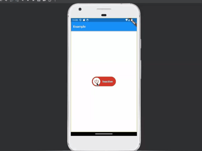
iconBuilder: (value) => value
? Icon(Icons.power_outlined, color: green, size: 32.0)
: Icon(Icons.power_settings_new_rounded,
color: Colors.red[800], size: 32.0),
textBuilder: (value) => value
? Center(child: Text('Active'))
: Center(child: Text('Inactive')),
),
),
),
DefaultTextStyle.merge: This widget sets default text styling properties for its descendants. The specified style includes white text color, a font size of 18.0, and bold text.
IconTheme.merge: This widget sets default icon styling properties for its descendants. The specified data includes white as the icon color.
AnimatedToggleSwitch<bool > .dual is the main widget inside this add toggle switch parameters. Additionally, it uses the animationDuration parameter it, and it gives Duration for the toggle switch animation (600 milliseconds).
customStyleBuilder: This is a callback function that dynamically builds the ToggleStyle for the toggle switch based on its current animation position.
global.position represents the current position of the toggle switch during the animation. It varies from 0.0 to 1.0, where 0.0 is the start of the animation, and 1.0 is the end.
return ToggleStyle(...) (when position > 0.0): If the toggle switch is not at the start of the animation, it returns a ToggleStyle with a gradient background.
Animated switch 4:
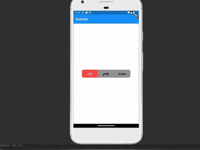
 AnimatedToggleSwitch<int>.size(
                current: min(value, 2),
                style: ToggleStyle(
                  backgroundColor: Color(0xFF919191),
                  indicatorColor: Color(0xFFEC3345),
                  borderColor: Colors.transparent,
                  borderRadius: BorderRadius.circular(10.0),
                  indicatorBorderRadius: BorderRadius.zero,
                ),
                values: const [0, 1, 2],
                iconOpacity: 1.0,
                selectedIconScale: 1.0,
                indicatorSize: const Size.fromWidth(100),
                iconAnimationType: AnimationType.onHover,
                styleAnimationType: AnimationType.onHover,
                spacing: 2.0,
                customSeparatorBuilder: (context, local, global) {
                  final opacity =
                  ((global.position - local.position).abs() - 0.5)
                      .clamp(0.0, 1.0);
                  return VerticalDivider(
                      indent: 10.0,
                      endIndent: 10.0,
                      color: Colors.white38.withOpacity(opacity));
                },
                customIconBuilder: (context, local, global) {
                  final text = const ['not', 'only', 'icons'][local.index];
                  return Center(
                      child: Text(text,
                          style: TextStyle(
                              color: Color.lerp(Colors.black, Colors.white,
                                  local.animationValue))));
                },
                borderWidth: 0.0,
                onChanged: (i) => setState(() => value = i),
              ),
AnimatedToggleSwitch<int>.size: This indicates the creation of an animated toggle switch with integer values, and it's customized for a specific size.
values: Specifies the list of possible integer values for the toggle switch, in this case, [0, 1, 2].
iconOpacity: Opacity of the icons when not selected.
selectedIconScale: Scale factor for the selected icon.
indicatorSize: Size of the indicator.
iconAnimationType: Type of animation for the icons, set to AnimationType.onHover.
styleAnimationType: Type of animation for the style, set to AnimationType.onHover.
customSeparatorBuilder: This is a callback function that dynamically builds separators (in this case, vertical dividers) between the toggle switch elements.
context: The BuildContext of the widget.
local: An object containing local information about the separator, such as its index.
global: An object containing global information about the animation position.
opacity calculation: This line calculates the opacity of the separator based on the difference between the global and local positions. The (global.position - local.position).abs() - 0.5 expression ensures that the opacity values are adjusted around the center (0.5). The clamp(0.0, 1.0) ensures that the opacity is kept within the valid range of 0.0 to 1.0.
VerticalDivider: This is a Flutter widget that draws a vertical line to visually separate content. In this case, it is customized with the following properties:
indent: Specify the space to the start of the divider (left in this case).
endIndent: Specifies the space to the end of the divider (right in this case).
color: The color of the divider, which is set to Colors.white38 with an opacity that depends on the calculated opacity value.
customIconBuilder: This is a callback function that builds custom icons for the toggle switch elements
Text calculation: The line final text = const ['not', 'only', 'icons'][local.index]; selects a text string from the list ['not', 'only', 'icons'] based on the index of the current toggle switch element.
text: The dynamically selected text based on the text calculation.
style: Defines the style of the text, specifically setting the text color. The color is determined by linearly interpolating (Color.lerp) between Colors.black and Colors.white based on the local.animationValue.
borderWidth: 0.0: This property sets the border width of the toggle switch to 0.0, meaning there is no border.
onChanged: This callback function is triggered when the selected value of the toggle switch changes. It updates the value variable in the widget's state using setState.
Animated switch 5:
AnimatedToggleSwitch<int>.rolling(
                current: value,
                indicatorIconScale: sqrt2,
                values: const [0, 1, 2, 3],
                onChanged: (i) {
                  setState(() => value = i);
                  return Future<dynamic>.delayed(Duration(seconds: 3));
                },
                iconBuilder: rollingIconBuilder,
              ),
AnimatedToggleSwitch<int>.rolling: This is a variant of the AnimatedToggleSwitch widget with a rolling animation effect.
onChanged: This callback function is triggered when the selected value of the toggle switch changes. It updates the value variable in the widget's state using setState. Additionally, it returns a Future delayed by 3 seconds. This delayed future likely introduces a delay before completing the toggle switch action, potentially for animation or visual effects.
For configuring rollingIconBuilder add below code after children[].
  Widget rollingIconBuilder(int? value, bool foreground) {
    return Icon(iconDataByValue(value));
  }
  IconData iconDataByValue(int? value) => switch (value) {
    0 => Icons.access_time_rounded,
    1 => Icons.check_circle_outline_rounded,
    2 => Icons.power_settings_new_rounded,
    _ => Icons.lightbulb_outline_rounded,
  };
Animated switch 6:
CustomAnimatedToggleSwitch<bool>(
                current: positive,
                values: [false, true],
                spacing: 0.0,
                indicatorSize: Size.square(30.0),
                animationDuration: const Duration(milliseconds: 200),
                animationCurve: Curves.linear,
                onChanged: (b) => setState(() => positive = b),
                iconBuilder: (context, local, global) {
                  return const SizedBox();
                },
                cursors: ToggleCursors(defaultCursor: SystemMouseCursors.click),
                onTap: (_) => setState(() => positive = !positive),
                iconsTappable: false,
                wrapperBuilder: (context, global, child) {
                  return Stack(
                    alignment: Alignment.center,
                    children: [
                      Positioned(
                          left: 10.0,
                          right: 10.0,
                          height: 20.0,
                          child: DecoratedBox(
                            decoration: BoxDecoration(
                              color: Color.lerp(
                                  Colors.black26,
                                  theme.colorScheme.background,
                                  global.position),
                              borderRadius:
                              const BorderRadius.all(Radius.circular(50.0)),
                            ),
                          )),
                      child,
                    ],
                  );
                },
                foregroundIndicatorBuilder: (context, global) {
                  return SizedBox.fromSize(
                    size: global.indicatorSize,
                    child: DecoratedBox(
                      decoration: BoxDecoration(
                        color: Color.lerp(
                            Colors.white, theme.primaryColor, global.position),
                        borderRadius: BorderRadius.all(Radius.circular(50.0)),
                        boxShadow: const [
                          BoxShadow(
                              color: Colors.black38,
                              spreadRadius: 0.05,
                              blurRadius: 1.1,
                              offset: Offset(0.0, 0.8))
                        ],
                      ),
                    ),
                  );
                },
              ),
onTap: This property specifies the callback to be executed when the toggle switch is tapped. In this case, it toggles the value of the positive variable in the widget's state using setState. The _ is used as a convention to denote that the argument is intentionally ignored.
iconsTappable: This property is set to false, indicating that the icons themselves are not tappable. This means that tapping on the toggle switch will trigger the toggle action, but tapping on the individual icons will not.
wrapperBuilder: This property defines a function that wraps the entire toggle switch with additional elements or styling. It takes three parameters:
* context: The build context of the widget.
* global: An object containing global information about the animation position.
* child: The child widget, which is the actual toggle switch.
foregroundIndicatorBuilder: This property defines a function that builds the foreground indicator of the toggle switch.
SizedBox.fromSize: This widget creates a box with a specified size. In this case, it uses the global.indicatorSize as the size of the box.
DecoratedBox: This widget applies a decoration to its child. It is used here to create a colored box with specific styling for the indicator
BoxDecoration: Defines the visual appearance of the box
In this blog, we discussed general instructions on how to create various animated toggles in Flutter. It includes customization options such as icon selection, text, background color, gradients, and animation effects. You can use this blog post as a starting point and modify it further to suit your style.
To read more about the overview of owl components in Odoo 16, refer to our blog An Overview of Owl Components in Odoo 16