Toggle switches are a common user interface element used in many mobile and web applications to allow users to easily enable or disable a specific feature or setting.
In this blog, we will discuss how to customize icons with Flutter.
Before you begin writing code, you should create a new project and channel in Flutter.
To create a new Flutter project, follow these steps:
Go to File -> New -> New Flutter Project.
After creating a new project, you will also need to create a channel.
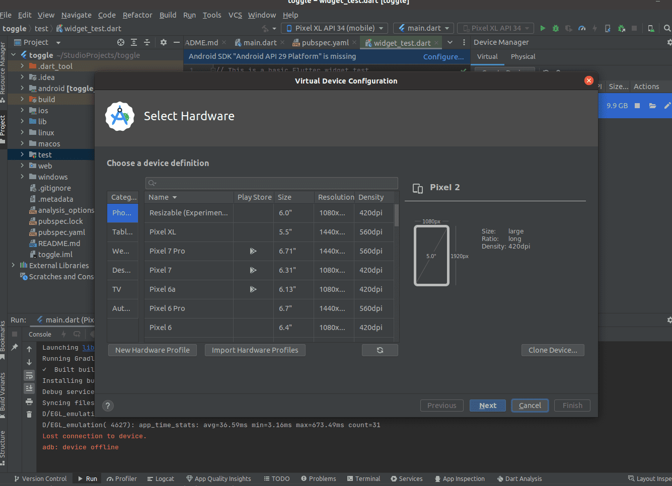
For creating a Device click on Create Device
Click on “Create Device” and a new window will open, as shown in the screenshot below. In this window, you can choose your device type, such as phone, tablet, Wear OS, desktop, TV, or car. After making your selection, continue by clicking the Next button and then the Finish button.
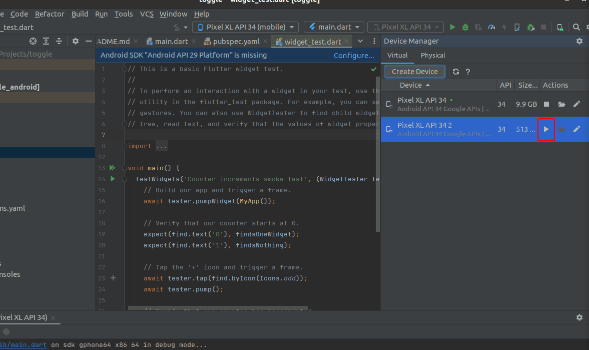
Next, you can run the selected device, as demonstrated in the screenshot below.
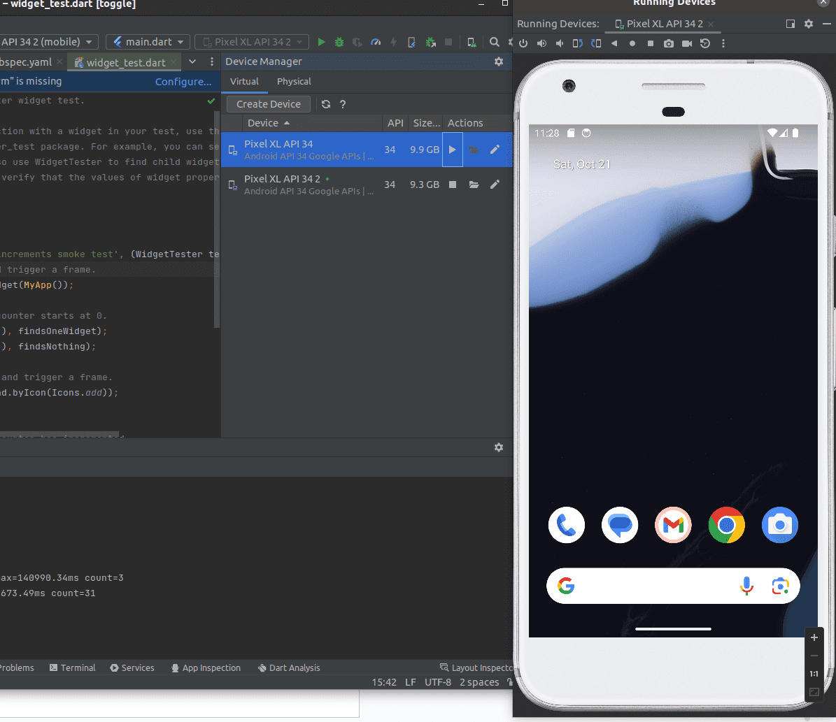
After running the test device, you will have a preview of your application's output, as illustrated in the screenshot below.
Let's begin with designing our toggle icons. First, you need to import the following components:
Create a new class that extends StatelessWidget.
class MyApp extends StatelessWidget {
  @override
  Widget build(BuildContext context) {
    return Scaffold(
      body: SafeArea(
        child: Padding(
          padding: const EdgeInsets.only(top: 20.0, bottom: 20.0),
          child: Center(
              child: SingleChildScrollView(
                child: Column(
                  mainAxisAlignment: MainAxisAlignment.center,
                  children: [
                  ],
               ),
           )),
        ),
      ),
    );
  }
}
Basic Toggle Switch :
Now, let's add a basic toggle switch as follows:
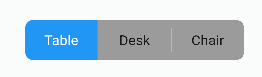
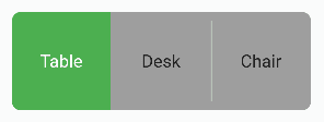
With the above switch, you can click on "Table," "Switch," and "Chair" accordingly. Let's take a look at the code for this.
Inside the Column widget, add the following code:
ToggleSwitch(
 initialLabelIndex: 0,
 totalSwitches: 3,
 labels: ['Table', 'Desk', 'Chair'],
),
If you want to add an extra button, you can increase the number in totalSwitches. The initialLabelIndex corresponds to the default or initial index of the selected label, which is set to "Table."
If you want to adjust the height, width, and font size, you can include the following code inside the ToggleSwitch.
minWidth: 90.0,
minHeight: 90.0,
fontSize: 16.0,
Also you can add background and foreground color by adding below code to inside ToggleSwitch for active button and inactive button.
activeBgColor: [Colors.green],
activeFgColor: Colors.white,
inactiveBgColor: Colors.grey,
inactiveFgColor: Colors.grey[900],
The complete code for this type of toggle switch is provided below
class MyApp extends StatelessWidget {
  @override
  Widget build(BuildContext context) {
    return Scaffold(
      body: SafeArea(
        child: Padding(
          padding: const EdgeInsets.only(top: 20.0, bottom: 20.0),
          child: Center(
              child: SingleChildScrollView(
                child: Column(
                  mainAxisAlignment: MainAxisAlignment.center,
                  children: [
                    ToggleSwitch(
			 initialLabelIndex: 0,
                         totalSwitches: 3,
			 labels: ['Table', 'Desk', 'Chair'],
			 minWidth: 90.0,
			 minHeight: 90.0,
			 fontSize: 16.0,
			 activeBgColor: [Colors.green],
			 activeFgColor: Colors.white,
			 inactiveBgColor: Colors.grey,
			 inactiveFgColor: Colors.grey[900],
			),
                    ],
                ),
              )),
        ),
      ),
    );
  }
}
The output of the above code is shown in below image.
Now see how to create a text or icon toggle switch as below image
To achieve the switches shown above, you need to add customWidths, cornerRadius, and icons inside the ToggleSwitch widget.
For different widths for text and icon, specify customWidths as follows:
customWidths: [90.0, 50.0],
To control the corner radius, use cornerRadius:
cornerRadius: 20.0,
Add the cross icon inside icons:
icons: [null, FontAwesomeIcons.times],
These parameters allow you to customize the appearance and behavior of your toggle switches.
The complete code for this type of toggle switch is provided below.
class MyApp extends StatelessWidget {
@override
Widget build(BuildContext context) {
return Scaffold(
body: SafeArea(
child: Padding(
padding: const EdgeInsets.only(top: 20.0, bottom: 20.0),
child: Center(
child: SingleChildScrollView(
child: Column(
mainAxisAlignment: MainAxisAlignment.center,
children: [
ToggleSwitch(
customWidths: [90.0, 50.0],
cornerRadius: 20.0,
activeBgColors: [
[Colors.cyan],
[Colors.redAccent]
],
activeFgColor: Colors.white,
inactiveBgColor: Colors.grey,
inactiveFgColor: Colors.white,
totalSwitches: 2,
labels: ['YES', ''],
icons: [null, FontAwesomeIcons.times],
),
],
),
)),
),
),
);
}
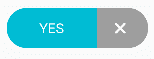
}Now see how to create two text toggle switch with different active background color and icons as below image.
The complete code for this type of toggle switch is provided below.
class MyApp extends StatelessWidget {
@override
Widget build(BuildContext context) {
return Scaffold(
body: SafeArea(
child: Padding(
padding: const EdgeInsets.only(top: 20.0, bottom: 20.0),
child: Center(
child: SingleChildScrollView(
child: Column(
mainAxisAlignment: MainAxisAlignment.center,
children: [
ToggleSwitch(
minWidth: 90.0,
initialLabelIndex: 1,
cornerRadius: 20.0,
activeFgColor: Colors.white,
inactiveBgColor: Colors.grey,
inactiveFgColor: Colors.white,
totalSwitches: 2,
labels: ['Male', 'Female'],
icons: [FontAwesomeIcons.mars, FontAwesomeIcons.venus],
activeBgColors: [
[Colors.blue],
[Colors.pink]
],
),
)),
),
),
);
}
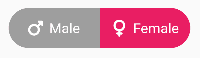
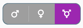
}Next, let's understand how to create a three-icons toggle switch with different active background colors, as displayed in the image below.
The complete code for this type of toggle switch is provided below.
class MyApp extends StatelessWidget {
  @override
  Widget build(BuildContext context) {
    return Scaffold(
      body: SafeArea(
        child: Padding(
          padding: const EdgeInsets.only(top: 20.0, bottom: 20.0),
          child: Center(
              child: SingleChildScrollView(
                child: Column(
                  mainAxisAlignment: MainAxisAlignment.center,
                  children: [
                     ToggleSwitch(
                      minWidth: 90.0,
                      minHeight: 70.0,
                      initialLabelIndex: 2,
                      cornerRadius: 20.0,
                      activeFgColor: Colors.white,
                      inactiveBgColor: Colors.grey,
                      inactiveFgColor: Colors.white,
                      totalSwitches: 3,
                      icons: [
                        FontAwesomeIcons.mars,
                        FontAwesomeIcons.venus,
                        FontAwesomeIcons.transgender
                      ],
                      iconSize: 30.0,
                      borderWidth: 2.0,
                      borderColor: [Colors.blueGrey],
                      activeBgColors: [
                        [Colors.blue],
                        [Colors.pink],
                        [Colors.purple]
                      ],
                    ),
                  ],
               ),
           )),
        ),
      ),
    );
  }
}
In the code provided above, you can also include iconSize to define the size of icons, borderWidth to set the border width, and borderColor to specify the border color. You can adjust these values as needed.
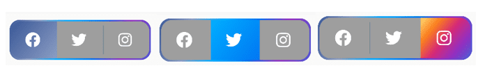
Let's now learn how to create a toggle icon with Facebook, Twitter, and Instagram icons, with their actual icon colors, as shown in the images below.
The complete code for this type of toggle switch is provided below.
class MyApp extends StatelessWidget {
  @override
  Widget build(BuildContext context) {
    return Scaffold(
      body: SafeArea(
        child: Padding(
          padding: const EdgeInsets.only(top: 20.0, bottom: 20.0),
          child: Center(
              child: SingleChildScrollView(
                child: Column(
                  mainAxisAlignment: MainAxisAlignment.center,
                  children: [
                     ToggleSwitch(
                      minWidth: 90.0,
                      minHeight: 70.0,
                      initialLabelIndex: 0,
                      cornerRadius: 20.0,
                      activeFgColor: Colors.white,
                      inactiveBgColor: Colors.grey,
                      inactiveFgColor: Colors.white,
                      totalSwitches: 3,
                      icons: [
                        FontAwesomeIcons.facebook,
                        FontAwesomeIcons.twitter,
                        FontAwesomeIcons.instagram
                      ],
                      iconSize: 30.0,
                      borderColor: [
                        Color(0xff3b5998),
                        Color(0xff8b9dc3),
                        Color(0xff00aeff),
                        Color(0xff0077f2),
                        Color(0xff962fbf),
                        Color(0xff4f5bd5)
                      ],
                      dividerColor: Colors.blueGrey,
                      activeBgColors: [
                        [Color(0xff3b5998), Color(0xff8b9dc3)],
                        [Color(0xff00aeff), Color(0xff0077f2)],
                        [
                          Color(0xfffeda75),
                          Color(0xfffa7e1e),
                          Color(0xffd62976),
                          Color(0xff962fbf),
                          Color(0xff4f5bd5)
                        ]
                      ],
                    ),
                  ],
               ),
           )),
        ),
      ),
    );
  }
}
To add a divider color between switches, you can define Colors.blueGrey (or specify your custom color).
In the code provided above, additional colors are defined inside [] to mix the colors for switches. For Facebook and Twitter, two colors are added, and for Instagram, five colors are mixed to achieve its exact color.
Now, let's explore how to create a toggle switch with turn-off and turn-on animations, as shown in the images below.

The complete code for this type of toggle switch is provided below.
class MyApp extends StatelessWidget {
  @override
  Widget build(BuildContext context) {
    return Scaffold(
      body: SafeArea(
        child: Padding(
          padding: const EdgeInsets.only(top: 20.0, bottom: 20.0),
          child: Center(
              child: SingleChildScrollView(
                child: Column(
                  mainAxisAlignment: MainAxisAlignment.center,
                  children: [
                     ToggleSwitch(
                      minWidth: 90.0,
                      minHeight: 70.0,
                      initialLabelIndex: 0,
                      cornerRadius: 20.0,
                      activeFgColor: Colors.white,
                      inactiveBgColor: Colors.grey,
                      inactiveFgColor: Colors.white,
                      totalSwitches: 2,
                      icons: [
                        FontAwesomeIcons.lightbulb,
                        FontAwesomeIcons.solidLightbulb,
                      ],
                      iconSize: 30.0,
                      activeBgColors: [
                        [Colors.black45, Colors.black26],
                        [Colors.yellow, Colors.orange]
                      ],
                      animate: true,
                      curve: Curves.bounceInOut,
                    ),
                  ],
               ),
           )),
        ),
      ),
    );
  }
}
In the code, you can set true for animate to enable the turn-on and turn-off effect for bulb icons.
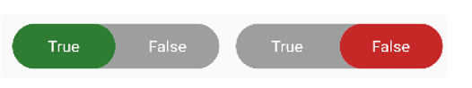
Next, let's learn how to create a toggle switch with radius style, as shown in the images below.
The complete code for this type of toggle switch is provided below.
class MyApp extends StatelessWidget {
  @override
  Widget build(BuildContext context) {
    return Scaffold(
      body: SafeArea(
        child: Padding(
          padding: const EdgeInsets.only(top: 20.0, bottom: 20.0),
          child: Center(
              child: SingleChildScrollView(
                child: Column(
                  mainAxisAlignment: MainAxisAlignment.center,
                  children: [
                     ToggleSwitch(
                      minWidth: 90.0,
                      cornerRadius: 20.0,
                      activeBgColors: [
                        [Colors.green[800]!],
                        [Colors.red[800]!]
                      ],
                      activeFgColor: Colors.white,
                      inactiveBgColor: Colors.grey,
                      inactiveFgColor: Colors.white,
                      initialLabelIndex: 1,
                      totalSwitches: 2,
                      labels: ['True', 'False'],
                      radiusStyle: true,
                    ),
                  ],
               ),
           )),
        ),
      ),
    );
  }
}
For the code provided, set radiusStyle to true to achieve the desired output.
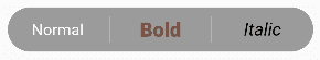
Now, let's explore how to create a toggle switch with different text styles and the ability to deactivate it by double-clicking, as shown in the images below.
The complete code for this type of toggle switch is provided below.
class MyApp extends StatelessWidget {
  @override
  Widget build(BuildContext context) {
    return Scaffold(
      body: SafeArea(
        child: Padding(
          padding: const EdgeInsets.only(top: 20.0, bottom: 20.0),
          child: Center(
              child: SingleChildScrollView(
                child: Column(
                  mainAxisAlignment: MainAxisAlignment.center,
                  children: [
                     ToggleSwitch(
                      minWidth: 90.0,
		      cornerRadius: 20.0,
		      inactiveFgColor: Colors.white,
		      initialLabelIndex: null,
		      doubleTapDisable: true,
		      totalSwitches: 3,
		      labels: ['Normal', 'Bold', 'Italic'],
		      customTextStyles: [
		      null,
		      TextStyle(
			  color: Colors.brown,
			  fontSize: 18.0,
			  fontWeight: FontWeight.w900),
		      TextStyle(
			  color: Colors.black,
			  fontSize: 16.0,
			  fontStyle: FontStyle.italic)
		      ],
                  ),
             )),
         ),
      ),
    );
  }
}
In the code, inside customTextStyles, you can set it as null for normal text. For bold text, you can define the font weight as FontWeight.w900 (you can specify your custom weight after the .). Additionally, you can style the text by adding a type of style for fontStyle as FontStyle.italic (you can set your custom style after the .). You can set true to doubleTapDisable to deactivate the icon by double-clicking.
Now, let's explore how to create custom icons, as shown in the images below.

The complete code for this type of toggle switch is provided below.
class MyApp extends StatelessWidget {
  @override
  Widget build(BuildContext context) {
    return Scaffold(
      body: SafeArea(
        child: Padding(
          padding: const EdgeInsets.only(top: 20.0, bottom: 20.0),
          child: Center(
              child: SingleChildScrollView(
                child: Column(
                  mainAxisAlignment: MainAxisAlignment.center,
                  children: [
                     ToggleSwitch(
                      minWidth: 90.0,
                      minHeight: 90.0,
                      cornerRadius: 20.0,
                      activeBgColors: [
                        [Color(0xfffdbb0a)],
                        [Colors.black54],
                        [Colors.white54]
                      ],
                      inactiveFgColor: Colors.white,
                      initialLabelIndex: 2,
                      totalSwitches: 3,
                      customIcons: [
                        Icon(
                          FontAwesomeIcons.ccVisa,
                          color: Color(0xff1a1f71),
                          size: 55.0,
                        ),
                        Icon(
                          FontAwesomeIcons.ccMastercard,
                          color: Color(0xffF79E1B),
                          size: 55.0,
                        ),
                        Icon(
                          FontAwesomeIcons.ccAmex,
                          color: Color(0xff27AEE3),
                          size: 55.0,
                        )
                      ],
                  ),
             )),
         ),
      ),
    );
  }
}
To design your custom icons, define the font, color, and size for each icon. This allows you to create unique custom icons.
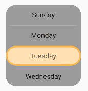
Next, let's understand how to create a vertical toggle switch with an active border, as shown in the images below.
The complete code for this type of toggle switch is provided below.
class MyApp extends StatelessWidget {
  @override
  Widget build(BuildContext context) {
    return Scaffold(
      body: SafeArea(
        child: Padding(
          padding: const EdgeInsets.only(top: 20.0, bottom: 20.0),
          child: Center(
              child: SingleChildScrollView(
                child: Column(
                  mainAxisAlignment: MainAxisAlignment.center,
                  children: [
                     ToggleSwitch(
                      activeBorders: [
                        Border.all(
                          color: Colors.purple.shade300,
                          width: 3.0,
                        ),
                        Border.all(
                          color: Colors.yellow.shade500,
                          width: 3.0,
                        ),
                        Border.all(
                          color: Colors.orange.shade300,
                          width: 3.0,
                        ),
                        Border.all(
                          color: Colors.blue.shade300,
                          width: 3.0,
                        ),
                      ],
                      activeFgColor: Colors.black54,
                      isVertical: true,
                      minWidth: 150.0,
                      radiusStyle: true,
                      cornerRadius: 20.0,
                      initialLabelIndex: 2,
                      activeBgColors: [
                        [Colors.purple.shade100],
                        [Colors.yellow.shade100],
                        [Colors.orange.shade100],
                        [Colors.blue.shade100]
                      ],
                      labels: ['Sunday', 'Monday', 'Tuesday', 'Wednesday'],
                  ),
             )),
         ),
      ),
    );
  }
}
To create a vertical switch, set true for isVertical.
Now, let's see how to create a toggle switch with a width greater than the device width, as shown in the images below.
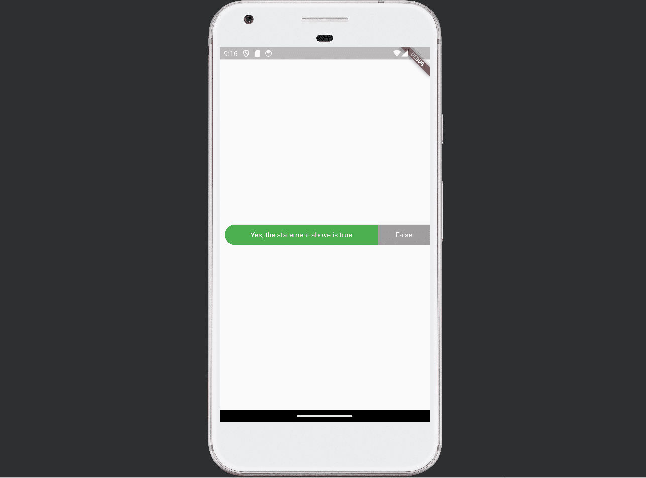
The complete code for this type of toggle switch is provided below.
class MyApp extends StatelessWidget {
  @override
  Widget build(BuildContext context) {
    return Scaffold(
      body: SafeArea(
        child: Padding(
          padding: const EdgeInsets.only(top: 20.0, bottom: 20.0),
          child: Center(
              child: SingleChildScrollView(
                child: Column(
                  mainAxisAlignment: MainAxisAlignment.center,
                  children: [
                      SingleChildScrollView(
                      scrollDirection: Axis.horizontal,
                      child: Scrollbar(
                        child: Padding(
                          padding: const EdgeInsets.symmetric(horizontal: 10.0),
                          child: ToggleSwitch(
                            customWidths: [300.0, 100.0, 100.0],
                            cornerRadius: 20.0,
                            activeBgColors: [
                              [Colors.green],
                              [Colors.redAccent],
                              [Colors.blue]
                            ],
                            activeFgColor: Colors.white,
                            inactiveBgColor: Colors.grey,
                            inactiveFgColor: Colors.white,
                            labels: [
                              'Yes, the statement above is true',
                              'False',
                              'Other'
                            ],
                          ),
                        ),
                      ),
                    ),
                  ),
             )),
         ),
      ),
    );
  }
}
To activate the scrolling bar, define scrollDirection: Axis.horizontal inside SingleChildScrollView().
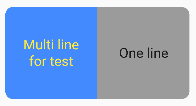
Now, let's learn how to create a toggle switch with multi-line text, as shown in the images below.
The complete code for this type of toggle switch is provided below.
class MyApp extends StatelessWidget {
  @override
  Widget build(BuildContext context) {
    return Scaffold(
      body: SafeArea(
        child: Padding(
          padding: const EdgeInsets.only(top: 20.0, bottom: 20.0),
          child: Center(
              child: SingleChildScrollView(
                child: Column(
                  mainAxisAlignment: MainAxisAlignment.center,
                  children: [
                     ToggleSwitch(
                      initialLabelIndex: 0,
                      minHeight: 100.0,
                      minWidth: 100.0,
                      activeBgColor: [Colors.blueAccent.shade200],
                      activeFgColor: Colors.yellow,
                      customTextStyles: [TextStyle(fontSize: 15.0)],
                      multiLineText: true,
                      centerText: true,
                      totalSwitches: 2,
                      labels: ['Multi line', 'One line'],
                  ),
             )),
         ),
      ),
    );
  }
}
To define multi-line text for a switch, set multiLineText to true.
Flutter's simplicity and flexibility make it an excellent choice for building user interfaces with a wide range of interactive elements like toggle switches.
You can use this blog post as a starting point and customize it further to suit your style