In this example, we are creating a custom widget and integrating it
into a form view. Specifically, we are building a date picker widget
that supports the selection of multiple dates.
To begin, we add a new Char field to the res.partner model, which
will be used in conjunction with our custom widget. This field will
store the selected date values. Once the field is added, we can
proceed with defining the widget and linking it to the form view.
                       from odoo import fields, models
class ResPartner(models.Model):
   _inherit = 'res.partner'
   test_field = fields.Char()
Next, include the newly added field in the form view by updating the
XML definition. This ensures the field appears in the user
interface, where it can be rendered using the custom widget.
<field name="test_field" widget="multiple_datepicker"/>
Next, define the QWeb template for the custom field widget. This
template will determine how the widget is displayed in the user
interface, allowing for the desired layout and interaction—for
example, selecting multiple dates.
<?xml version="1.0" encoding="UTF-8"?>
<templates>
   <t t-name="DatePickerField" owl="1">
       <input type="text"
              class="input_datepicker o-autocomplete--input o_input"
              t-ref="inputdate"
              t-on-click="(ev) => this._onSelectDateField(ev)"/>
   </t>
</templates>
Next, we'll define the CSS styles for the widget to control its
appearance and layout. This styling ensures that the widget is
visually consistent with the rest of the interface and provides a
user-friendly experience when selecting multiple dates.
                       .datepicker-dropdown {
   top: 0;
   left: 0;
   padding: 4px
}
.datepicker table tr td,
.datepicker table tr th {
   text-align: center;
   width: 30px;
   height: 30px;
   border: none
}
.datepicker table tr td.day:hover,
.datepicker table tr td.focused {
   background: #eee;
   cursor: pointer;
   border-radius: 18px;
}
.datepicker table tr td.active.active,
.datepicker table tr td.active.highlighted.active,
.datepicker table tr td.active.highlighted:active,
.datepicker table tr td.active:active {
   color: #fff;
   background-color: #7C7BAD;
   border-radius:18px;
   border-color: #7C7BAD;
   background-radius:11px;
}
.datepicker table tr td span {
   display: block;
   width: 23%;
   height: 54px;
   line-height: 54px;
   float: left;
   margin: 1%;
   cursor: pointer;
}
.datepicker table tr td span.active,
.datepicker table tr td span.active.disabled,
.datepicker table tr td span.active.disabled:hover,
.datepicker table tr td span.active:hover {
   color: #fff;
   background-color: #7C7BAD;
   border-color: #2e6da4;
   text-shadow: 0 -1px 0 rgba(0, 0, 0, .25)
}
.datepicker .datepicker-switch {
   width: 145px;
   background:#7C7BAD;
   color:white;
}
.datepicker .datepicker-switch,
.datepicker .next,
.datepicker .prev,
.datepicker tfoot tr th {
   cursor: pointer;
   background:#7C7BAD;
   color:white;
}
Next, you need to define the widget as a component using OWL. This
involves creating a JavaScript class that extends Component from
OWL, where you’ll implement the logic for rendering the widget and
handling user interactions, such as selecting and updating multiple
dates.
/** @odoo-module **/
import { registry } from "@web/core/registry";
import { useInputField } from "@web/views/fields/input_field_hook";
import { Component,useRef } from "@odoo/owl";
import { _t } from "@web/core/l10n/translation";
import { standardFieldProps } from "@web/views/fields/standard_field_props";
export class DatePickerField extends Component {
   static template = 'DatePickerField'
   setup() {
       this.input = useRef("inputdate");
       useInputField({
           getValue: () => this.props.record.data[this.props.name] || "",
           refName: "inputdate"
       });
   }
   _onSelectDateField(ev) {
       var dateFormat = "MM/DD/YYYY";
       dateFormat = dateFormat.toLowerCase()
       if (this.input.el) {
           if (this.input.el.value) {
               this.props.record.update({
                   [this.props.name]: this.input.el.value
               })
               }
           $(this.input.el).datepicker({
               multidate: true,
               format: dateFormat,
           }).trigger('focus');
       }
   }
}
DatePickerField.props = {
   ...standardFieldProps,
}
export const datepickerField = {
   component: DatePickerField,
   supportedTypes: ["char"],
};
registry.category("fields").add("multiple_datepicker", datepickerField);
Next, include the JavaScript, XML, and CSS files in your module’s
__manifest__.py file to ensure they are loaded properly. Here's how
you can define them:
                       'assets': {
   'web.assets_backend': [
       '/owl_test/static/src/scss/style.scss',
       '/owl_test/static/src/js/owl_test.js',
       '/owl_test/static/src/js/lib/bootstrap-datepicker.min.js',
       '/owl_test/static/src/xml/owl_test.xml',
   ],
},
Now, the field is ready to support multiple date selections using the
custom widget. Users can interact with the field to choose multiple
dates, which will be reflected in the form view accordingly.
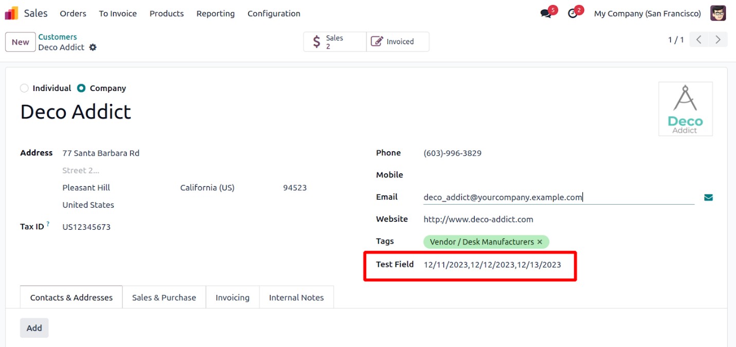
In this way, multiple dates can be added seamlessly using the
DatePicker widget, enhancing the form's functionality with an
interactive and user-friendly interface.