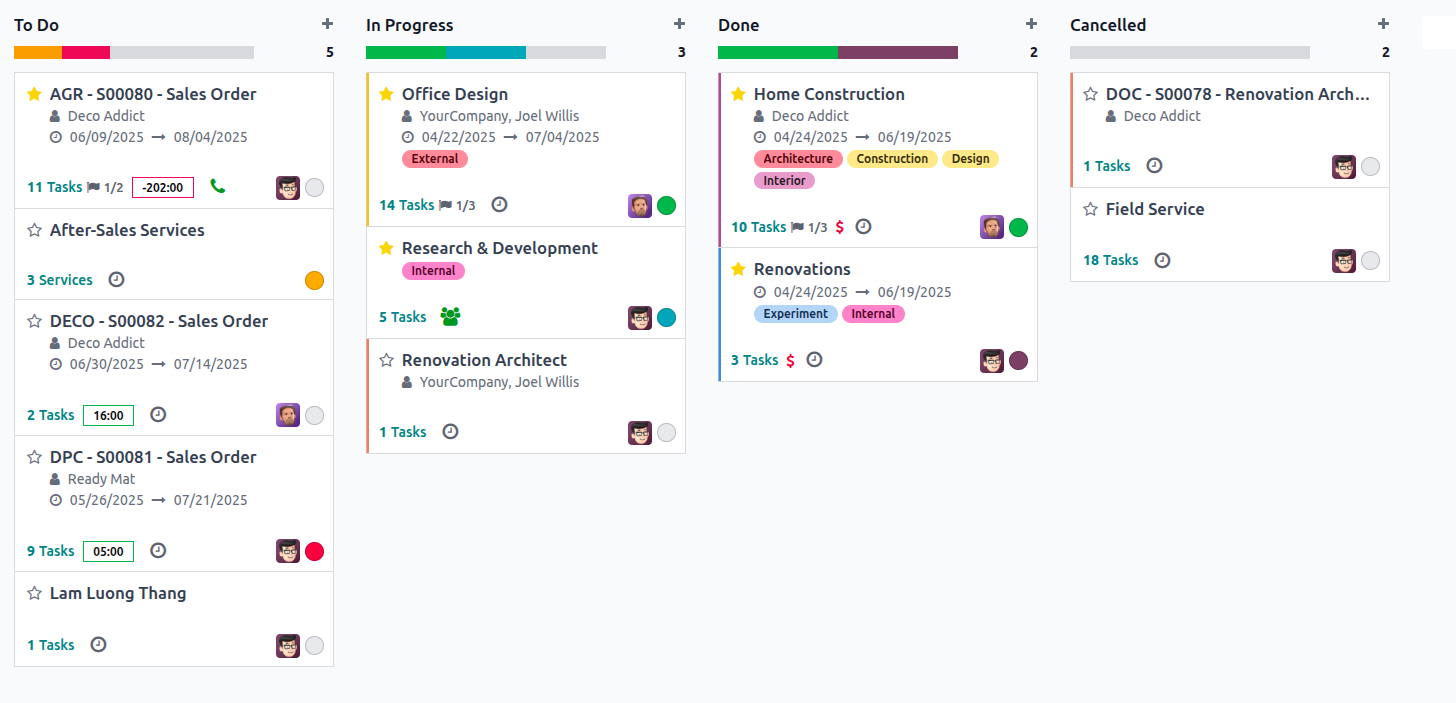
In Odoo 18, Kanban views offer a highly customizable and visually interactive way of
displaying data. Each record in a model is represented as a card (also called a Kanban box),
and you can define these cards using XML templates. You can design them using multiple
templates, but at least one base template must be defined to render individual Kanban cards.
Structure of a Kanban Card
Each Kanban card is structured using a main template. The card layout
typically includes:
- Header with dropdown options (edit/delete/color picker)
- Body to display field data like name, tags, dates, and user
- Footer to add priority levels, avatars, or Kanban state
Here's a sample Kanban card layout:
<t t-name="kanban-box">
  <div t-attf-class="oe_kanban_color_#{kanban_getcolor(record.color.raw_value)} oe_kanban_global_click">

    <div class="o_dropdown_kanban dropdown">
        <!-- Action menu: Edit, Delete, Color Picker -->
    </div>

    <div class="oe_kanban_body">
        <!-- Field content like name, tags, deadline -->
    </div>

    <div class="oe_kanban_footer">
        <div class="oe_kanban_footer_left">
            <!-- Footer left: Priority field -->
        </div>
        <div class="oe_kanban_footer_right">
            <!-- Footer right: Kanban status and avatar -->
        </div>
    </div>
    <div class="oe_clear"/>
  </div>
</t>
Populating the Kanban Card Body
Use standard field declarations to show data inside the .oe_kanban_body section. Here’s a
common setup:
            <div class="oe_kanban_body">
  <div>
    <field name="tag_ids"/>
  </div>
  <div>
    <strong><a type="open"><field name="name"/></a></strong>
  </div>
  <ul>
    <li><field name="user_id"/></li>
    <li><field name="date_deadline"/></li>
  </ul>
</div>
Footer Elements
In the left footer, we commonly include interactive widgets like priority:
            <div class="oe_kanban_footer_left">
  <field name="priority" widget="priority"/>
</div>
In the right footer, we can show the record's status and avatar:
<div class="oe_kanban_footer_right"<
  <field name="kanban_state" widget="state_selection"/<
  <img t-att-src="kanban_image('res.users', 'image_small', record.user_id.raw_value)"
       t-att-title="record.user_id.value"
       width="24" height="24"
       class="oe_kanban_avatar"/<
</div<
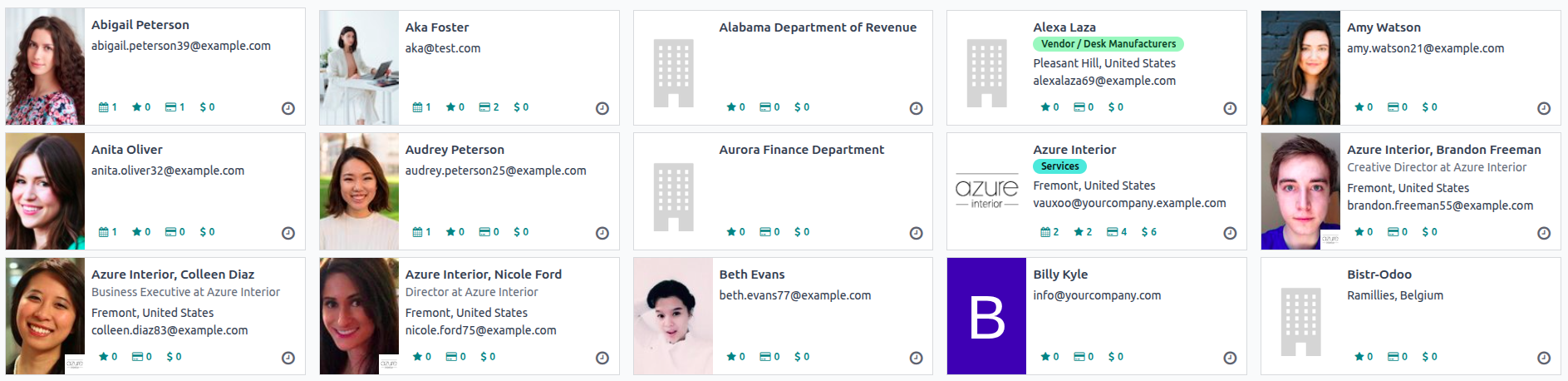
To show a company or customer image on a Kanban card (like in Contacts), use:
<img t-att-src="kanban_image('res.partner', 'image_medium', record.id.value)"
     class="o_kanban_image"/>
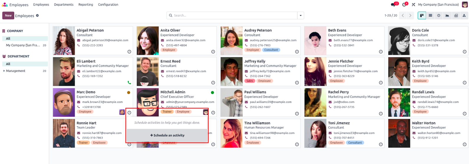
Activities in Kanban View
Activities are used in Odoo to plan future actions like calls, emails, or meetings. In Kanban
views, you can show and manage activities using built-in widgets.
Enabling Activity Management in Kanban
First, ensure your model inherits mail.activity.mixin and the mail module is included in
dependencies.
class HrEmployeePrivate(models.Model):
    _name = "hr.employee"
    _inherit = ['mail.thread', 'mail.activity.mixin']
In your Kanban view:
- Add activity_state to the view for activity status.
- Include activity_ids with kanban_activity widget to display activities.
<field name="activity_state"/>
<field name="activity_ids" widget="kanban_activity"/>
This allows users to view, edit, schedule, or mark activities directly from the card.
Making Kanban Cards Interactive
To make Kanban cards more user-friendly, Odoo provides features like color coding, quick
actions, and tag widgets.
Add Color to Kanban Cards
Add a color field in your model and in the view.
<field name="color"/>
Then update the main div with dynamic class generation:
<div t-attf-class="oe_kanban_color_#{kanban_getcolor(record.color.raw_value)} oe_kanban_card oe_kanban_global_click">
Add a dropdown for Edit/Delete options and a color picker:
                <div class="o_dropdown_kanban dropdown">
  <a role="button" class="dropdown-toggle o-no-caret btn" data-toggle="dropdown" aria-label="Dropdown menu">
    <span class="fa fa-ellipsis-v"/>
  </a>
  <div class="dropdown-menu" role="menu">
    <t t-if="widget.editable">
      <a role="menuitem" type="edit" class="dropdown-item">Edit</a>
    </t>
    <t t-if="widget.deletable">
      <a role="menuitem" type="delete" class="dropdown-item">Delete</a>
    </t>
    <div class="dropdown-divider"/>
    <ul class="oe_kanban_colorpicker" data-field="color"/>
  </div>
</div>
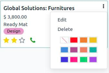
Add Tags and Priority Fields
Use many2many_tags and priority widgets for visual feedback:
<span class="oe_kanban_list_many2many">
  <field name="category_id" widget="many2many_tags" options="{'color_field': 'color'}"/>
</span>
<field name="priority" widget="priority"/>
- The priority widget displays stars.
- many2many_tags allows colorful tag displays using the color_field option.
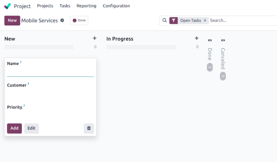
Quick Create in Kanban View
Odoo 18 still supports Quick Create, allowing users to add new records without leaving the
Kanban board.
Steps to Enable Quick Create
1. Create a minimal form view:
<record id="mobile_service_view_form_minimal" model="ir.ui.view">
  <field name="name">Quick Form</field>
  <field name="model">mobile.service</field>
  <field name="arch" type="xml">
    <form>
      <group>
        <field name="name"/>
        <field name="partner_id"/>
        <field name="priority"/>
      </group>
    </form>
  </field>
</record>
2. Attach this form view to your Kanban view using quick_create_view:
<kanban
  default_group_by="service_state"
  quick_create_view="mobile_service.mobile_service_view_form_minimal"
  on_create="quick_create">
Clicking the + icon on any Kanban column now opens a simple form to create a new record
directly.