The Kanban view in Odoo provides a clear and intuitive way to manage
workflows. It displays records in columns, with each column
representing a specific stage of the process. Users can easily view
and move records between stages, streamlining workflow management.
Just like with form and tree views, the view type for the Kanban view
must also be specified in the action. It can be included as shown
below:
<record id="action_support_ticket" model="ir.actions.act_window">
   <field name="name">Support Tickets</field>
   <field name="res_model">support.ticket</field>
   <field name="view_mode">list,form,kanban</field>
</record>
The view can now be defined as shown below:
<record id="view_support_ticket_kanban" model="ir.ui.view">
   <field name="name">support.ticket.kanban</field>
   <field name="model">support.ticket</field>
   <field name="arch" type="xml">
       <kanban default_group_by="stage">
           <templates>
               <t t-name="kanban-box">
                   <div class="oe_kanban_global_click">
                       <div class="oe_kanban_content">
                           <div class="oe_kanban_card">
                               <div>
                                   <b>
                                       <field name="ticket_id"/>
                                   </b>
                               </div>
                               <div class="text-muted">
                                   <field name="customer_id" widget="res_partner_many2one"/>
                               </div>
                               <div class="text-muted">
                                   <field name="customer_email"/>
                               </div>
                           </div>
                       </div>
                   </div>
               </t>
           </templates>
       </kanban>
   </field>
</record>
This is a basic Kanban view definition. In addition to this, various
classes and attributes can be used to enhance its functionality and
appearance.
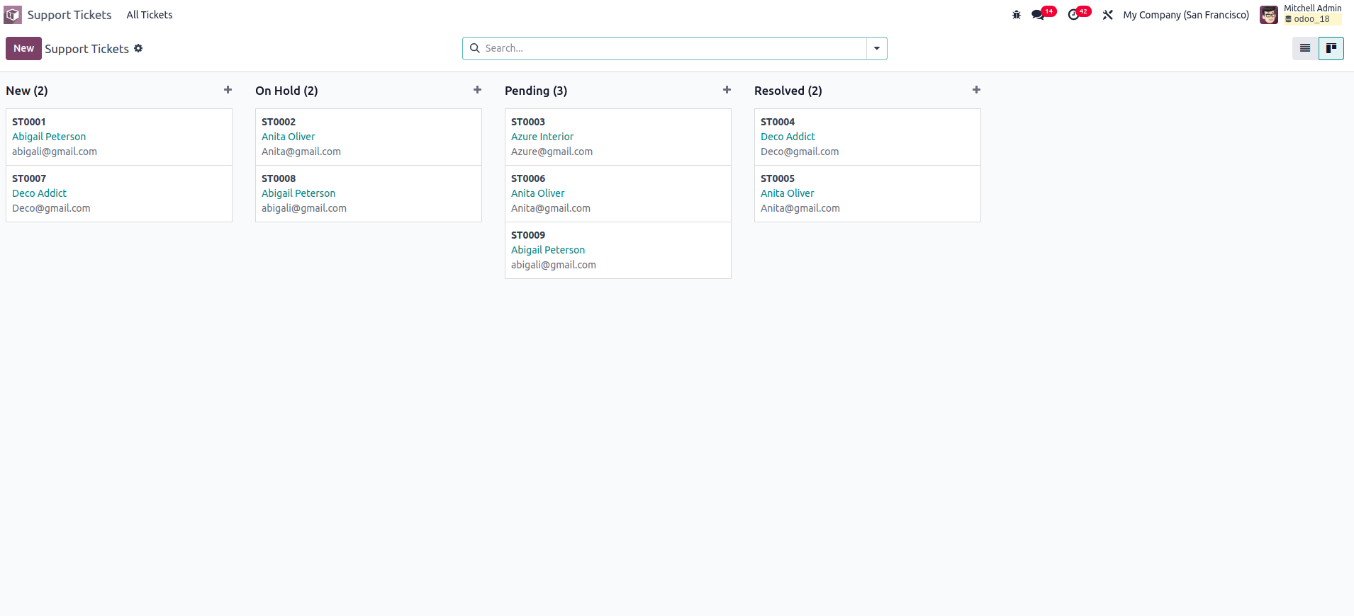
As explained above, the Kanban view shows records as cards grouped by
their states. These states are helpful because you can drag and drop
records between them. To ensure that all states appear in the Kanban
view—even when no records exist for some states—you should use the
group_expand attribute on the field declaration.
Here’s an example of how to define it:
 stage = fields.Selection([
    ('new', 'New'),
    ('on_hold', 'On Hold'),
    ('pending', 'Pending'),
    ('resolved', 'Resolved')
], string='Stage', default='new')
Once these steps are completed, the Kanban view along with its states
will appear as shown below.
Progress bar in kanban view
Another handy feature of the Kanban view is the progress bar. When
there are many records, understanding their distribution across
different states can become difficult. The progress bar helps by
visually indicating the status of each state at the top of the
column. In the following example, the progress bar is configured
based on the priority field.
priority = fields.Selection([
    ('0', 'Low'),
    ('1', 'Medium'),
    ('2', 'High'),
], string='Priority', default='1')
The progress bar uses three main attributes: field, colors, and
sum_field.
- Field: Determines the basis on which the progress bar is
displayed, using the values from this field.
- Colors: You can assign one of four main colors to represent
different field values, success, warning, danger, and info.
- Sum_field: An optional attribute used to display the total of a
specific field from the records.
The progress bar is configured in the XML using the
<progressbar> tag.
<progressbar field="priority" colors='{"2": "success", "1": "warning", "0": "danger"}'/>
After upgrading the module with the added progress bar, the Kanban
view will appear as shown below:
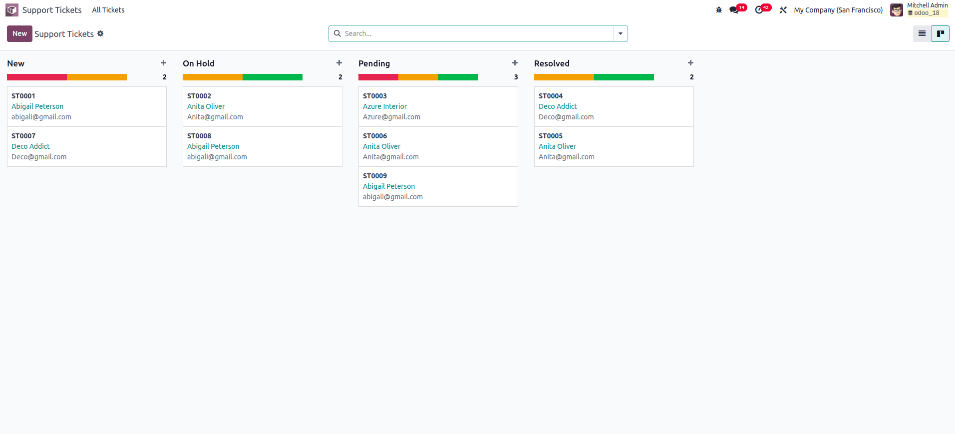
When you hover the mouse over the progress bar, it will display the
records corresponding to each field value, and the total number of
records will appear to the right of the column. This behavior is
enabled by default. However, if you want to show the sum of a
specific field from the records instead, you can use the optional
sum_field attribute.