Odoo provides a wide range of widgets to enhance field behavior—for
example, widget="image" for displaying image fields or widget="date"
for formatting date inputs. But sometimes, you may want to go beyond
what's available out of the box. In such cases, building a custom
widget gives you the flexibility to tailor behavior to your exact
needs.
Let's explore how to build a custom widget in Odoo 18, including
JavaScript, XML, and Python integration, using a clean, modern
approach supported by OWL (Odoo Web Library) and the registry
system.
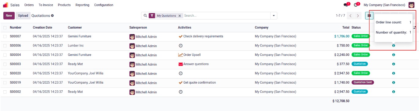
Example: Order Line Count Widget
Let’s look at a practical example — a widget that shows a quick
summary of a Sales Order’s line items. It will display:
- The total number of order lines.
- The total quantity of all products.
This can help sales managers quickly evaluate an order without
manually counting rows.
Step 1: Backend Model (Python)
First, we extend the sale.order model to include computed fields:
                         from odoo import fields, models

class SaleOrder(models.Model):
    _inherit = 'sale.order'

    order_line_count = fields.Integer(string='Order Line Count',
                                      compute='compute_line_count', store=True)
    num_qty = fields.Integer(string='Number Of Quantity',
                             compute='compute_line_count', store=True)

    def compute_line_count(self):
        for rec in self:
            rec.order_line_count = len(rec.order_line)
            rec.num_qty = sum(rec.order_line.mapped('product_uom_qty'))
Step 2: JavaScript Widget Logic
Now, we create a new widget using OWL that displays a popover with
the counts.
            /** @odoo-module **/
import { registry } from "@web/core/registry";
import { useService } from "@web/core/utils/hooks";
import { usePopover } from "@web/core/popover/popover_hook";
import { Component } from "@odoo/owl";

export class OrderLineCountPopover extends Component {
    setup() {
        this.actionService = useService("action");
    }
}
OrderLineCountPopover.template = "your_module.OrderLineCountPopOver";

export class OrderLineCountWidget extends Component {
    setup() {
        this.popover = usePopover(this.constructor.components.Popover, { position: "top" });
        this.calcData = {};
    }
    showPopup(ev) {
        this.popover.open(ev.currentTarget, {
            record: this.props.record,
            calcData: this.calcData,
        });
    }
}
OrderLineCountWidget.components = { Popover: OrderLineCountPopover };
OrderLineCountWidget.template = "your_module.OrderLineCount";

export const OrderLineCountWidgetDefinition = {
    component: OrderLineCountWidget,
};
registry.category("view_widgets").add("order_line_count_widget", OrderLineCountWidgetDefinition);
Step 3: Widget Templates (XML)
Add the popover and icon layout for the widget:
<?xml version="1.0" encoding="UTF-8" ?>
<template xml:space="preserve">
    <t t-name="your_module.OrderLineCount">
        <a t-on-click="showPopup" class="fa fa-info-circle" role="button"/>
    </t>

    <t t-name="your_module.OrderLineCountPopOver">
        <div>
            <table class="table table-borderless table-sm">
                <tr>
                    <td><strong>Order line count:</strong></td>
                    <td><span t-out="props.record.data.order_line_count"/></td>
                </tr>
                <tr>
                    <td><strong>Total quantity:</strong></td>
                    <td><span t-out="props.record.data.num_qty"/></td>
                </tr>
            </table>
        </div>
    </t>
</template>
Step 4: Add Widget to Manifest
Reference the widget assets in your __manifest__.py:
'assets': {
    'web.assets_backend': [
        'your_module/static/src/js/order_line_widget.js',
        'your_module/static/src/xml/order_line_widget.xml',
    ],
},
Step 5: Embed Widget in Views
Now, integrate your widget into the sale order list or form view:
<odoo>
    <record id="view_sale_order_tree_custom" model="ir.ui.view">
        <field name="name">sale.order.tree.custom</field>
        <field name="model">sale.order</field>
        <field name="inherit_id" ref="sale.view_quotation_tree"/>
        <field name="arch" type="xml">
            <xpath expr="//tree" position="inside">
                <field name="order_line_count" invisible="1"/>
                <field name="num_qty" invisible="1"/>
                <widget name="order_line_count_widget"/>
            </xpath>
        </field>
    </record>
</odoo>
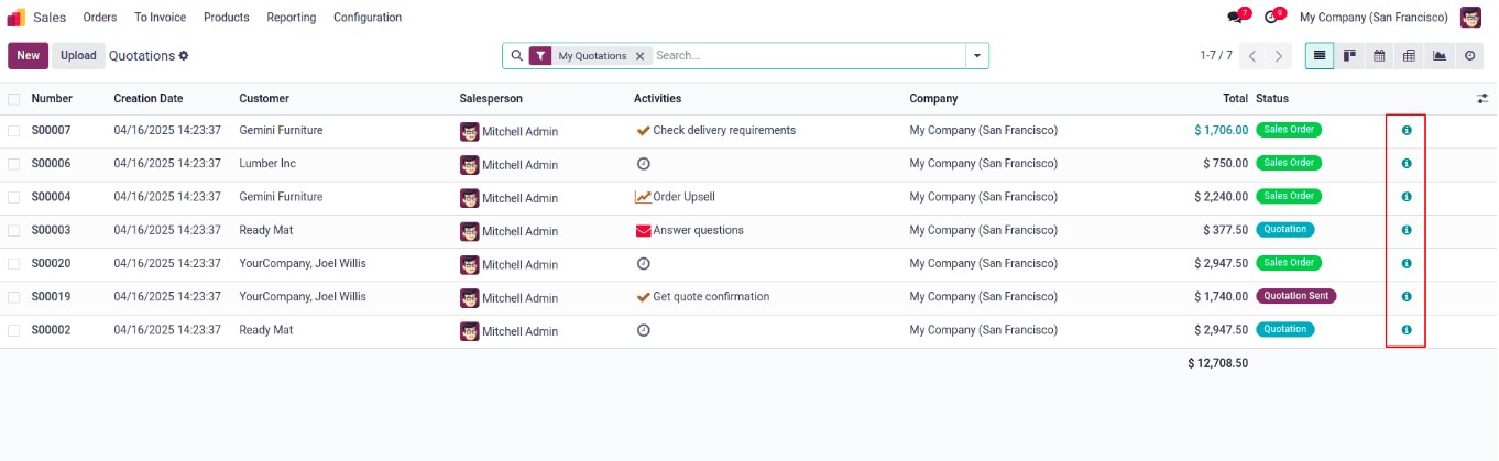
Once integrated, users will see an info icon on each Sales Order row.
Clicking it opens a popover with real-time summary data — no need to
open each order.