The relationship between the company and customers improvises through customer relationship management. Firms began to use the software due to technological advancements assisting in removing business barriers. For formulating opportunities and leads, CRM application is used in most companies. We can enhance a company's workflow using CRM, and the Odoo 16 CRM module is the best solution. A specific team in a firm can plan activities and convert leads into opportunities using Odoo 16 CRM. Evaluating previous years' work enables a company to make changes in the future. It is possible through the Reporting feature of the Odoo CRM module.
This blog points out an analysis of Reporting feature with the Odoo 16 CRM module.
Reporting tab of the Odoo CRM module covers various menus such as Dashboard, Leads, Forecast, Partnerships, and more. We can make drastic changes in business by evaluating each function in reporting feature. Analytical reports give way for further decisions concerning customer relationships in a company.
Dashboard
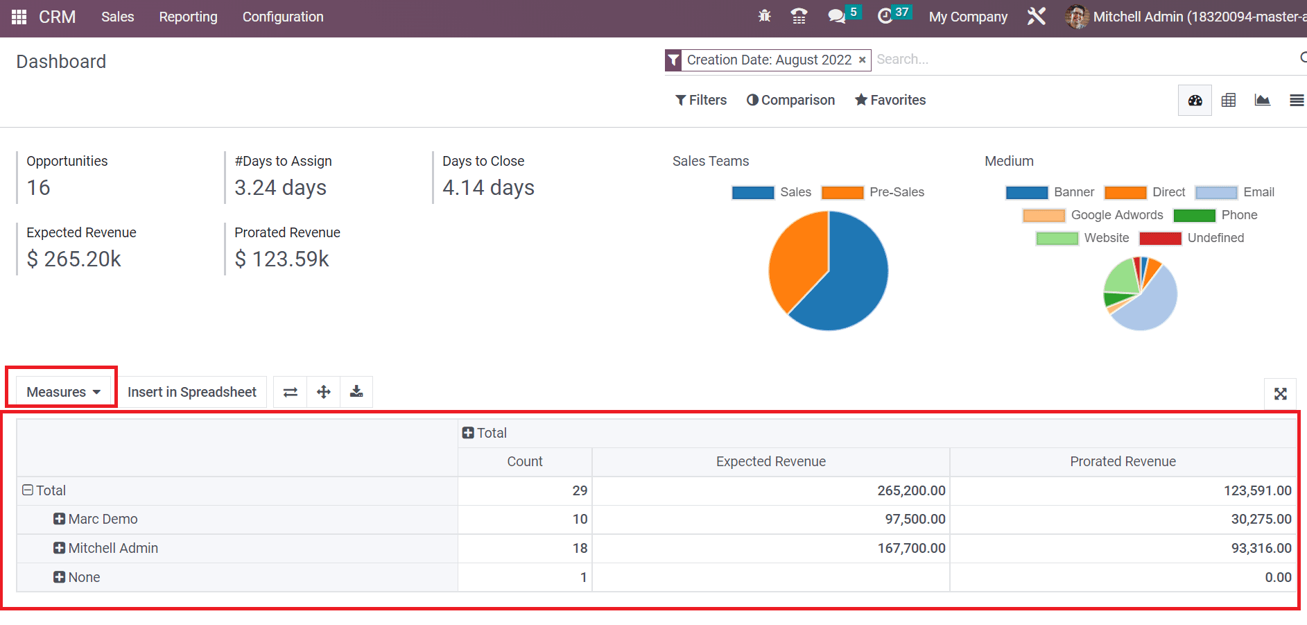
We can access the report of dashboard activities from the CRM module. Choose the Dashboard menu inside the Reporting tab, and the graphical representation of the report is viewable to you. The graph shows the count of opportunities in a specific year. Using the Measures icon as displayed in the screenshot below, it is possible to apply other measures, including Expected Revenue, Days to Close, and more.
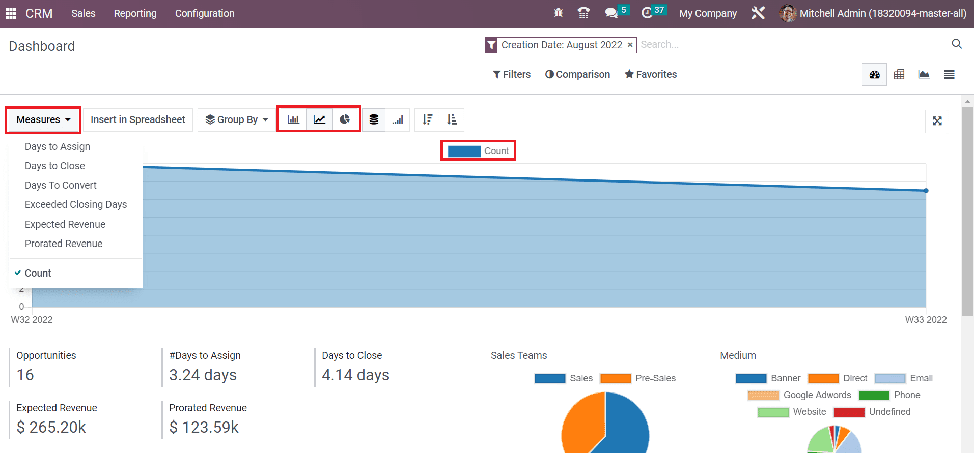
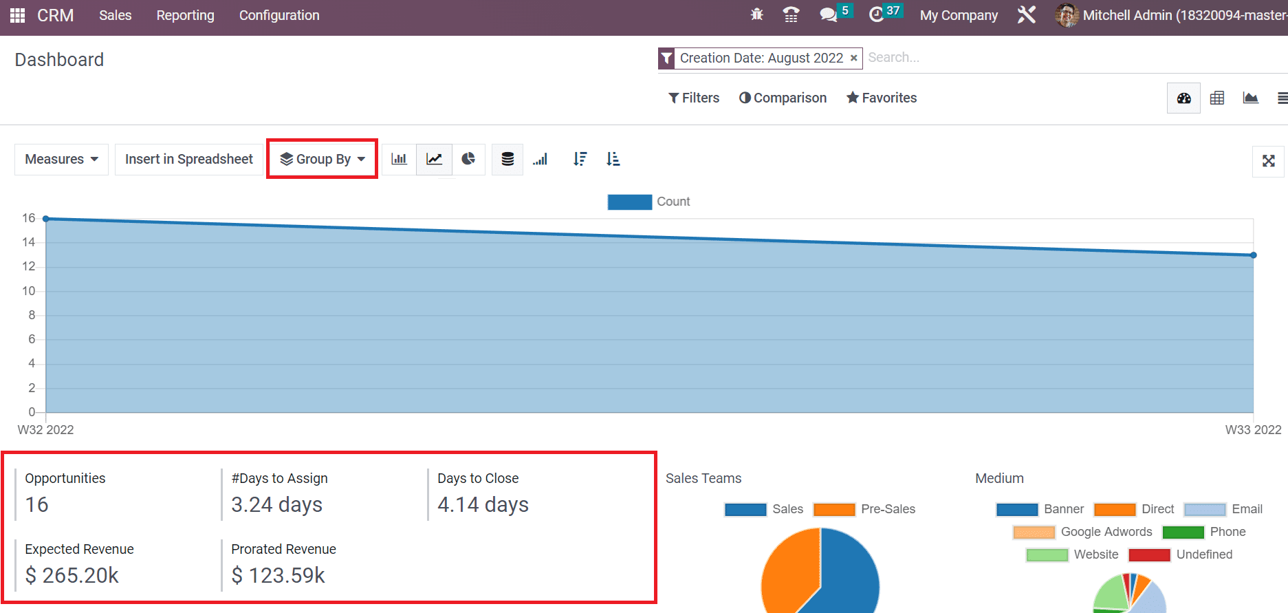
Users can also view the graph in both bar and pie chart format. The other details available in the graph are the total number of opportunities, the number of days to assign or close, and Expected or Prorated Revenue, as depicted in the screenshot below.
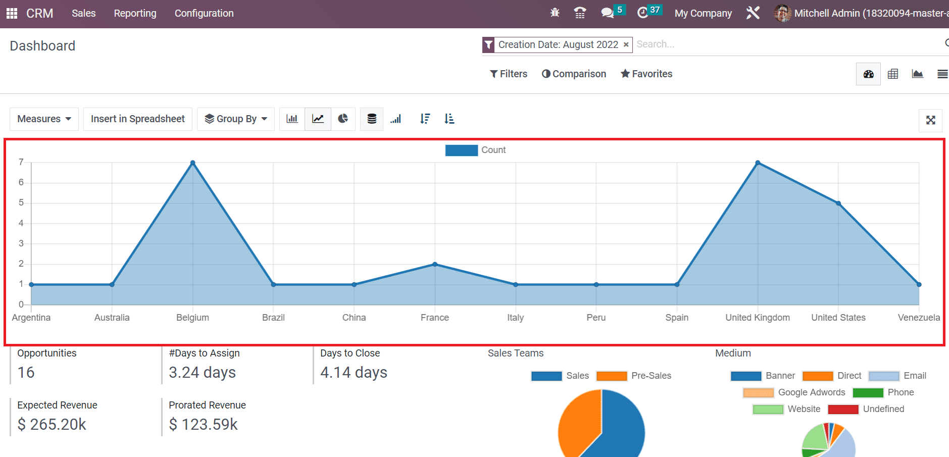
We can group the data based on Country, salesperson, source, sales team, medium, city, and more by selecting the Group By option above the graph. For example, if you choose Country below the Group By option, you can access individual results on a graphical representation, as illustrated in the screenshot below.
A pie chart representing the opportunity count by Sales Teams and the medium used by the team is viewable to you below the right end of the graph. Users can view the count of Sales and Pre-Sales teams separately inside the pie chart as in the screenshot below.
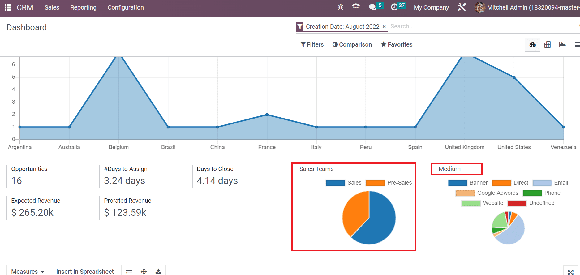
Right next to the Sales teams chart, we can see the medium for sales. Some of the channels used by the sales team include google Adwords, website, email, phone, etc. Each medium is displayed in different colors on the pie chart below the Medium section, as noted in the above screenshot. Furthermore, you can obtain the pivot table at the bottom of the Dashboard window. The Pivot table separately shows each admin's count, Expected, and prorated revenue. Using the Measures option, you can apply more measures to the Pivot table, as portrayed in the screenshot below.
Forecast
We can predict the upcoming closing of opportunities per month in the form of analytical reports using the forecast feature. You can access the Forecast menu below the Reporting tab, and a list of upcoming or expected closings is visible in the List view. The data regarding forthcoming opportunities such as Company, Email, Revenue, salesperson, and more are available in the List view of the Forecast window, as demonstrated in the screenshot below.
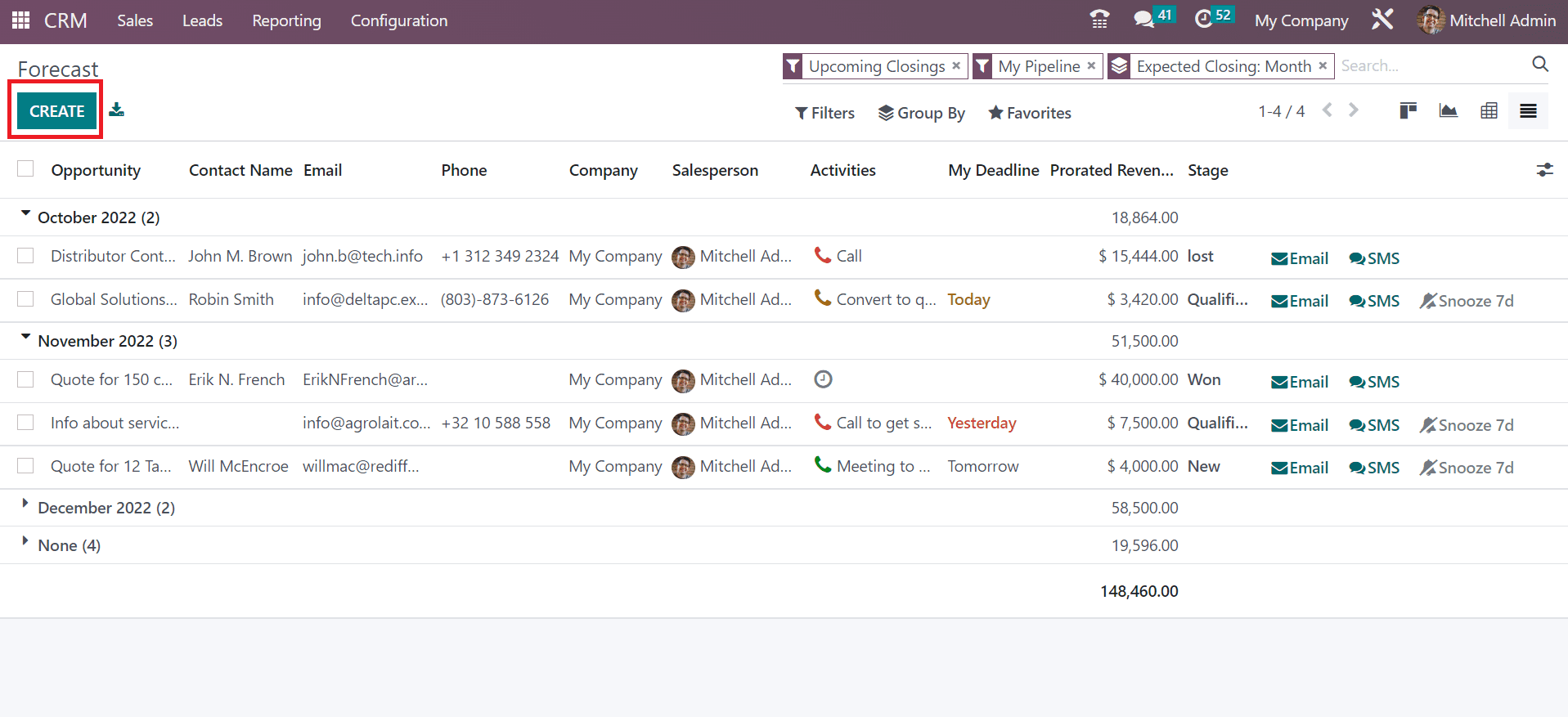
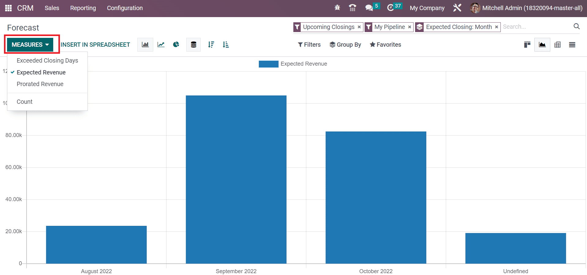
Users can generate new forecast data for the upcoming month by clicking on CREATE button, as shown in the above screenshot. On the Graph view, we can obtain the expected revenue count for upcoming months in a graphical representation. We can apply more values to the graph by choosing the MEASURES button, as cited in the screenshot below.
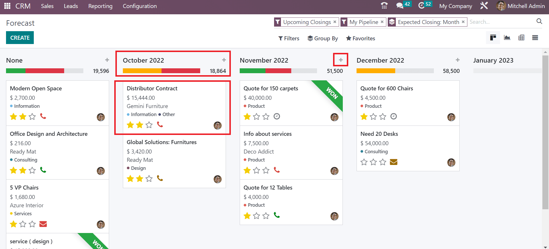
In the Kanban view, you can see the opportunities forecast under different months. We can access the revenue count below each month, and other data regarding opportunity relies separately on the Forecast window. To add a new opportunity, press the +icon near a specific year, as indicated in the screenshot below.
Analysis of Pipeline
The report of created pipelines is accessible easily through the Reporting feature of the Odoo 16 CRM module. In the Graph view of a Pipeline Analysis window, you can view the stage details on the X-axis and the Count on the Y-axis.
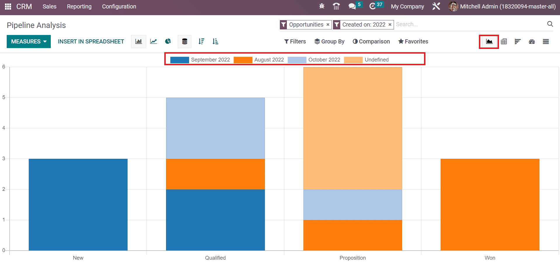
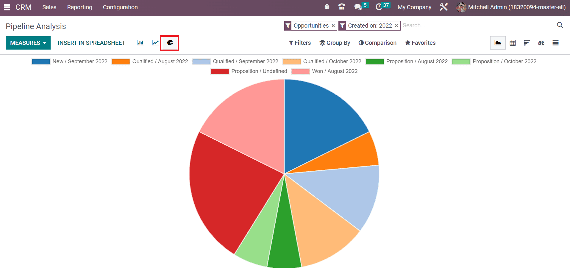
At the top of a graphical representation, you can view the count of each stage in a specific year. Using the MEASURES button, we can add various measures, including Days to Close, Expected Revenue, Days to Assign, and more. By choosing the Pie chart, you can acquire data in the form of a circle format, and the count of each stage shows in different colors.
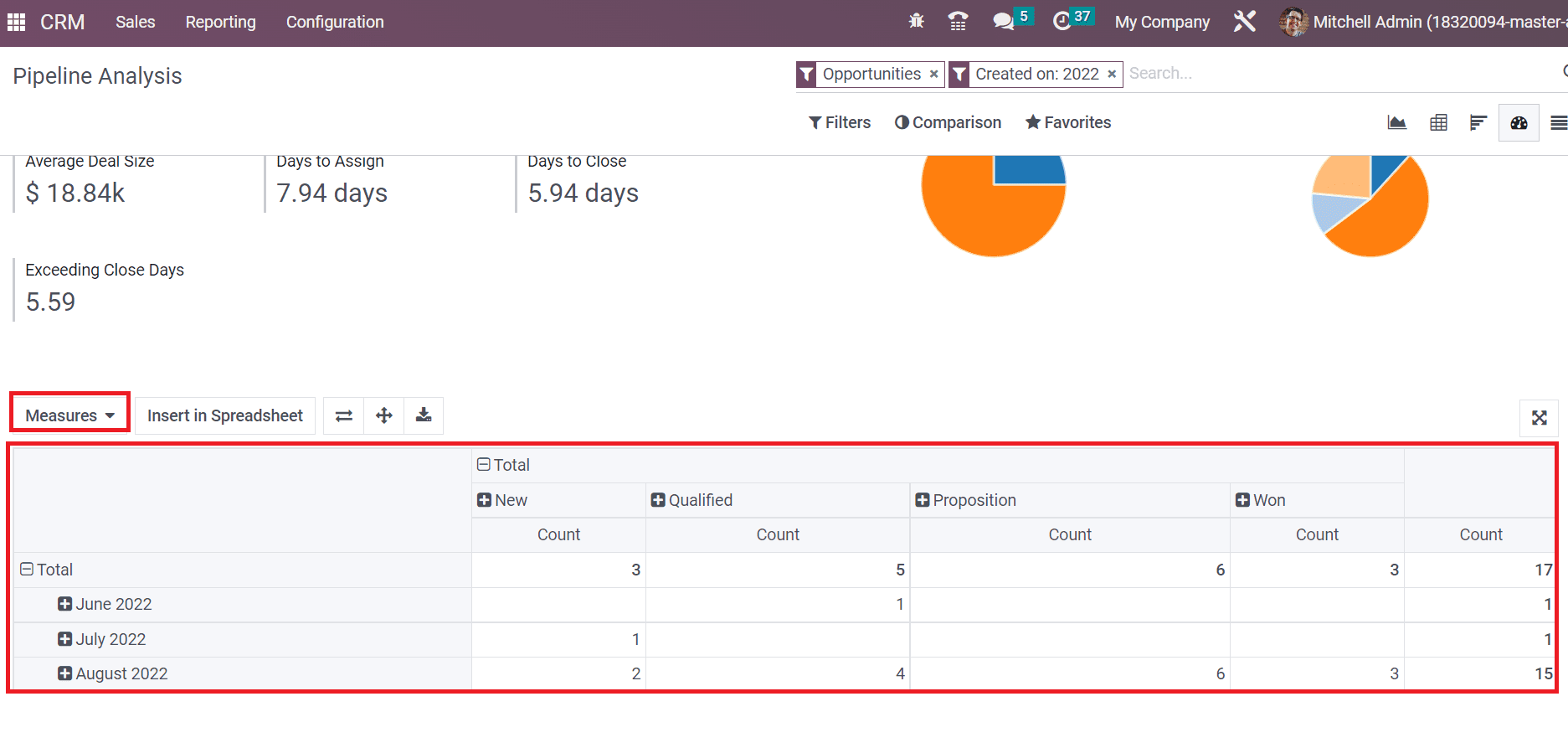
The dashboard view of the Pipeline Analysis window depicts graphical, pivotal, and cohort data analysis. Users can obtain the total number of Opportunities, Days to Close, Expected Revenue, Average Deal Size, Prorated Revenue, and Exceeding Close Days below the graphical representation as described in the screenshot below.
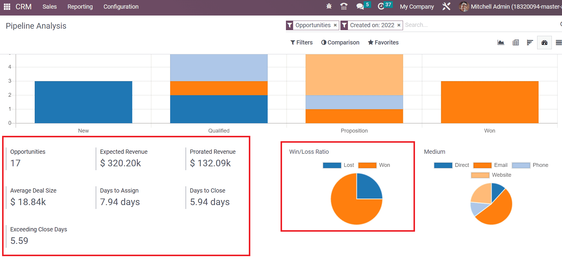
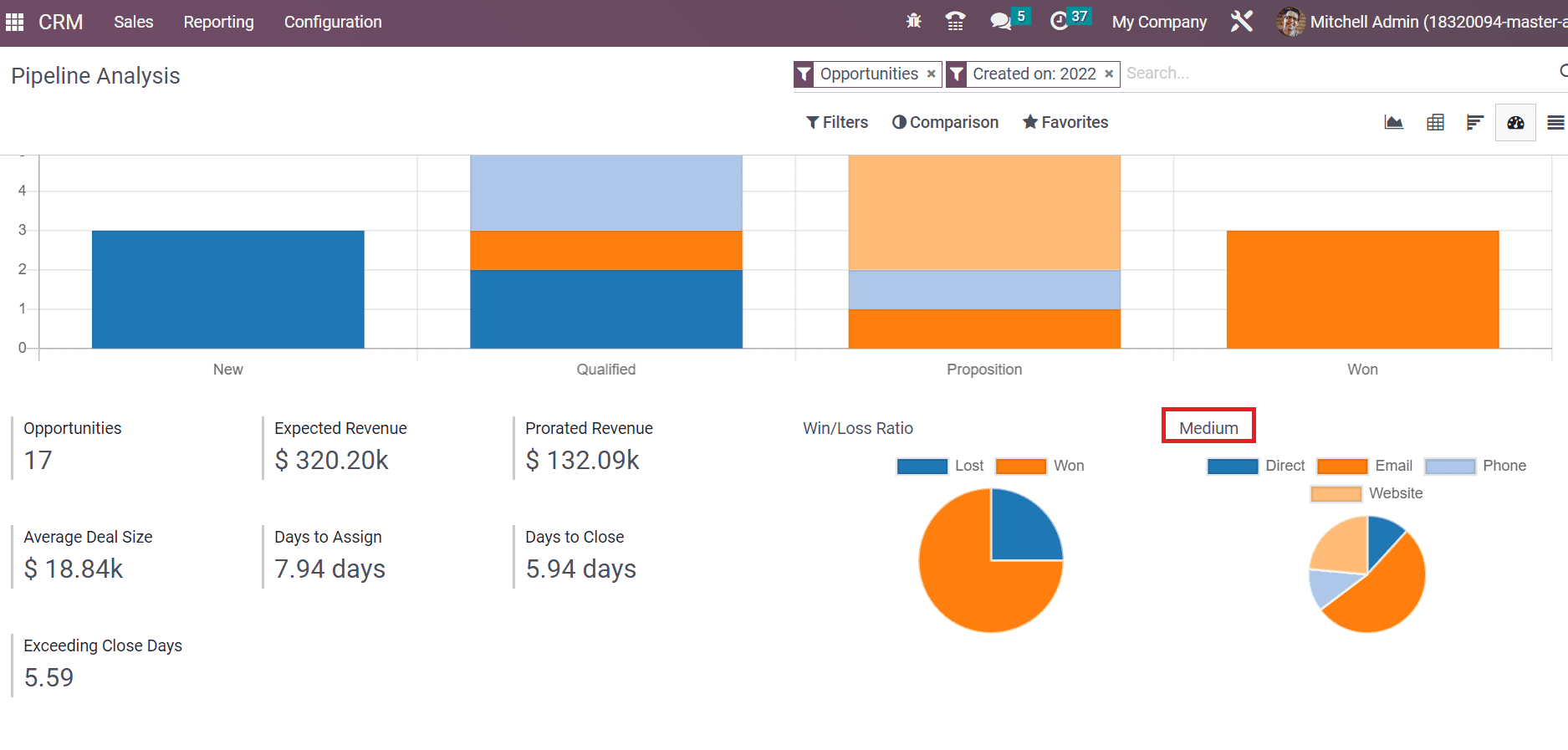
A pie chart showing pipelines' Win/Loss ratio is visible below the graph. Additionally, we can view the medium for necessary pipelines, such as website, email, etc., in the pie chart below the Medium section
Inside the Pivot table, you can access the total count of pipelines on a specific month. We can specify various features to the pivot table by selecting the Measures button.
At the end of the Pipeline Analysis window, we can see the Cohort table. It shows an average of pipelines based on a closed date in a percentage rate. Users can sort out the cohort table per Month, Day, Week, and Year.
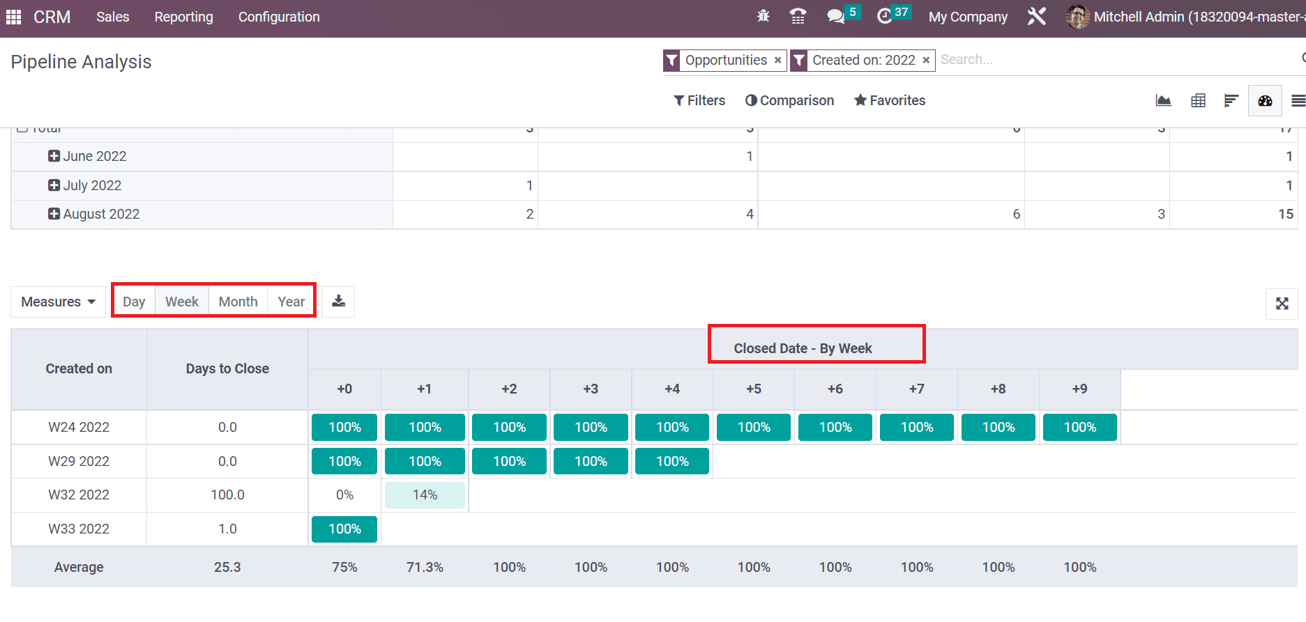
Here, you can acquire a pipeline according to the closed date by a week. Hence, it is easy to evaluate pipelines within the Dashboard view of the Pipeline Analysis window.
Leads Analysis
The evaluation of created leads in CRM is easily accessible through Reporting feature. Select the Lead menu inside Reporting tab, and a graphical representation is viewable inside the Graph view of the Lead Analysis window. The count of leads on a specific month is viewable in the graph for a user.
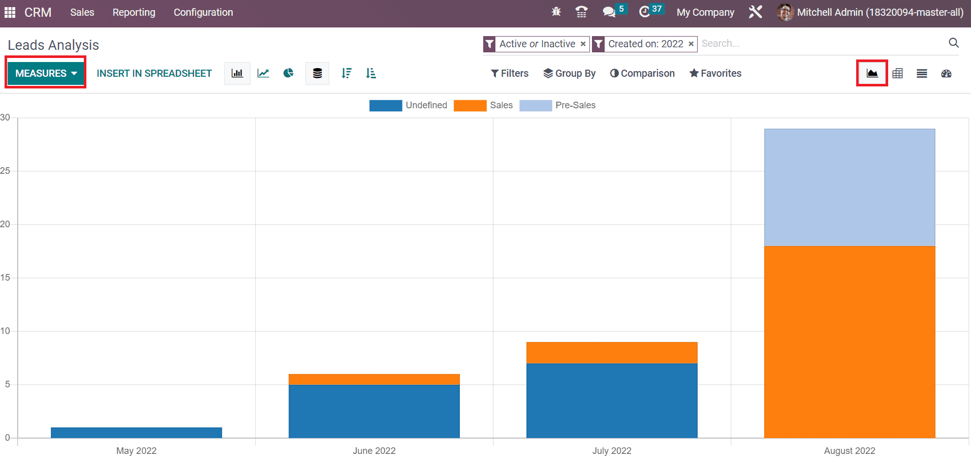
Using the MEASURES button, we can specify other values in the graph. A record of all leads is attainable to you by choosing the List view of the Lead Analysis window. In the List view, we can view the information of each lead, containing Email, Stage, Company, Lead, Salesperson, and more.
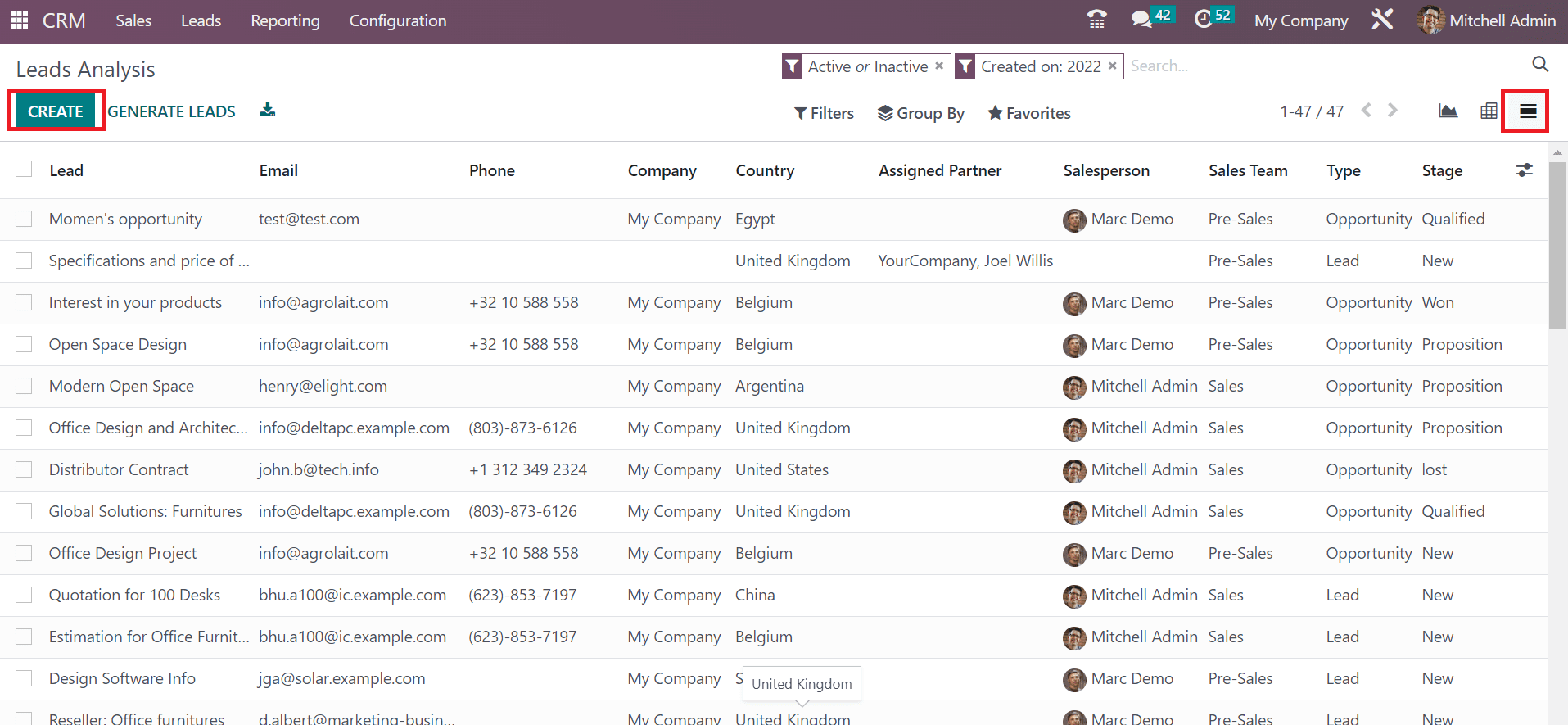
A new lead develops quickly by clicking on the CREATE icon in the Lead Analysis window.
Activities
Using the Reporting feature, we can evaluate activities scheduled in your company regarding leads. You can obtain the Activities menu from the Reporting tab and analyze it quickly. In the Graph view, we can see the count of each activity on the Y-axis of the graphical representation.
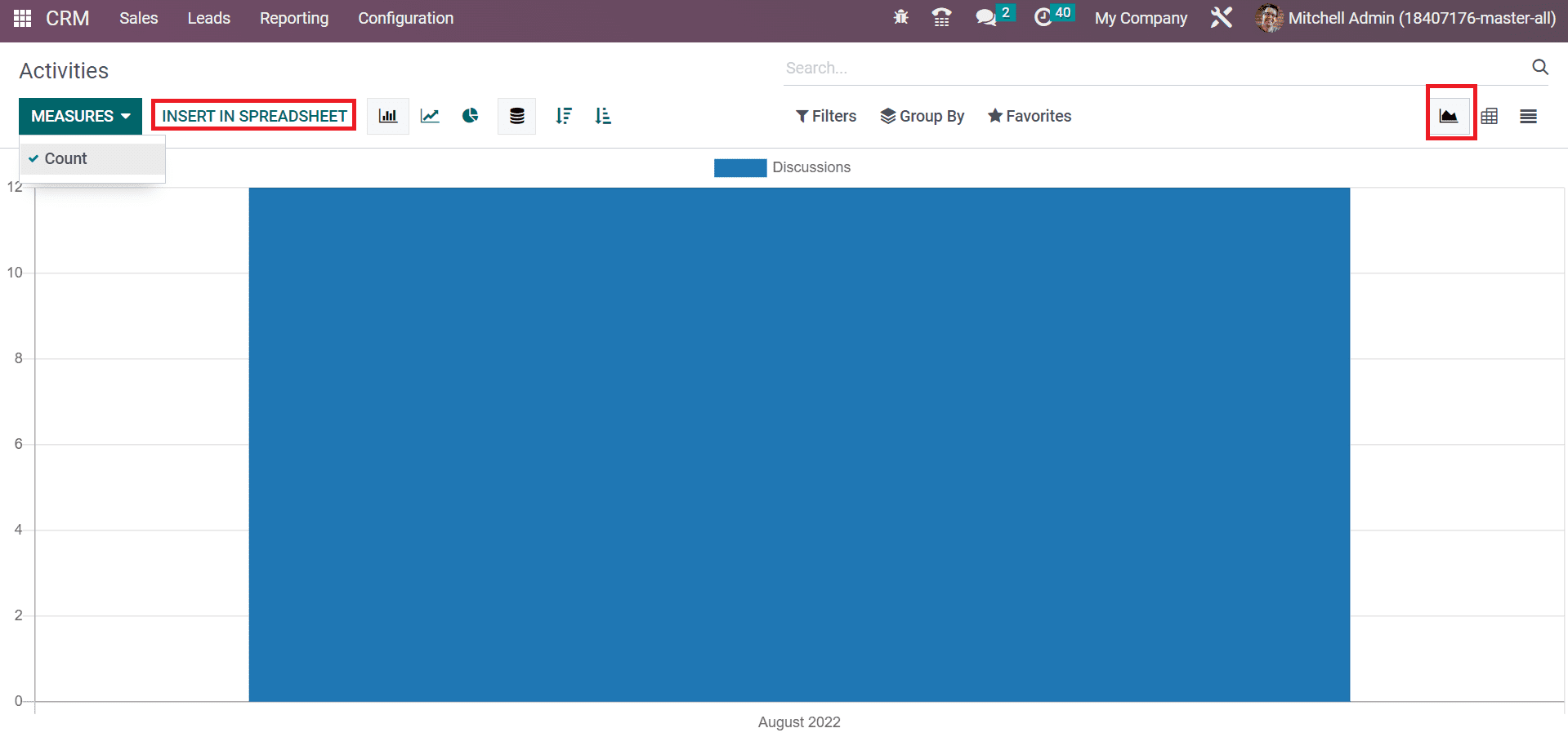
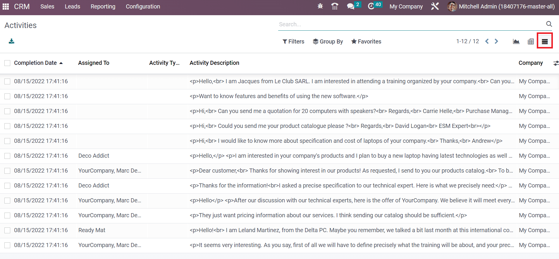
Choosing a spreadsheet for your graph is accessible by selecting the INSERT IN SPREADSHEET button in the Activities window. In the List format, the user can see records concerning all activities such as Completion Date, Activity Type, Company, and Assigned To data.
Partnerships
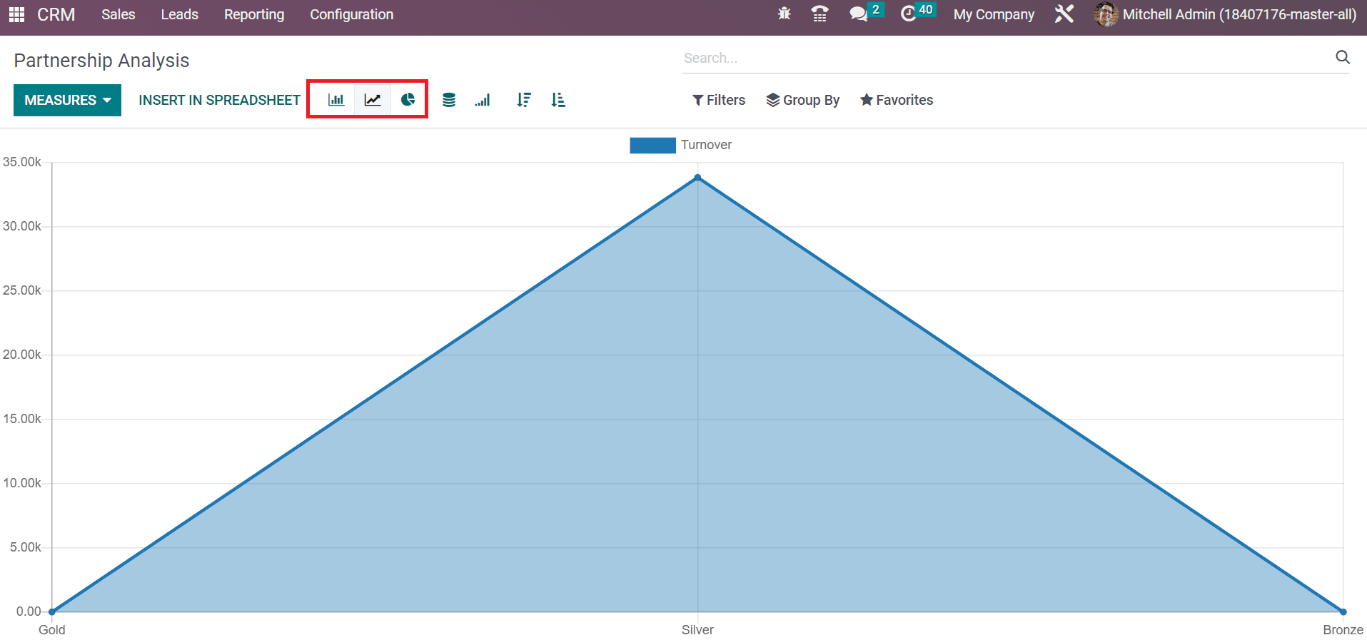
Users can analyze the partnerships within the Reporting feature of Odoo 16 CRM. In the Partnership Analysis window, a graphical illustration contains Turnover details on Y-axis. We can access the graph in Pie, Bar, or Line format and evaluate data quickly.
Hence, knowing about partnership analysis in the CRM module is possible.
The Reporting feature of Odoo ERP ensures users deeply analyze data in a specific module. A company can make further improvements by evaluating data at the year-end. It assists in formulating new changes in a firm on particular sections. All these are made possible with the support of Odoo 16.