There may be many instances where we need to add charts to our templates or dashboard to make the data more visually appealing and easier to understand for the users. That’s where the chart.js library comes in handy. Using chart.js we can create a wide variety of charts and use them in Odoo. In this blog, let’s discuss different charts in Odoo and how to use them.
Chart.js is a free JS library that enables us to create HTML-based charts. We get access to a wide variety of inbuilt charts using chart.js.
The most commonly used charts in chart.js includes:
1) Scatter Plot Chart
2) Line Chart
3) Bar chart
4) Pie Chart,
5) Doughnut Chart
To enable chart.js features, we can either use the cdnjs link as an src attribute in the script tag or pull chart.js from git and add it to manifest. We can decide the version of chart js we want to use depending on our requirements, though it’s always better to opt for the latest version.
The next step is to add the XML file where we want the chart to be displayed, and charts are basically displayed on a canvas. So we need to mention the canvas using the <canvas> tag where we’ll be showing the chart, and please note that we should provide a unique id and mention the height and width of the canvas.
<canvas id="chart_example" height="400px" width="400px"/>
Now that we have a canvas for the chart, it’s time to add the chart to the canvas.
Let’s start with the Scatter Plot Chart.
The basic syntax of the chart is:
new Chart(“id of canvas”, {
    type = “type of graph”,
    data = { “data of the graph” },
    options = {“options of the graph” }
});
The type, data, and options change depending on the graph we want. In this blog, I’ll explain one example for each type of graph.
Scatter Plot Chart
The scatter plot chart is defined by giving the type “scatter.” The scatter plot chart takes data as a dictionary for the x and y axes. We can also define the step of the axes, the color of the dots, give labels, etc., in chart.js, but here, we are going to create a simple scatter plot graph with data and background color and keep other attributes default.
An example of a scatter plot chart is given below.
var chart = new Chart("chart_example", {
    type: "scatter",
    data: {
        datasets: [{
            data: [{
                x: 10,
                y: 10
            }, {
                x: 20,
                y: 20
            }, {
                x: 30,
                y: 30
            }, {
                x: 40,
                y: 40
            }, {
                x: 50,
                y: 50
            }],
            pointBackgroundColor: "black",
        }]
    },
    options: {}
});
Here we create a basic scatter chart and the output we get is:
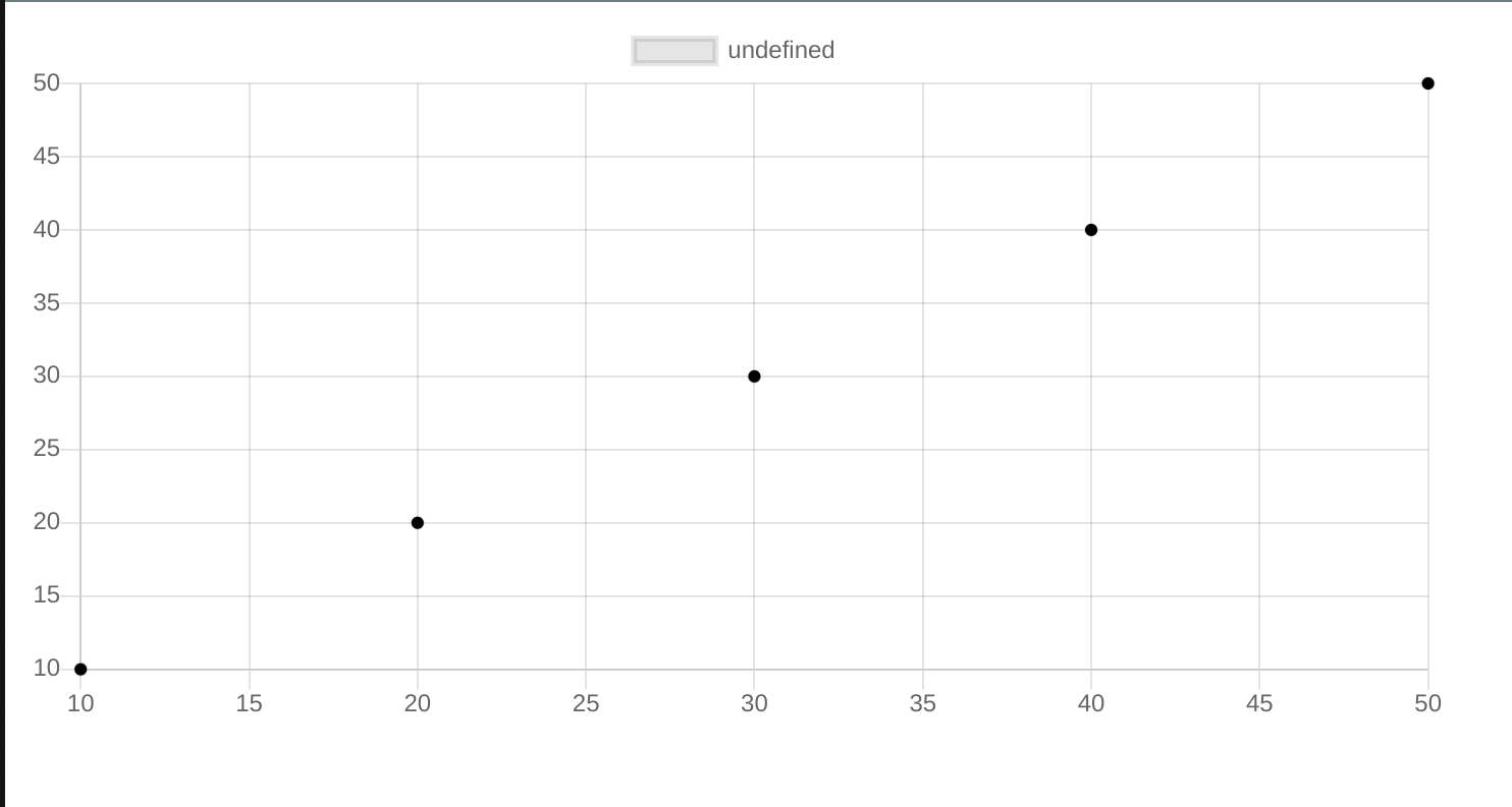
We can see the x and y values are mapped based on the data we give in the datasets.
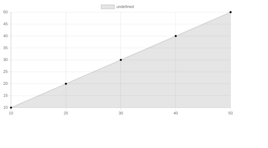
Line Chart
Line chart is basically like a scatter plot chart but it has a line connecting the dots. It’s defined by giving the type as “line”.
An example of a simple line chart is given below.
var chart = new Chart("chart_example", {
    type: "line",
    data: {
        labels: [10, 20, 30, 40, 50],
        datasets: [{
            data: [10, 20, 30, 40, 50],
            pointBackgroundColor: "black",
        }]
    },
    option: {}
});
Here, we give labels for the values on X-axis and data for the values on the Y axis.
The output of the above line chart is:
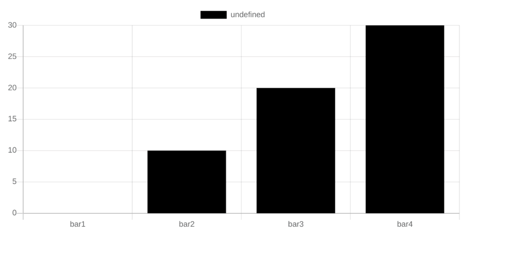
Bar Chart
Bar chart is the most commonly used chart in Odoo. The data is presented as a rectangular bar in the bar chart. Bar chart is defined by giving the type “bar’. We can give individual color to the bars if we want to make it more defined.
An example of a bar chart is shown below.
var chart = new Chart("chart_example", {
    type: "bar",
    data: {
        labels: ["bar1", "bar2", "bar3", "bar4"],
        datasets: [{
            backgroundColor: "black",
            data: [0, 10, 20, 30]
        }]
    },
    options: {}
});
Like the line chart, the labels define the values of the X-axis and data define the values of the Y-axis.
The output of the above bar chart is:
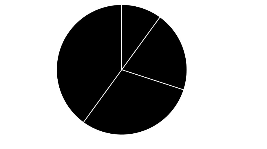
Pie Chart:
Next, we’ll discuss pie charts. A pie chart is divided into sectors based on the data. The total value is taken as 100%, and the sectors are divided accordingly. Like a bar chart, we can give specific colors for each sector of the pie chart. To specify a pie chart, we give the type “pie.”
An example of the pie chart is given below:
var chart = new Chart("chart_example", {
    type: "pie",
    data: {
        datasets: [{
            backgroundColor: "black",
            data: [0, 10, 20, 30, 40]
        }]
    },
    options: {}
});
In the pie chart, the sum of values in data is taken as 100% and each value is divided as a sector from the total. The output of the above chart is:
Doughnut chart
The next is a doughnut chart, which is basically a pie chart with a hole in the middle. We can change a pie chart to a doughnut chart simply by changing the type to “doughnut,” as the values processed are the same.
An example of a doughnut chart is given below:
var chart = new Chart("chart_example", {
    type: "doughnut",
    data: {
        datasets: [{
            backgroundColor: "black",
            data: [0, 10, 20, 30, 40]
        }]
    },
    options: {
    }
});
The output of the above doughnut chat is: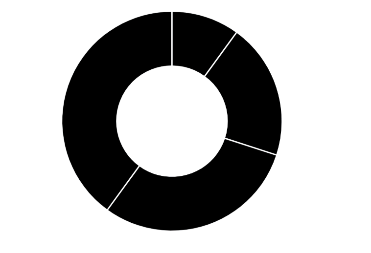
These are the basic charts in chat.js that we can add in Odoo. The artistic aspect of charts depends on the individual, so be creative and experiment with colors and other attributes. Give fancy colors, titles, etc to chart and make them stand out. That’s it about the charts in this blog. Feel free to reach out in the comment section in case of any queries.