Bootstrap is an open-source templating framework for CSS styling. It helps the developers and web designers to make their design more responsive and stylish by using predefined classes and other layouts. Bootstrap provides functionalities to design and manipulate different views for different screen resolutions like desktops, tabs, and mobiles.
Odoo uses bootstrap to make its beautiful user interface. Odoo is known as one of the best user-friendly web applications. Thanks to bootstrap.
Today, in this section, we are going to take a look at the basics of Bootstrap and its styling attributes.
Bootstrap grid system
One of the main attractive styles structure of Bootstrap is its Grid system. Grid division contains an equal 12 column subdivisions which are encapsulated in a row division.
Basic structure
<div class="container">
<div class="row">
<div class="col-*-*"></div>
<div class="col-*-*"></div>
</div>
<div class="row">
<div class="col-*-*"></div>
<div class="col-*-*"></div>
<div class="col-*-*"></div>
</div>
<div class="row">
...
</div>
</div>
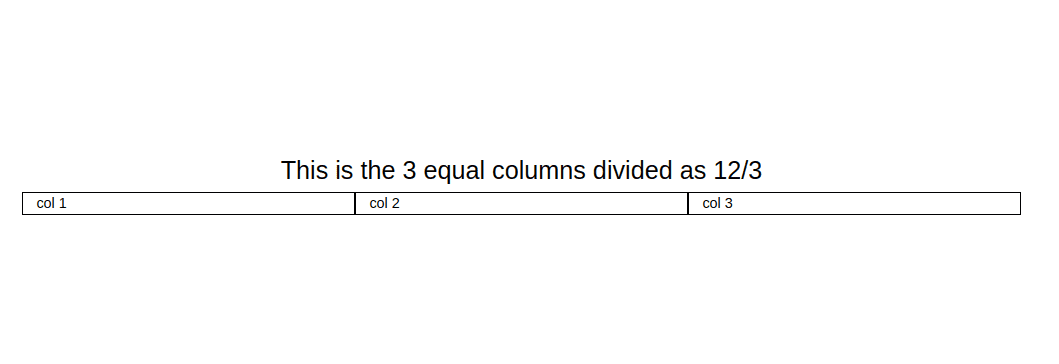
In the above example, we have divided the total 12 columns into 3 subparts which merged 4 columns equally. Here is the code snippet of the above example.
<div class="container">
<h3 class="text-center">This is the 3 equal columns divided as 12/3</h3>
<div class="row">
<div class="col-4" style="border: 1px solid black;">col 1</div>
<div class="col-4" style="border: 1px solid black;">col 2</div>
<div class="col-4" style="border: 1px solid black;">col 3</div>
</div>
</div>
In the grid system, we have to create a parent div and its class should be ‘container’ or container-fluid. Then we have added one more div with class ‘row’ in order to create horizontal groups for columns. We need 3 equal columns. So, within the ‘row’ div, we have added 3 divs. We can specify how many columns should be merged by adding numbers along with ‘col-’ up to 12. So, we want 3 equal columns. for that, we have merged 4 columns (12/3).
Another example with 2 rows:
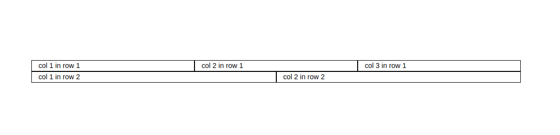
<div class="container">
<div class="row">
<div class="col-4" style="border: 1px solid black;">col 1 in row 1</div>
<div class="col-4" style="border: 1px solid black;">col 2 in row 1</div>
<div class="col-4" style="border: 1px solid black;">col 3 in row 1</div>
</div>
<div class="row">
<div class="col-6" style="border: 1px solid black;">col 1 in row 2</div>
<div class="col-6" style="border: 1px solid black;">col 2 in row 2</div>
</div>
</div>
Grid system responsive classes
We have discussed that Bootsrap is a web-responsive framework. In order to apply a responsive view on the page, it has some pre-defined classes, which change its styles and layouts based on the page resolution(divides).
? xs : For phones - screens less than 768px wide
? sm : For tablets - screens equal to or greater than 768px wide
? md : For small laptops - screens equal to or greater than 992px wide
? lg : For laptops and desktops - screens equal to or greater than 1200px wide
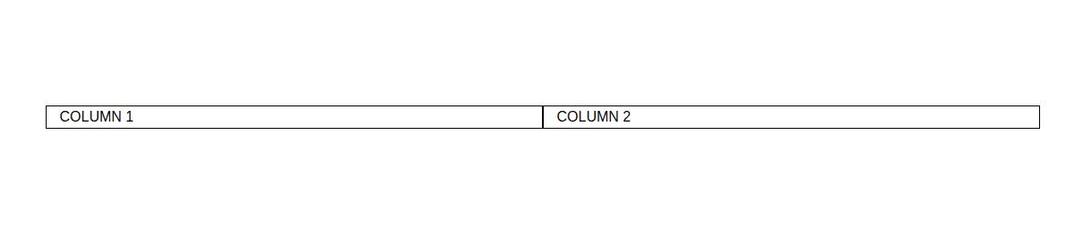
Example
Let’s take a look at how do these classes help the designers and developers to make their content responsive.
<div class="container-fluid">
<div class="row">
<div class="col-sm-3 col-md-6">
COLUMN 1
</div>
<div class="col-sm-9 col-md-6">
COLUMN 2
</div>
</div>
</div>
You can use the container-fluid class instead of a container class in order to change the whole div size in any amount as you wish. Let us check what would be the result of the above one.
1. Normal size(Desktops and laptops)
2. Small size(Mobile view)
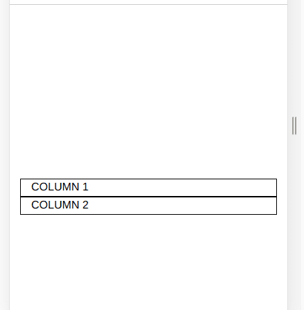
As you see, when the screen size changes, Bootstrap automatically changes its sizes and columns. So, end-users will be able to handle the website (or any kind of web views like web applications) in all kinds of screen sizes without overlapping or disorder of the divisions.
Odoo Blogs Odoo Development Tutorials Odoo Apps