Odoo has many field widgets, including status bars, checkboxes, radio buttons, floats, percentages, color selectors, URLs, etc. We can alter the view with the widget by using different rendering templates. Furthermore, it helps us to design for our needs, which will simplify, expedite, expand, and enhance the efficacy of our development.
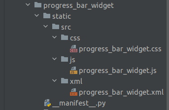
The structure of the module we will create is shown in the following image.
Let's create the "progress_bar_widget.xml" XML file, where a new template called "ProgressBarWidget" is defined. There are two classes, progress_number and progress-bar-inner. The class 'progress_number' displays the percentage of progress, and the class 'progress-bar-inner' specifies the style of the progress bar. I've specified the progress bar's height and background color. Additionally, you have complete control over these style parameters.
XML File: progress_bar_widget.xml
<?xml version="1.0" encoding="utf-8"?>
<templates id="template" xml:space="preserve">
   <t t-name="ProgressBarWidget" owl="1">
       <div t-ref="ProgressBarWidget-root">
           <div class="progress_bar">
               <div class="pro-bar">
                   <span class="progress-bar-inner"/>
                   <span class="progress_number"/>
               </div>
           </div>
       </div>
   </t>
</templates>
CSS File: progress_bar_widget.css
.progress_bar .pro-bar {
  background: hsl(0, 0%, 97%);
  box-shadow: 0 1px 2px hsla(0, 0%, 0%, 0.1) inset;
  height: 4px;
  width: 200px;
  margin-bottom: 15px;
  margin-top: 10px;
  position: relative;
}
.progress_bar .progress_number {
  float: right;
  margin-top: -6px;
  margin-right: -50px;
}
.progress_bar .progress-bar-inner {
   background-color: green;
   display: block;
   width: 0;
   height: 100%;
   position: absolute;
   top: 0;
   left: 0;
   transition: width 1s linear 0s;
}
.progress_bar .progress-bar-inner:before {
   content: "";
   background-color: hsl(0, 0%, 100%);
   border-radius: 50%;
   width: 4px;
   height: 4px;
   position: absolute;
   right: 1px;
   top: 0;
   z-index: 1;
}
.progress_bar .progress-bar-inner:after {
   content: "";
   width: 14px;
   height: 14px;
   background-color: inherit;
   border-radius: 50%;
   position: absolute;
   right: -4px;
   top: -5px;
}
Let's move on to JavaScript, where we will be creating a class called "ProgressBarWidget" for our progress bar by extending the class "Component".
/** @odoo-module **/
import { registry } from "@web/core/registry"
import { standardFieldProps } from "@web/views/fields/standard_field_props";
const { Component, useRef, onMounted, onPatched} = owl;
class ProgressBarWidget extends Component{
    setup(){
       this.root = useRef('ProgressBarWidget-root')
       onMounted(this.onUpdateProgressBar)
       onPatched(this.onUpdateProgressBar)
    }
    onUpdateProgressBar(){
       if (this.props.value <= 100){
           this.widthComplete = parseInt(this.props.value/100 * 100);
       }else{
           this.widthComplete = 100;
       }
       this.root.el.querySelector('.progress-bar-inner').style.width = this.widthComplete+'%'
       this.root.el.querySelector('.progress_number').textContent = this.widthComplete+'%'
    }
}
ProgressBarWidget.template = 'ProgressBarWidget'
ProgressBarWidget.props = standardFieldProps
ProgressBarWidget.supportedTypes = ["float", "integer"];
registry.category("fields").add("progress_bar_widget", ProgressBarWidget)
The setup method is a lifecycle method in Odoo components. It initializes the component by setting up a reference to the root element using useRef, and it attaches event handlers using ‘onMounted’ and ‘onPatched’.The method, ‘onUpdateProgressBar,’ is responsible for updating the progress bar based on the value provided in the props. It calculates the width of the progress bar and updates the corresponding elements in the DOM. Add templates, props, and supportedTypes to the progress bar lastly. Types that are supported by the ProgressBarWidget include "float" and "integer" fields. Register the ProgressBarWidget in the Odoo registry under the "fields" category with the name "progress_bar_widget".
File: __manifest__.py
'assets': {
   'web.assets_backend': {
       '/progress_bar_widget/static/src/xml/progress_bar_widget.xml',
       '/progress_bar_widget/static/src/css/progress_bar_widget.css',
       '/progress_bar_widget/static/src/js/progress_bar_widget.js',
   },
},
Apply our widget ‘progress_bar_widget’ to the field.
<field name="progress" widget="progress_bar_widget"/>
Output:
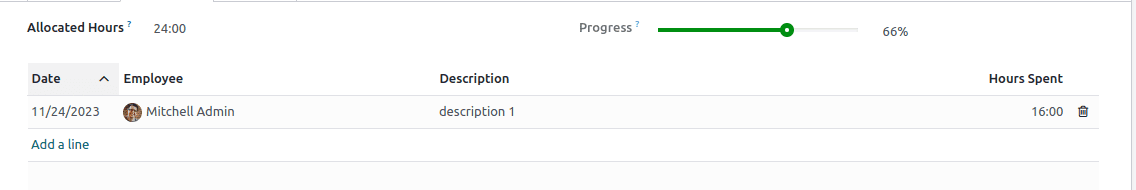
The automatic progress bar update based on timesheet entries in Odoo provides a seamless and visual representation of task completion. By integrating estimated hours and completed hours within the project task model, users can easily monitor progress without manual intervention. To read more about How To Create a Progress Bar in Odoo , refer to our blog How To Create a Progress Bar in Odoo.