In Odoo, widgets are front-end tools designed to improve the user experience by offering interactive and intuitive elements. They enable developers to customize how fields behave and appear within various views, like forms, kanban boards, lists, and others. Widgets play a key role in managing complex UI interactions and modifying how users interact with data.
In this Blog, we'll explore how to make a slider widget in Odoo 18. The creation involves defining the widget and registering it under the field widgets category. A slider widget in Odoo is typically used within form views, allowing users to select values by dragging a slider instead of typing numbers manually. This is especially useful for inputs like percentages, ratings, or quantities within a specific range.
Here, our focus will be on slider widgets for integer fields, though it's possible to make the widget compatible with other field types by specifying them in the JavaScript configuration. Also, you can define the slider’s minimum and outside values when assigning it to a field.
To begin, you'll need to create a JavaScript file that contains the logic and behavior of the widget.
range_slider.js:
/** @odoo-module **/
import { Component } from "@odoo/owl";
import { useState } from "@odoo/owl";
import { registry } from "@web/core/registry";
export class RangeSliderField extends Component {
  static template = 'FieldRangeSlider';
  setup(){
       const {min,max} = this.__owl__.parent.props.fieldInfo.attrs
       this.state = useState({
           value : this.props.record.data[this.props.name],
           min : min,
           max : max,
       });
  }
  getValue(e) {
       const config = this.env.model.config
       this.state.value = e.srcElement.value
       this.env.model.orm.write(config.resModel,
                               [config.resId], {
                               [this.props.name]: this.state.value,
       });
  }
}
export const rangeSliderField = {
   component: RangeSliderField,
   displayName: "RangeSliderField",
   supportedTypes: ["int"],
};
registry.category("fields").add("RangeSliderField", rangeSliderField);
The next step is to create an XML file that contains the template structure for the widget. In this case, we’ll name the file range_slider.xml and insert the required structure within it.
range_slider.xml:
<?xml version="1.0" encoding="utf-8" ?>
<templates>
   <t t-name="FieldRangeSlider" owl="1">
       <div class="slidecontainer" t-on-change="getValue">
           <input type="range" t-att-min="state.min or 1" t-att-max="state.max or 10" value="state.value"/>
           <p>Value:
               <span>
                   <t t-esc="state.value"/>
               </span>
           </p>
       </div>
   </t>
</templates>
After that, it's important to include all the necessary files in the module manifest. Both the template and JavaScript files should be added under the appropriate assets section, as shown below.
'assets': { 'web.assets_backend': [ 'range_slider/static/src/xml/range_slider.xml', 'range_slider/static/src/js/range_slider_field.js', ], }With the custom widget created and registered, we can now use it in a field. In our example, we’re applying the widget to the quality_level field in the product.product model.
<record id="product_product_form" model="ir.ui.view">
   <field name="name">product_product.form.inherit</field>
   <field name="model">product.product</field>
   <field name="inherit_id" ref="product.product_normal_form_view"/>
   <field name="arch" type="xml">
       <field name="default_code" position="after">
           <field name="
      widget="RangeSliderField" min="5" max="15"/>
       </field>
   </field>
</record>
Once integrated, the field will appear with a visual slider interface.
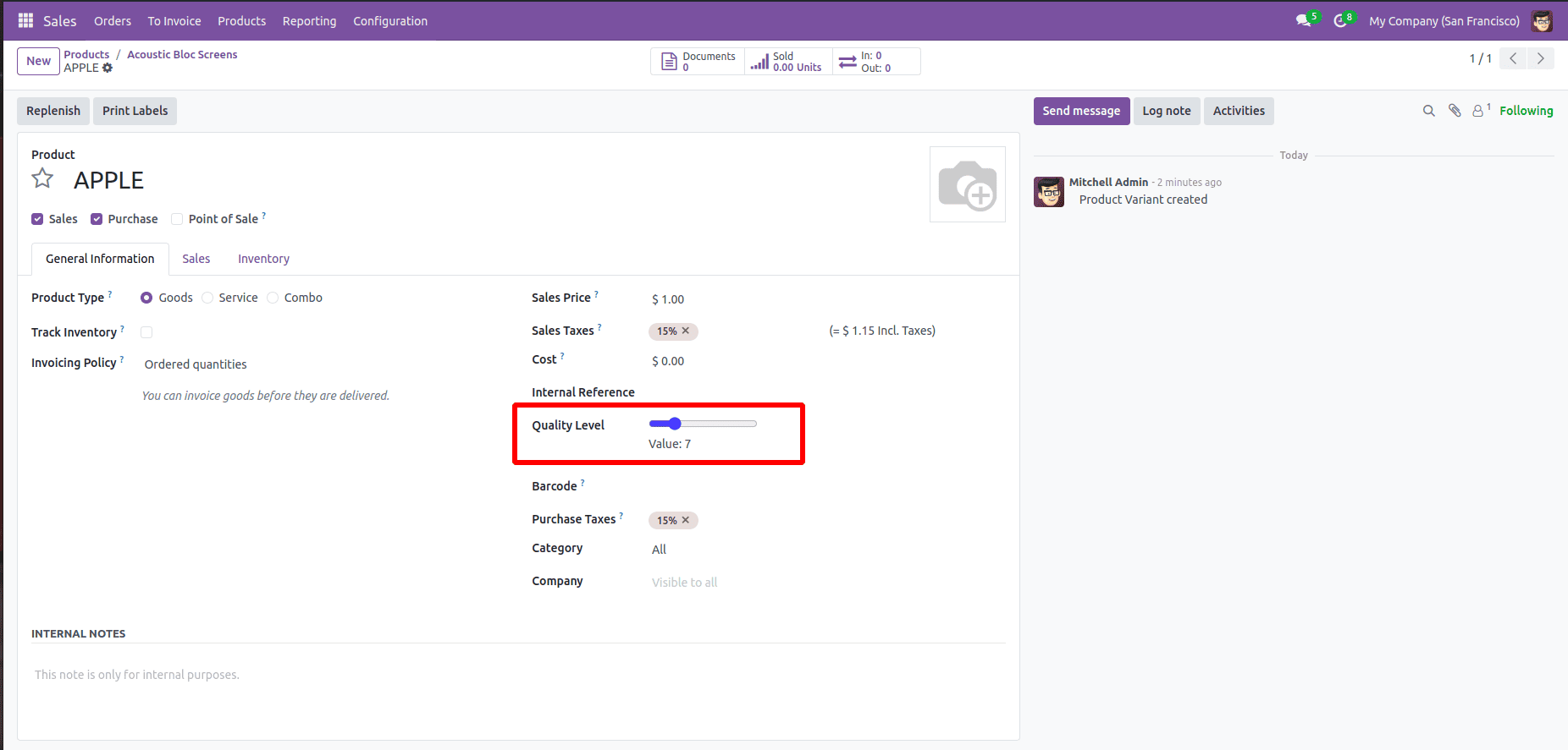
The slider allows the user to adjust the value by dragging it in either direction. This makes it easy to select a desired value quickly and accurately.
In conclusion, the slider widget is a flexible and user-friendly component that simplifies numeric input within a fixed range. You can also develop other types of widgets based on your requirements by modifying the code structure accordingly.
To read more about How to Create a Slider Widget in Odoo 17, refer to our blog How to Create a Slider Widget in Odoo 17.