In Odoo’s backend, different widgets such as one2many, many2many, and many2many_tags make working with selection fields much more efficient. These widgets are enhanced through the Select2 JavaScript library, which adds dynamic features and improves usability. Reproducing the same smooth functionality without a library like Select2 is quite challenging.
This blog will walk through the various types of selection fields powered by Select2, explain how they make form building easier, and outline their implementation with clear examples and syntax.
Basic Select2 Field
A basic Select2 field is essentially an enhanced dropdown menu that lets users choose one or more items from a list. Unlike the standard HTML <select> element, it comes with powerful features such as built-in search, multi-selection, tagging, and a cleaner interface design.
In Odoo and other web applications, Select2 is widely used to make selection fields more user-friendly. It allows users to quickly filter through long lists, pick multiple values, or even create new entries on the fly.
To enable Select2 in Odoo 18, you need to load the library’s styles and scripts. This can be done by adding the Select2 CSS CDN link inside the web.assets_frontend section of your module’s __manifest__.py file, ensuring the dropdown styling is applied correctly.
'https://cdn.jsdelivr.net/npm/select2@4.1.0-rc.0/dist/css/select2.min.css,
In this setup, the Select2 JavaScript library is not added through the manifest directly but instead imported into the custom JavaScript file. This is done by referencing the CDN link and loading it with the loadJS utility, ensuring the library is available wherever the script is used.
loadJS("https://cdnjs.cloudflare.com/ajax/libs/select2/4.0.13/js/select2.min.js")Next, create a new XML file inside the your_custom_module/views directory. In this file, add the following code to include the Select2 assets:
<select name="type"
       t-attf-class="form-control select2_box"
       required="">
   <option value="support">Support</option>
   <option value="feedback">Feedback</option>
   <option value="question">Question</option>
   <option value="complaint">Complaint</option>
   <option value="suggestion">Suggestion</option>
</select>
The next step is to initialize the Select2 plugin inside your custom JavaScript file located at your_custom_module/static/src/js. For this, you can target elements with the advanced-select class.
In this setup, the Select2 library is brought in directly through the JavaScript file by using loadJS with the CDN link.
/** @odoo-module **/
import publicWidget from "@web/legacy/js/public/public_widget";
import { loadJS } from "@web/core/assets";
publicWidget.registry.WebsiteCustomerContactRequestForm = publicWidget.Widget.extend({
   selector: ".s_website_form_required",
   init: function (parent, options) {
       this._super.apply(this, arguments);
      // Load Select2 dynamically (ensure it's included)
    loadJS("https://cdnjs.cloudflare.com/ajax/libs/select2/4.0.13/js/select2.min.js").then(() => {
Const selects = document.querySelectorAll('.s_website_form_required select');
          $(".s_website_form_required select").select2();
       }).catch(err => console.error("Error loading Select2:", err));
   },
});
Finally, add references to both files in the __manifest__.py file so that Odoo can load them properly.
'data': [
       'views/templates.xml',
   ],
'assets': {
       'web.assets_frontend': [
           'https://cdn.jsdelivr.net/npm/select2@4.1.0-rc.0/dist/css/select2.min.css',
'custom_contact_form/static/src/js/select2.js',  # Include select2 JS ],
   },
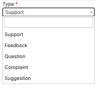
After setting up the Select2 integration, we introduced a new selection field that comes with real-time search and filtering capabilities, as illustrated in the image below.
Select2 with Grouping
The next enhancement is to build a Select2 field that organizes options into groups. This is achieved by making use of the <optgroup> tag, which allows related choices to be displayed under a common heading.
<select name="type"
       t-attf-class="form-control select2_box"
       required="">
   <optgroup label="Group1">
       <option value="support">Support</option>
       <option value="feedback">Feedback</option>
       <option value="question">Question</option>
   </optgroup>
   <optgroup label="Group2">
       <option value="complaint">Complaint</option>
       <option value="suggestion">Suggestion</option>
   </optgroup>
</select>
The enhancements applied to the <select> element using Select2 are powered by JavaScript. In the example below, the initialization is done by targeting the element through its ID selector.
loadJS("https://cdnjs.cloudflare.com/ajax/libs/select2/4.0.13/js/select2.min.js").then(() => {
const selects = document.querySelectorAll('.s_website_form_required select');
$(".s_website_form_required select").select2();
}).catch(err => console.error("Error loading Select2:", err));
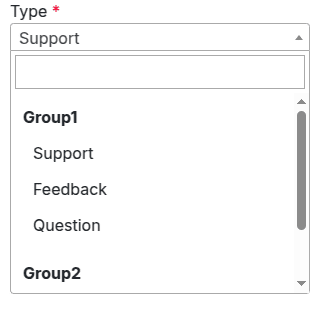
},The screenshot below shows how options appear when using Select2 with grouping.
Select2 with Clear Option Enabled
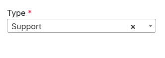
The next example demonstrates how to add a clear option to a Select2 field. This functionality is activated in the JavaScript file by setting the attributes allowClear: true along with a placeholder: "Select an option".
With the clear option enabled, users can easily remove their selection, leaving the field empty if no choice is required.
$(".s_website_form_required select").select2({
        placeholder: "Select an option",
        allowClear: true
    });
The example image below illustrates how a selected option can be removed by clicking the “x” icon displayed next to it.
Select2 with Multi-Selection
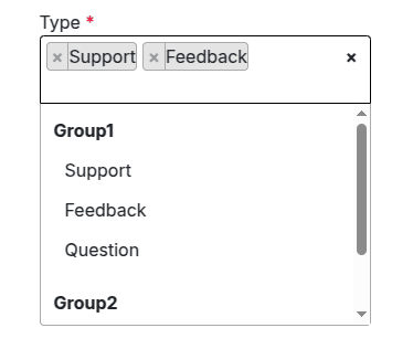
The next step is to create a Select2 field that supports multiple selections. By enabling multiple attributes in the <select> tag, users can choose more than one item from the dropdown list.
Here’s a sample code snippet:
<select name="type"
       t-attf-class="form-control select2_box"
       required="" multiple="" style="width:300px;">
   <optgroup label="Group1">
       <option value="support">Support</option>
       <option value="feedback">Feedback</option>
       <option value="question">Question</option>
   </optgroup>
   <optgroup label="Group2">
       <option value="complaint">Complaint</option>
       <option value="suggestion">Suggestion</option>
   </optgroup>
</select>
Following the same method as in the basic Select2 example, we connect the <select> element to the Select2 functionality using JavaScript.
$(".s_website_form_required select").select2({
        placeholder: "Select an option",
        allowClear: true
    });
The example below shows a Select2 field with multiple selection enabled, allowing users to pick several options from the list.
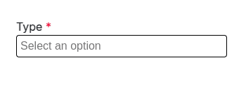
Select2 with Placeholder
The next step is to add a placeholder to the Select2 field. This can be configured in the JavaScript file by setting the placeholder attribute, which displays a hint text when no option has been selected.
$(".s_website_form_required select").select2({
        placeholder: "Select an option",
    });
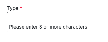
Select2 with Minimum and Maximum Search Input
Select2 allows you to define minimum and maximum character limits for the search input. This helps control when the filtering function is activated. For instance, in large datasets, very short search queries may return too many results, making the minimum input length particularly useful.
The example below shows how to implement both minimum and maximum character restrictions for a Select2 search field.
$(".s_website_form_required select").select2({
        minimumInputLength: 3,
        maximumInputLength: 10
    });
In this demonstration, the filtering feature activates only after the minimum input length requirement is met. An example image is included to illustrate how it works in practice.
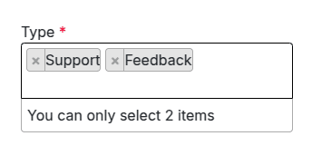
Select2 with Maximum Selection Limit
Next, we introduce a maximum selection limit for a Select2 field that supports multi-selection. This is achieved using the maximumSelectionSize attribute in JavaScript.
$(".s_website_form_required select").select2({
         maximumSelectionLength: 2
   });
For instance, the select field can be configured to allow up to two selections. As users make their choices, Select2 dynamically enforces this limit, providing a smooth and interactive experience, as shown in the accompanying images.
The Select2 JavaScript library provides a wide range of properties and features that enhance the functionality of select fields. Some of the key features include:
- Width – Controls the dropdown’s width using the style attribute.
- Id – Retrieves the ID of the selected option, which can be useful for handling selections programmatically.
- Locked – Prevents changes to the selected option, ensuring its value remains fixed.
- Disabled – Disables specific options to prevent them from being selected accidentally.
- Tokenizer – Converts user input from the search field into selectable options, improving search efficiency.
- Query – Supports dynamic loading of results in real time, keeping the dropdown data up to date.
When combined with Odoo’s native widgets, external libraries like Select2 give developers the ability to build highly customized selection fields. This integration enables the creation of sophisticated user interfaces tailored to the specific needs of the application. By leveraging Odoo’s built-in functionality alongside external libraries, developers gain flexibility and extensibility, allowing for advanced, customized solutions not only for select fields but across the entire application.
To read more about How to Create an Advanced Selection Field in Odoo 18, refer to our blog How to Create an Advanced Selection Field in Odoo 18.