Buttons play a vital role in mobile apps, serving as the main triggers for user actions. In mobile apps, buttons are central to enabling user interaction. They act as the bridge between the user and the app’s functionality, allowing people to perform actions like submitting forms, navigating to other screens, or triggering commands. Whether you need a simple text link, a prominent call-to-action, an icon-only control, or a fully custom-shaped gradient button, Flutter has you covered. In this blog, we’ll explore all the main button types available in Flutter, see when to use each one, and learn how to style them for beautiful, consistent, and accessible UIs.
PopupMenuButton
In Flutter, the PopupMenuButton widget lets you show a list of options in a small pop-up menu when the user taps it. It’s commonly used for overflow or secondary actions that don’t need to be displayed on the screen all the time.
While it’s often shown as the familiar three-dot “more” icon in an app bar, you can also attach it to any custom widget to trigger the menu.
PopupMenuButton<String>(
tooltip: 'Menu',
 onSelected: _handleMenuSelection,
 itemBuilder: (BuildContext context) => [
   const PopupMenuItem(
     value: 'about',
     child: ListTile(
       leading: Icon(Icons.info),
       title: Text('About'),
     ),
   ),
   const PopupMenuItem(
     value: 'reset',
     child: ListTile(
       leading: Icon(Icons.settings),
       title: Text('Settings'),
     ),
   ),
   const PopupMenuItem(
     value: 'exit',
     child: ListTile(
       leading: Icon(Icons.exit_to_app),
       title: Text('Exit'),
     ),
   ),
 ],
),
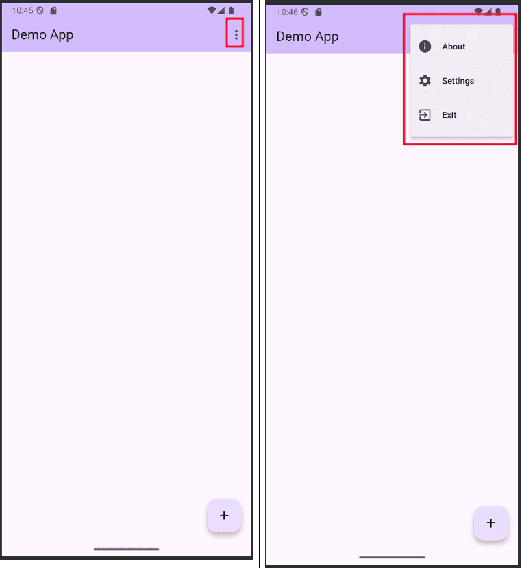
In the above, the first image shows the ‘PopupMenuButton’ button, and in the second image, a PopupMenuItem has been added to it, enabling specific actions to be executed when selected.
IconButton
An IconButton is a clickable widget that contains only an icon instead of written text. It is often placed in areas like the app bar, toolbars, or any part of the interface where you want users to trigger an action by tapping the icon.
IconButton(
 icon: const Icon(Icons.favorite, color: Colors.red),
 onPressed: () {
   ScaffoldMessenger.of(context).showSnackBar(
     const SnackBar(
       content: Text('Favorite icon pressed'),
       backgroundColor: Colors.black,
     ),
   );
 },
),
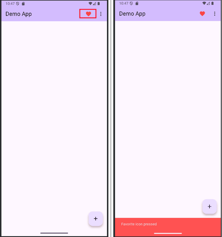
Clicking on the favourite icon will display a short message.
ElevatedButton
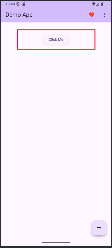
The ElevatedButton widget in Flutter is one of the most commonly used buttons for creating interactive, clickable elements with a raised or 3D-like appearance. It’s part of Flutter’s Material Design library and is ideal for drawing attention to primary actions in your app. By default, an ElevatedButton has a background colour, elevation (shadow), and smooth ripple effect when tapped, giving it a modern and visually appealing look.
ElevatedButton(
 onPressed: () {
   ScaffoldMessenger.of(context).showSnackBar(
     const SnackBar(content: Text('Liked the image')),
   );
 },
 child: const Text('Click Me'),
),
FloatingActionButton (FAB)
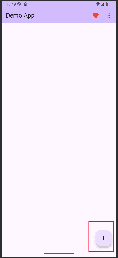
The FloatingActionButton (FAB) in Flutter is a circular, icon-based button that hovers over the app’s main content, typically positioned in the bottom-right corner. It’s a prominent Material Design element used to highlight the most important or frequent action on a screen, such as creating a new item, composing a message, or starting a search.
floatingActionButton: Row(
 mainAxisAlignment: MainAxisAlignment.end,
 children: [
   const SizedBox(width: 16),
   FloatingActionButton(
     heroTag: 'increment',
     onPressed: () {
       ScaffoldMessenger.of(context).showSnackBar(
         const SnackBar(
           content: Text('FloatingActionButton icon pressed'),
           backgroundColor: Colors.black,
         ),
       );
     },
     tooltip: 'Increment',
     child: const Icon(Icons.add),
   ),
 ],
),
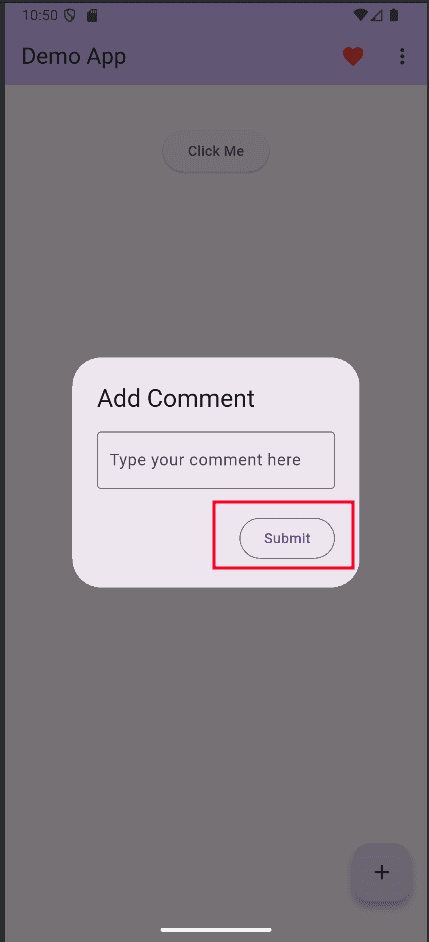
OutlinedButton
The OutlinedButton widget in Flutter is a Material Design button that features a border outline with no filled background, giving it a clean, minimal, and modern look. It’s ideal for secondary or less-prominent actions where you still want the button to be visible but not as visually dominant as an ElevatedButton.
OutlinedButton(
 onPressed: () {
   Navigator.pop(context);
 },
 child: const Text('Submit'),
),
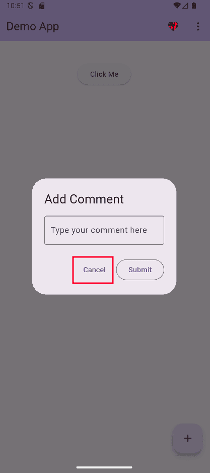
TextButton
The TextButton widget in Flutter is the simplest type of Material Design button, consisting of just text with no background fill or border. It’s designed for low-priority or subtle actions that don’t need to draw too much attention, such as “Skip”, “Cancel”, or small inline actions within content.
TextButton(
 onPressed: () {
   Navigator.pop(context);
 },
 child: const Text('Cancel'),
),
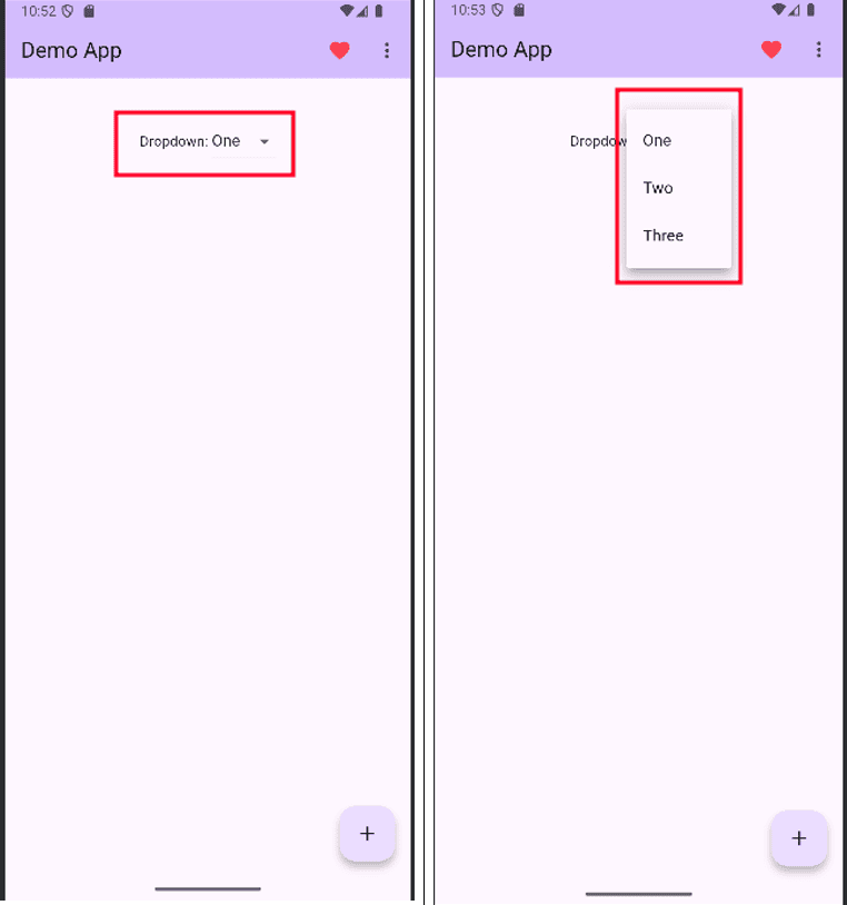
DropdownButton
The DropdownButton widget in Flutter is a control that allows users to pick a single item from a dropdown list of preset options. When tapped, it displays a dropdown menu containing all the available choices, and the selected value is shown in the button’s main area.
It’s a convenient and space-saving way to handle multiple options without cluttering the UI. You can customize its appearance, such as the style of the displayed text, dropdown icon, colours, and the shape of the menu.
Row(
 mainAxisAlignment: MainAxisAlignment.center,
 children: [
   const Text('Dropdown: '),
   DropdownButton<String>(
     value: selected,
     onChanged: (String? newValue) {
       if (newValue != null) {
         setState(() => selected = newValue);
       }
     },
     items: <String>['One', 'Two', 'Three']
         .map<DropdownMenuItem<String>>((String value) {
       return DropdownMenuItem<String>(
         value: value,
         child: Text(value, style: const TextStyle(fontWeight: FontWeight.normal),),
       );
     }).toList(),
   ),
 ],
),
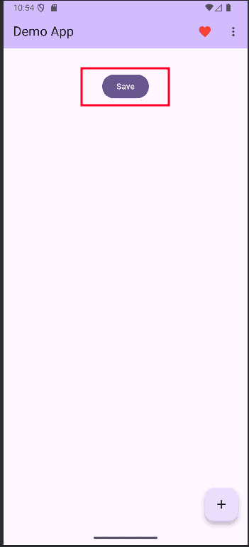
FilledButton
The FilledButton widget in Flutter is a modern Material Design button style introduced to provide a more prominent and visually solid call-to-action. It features a filled background with rounded corners by default, making it stand out clearly against the app’s interface.
FilledButtons are perfect for primary actions that you want users to notice immediately, such as “Save,” “Submit,” or “Continue.” They support full customization, including background color, text style, padding, shape, and elevation. Compared to other button types, the FilledButton strikes a balance between visibility and elegance, making it a go-to choice for creating clear, impactful actions in your app’s UI.
FilledButton(
 onPressed: () {
   ScaffoldMessenger.of(context).showSnackBar(
     const SnackBar(content: Text('FilledButton pressed')),
   );
 },
 child: const Text('Save'),
),
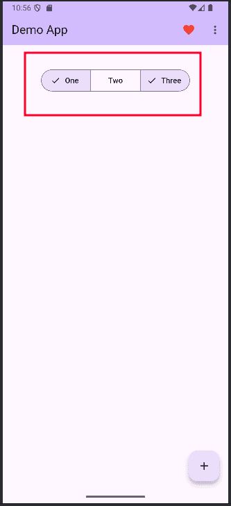
SegmentedButton
The SegmentedButton widget in Flutter is a modern UI component that allows users to choose between multiple related options, with only one (or sometimes multiple) selections active at a time. Each option appears as a connected segment, creating a clean, tab-like design where the selected segment is visually highlighted.
We should start by declaring the variables at the top of the class.
class _MyHomePageState extends State<MyHomePage> {
 String selected = 'One'; //For single selection
Set<String> selectedFruits = {'One'}; // For multiple selectionFirst, initialise the variable ‘selected’
SegmentedButton<String>(
 segments: const <ButtonSegment<String>>[
   ButtonSegment(value: 'One', label: Text('One')),
   ButtonSegment(value: 'Two', label: Text('Two')),
   ButtonSegment(value: 'Three', label: Text('Three')),
 ],
 selected: {selected},
 onSelectionChanged: (Set<String> newSelection) {
   setState(() {
     selected = newSelection.first;
   });
 },
),
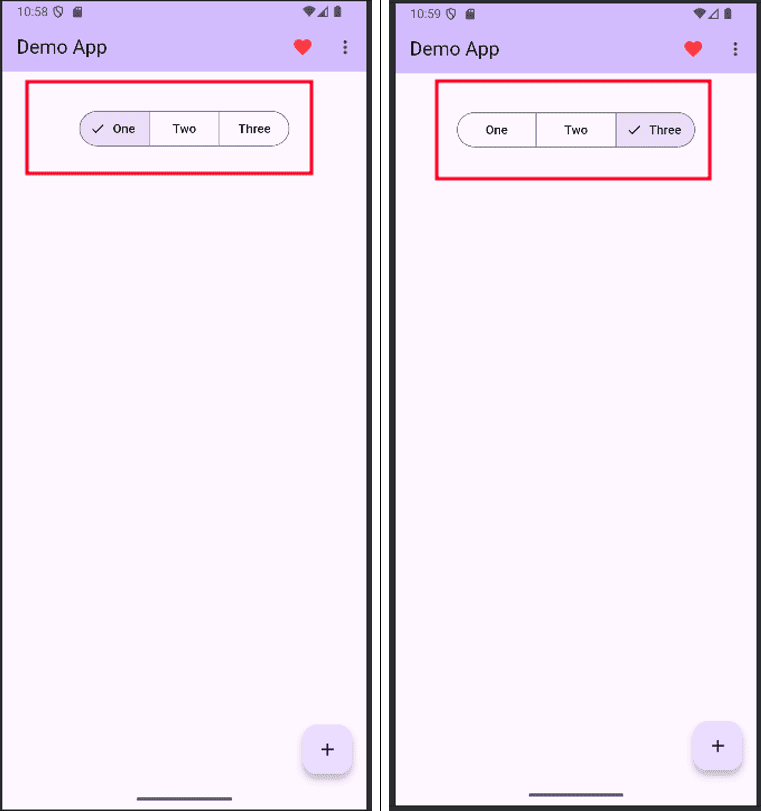
SegmentedButton<String>(
 multiSelectionEnabled: true,
 segments: const <ButtonSegment<String>>[
   ButtonSegment(value: 'One', label: Text('One')),
   ButtonSegment(value: 'Two', label: Text('Two')),
   ButtonSegment(value: 'Three', label: Text('Three')),
 ],
 selected: selectedFruits,
 onSelectionChanged: (Set<String> newSelection) {
   setState(() {
     selectedFruits = newSelection;
   });
 },
),
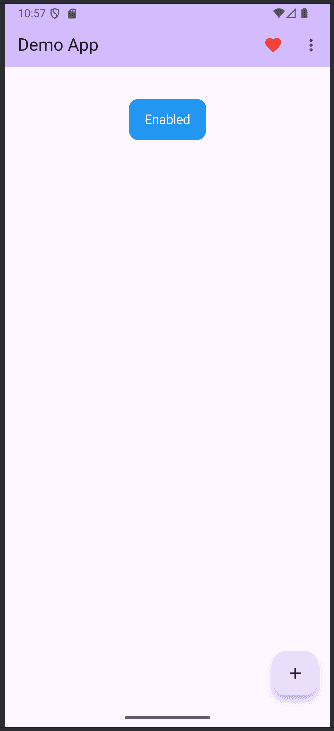
CupertinoButton
The CupertinoButton widget in Flutter is a button styled according to Apple’s iOS design guidelines, making it perfect for building apps with a native iOS look and feel. Unlike Material buttons, it uses a flat, minimalistic design with smooth touch animations, matching the aesthetics of Cupertino-style interfaces.
It’s commonly used for actions like navigation, form submission, or triggering events in iOS-themed apps. You can customize its color, padding, border radius, and even add icons or images. By using CupertinoButton, developers can ensure a consistent and polished user experience for iOS users while still working within Flutter’s cross-platform framework.
Import the package first.
import 'package:flutter/cupertino.dart';
CupertinoButton.filled(
 color: Colors.blue,
 onPressed: () {
   ScaffoldMessenger.of(context).showSnackBar(
     const SnackBar(content: Text('iOS Style Pressed')),
   );
 },
 child: const Text('Enabled'),
),
Flutter offers a wide variety of button widgets, each designed for different use cases, from simple text actions to prominent call-to-actions and iOS-styled controls. By choosing the right button type, developers can create intuitive, visually appealing, and user-friendly interfaces. With proper styling and customization, these buttons help ensure consistency, accessibility, and a seamless user experience across apps.
To read more about Overview of Purchase Report Analysis in Odoo 18, refer to our blog Overview of Purchase Report Analysis in Odoo 18.