Odoo 18's Dashboard module is an effective tool for helping users observe and track important company KPIs in real-time. Through the integration of data from many Odoo modules, including Sales, Inventory, CRM, Accounting, HR, and more, it provides a centralized view of performance metrics. Businesses can make data-driven choices effectively using dynamic and customized dashboards. This blog provides a clear understanding of the Odoo 18 Dashboard module.
Here, you can select the Dashboard module from Odoo 18.
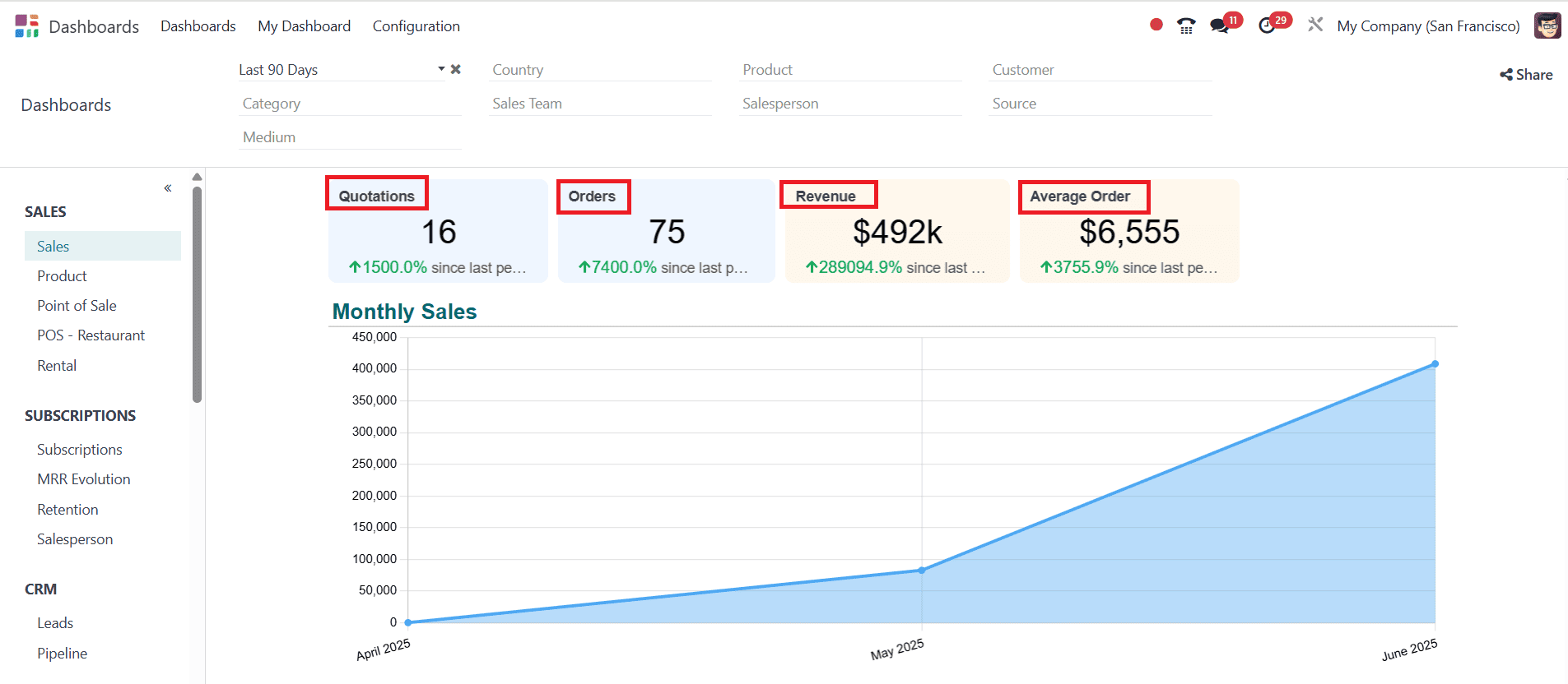
Sales
Sales:
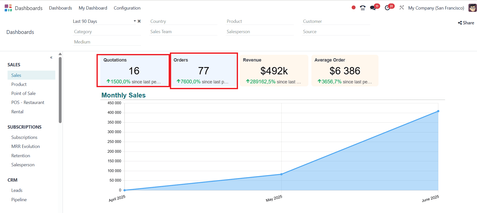
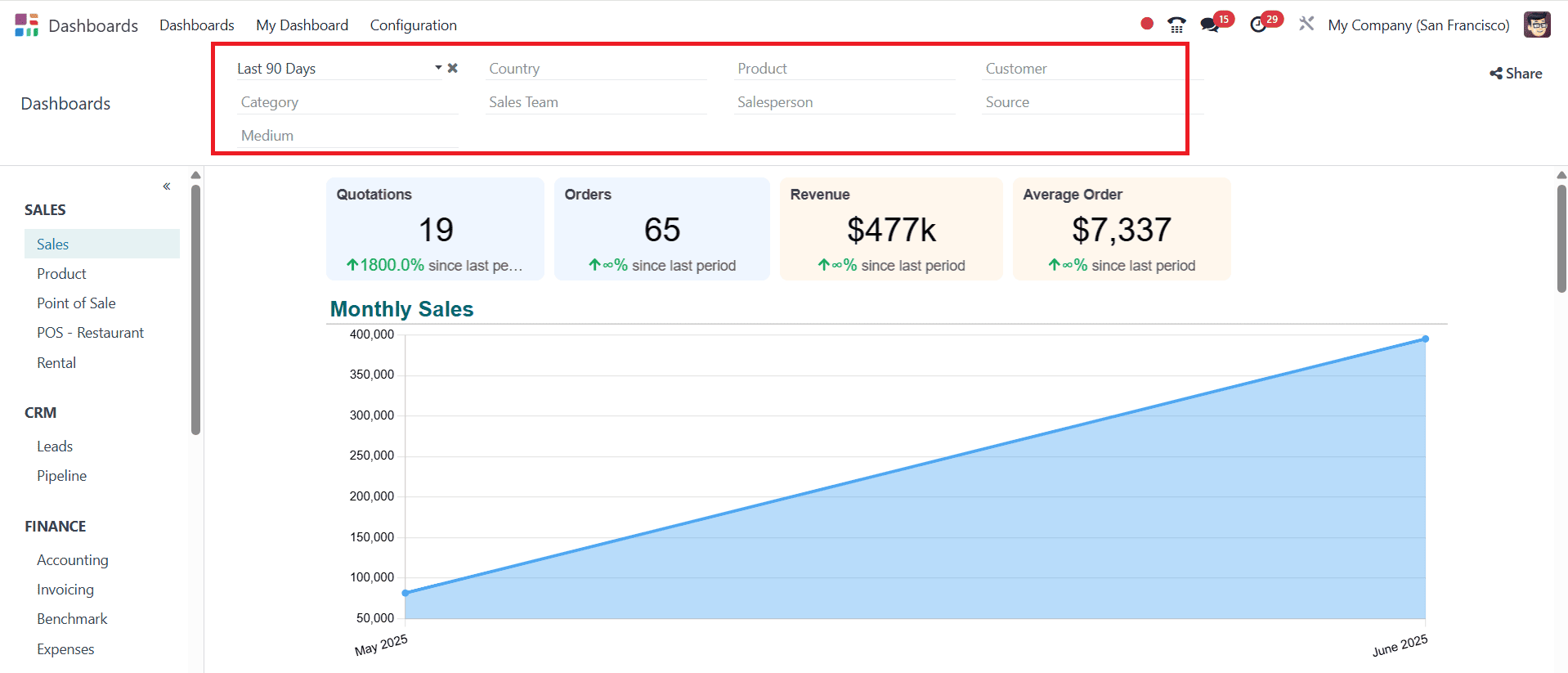
When you open the Dashboard module, you can see the created Quotations, Orders, and Revenue details at the top of the screen. We can also obtain a comprehensive analysis of these through a graph in the Dashboard module. Here you can manage Sales, Subscriptions, CRM, Finance, Logistics, Services, Marketing, Website, and Human Resources.
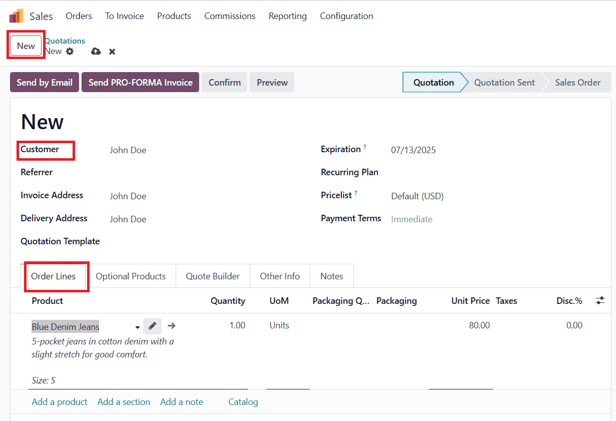
Then move on to the Sales module and create a new quotation to see how the Dashboard module works.
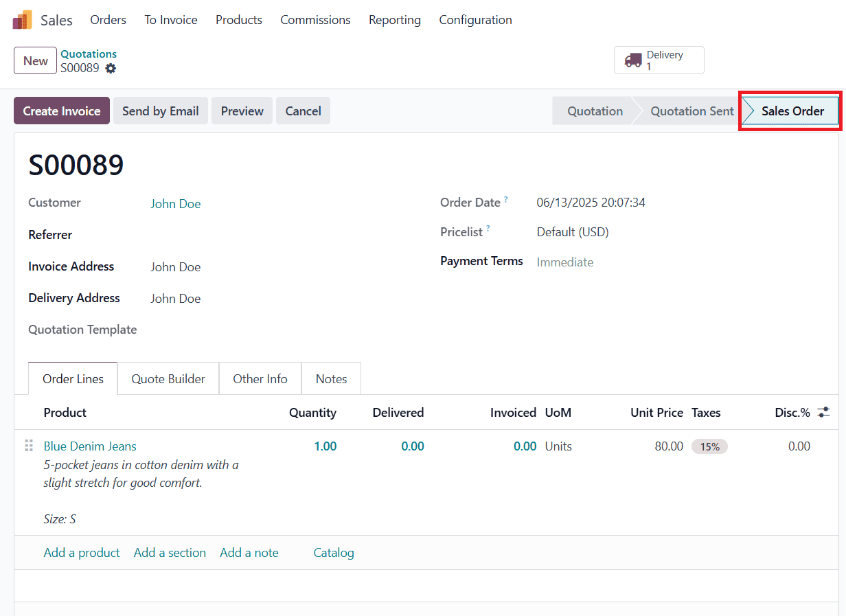
To create a new quotation in the Sales module, click on the New button. Add a customer name, and in the Order Lines tab, select a product as shown below:
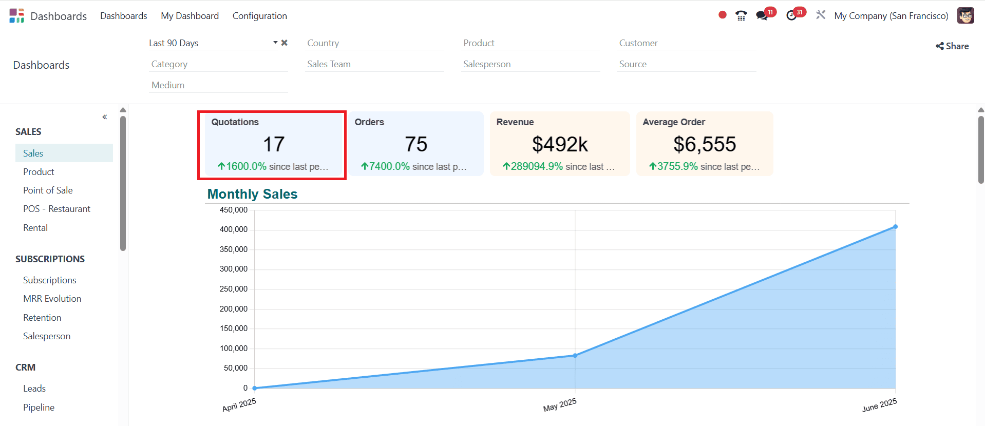
Then go back to the Dashboard module, where you can see that the quotation has increased.
Then, return to the Sales module, click the Confirm button, and create a sales order.
Then go back to the Dashboard module, where you can see that the Quotation is decreased and the Order is increased when you confirm the order. You can also see the Monthly Sales analysis through a graph as shown below:
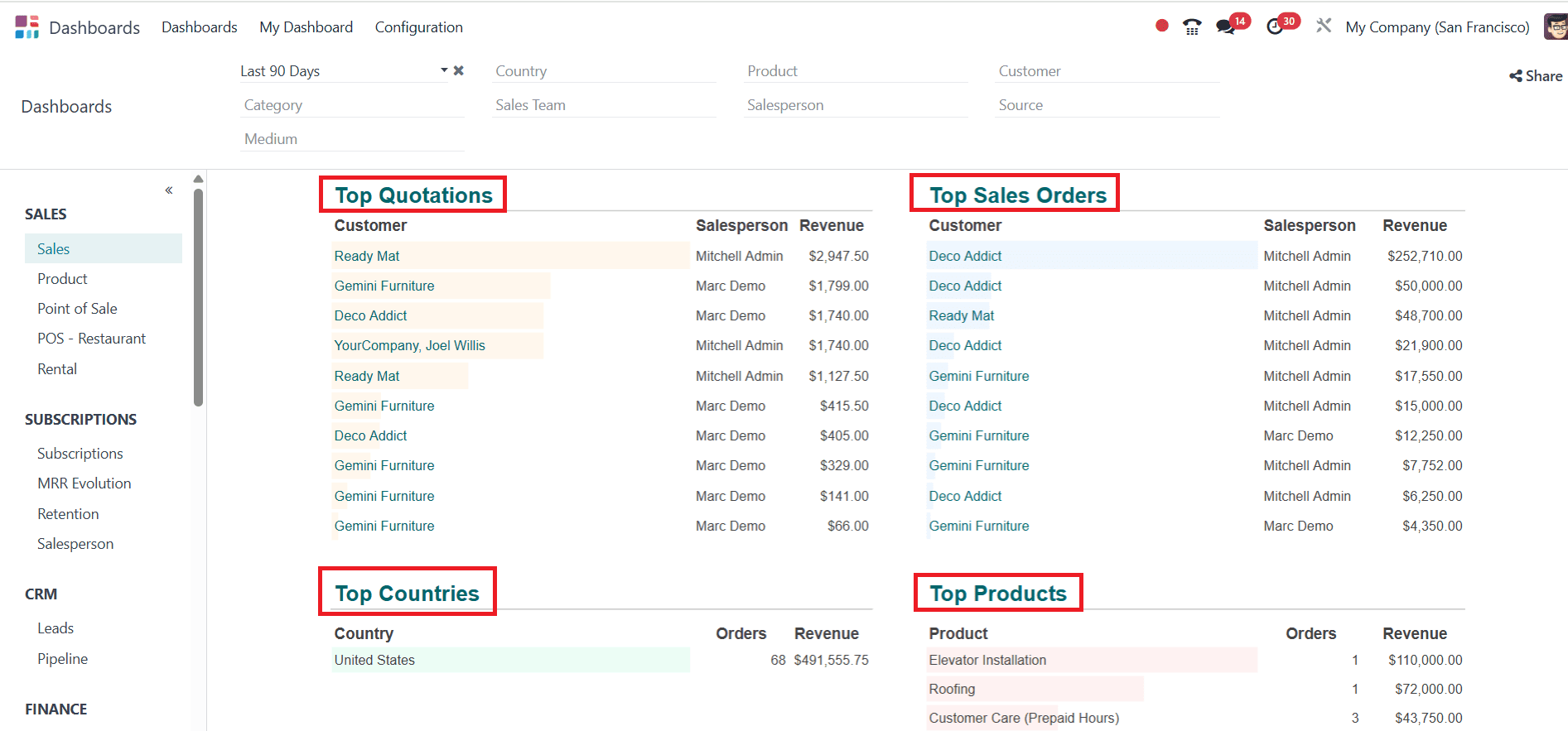
Here, you can see the Top Quotation and Sales Orders as listed. You can also find out which country the order originated from and for which product.
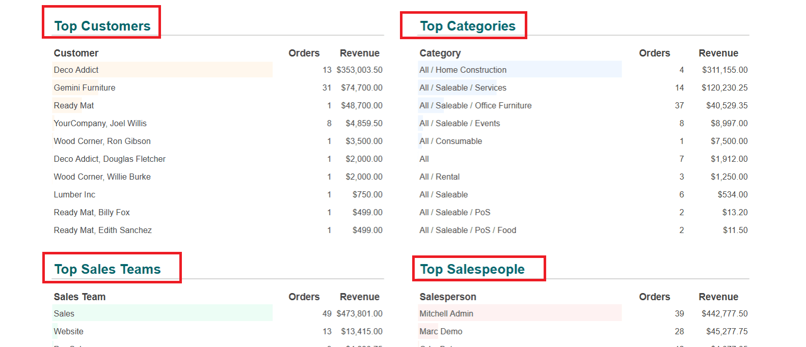
The Top Customers, Categories, Sales Teams, and Salespeople are visible over here.
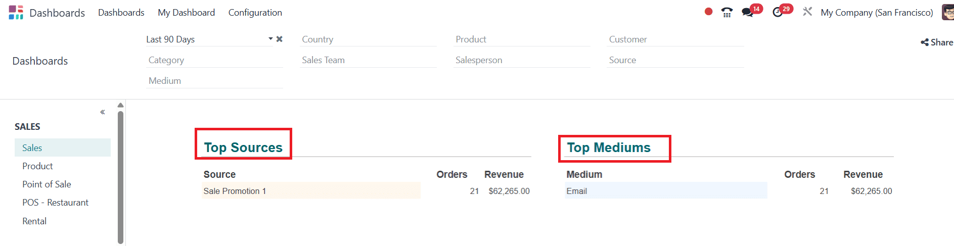
Here, you can also find Top Sources and Media.
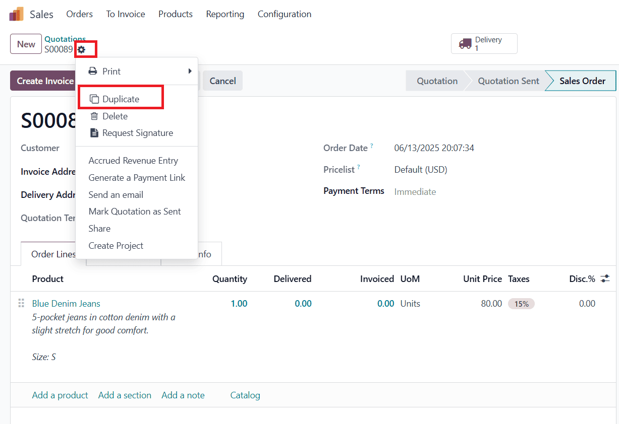
Then go back to the Sales module, and make a Duplicate of the created order as shown below:
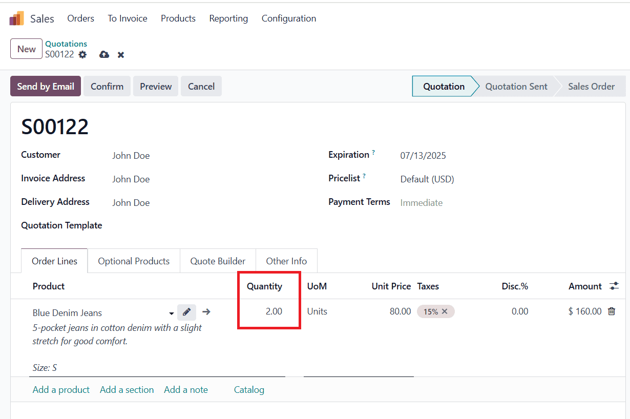
In the newly duplicated order, click on the Order Lines tab and change the Quantity to two or any appropriate one as shown below:
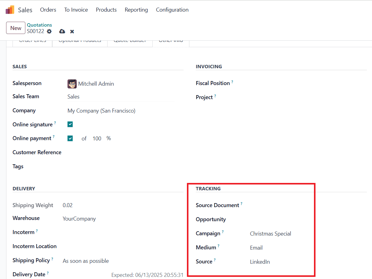
In the Other Info tab, you can add details such as Source Document, Opportunity, Campaign, Medium, and Source under the Tracking option. Then, save, confirm the order, and make a payment to confirm.
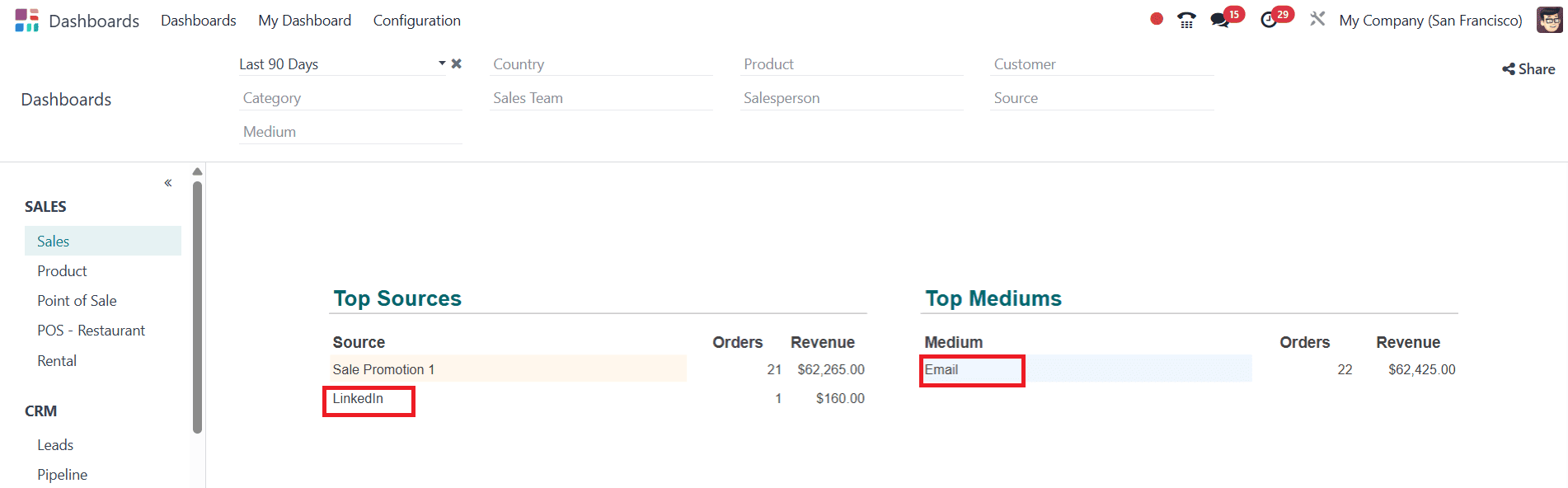
Again, go back to the Dashboard module, under Top Sources and Mediums, you can find LinkedIn as a newly created source, and Email as a medium, as shown below:
Here, you can filter the data based on Period, Country, Product, Customer, Category, Sales Team, Salesperson, Sources, and Medium.
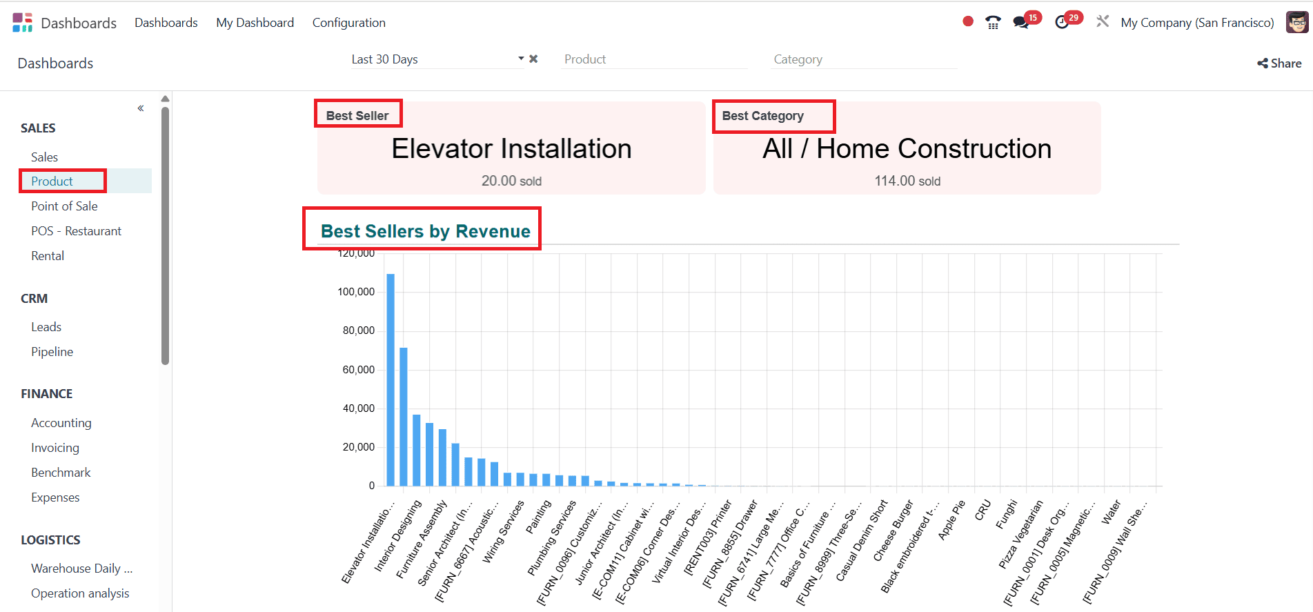
Product
When you click on the Product option, you can easily identify the Best Seller product and the Best Category. You can easily analyze the Best Sellers by Revenue with the help of a graph, as shown below:
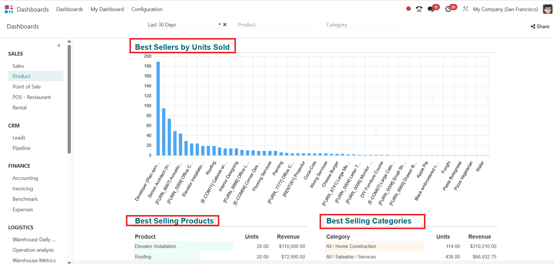
You can also easily analyze best-selling products with the help of a graph, as shown below:
Point Of Sale:
Select Point of Sale from the Sales option. There, you can easily find the number of Orders, Revenue, and Average order. You can also easily analyze the number of orders per month with the help of a graph.
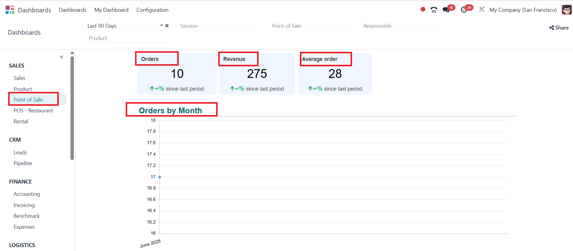
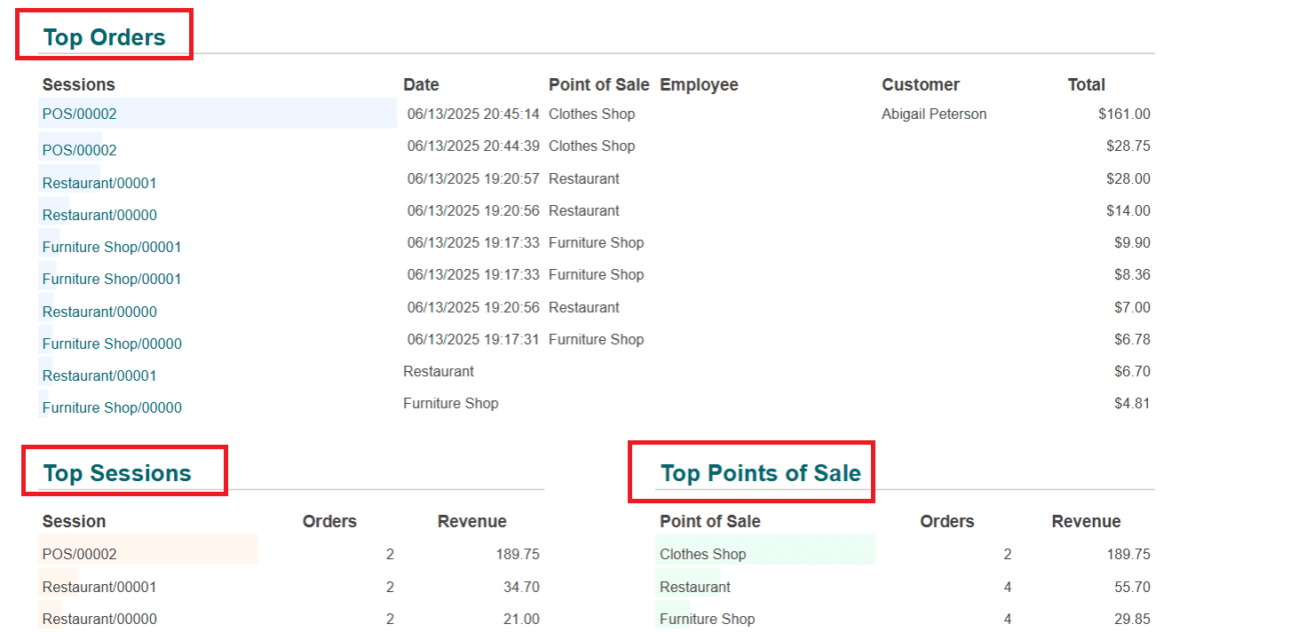
You can also find lists of Top Orders, Top Sessions, Top Point of Sale, Top Responsibles, and Top Products.
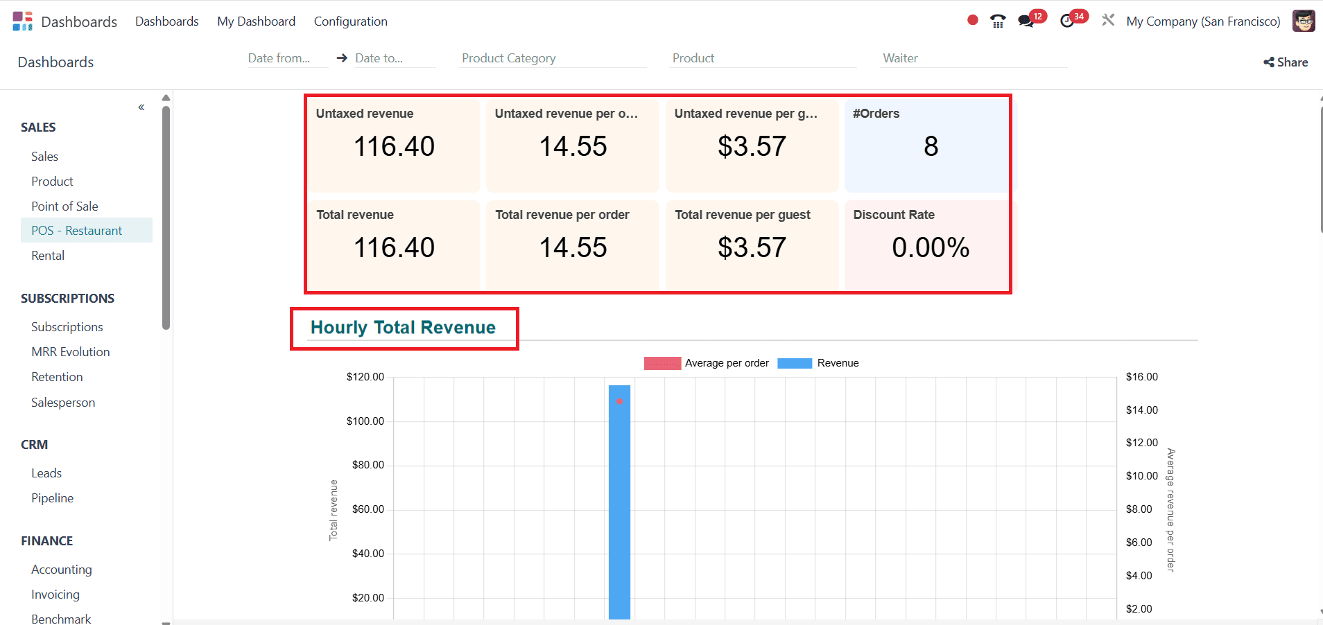
POS - Restaurant:
When you select 'POS - Restaurant' from the Sales option, you can easily view details such as Untaxed revenue, Untaxed revenue per order and guest, number of orders, Total revenue, Total revenue per order and guest, and Discount Rate. Here, you can find graphs that give a clear idea about the Hourly Total Revenue and Daily Total Revenue.
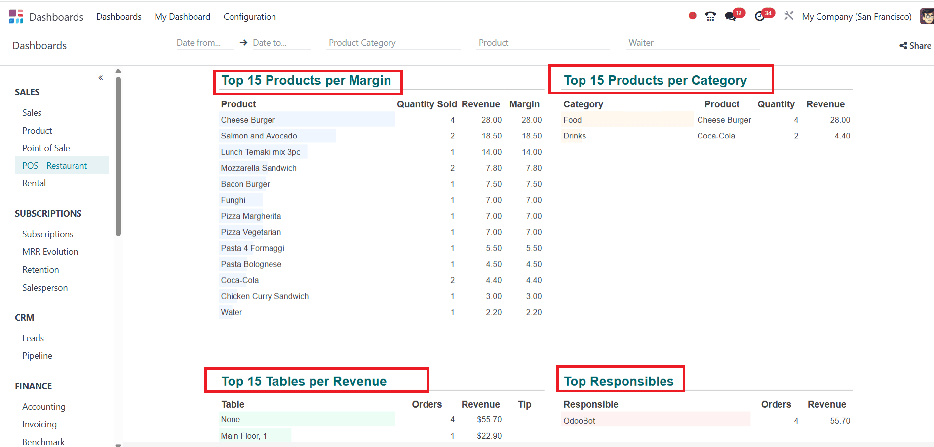
Here, you can see a list of details like Top 15 Products per Margin, Products per Category, Table per Revenue, and Top Responsibles as shown below:
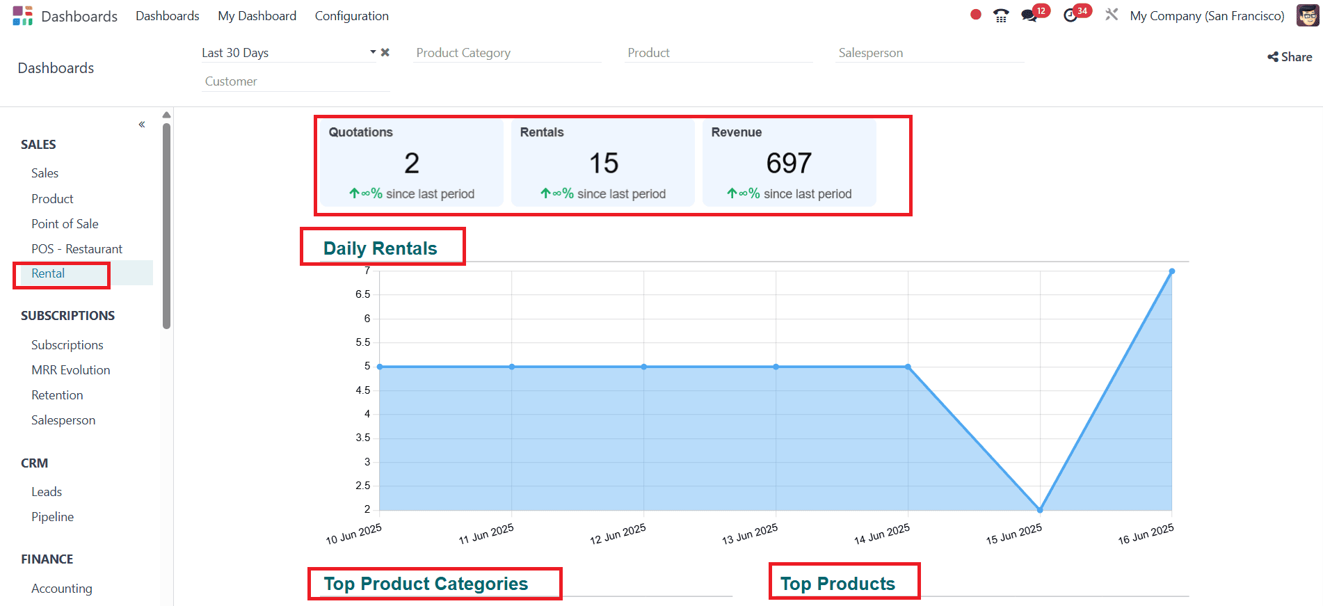
Rentals:
Select the Rentals from Sales option. Here, you can see the details, including the number of Quotations, Rentals, and Revenue. The graph analyzes daily rentals and provides a list of details, including Top Product Categories, Top Products, Top Salespeople, and Top Customers.
Subscriptions:
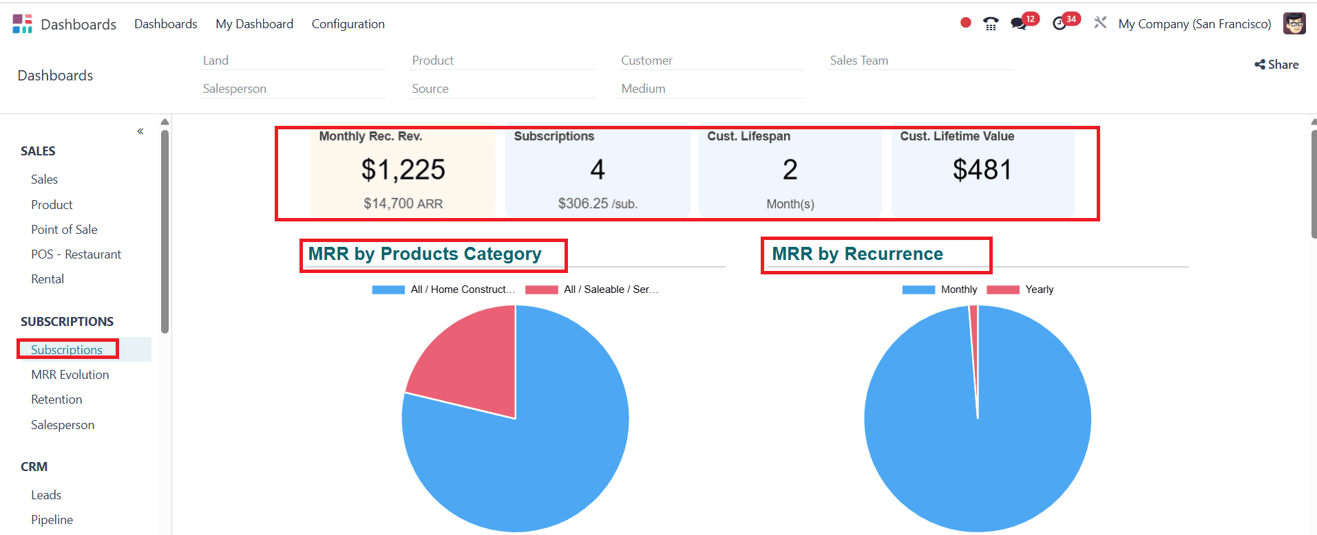
Subscriptions:
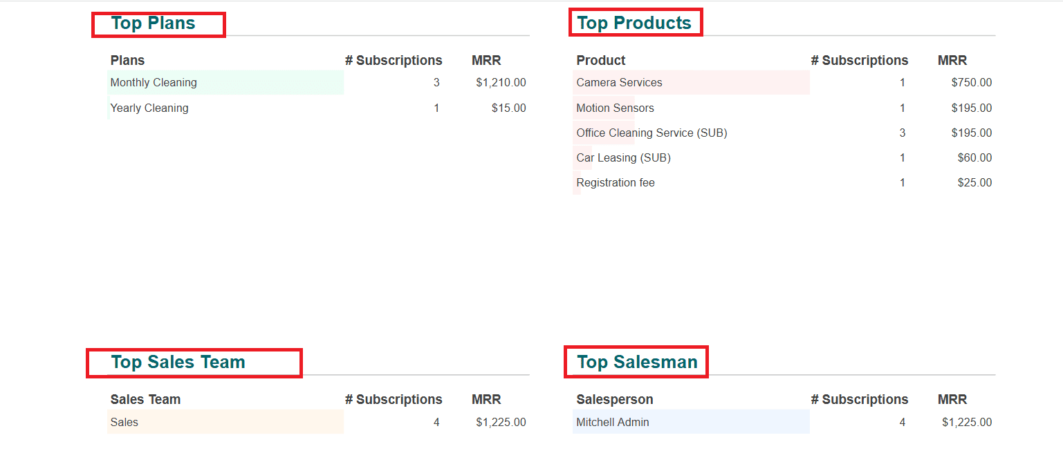
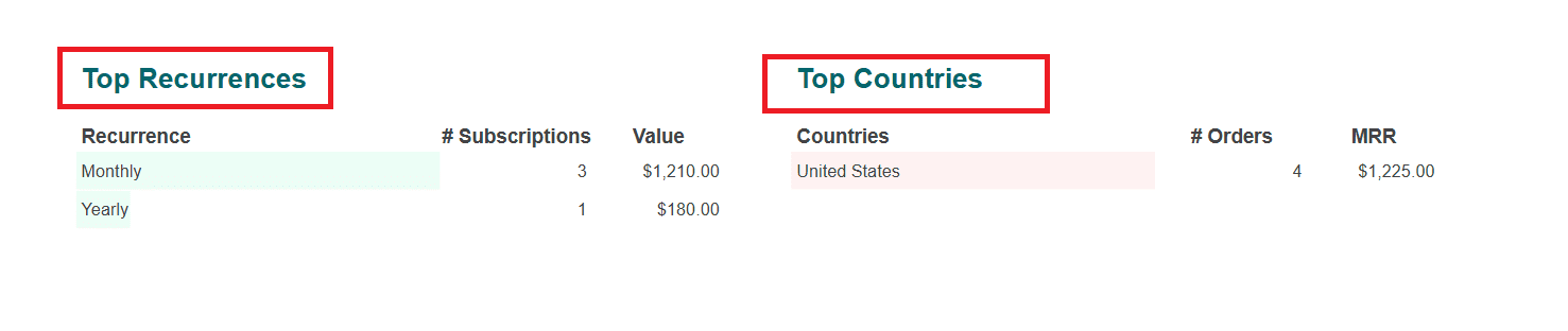
Under the Subscriptions option, select Subscriptions as shown below. Here, you can quickly analyze the number of Monthly Recurrence Revenue, Subscriptions, Custom Lifespan, and Custom Lifetime Value. You can also find pie charts that show values of MRP by Products Category and MRP by Recurrence. Here, you can see details like Top Plans, Top Products, Top Sales Team, Top Salesman, Top Recurrences, and Top Countries are listed as shown below:
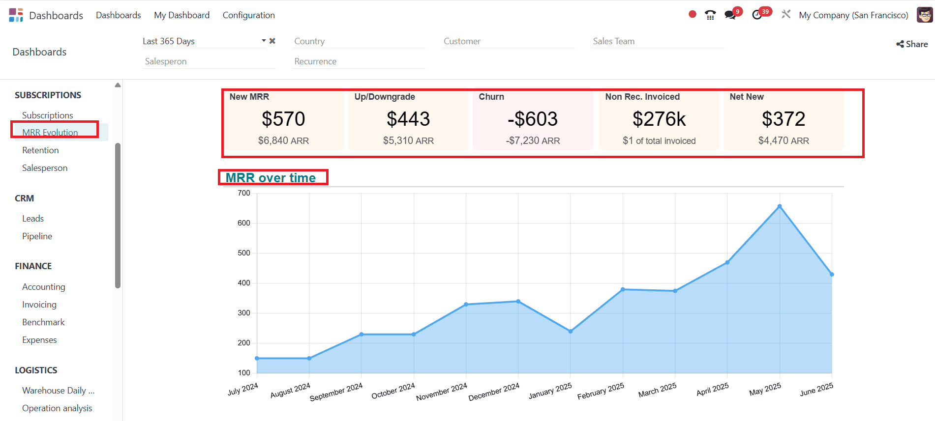
MRR Evolution:
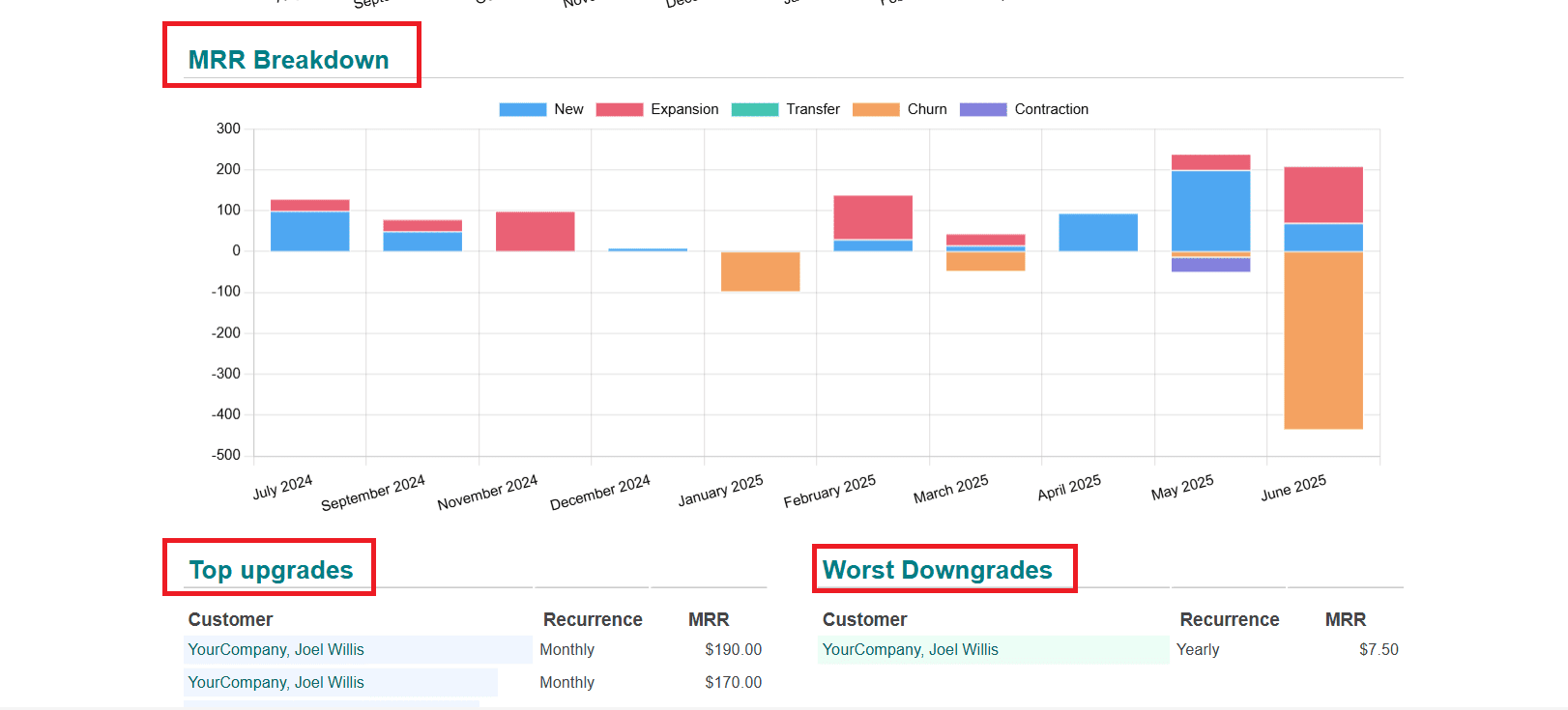
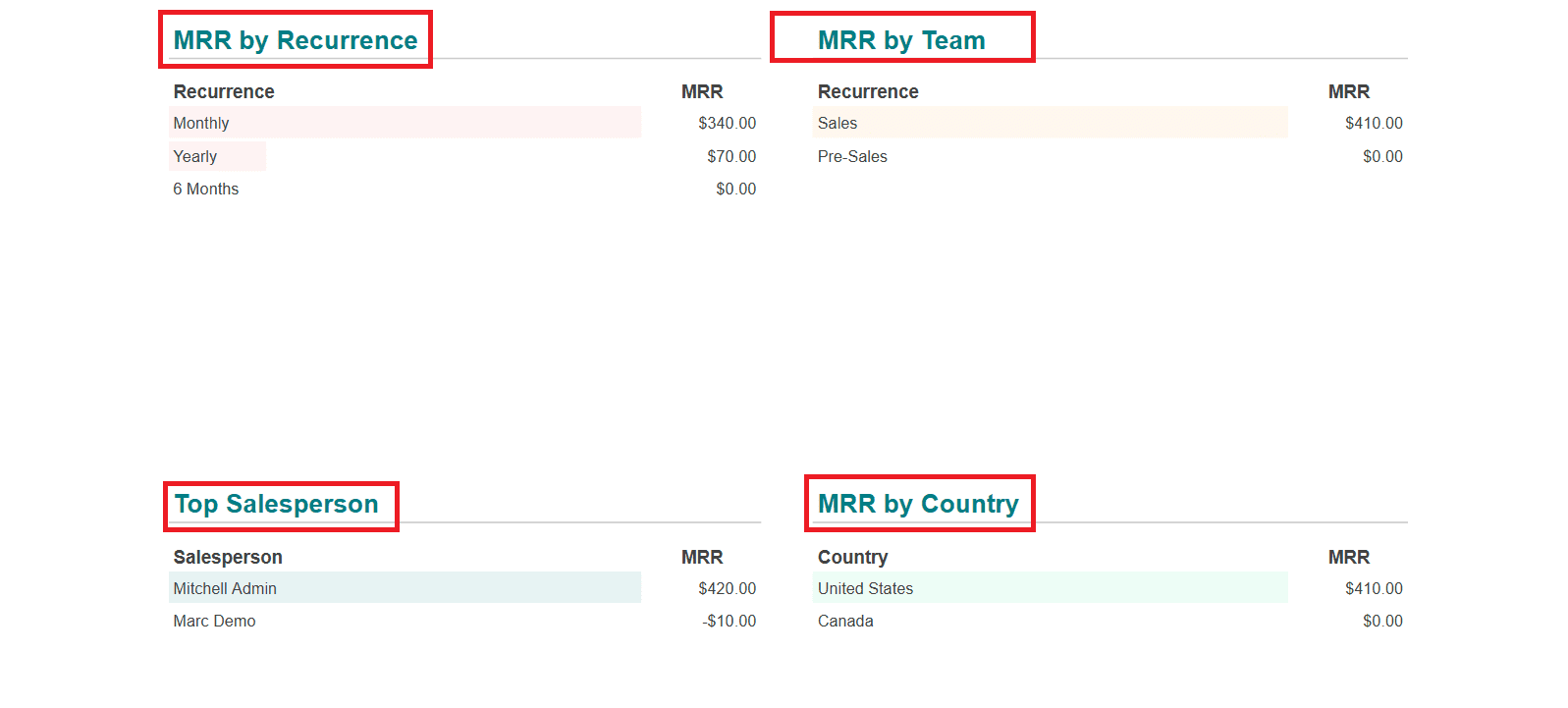
When you select MRR Evolution, you can easily understand MRR over time and MRR Breakdown with the help of graphs. The details like Top Upgrades, Worst Downgrades, MRR by Recurrence, MRR by Team, Top Salesperson, and MRR by Country are all listed as shown below:
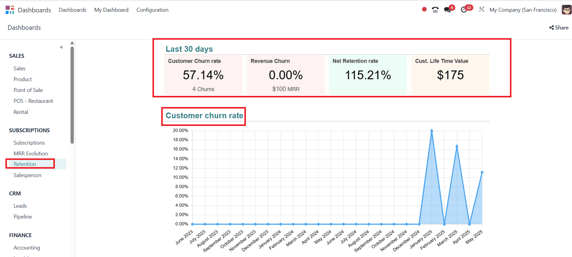
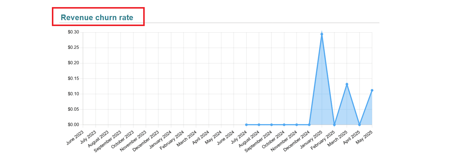
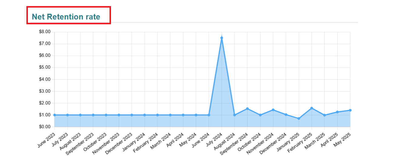
Retention:
Here, you can see the percentage of Customer Churn Rate, Revenue Churn, Net Retention rate, and Customer. Life Time Value. With the help of the graph, you can analyze the Customer churn rate, Revenue churn rate, and Net retention rate based on different years.
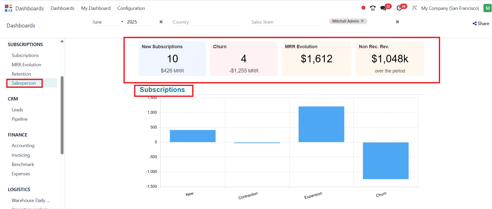
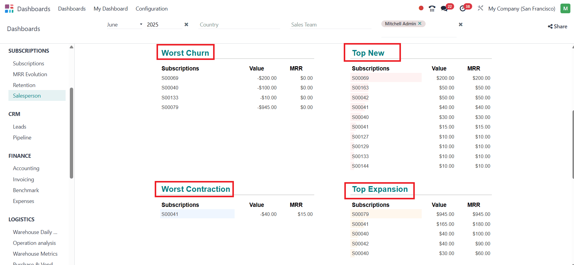
Salesperson:
In the Salesperson option, you can view details such as New Subscription, Churn, MRR Evolution, etc. You can easily analyze the subscription details with the help of a graph. The details, such as Worst Churn, Top New, Worst Contraction, Top Expansion, and Top Recurrence, are listed.

CRM:
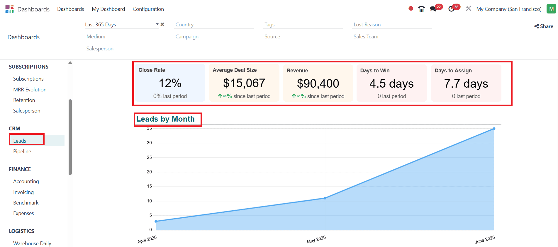
Leads:
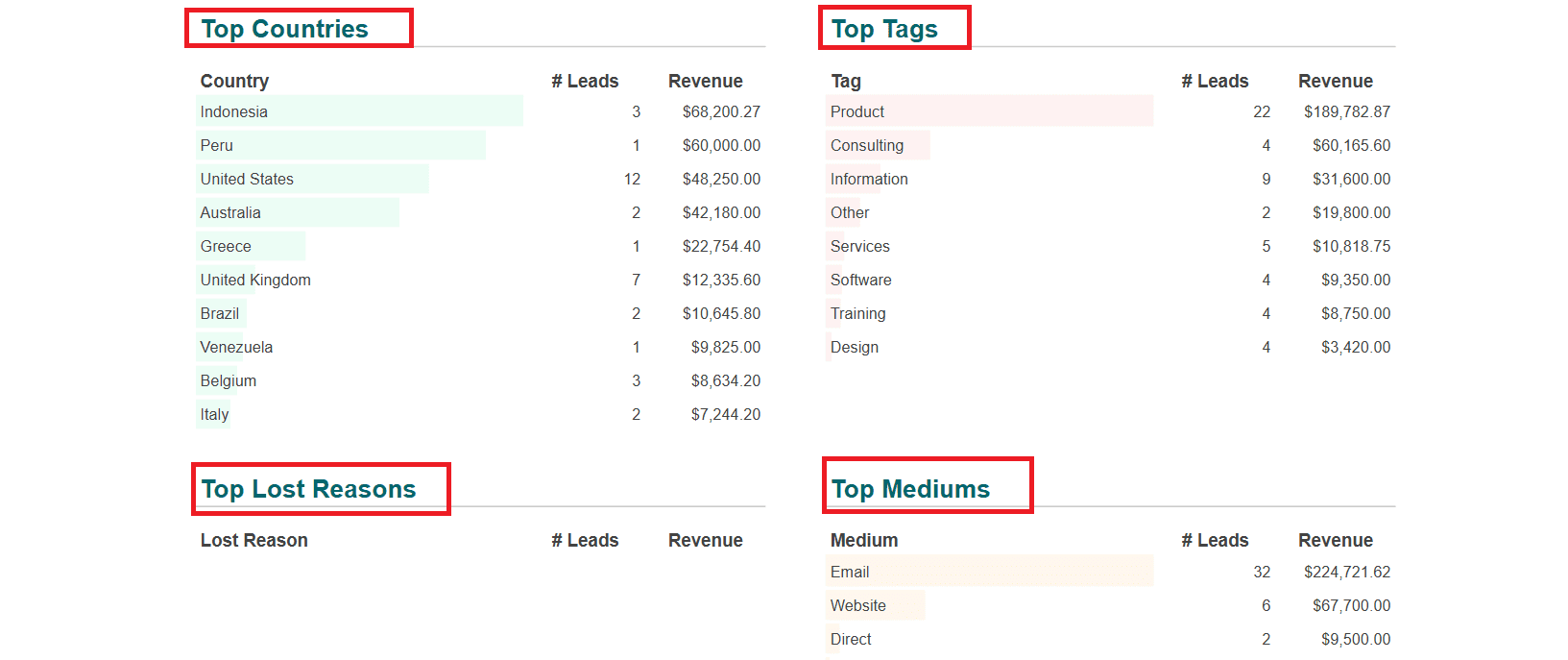
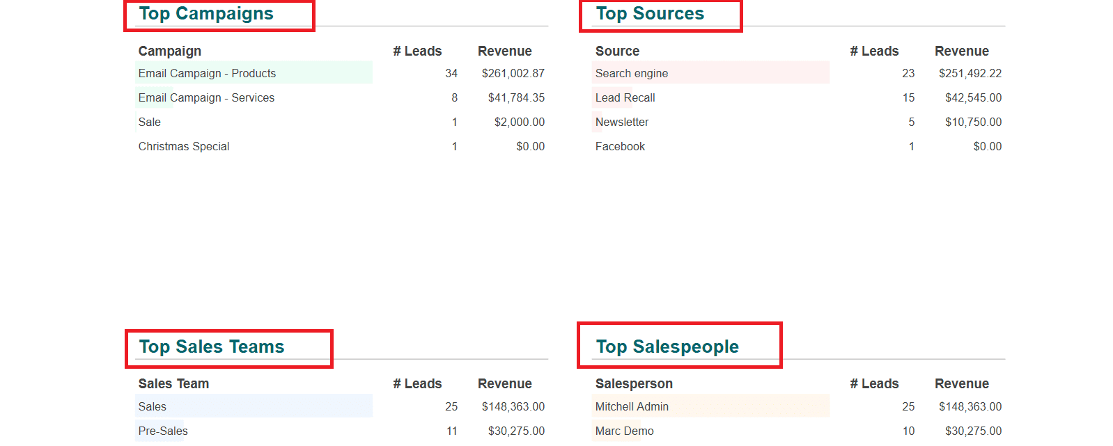
Select Leads from the CRM option, where you get an idea of the Close rate percentage, Average Deal Size, Revenue, Days to Win, and Days to Assign. Here, you can view the listed details of Top Countries, Top Tags, Top Lost Reasons, Top Mediums, Top Campaigns, Top Sources, Top Sales Teams, and Top Salespeople.
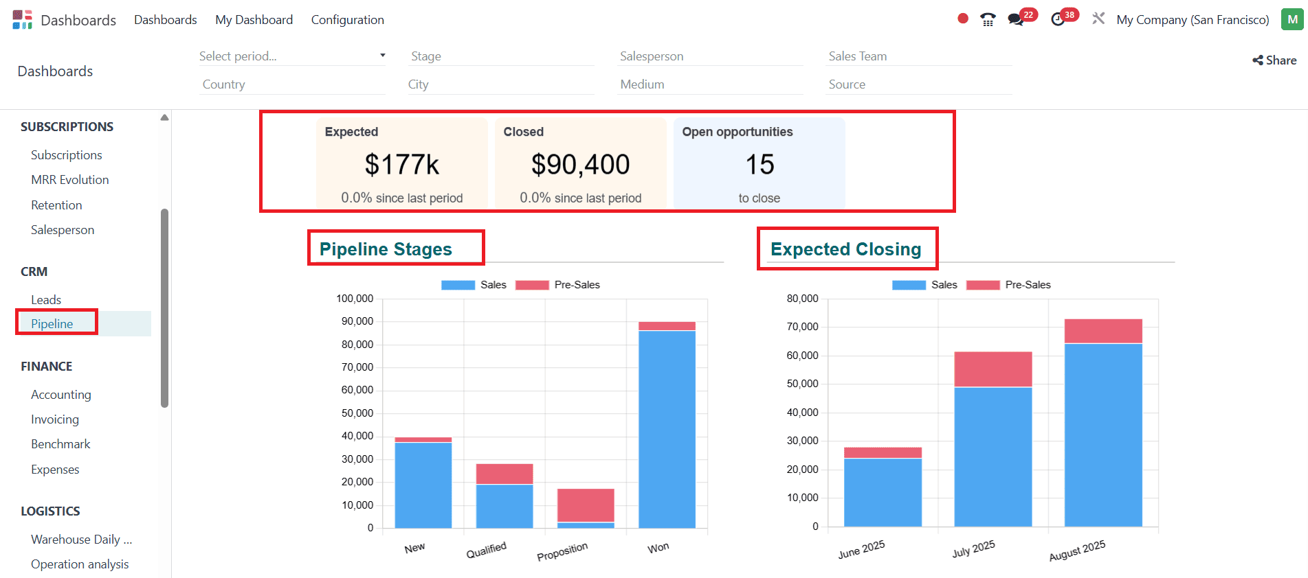
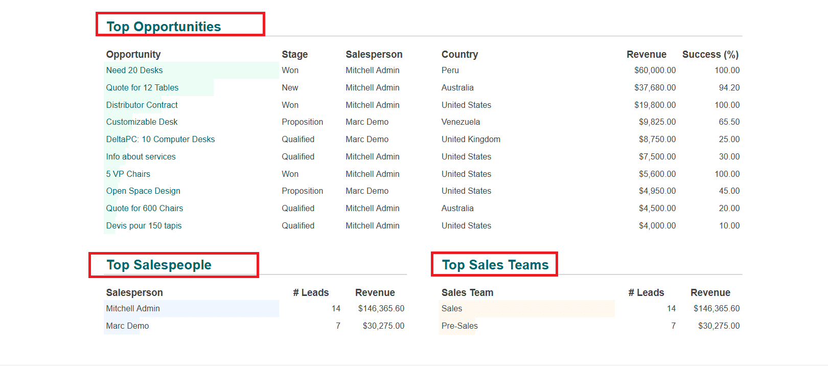
Pipeline:
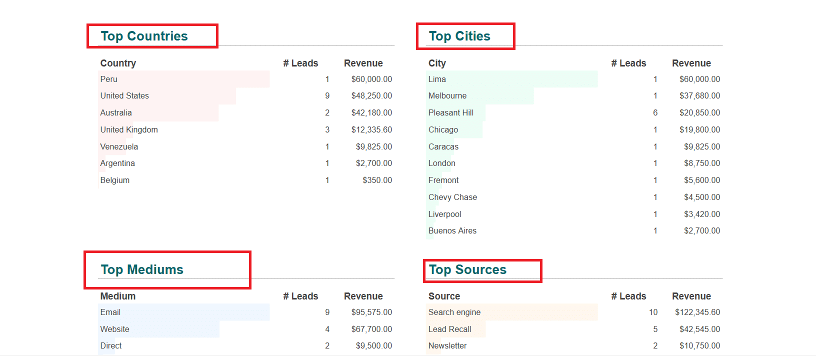
In the Pipeline option, you can view the Expected amount, Closed amount, and number of Open opportunities. Here, you can get a clear idea about Top Opportunities, Top Salespeople, Top Sales Teams, Top Countries, Top Cities, Top Mediums, and Top Sources in a list form.
Finance:
Accounting:
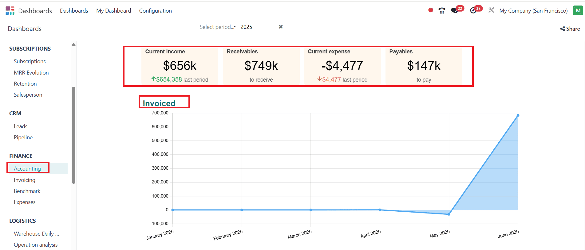
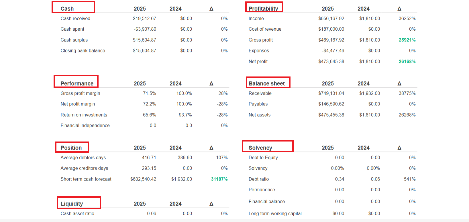
Select the Accounting option under the Finance section, where you can see the details such as Current Income, Receivables, Current Expense, and Payables. Invoiced details, organized by month, can be viewed with the help of a graph, as shown below. The details of Cash, Profitability, Performance, Balance sheet, Position, Solvency, and Liquidity are listed.
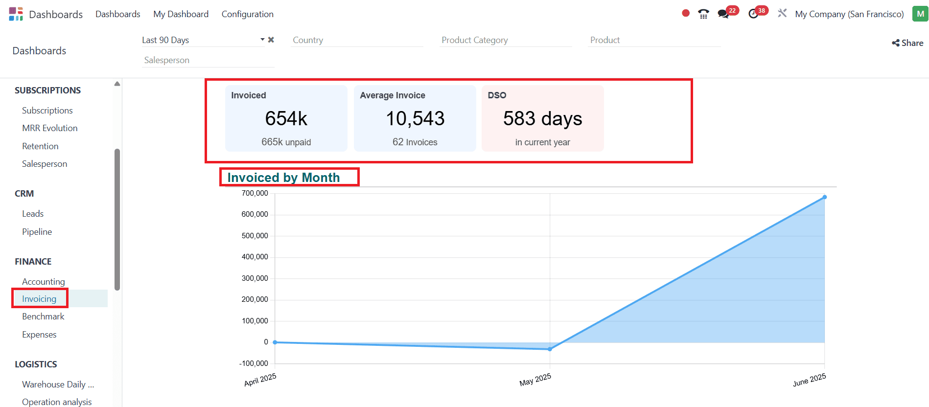
Invoicing:
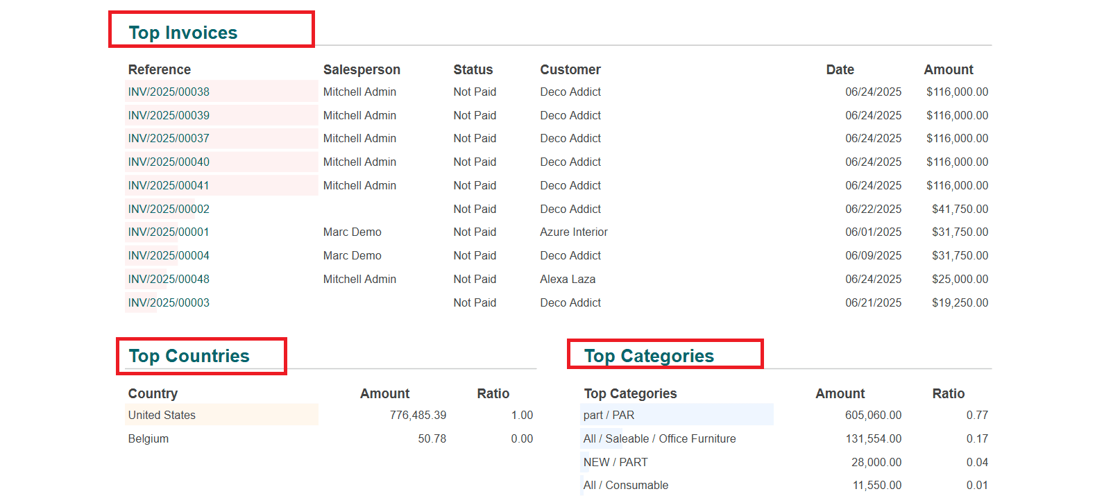
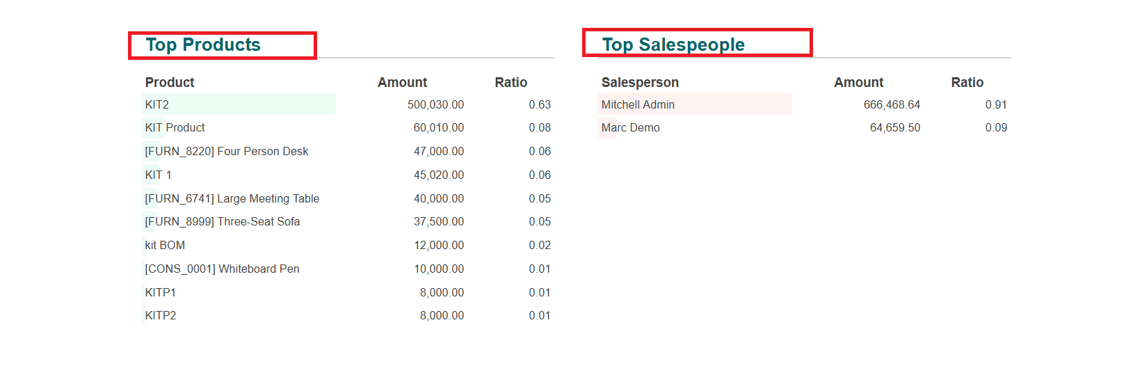
In the Invoiced option, you can view the Invoiced amount, Average Invoice amount, and DSO days. You can view a graph showing the invoiced amount by month. Details such as Top Invoices, Top Countries, Top Categories, Top Products, and Top Salespeople are listed below:
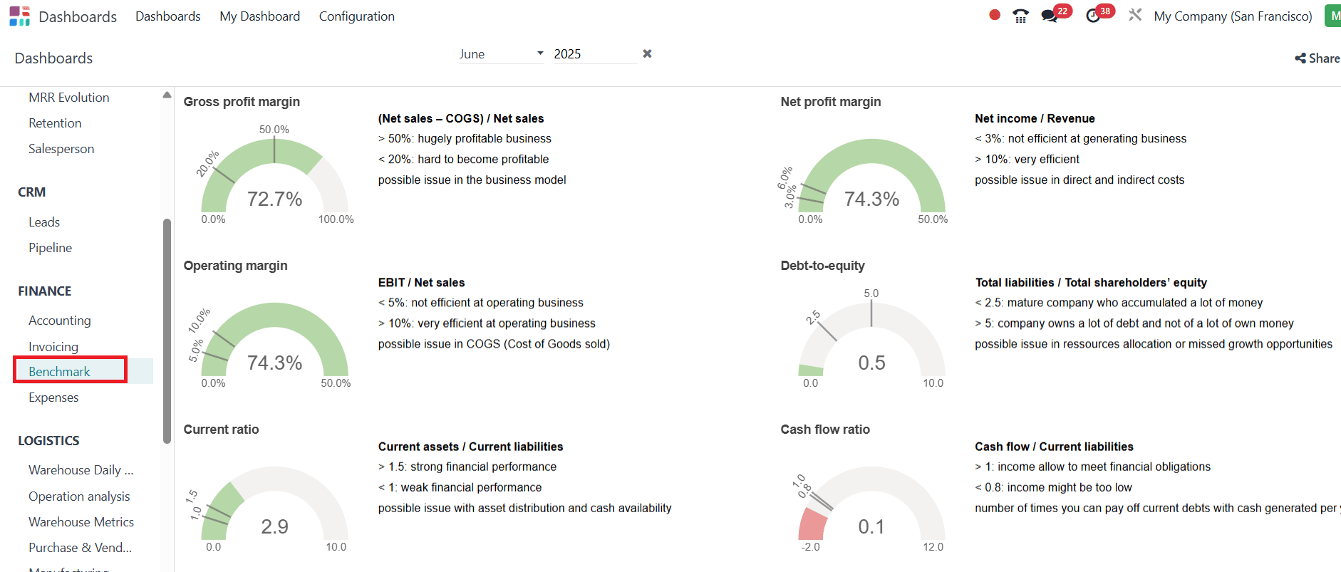
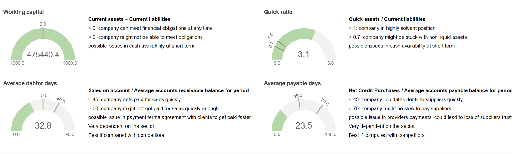
Benchmark:
In the Benchmark option, you can view analyses of possibilities, including Gross profit margin, Net profit margin, Operating margin, and more.
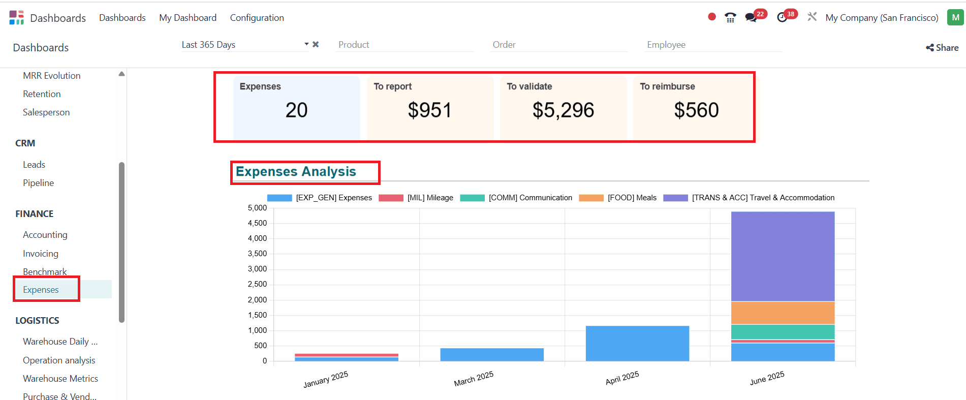
Expenses:
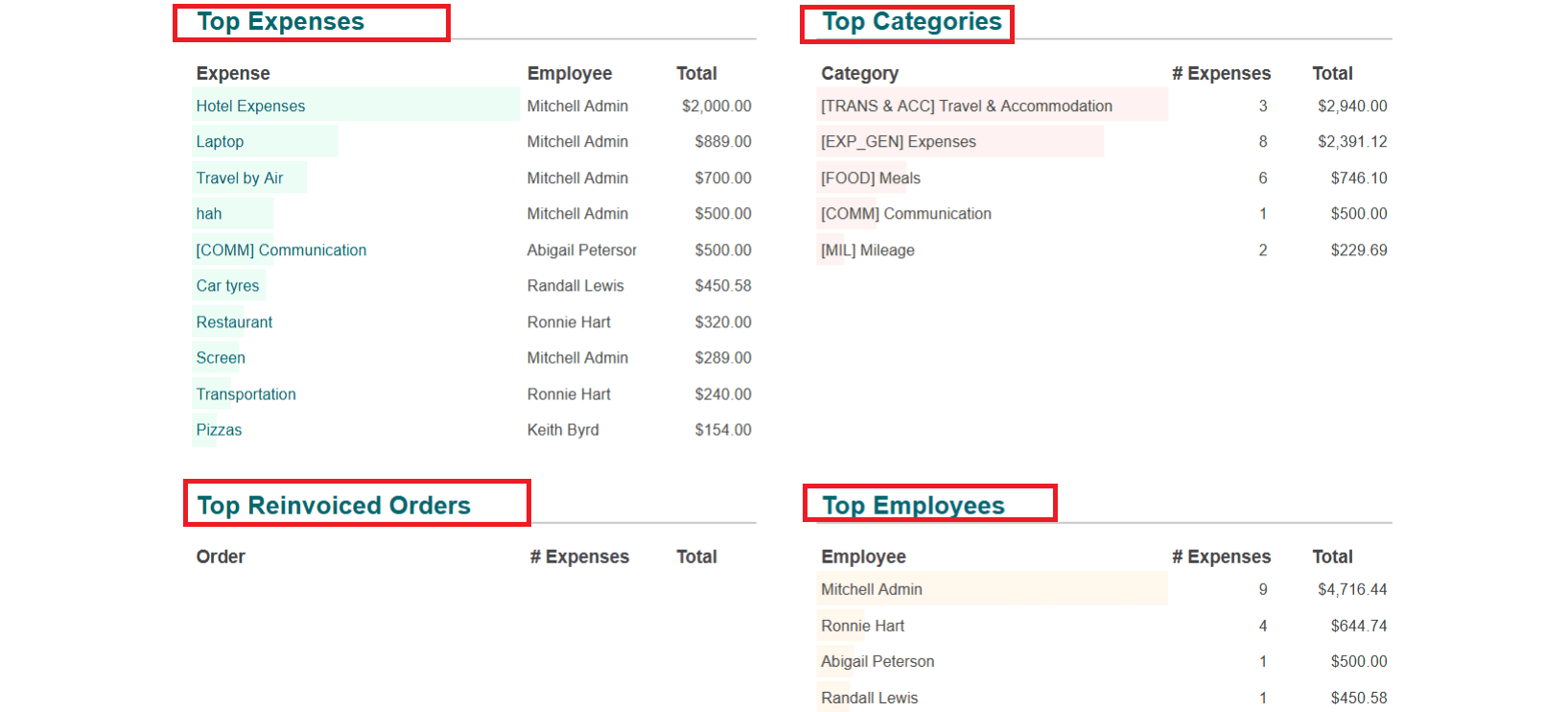
In the Expenses option, you can view details such as Expenses, the amount to report, the amount to validate, and the amount to reimburse. The graph illustrates the analysis of expenses by month. Here, you can see details such as Top Expenses, Top Categories, Top Reinvoiced Orders, and Top Employees in a listed form.
Logistics:
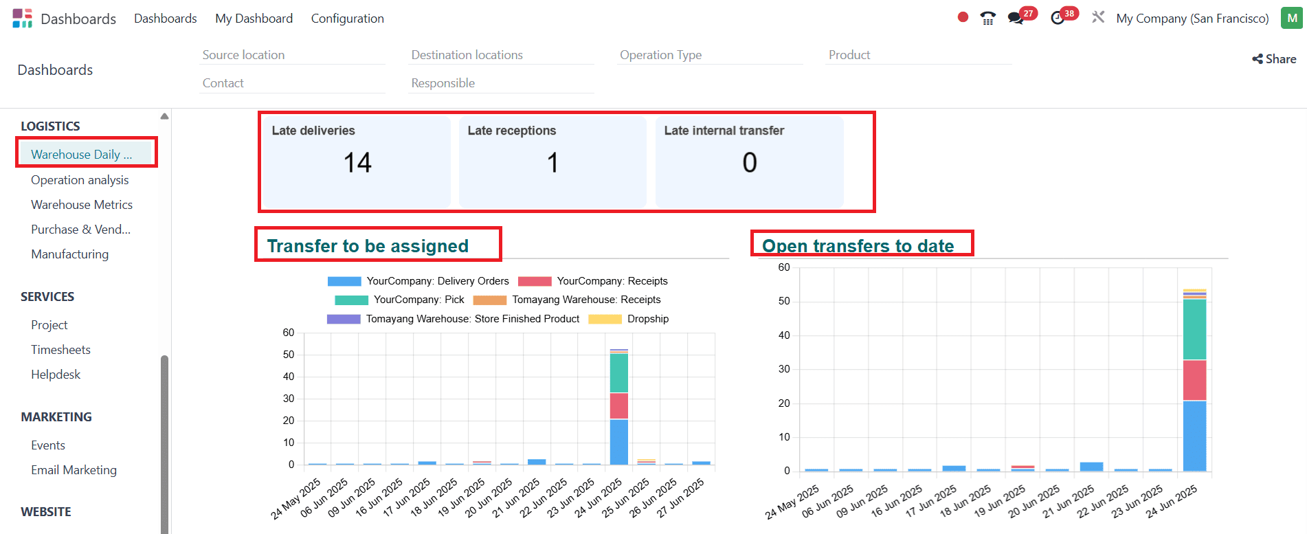
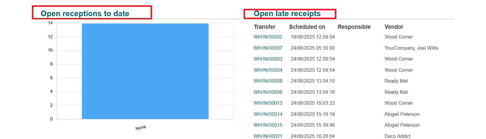
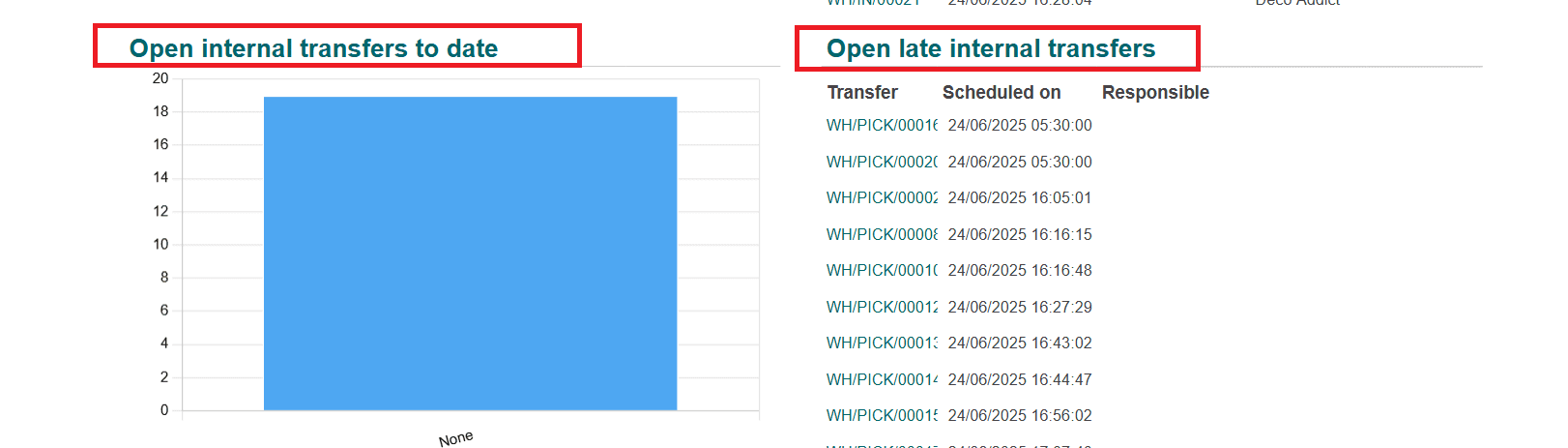
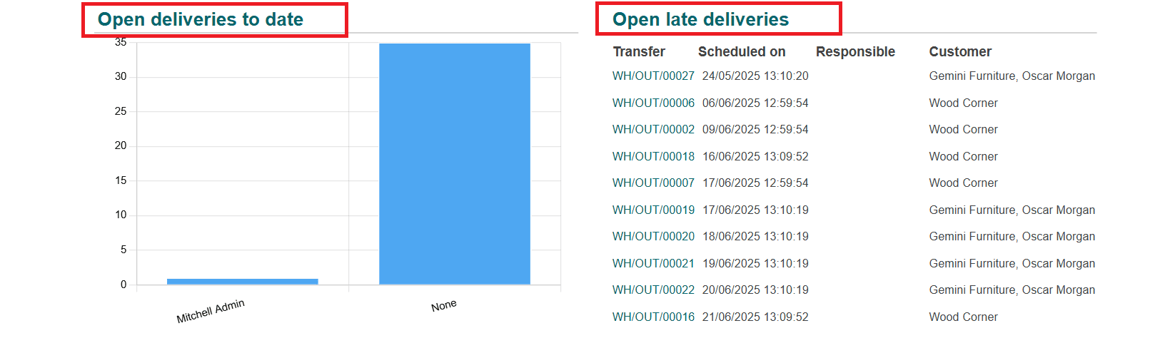
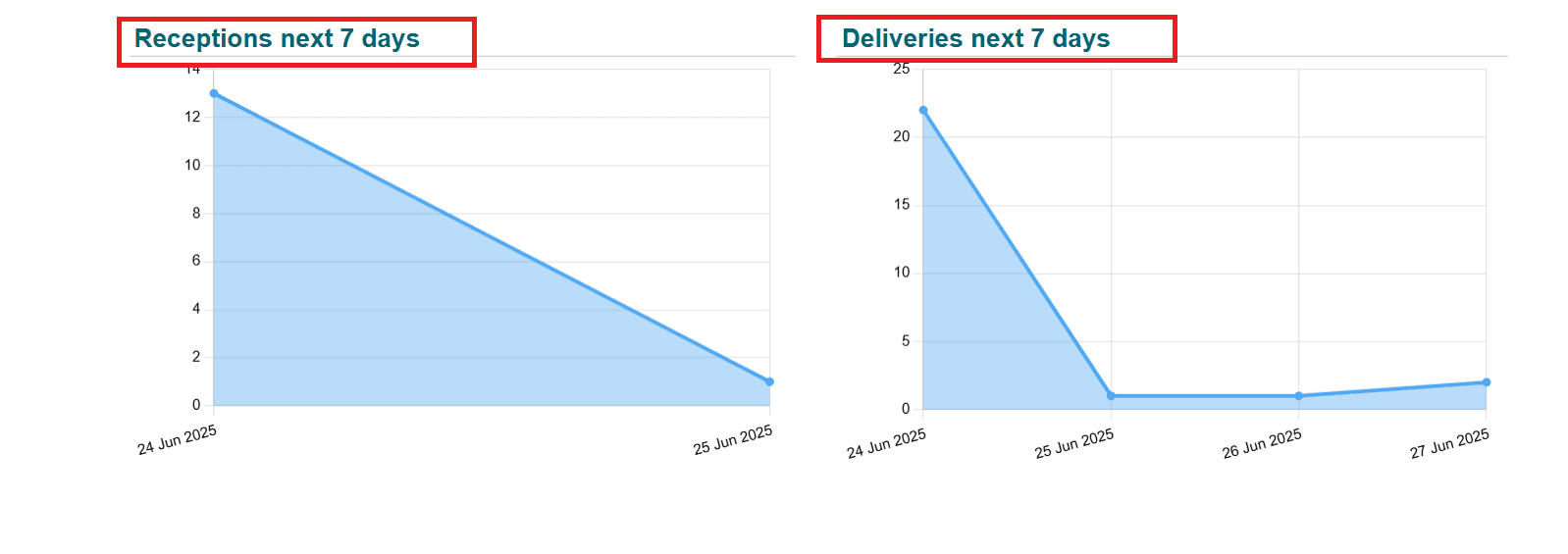
Warehouse:
Select the Warehouse Daily option from the Logistics section. Here, you can see the numbers of Late deliveries, Late receptions, and Late internal transfers. You can analyze the data, such as Transfer to be assigned, Open transfers to date, Open receptions to date, Open internal transfers to date, Open deliveries to date, Receptions next 7 days, and Deliveries next 7 days, with the help of graphs. You can also view Open late receipts, Open late internal transfers, and Open late deliveries in a listed form.
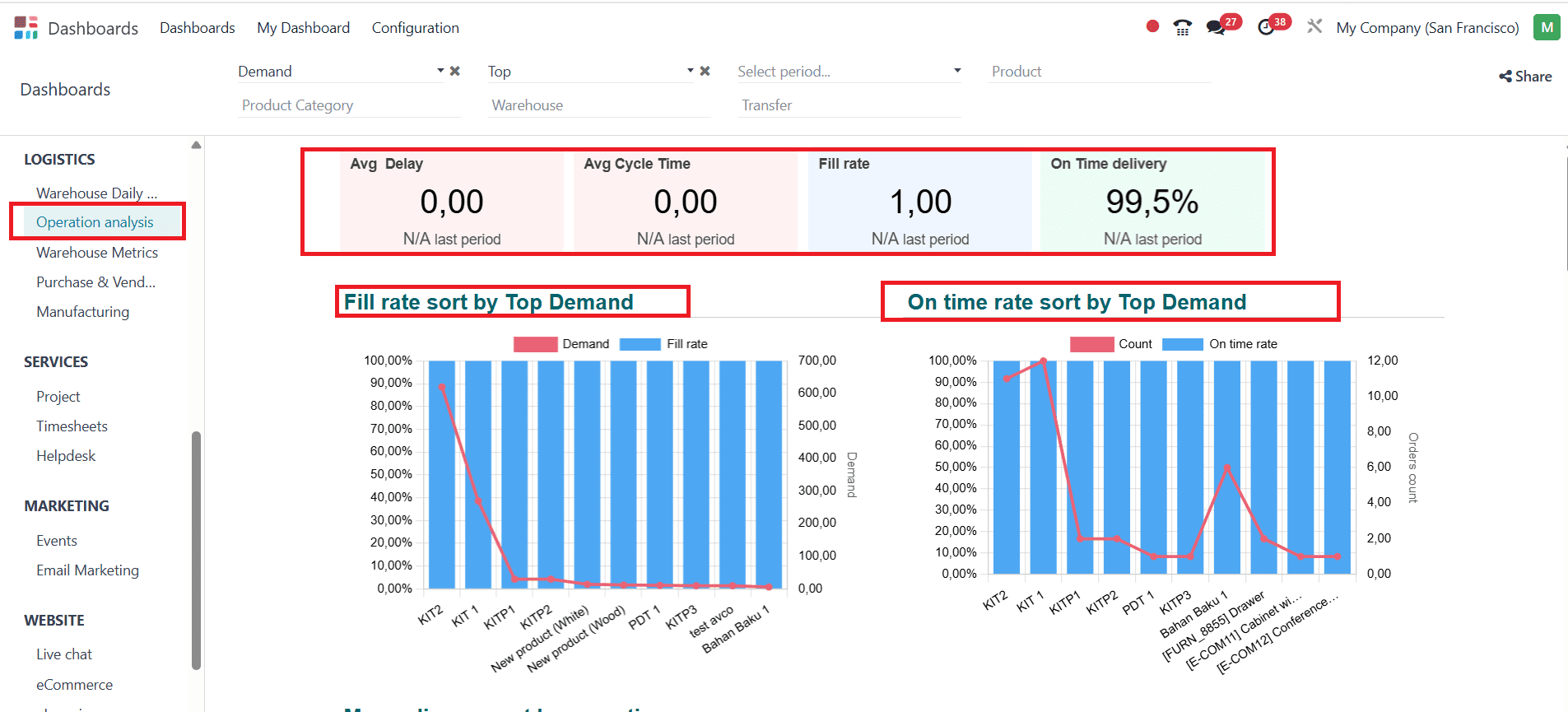
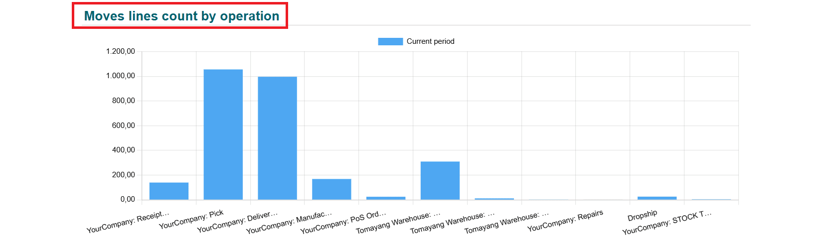
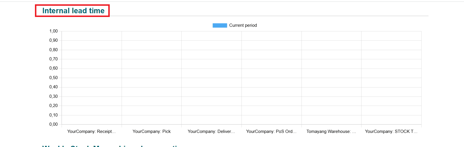
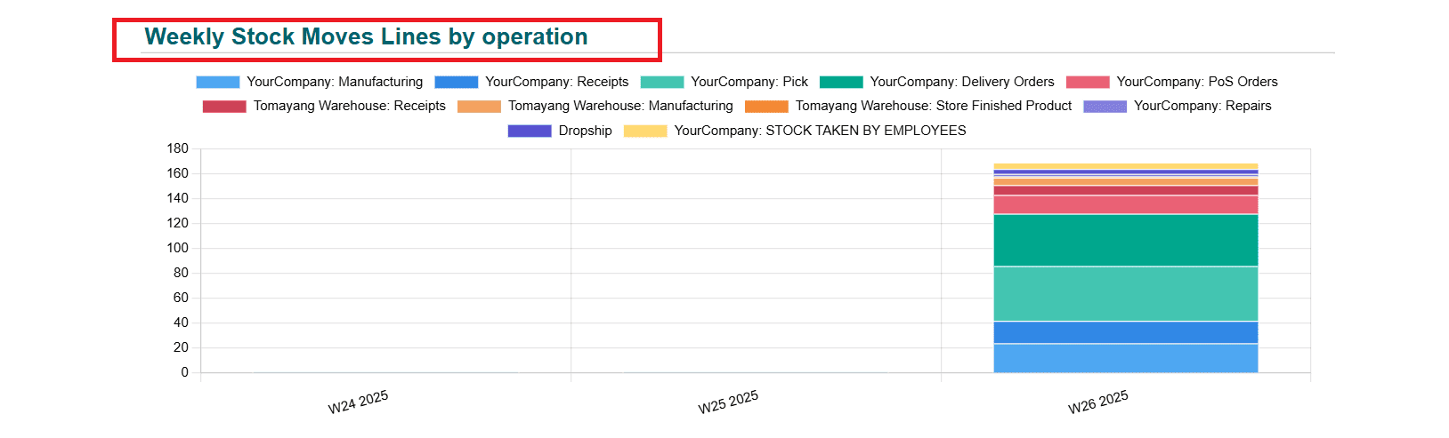
Operation Analysis:
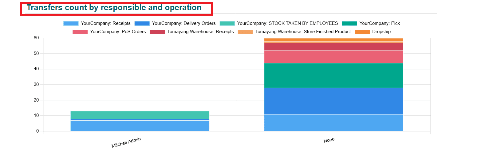
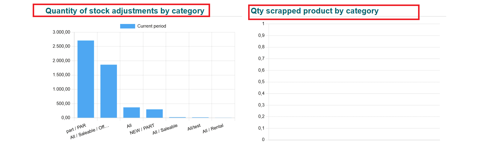
In the Operational analysis option, you can get an idea about the Avg Delay, Avg Cycle Time, Fill rate, and percentage of On Time delivery. Here, the graphs shows the details of Fill rate sort by Top Demand, On time rate sort by Top Demand, Moves lines count by operation, Internal Lead Time, Weekly Stock Moves Lines by operation, Transfers count by responsible and operation, Quantity of stock adjustments by category, and Qty scrapped product by category.
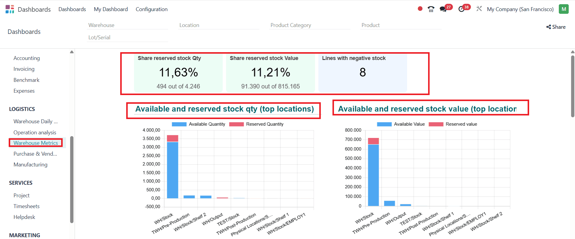
Warehouse Metrics:
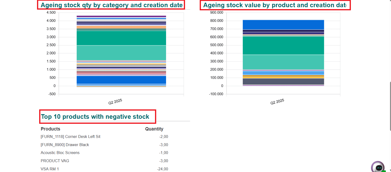
In the Warehouse metrics option, you can easily analyze the percentage of Share reserved stock Qty, Share reserved stock value, and the number of Lines with negative stock. Here, the graphs display the details of Available and reserved stock quantity, ageing stock value, ageing stock quantity by category and creation date, and Ageing stock value by product and creation date. The top 10 products with negative stock are listed below.
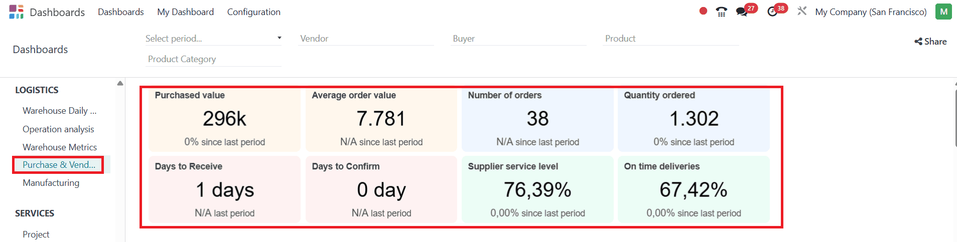
Purchase & Vendor:
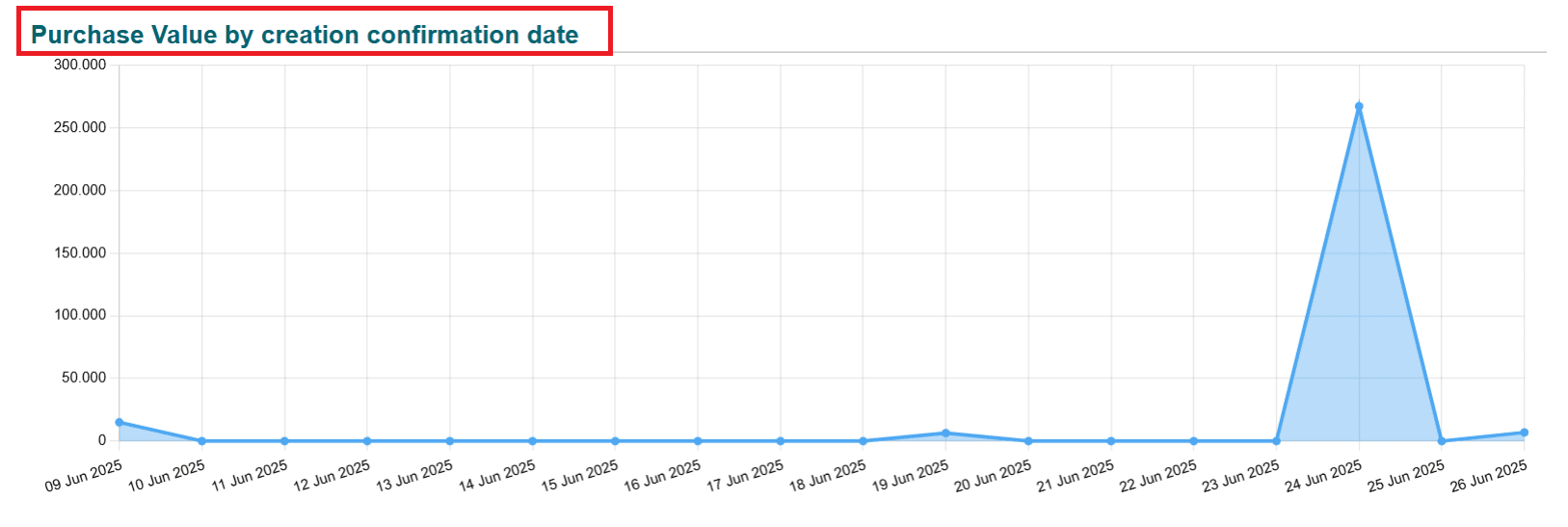
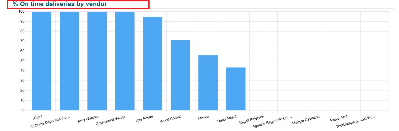
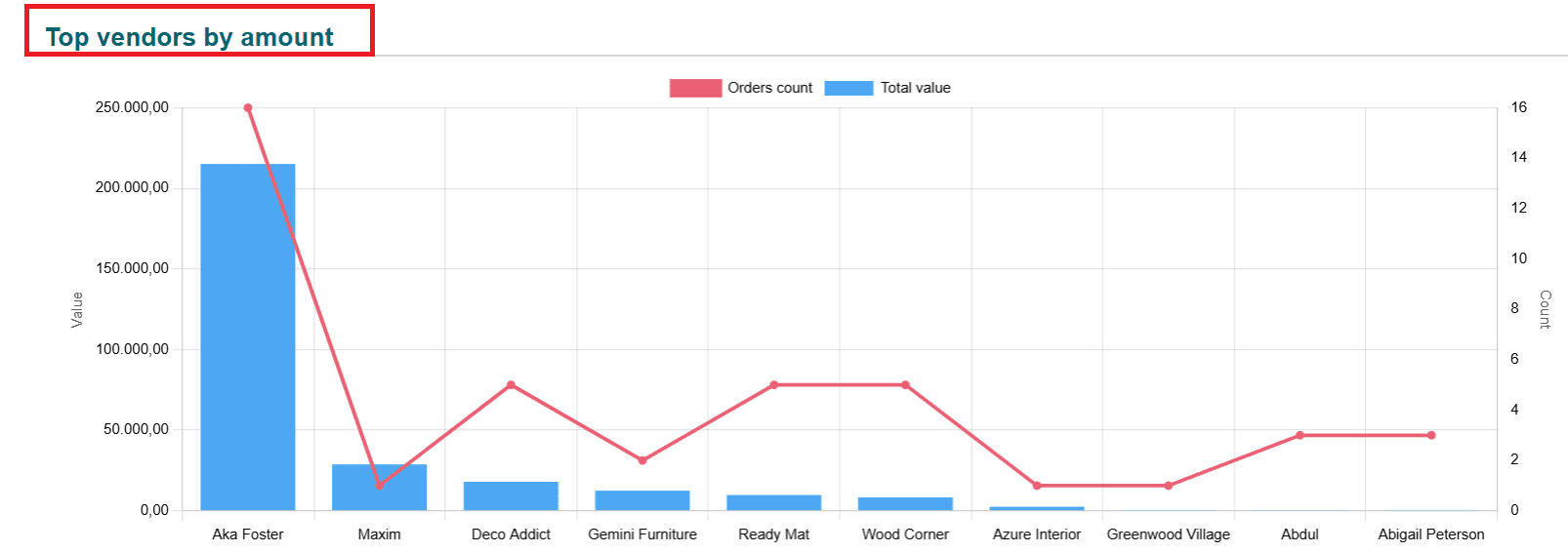
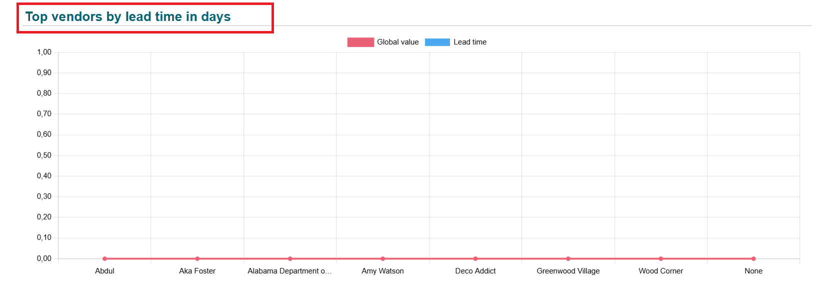
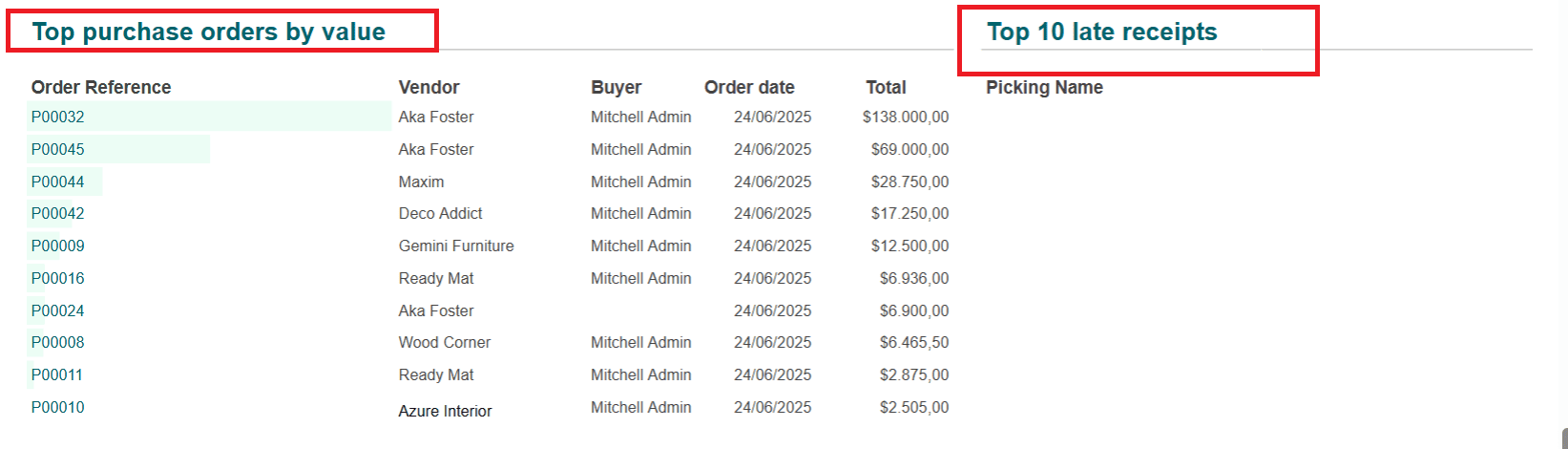
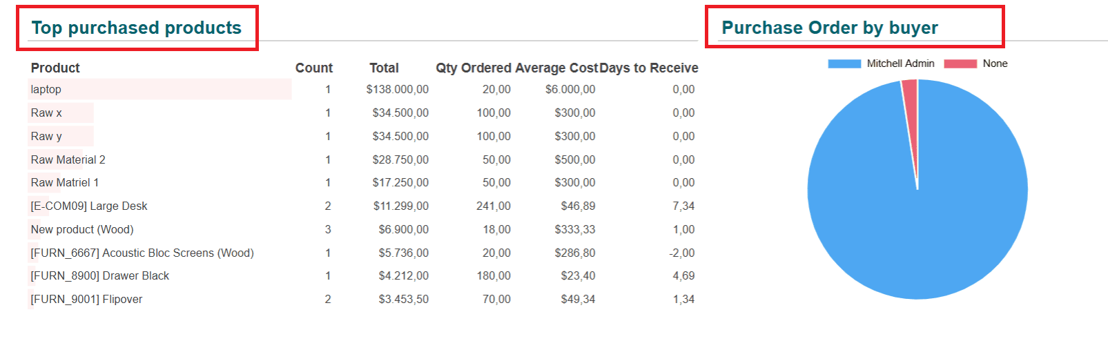
In the Purchase & Vendor option, you can easily view details such as purchased value, Average order value, Number of orders, Quantity ordered, Days to receive, Days to confirm, Supplier service level, and on-time deliveries. The graph presents an analysis of Purchase Value by creation confirmation date, the percentage of on-time deliveries by vendor, the top vendors by amount, the top vendors by lead time in days, the average product purchased cost by confirmation week, and the purchase order by buyer. Top purchase orders by value and Top purchased products are arranged in a list form.
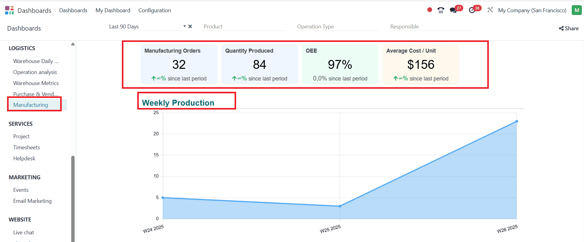
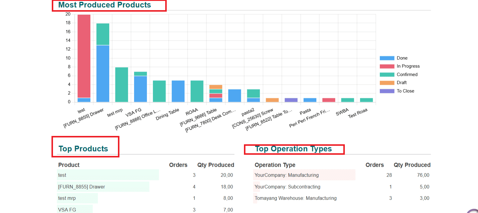
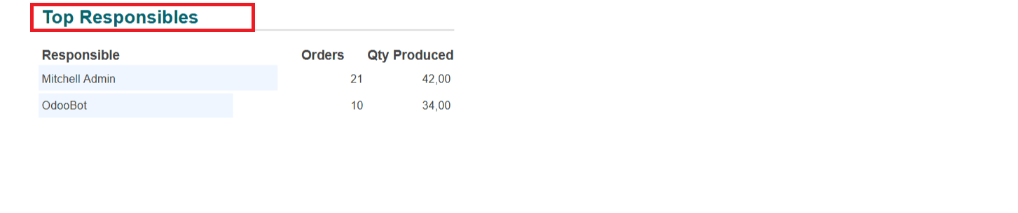
Manufacturing:
In the Manufacturing option, you can see the number of Manufacturing Orders, Quantity Produced, percentage of OEE, and average cost/unit. You can analyze Weekly Production and Most Produced Products with the help of graphs. Top Products, Top Operation Types, and Top Responsibles are listed below:
Services:
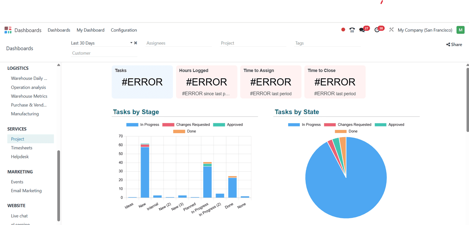
Project:
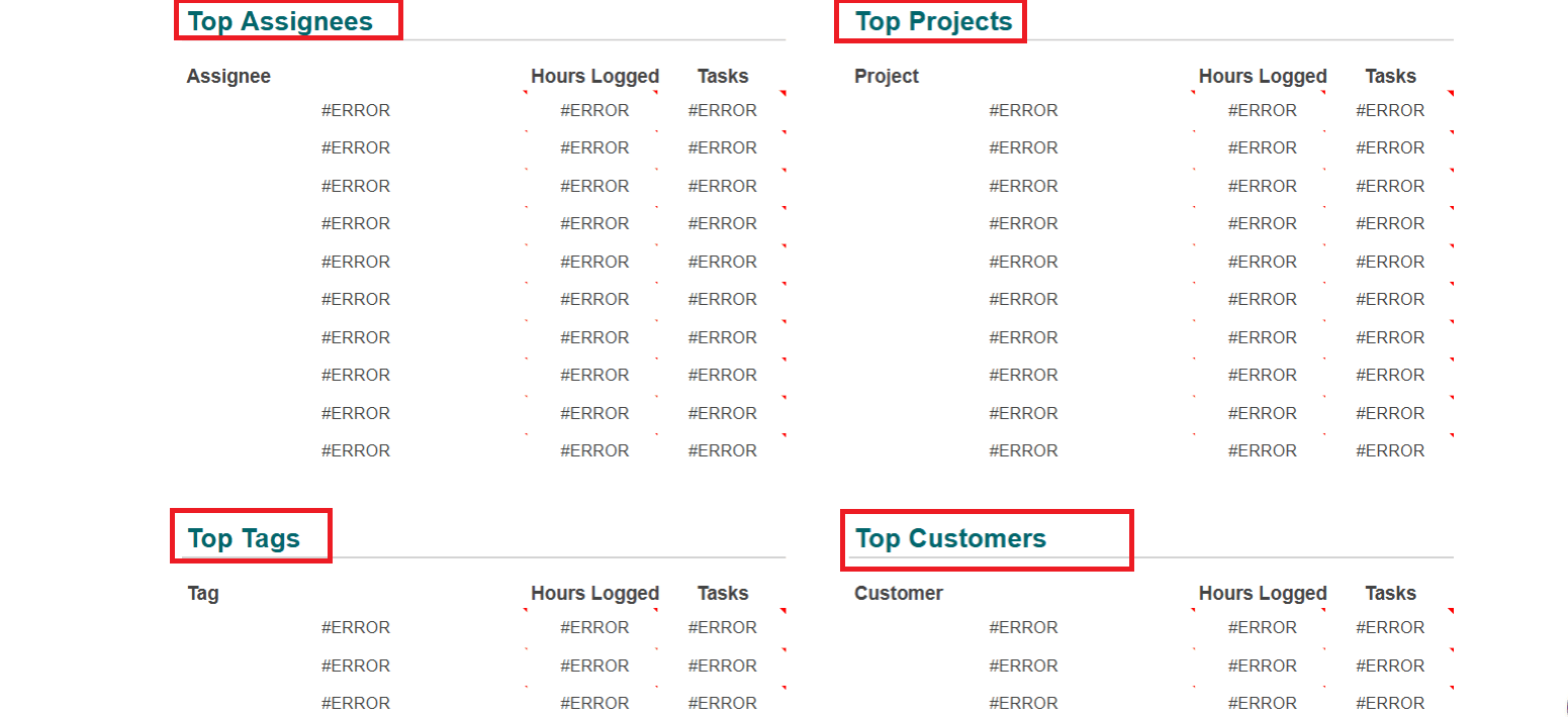
In the Project option under the Services section, you can view graphs that show the analysis of Tasks by Stage and Tasks by State. The Top Assignees, Top Projects, Top Tags, and Top Customers lists can be seen below:
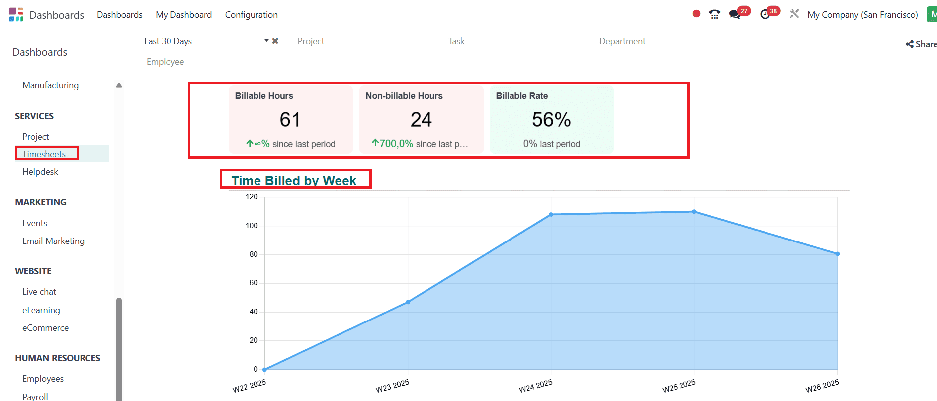
Timesheets:
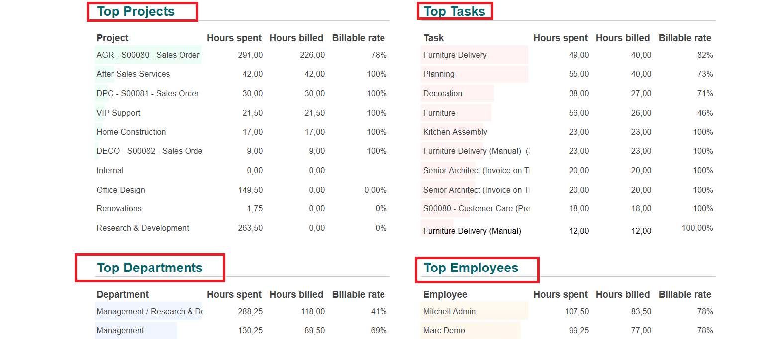
In the Timesheet option, you can easily analyze the Billable Hours, Non-billable Hours, and percentage of Billable Rate. The graph shows the Time Billed by Week. The list below displays the Top Projects, Top Tasks, Top Departments, and Top Employees.
Helpdesk:
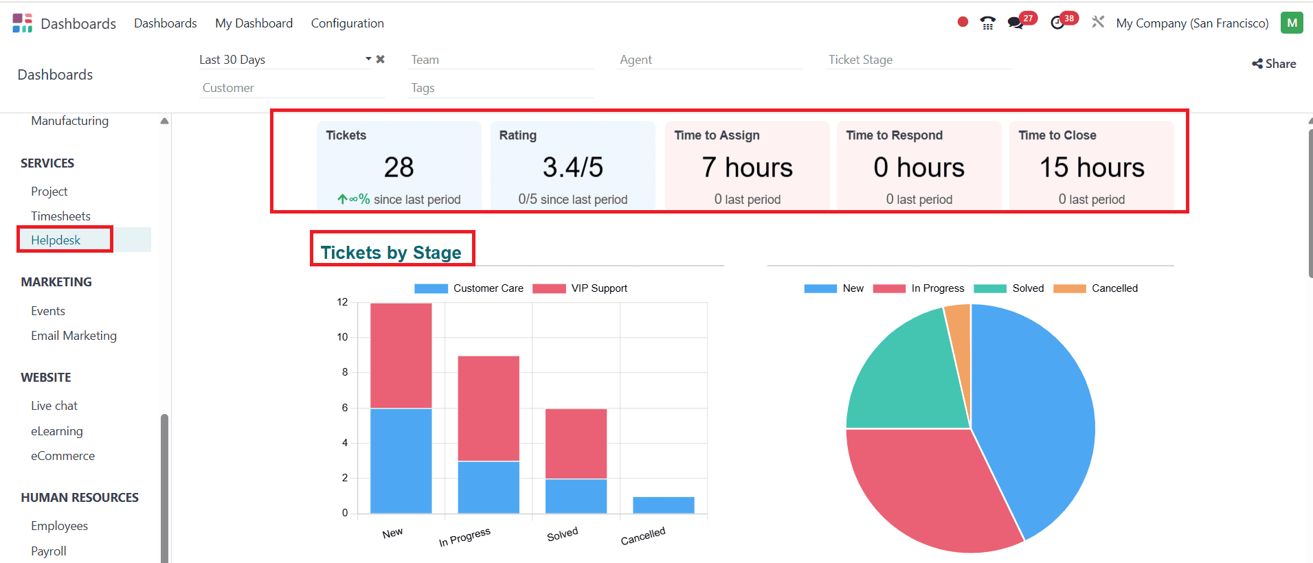
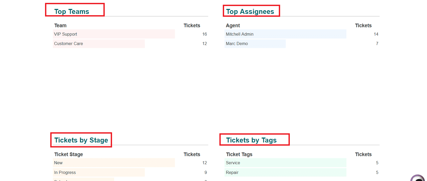
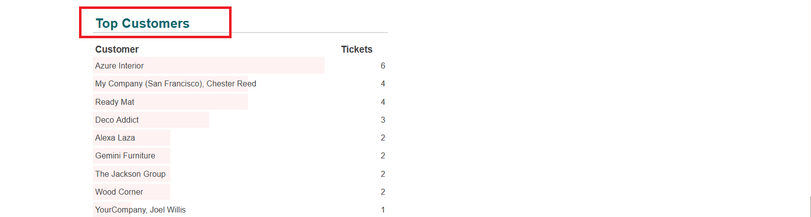
In the Helpdesk option, you can access data on Tickets, Ratings, Time to Assign, Time to Respond, and Time to Close. The graph shows the analysis of the Tickets by Stage in a bar and pie chart. Top Teams, Top Assignees, Tickets by Stage, Tickets by Tags, and Top Customers are also listed below:
Marketing:
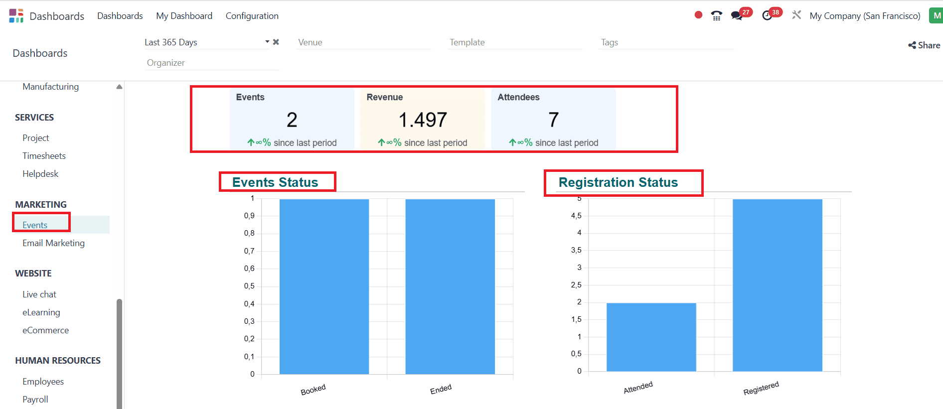
Events:
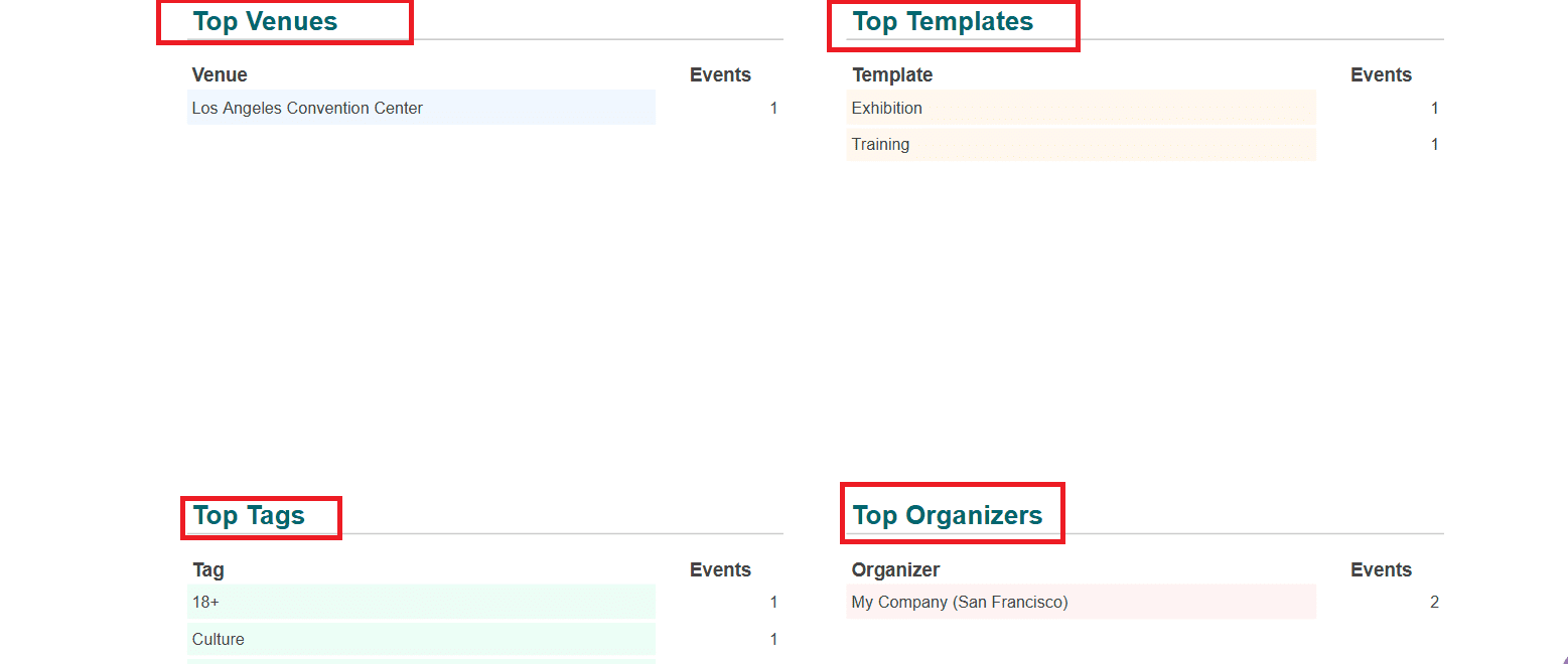
In the Events option, you can view the number of Events, Revenue, and Attendees. The graph shows the Events Status and Registration Status. Top Venues, Top Templates, Top Tags, and Top Organizers are also listed below:
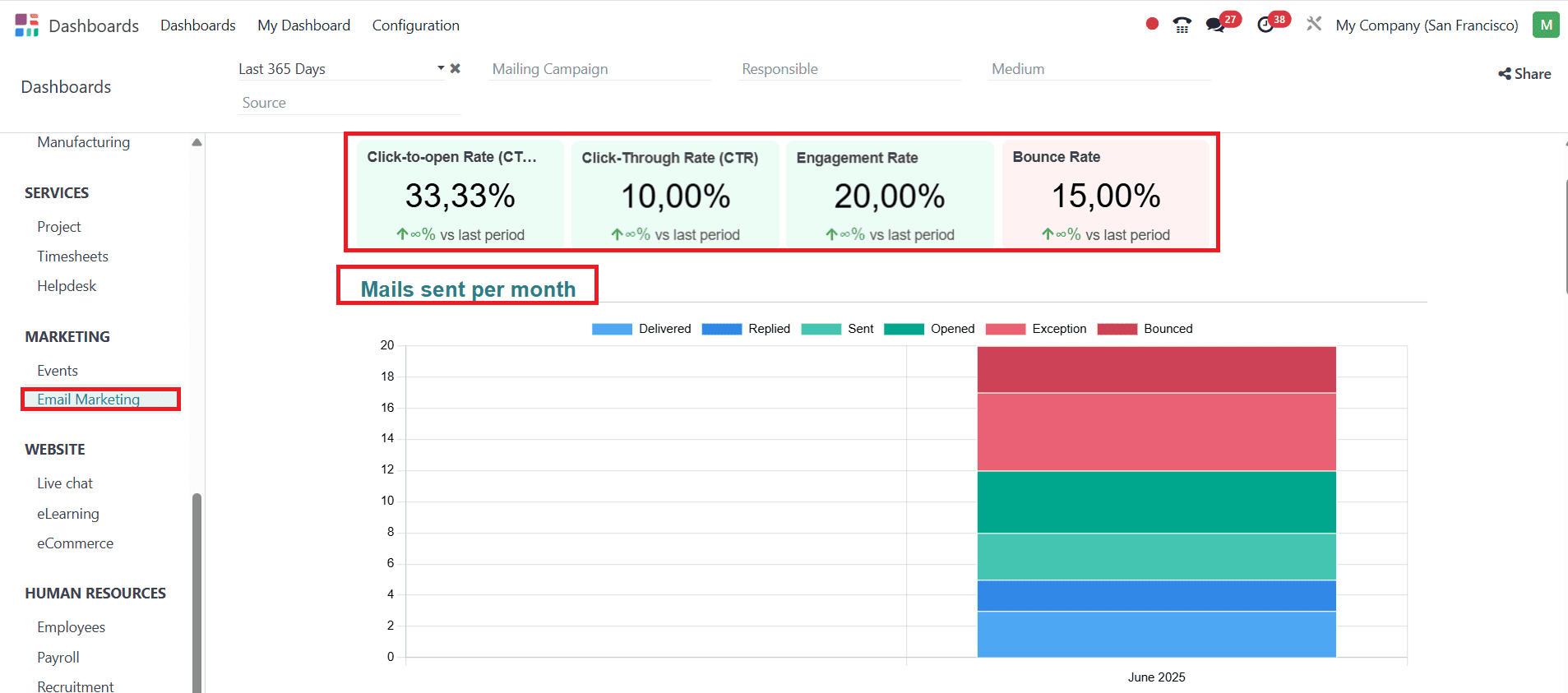
Email Marketing:
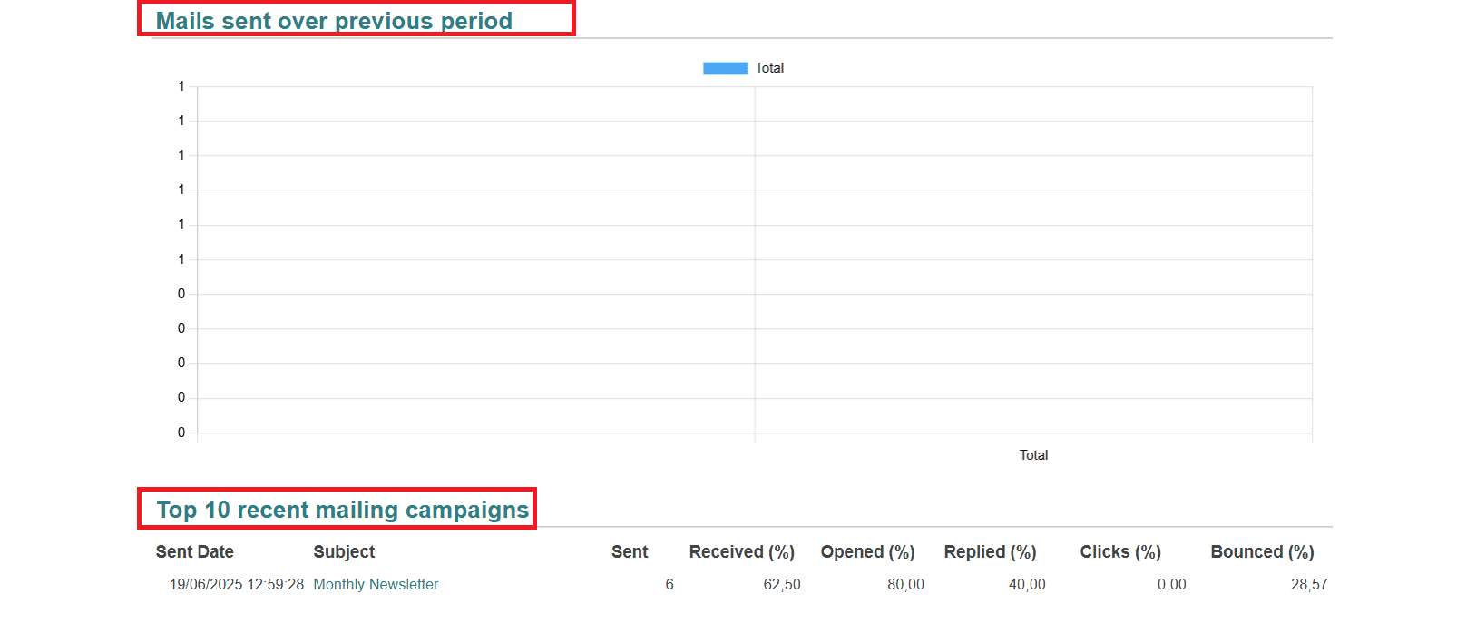
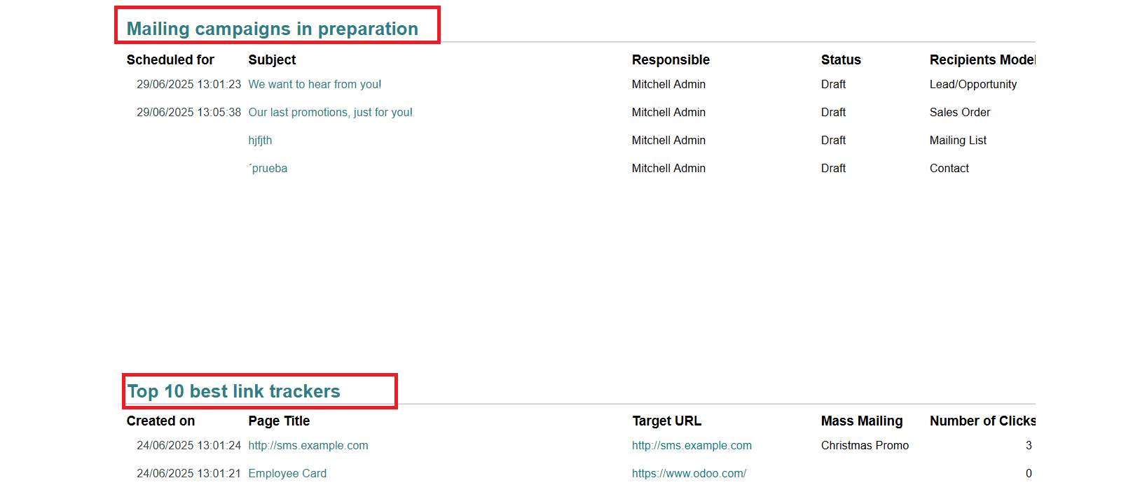
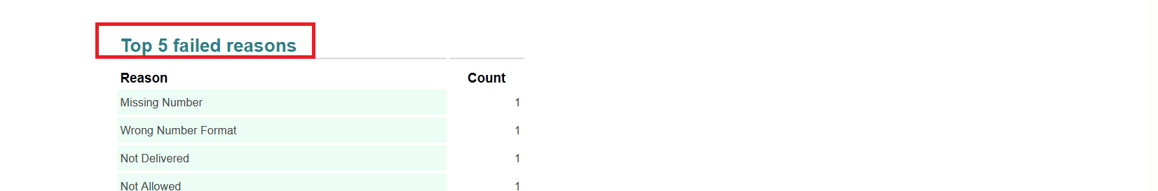
In the email marketing option, you can view the percentages of Click-to-Open Rate, Click-Through Rate, Engagement Rate, and Bounce Rate. The graph shows the Mails sent per month and the Mails sent over the previous period. You can also view the Top 10 recent mailing campaigns, mailing campaigns in preparation, the Top 10 best link trackers, and the Top 5 failed reasons in a list form.
Website:
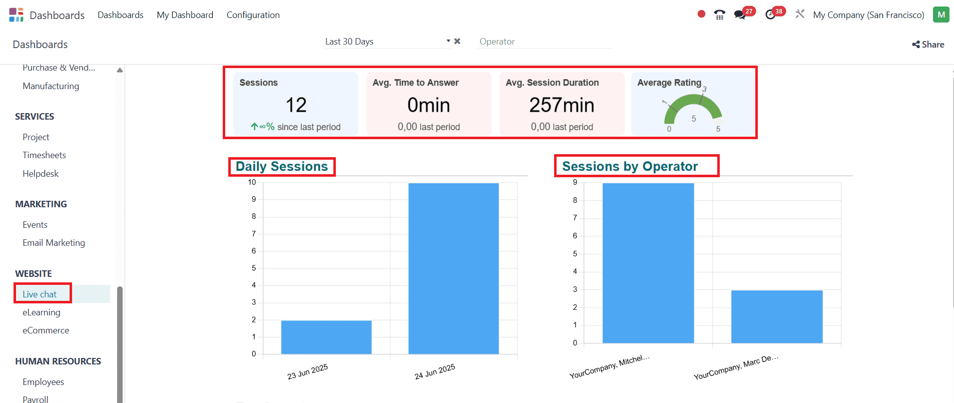
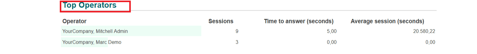
Livechat:
In the Live Chat option, you can view details such as sessions, average time to answer, average session duration, and average rating. The graph helps to analyze Daily Sessions and Sessions by operator. Top Operators can also be viewed in a list form.
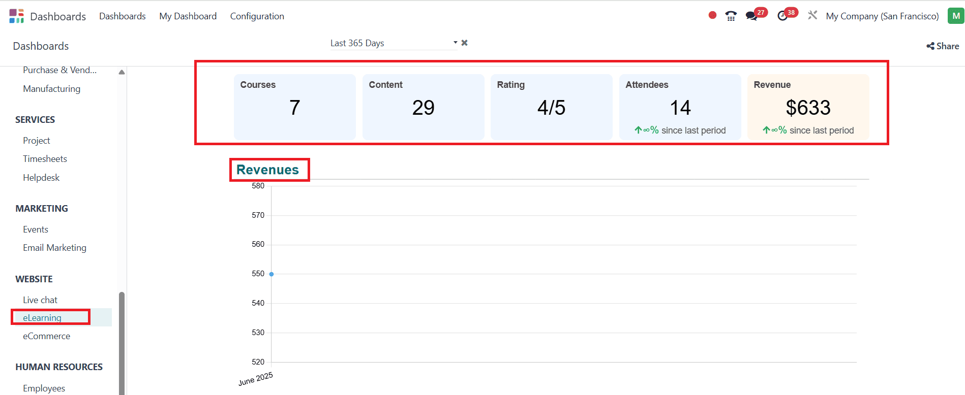
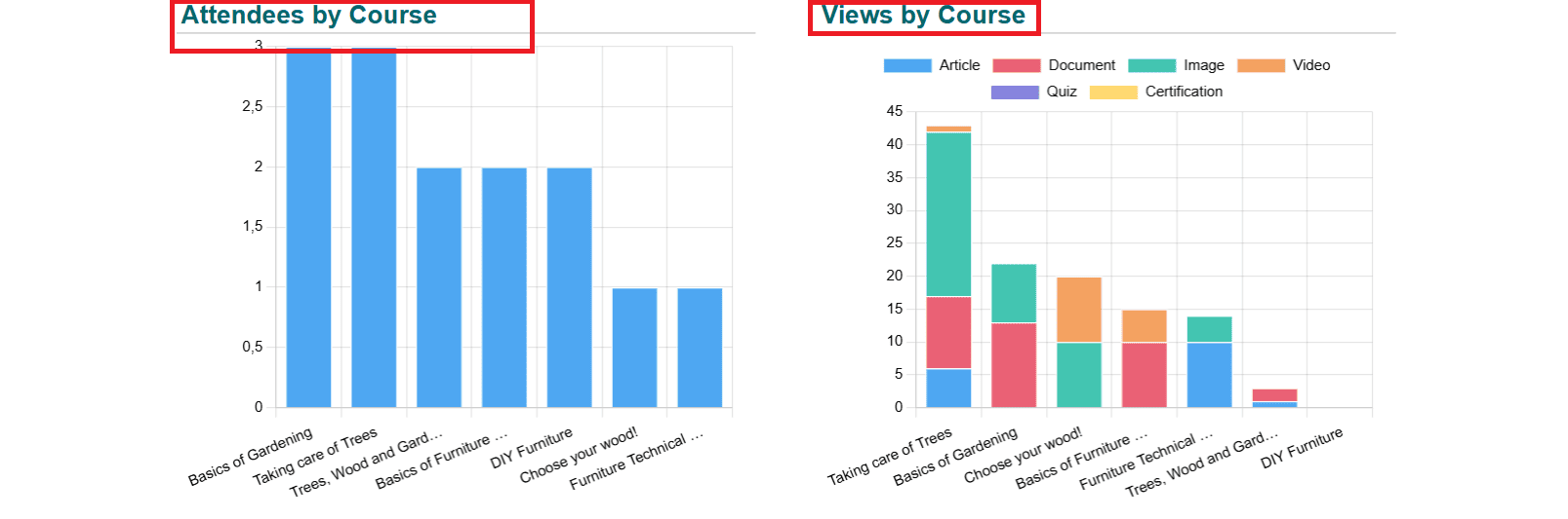
eLearning:
In the eLearning feature, you can view the details such as Courses, Content, Rating, Attendees, and Revenue. The graphs help to analyze Revenues, Attendees by Course, and Views by Course.
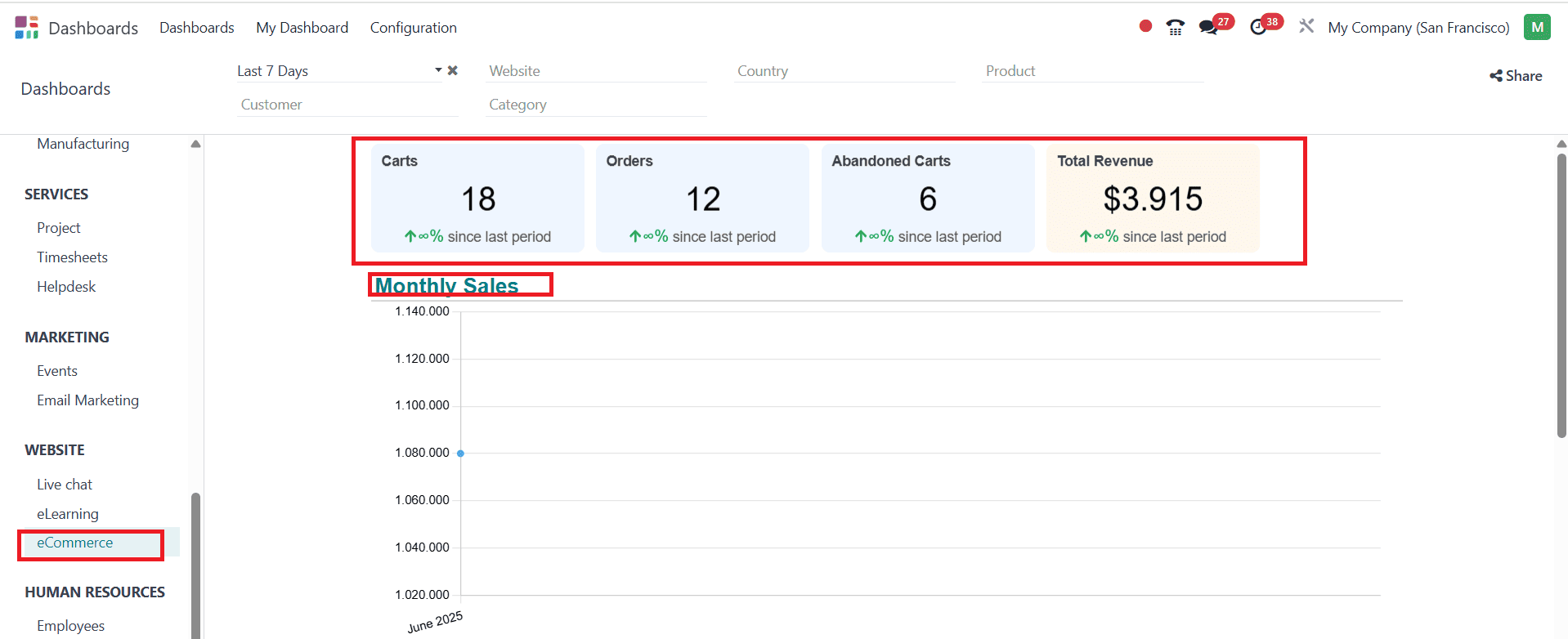
eCommerce:
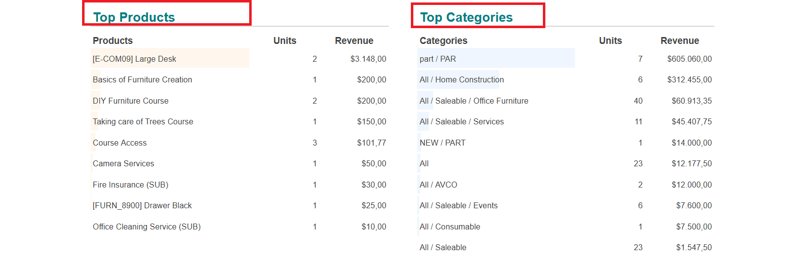
In the eCommerce option, you can view the details such as Carts, Orders, Abandoned Carts, and Total Revenue. The graph helps to analyze the Monthly Sales data. We can also get an idea of Top Products and Top Categories with the help of a list form.
Human Resources:
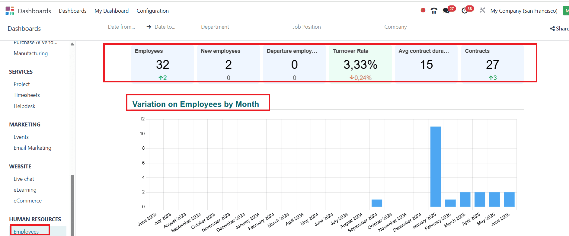
Employees:
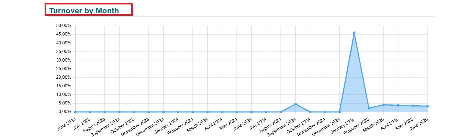
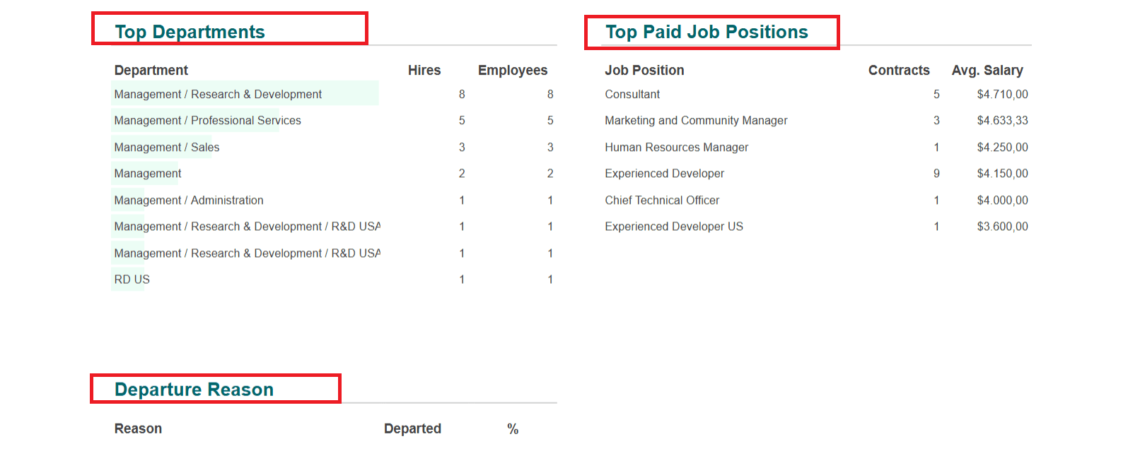
In the Employee feature, you can easily obtain information about the number of Employees, New employees, Departing employees, Average contract duration, Contracts, and the percentage of Turnover Rate. The graphs help to analyze the Variation in Employees by Month and Turnover by Month. We can easily obtain the Top Departments, Top Paid Job Positions, and Departure reasons, which are listed in a clear format.
Payroll:
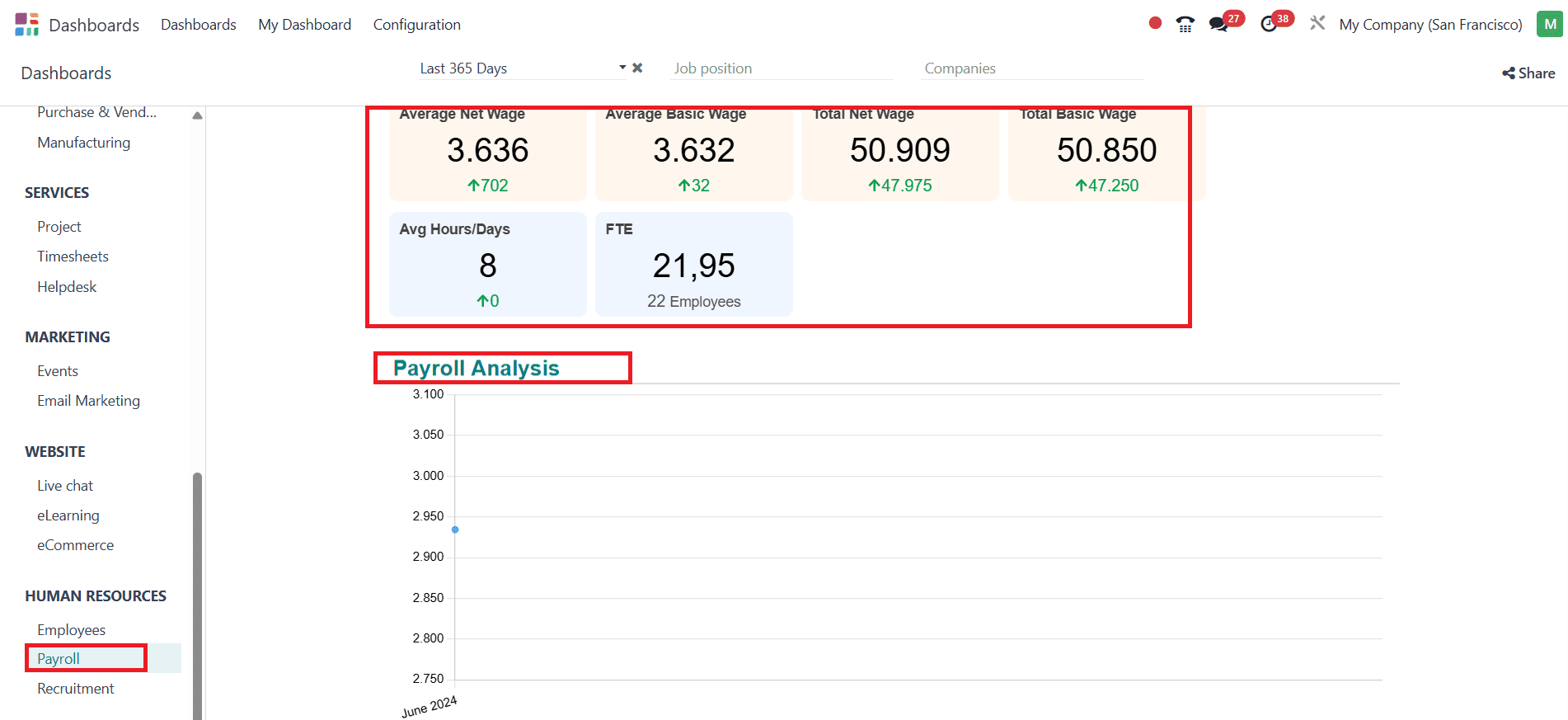
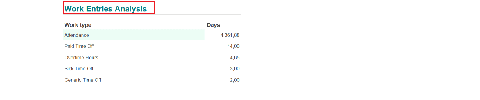
In the Payroll feature, you can easily get an idea about the Average net wage, Average basic wage, Total net wage, Total basic wage, Average hours/days, and FTE. With the help of a graph, we can easily get Payroll analysis. Work entries analysis is also seen in a listed form.
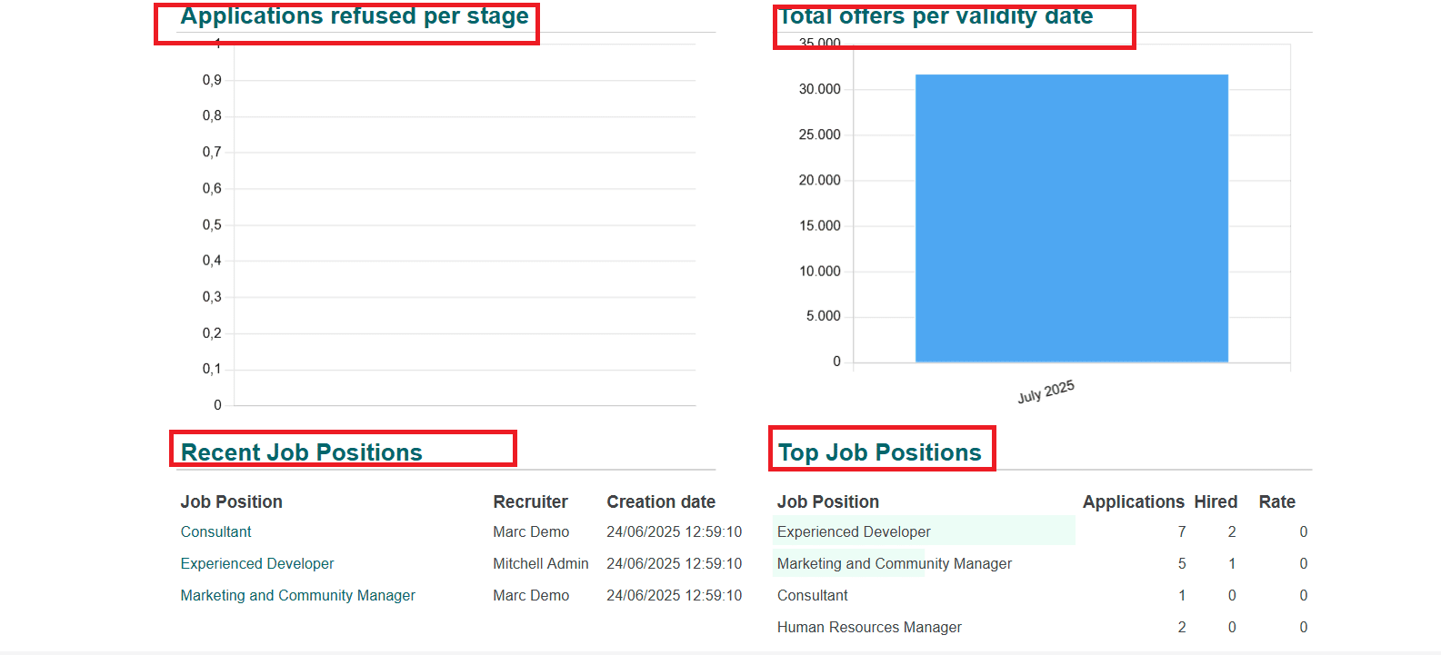
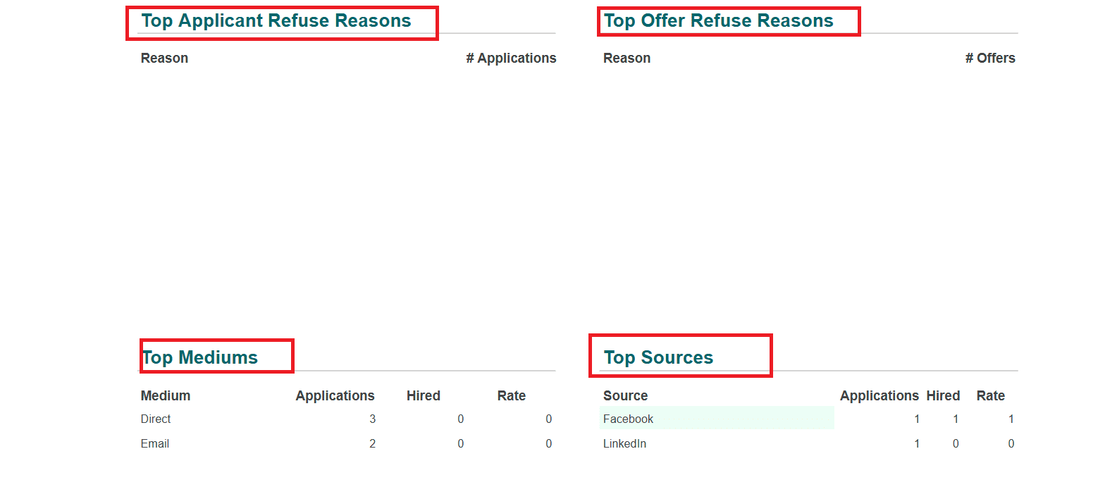
Recruitment:
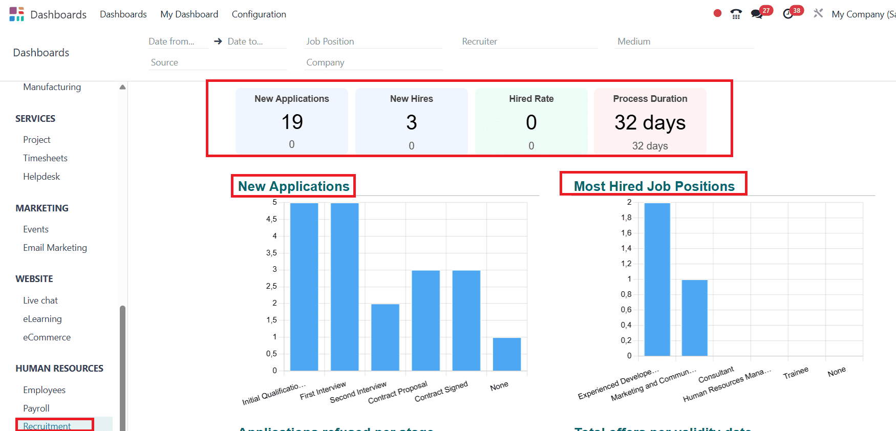
In the Recruitment option, you can easily analyse the number of New Applications, New Hires, Hired Rate, and Process Duration. With the help of a graph, we can easily get an analysis of New Applications, Most Hired Job Positions, Applications refused per stage, and Total offers per validity date. Recent Job Positions, Top job positions, Top applicant refuse reasons, Top offer refuse reasons, Top mediums, Top sources, and Top recruiters are listed.

In conclusion, any firm that values performance tracking and data visibility must have the Odoo 18 Dashboard module. It enables companies to track operations and make better decisions by providing a comprehensive suite of visualizations and real-time analytics.
To read more about how to create a Dashboard in Odoo 18, refer to our blog How to Create Dashboard in Odoo 18.