Kanban views in Odoo make it easy to track and manage workflows at a glance. They visually organize records into clear stages, helping teams understand progress without digging into detailed reports. However, Kanban boards become even more powerful when they are enhanced with Kanban Widgets.
Kanban widgets make your cards more lovely and interesting by introducing interactive elements, visual indicators, and meaningful highlights directly on each record. Instead of just displaying static information, widgets allow users to interact with data instantly—making Kanban views more intuitive and efficient.
In this blog, we will discuss what Kanban widgets are, how Kanban widgets are different from standard Kanban views in Kanban systems, and how Kanban widgets can be employed in Odoo to design more interactive and engaging interfaces.
Kanban View vs. Kanban Widget
However, before we dive in, we should note the difference between "the view" and "the widget":
- Kanban View: The container or "board" on which records are laid out through columns (e.g., "Draft", "In Progress", "Done"). The Kanban View represents the full view type offered by Odoo, similar to the form views, tree views, calendar views, among others.
- Kanban Widget: It is a specific UI component used for displaying a single field value inside a card. For instance, a selection field turned into clickable stars (Priority) or a user dropdown turned into an avatar.
Essential Kanban Widgets in Odoo 19
Here is a list of the most commonly used widgets available for Kanban views in Odoo 19, along with examples from our demo module.
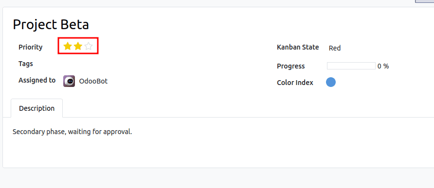
1. Priority Widget (widget="priority")
- Use Case: Displaying a rating or importance level (e.g., Low, Medium, High).
- Visual: Clickable stars.
Code Example:
<field name="priority" widget="priority"/>
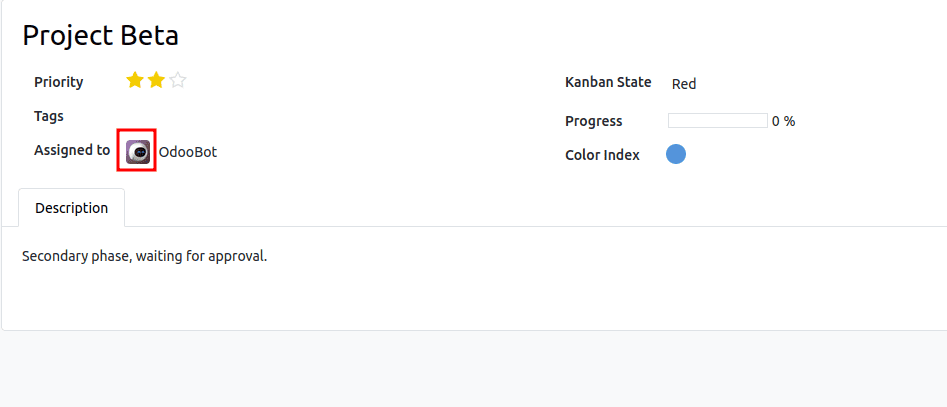
2. User Avatar (widget="many2one_avatar_user")
- Use Case: Showing the assigned user's profile picture.
- Visual: A circular avatar image.
Code Example:
<field name="user_id" widget="many2one_avatar_user"/>
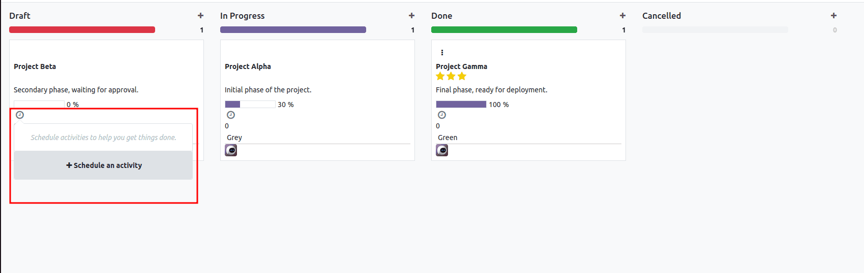
3. Activity Widget (widget="kanban_activity")
- Use Case: Managing scheduled activities (calls, meetings, emails) directly from the card.
- Visual: A clock icon that changes color based on due date (Green=Future, Yellow=Today, Red=Overdue).
Code Example:
<field name="activity_ids" widget="kanban_activity"/>
4. Many2Many Tags (widget="many2many_tags")
- Use Case: Displaying categories or labels associated with the record.
- Visual: Colored pills.
Code Example:
<field name="tag_ids" widget="many2many_tags" options="{'color_field': 'color'}"/>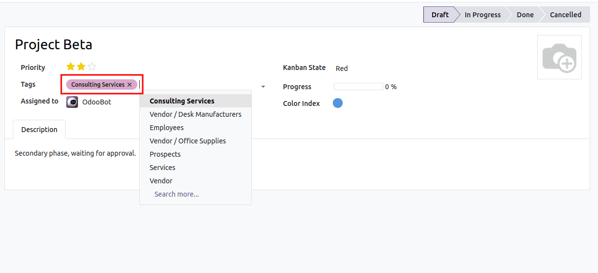
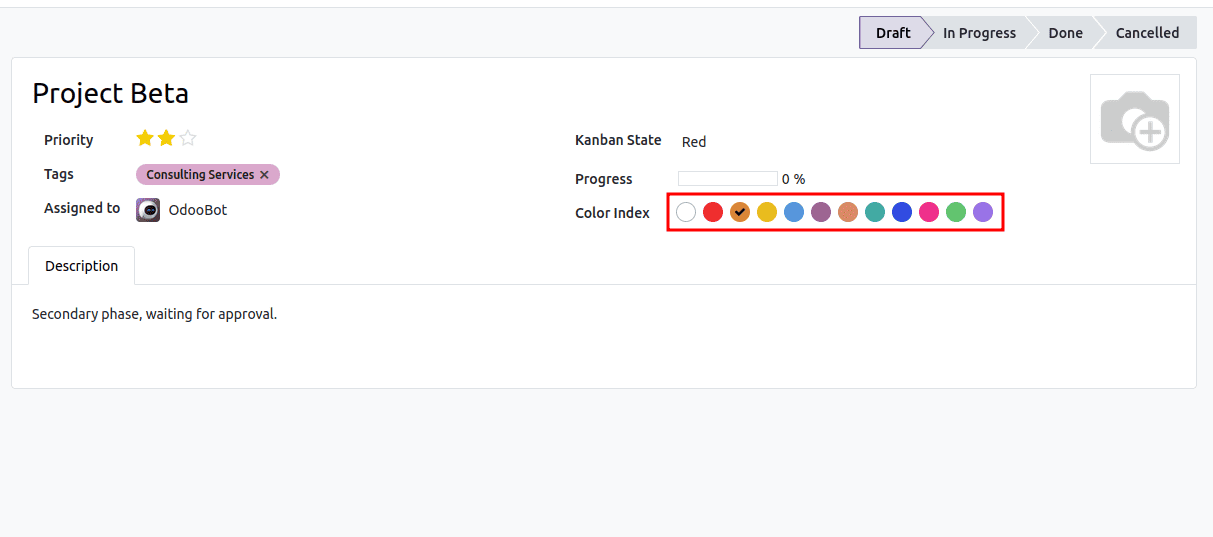
5. Color Picker (widget="color_picker")
- Use Case: Allowing users to change the background color of the card.
- Visual: A palette of colors in the dropdown menu.
Code Example:
<field name="color" widget="color_picker"/>
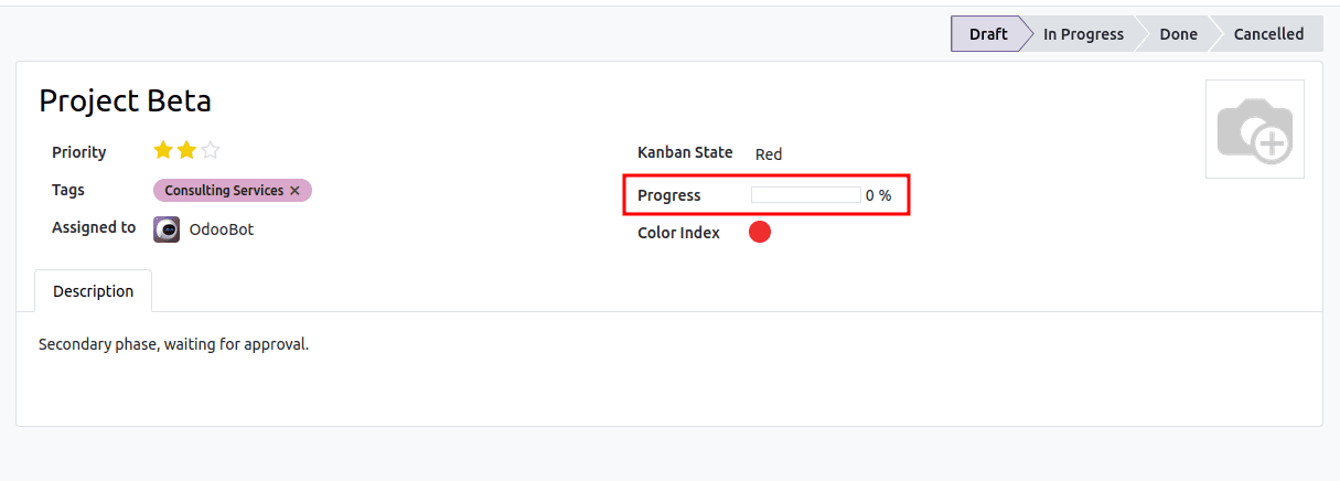
6. Progress Bar (widget="progressbar")
- Use Case: Visualizing a numeric value as a completion percentage.
- Visual: A horizontal bar filled based on the value.
Code Example:
<field name="progress" widget="progressbar"/>
Other Available Widgets
Although the above-mentioned are the most used in the Kanban cards, there are many others that you may use according to the type of information you have in the Odoo system:
- boolean_toggle: Toggle switch for boolean fields.
- image: Presents a binary field as an image.
- monetary: Formats numbers as currency.
- handle: Drag handle for ordering records by hand (used in list views and in some other situations).
- statinfo: Used in “Smart Buttons.”
The widgets can transform a basic Kanban board interface into an engaging and interactive work environment. Including "widget=." in your Kanban XML fields can thus increase the efficiency and effectiveness of data visualization and handling in your records by a tremendous degree, just by making a minor modification in your interface design.
To read more about Everything You Need to Know About Char Widgets in Odoo, refer to our blog Everything You Need to Know About Char Widgets in Odoo.