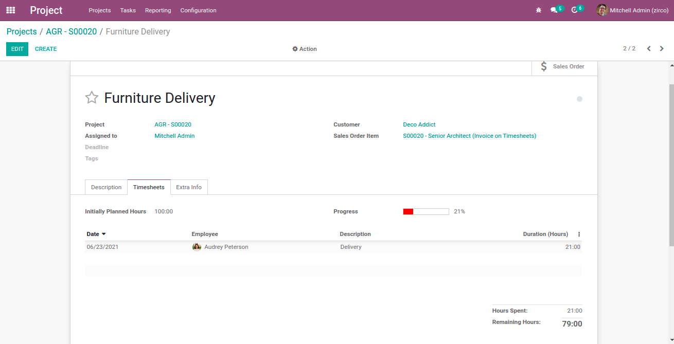
Odoo has different types of widgets available to perform different functionalities. Checkboxes, Status bar, Radio buttons, and many more widgets, that can be implemented with ease making the operations run easily. Progress bar is a widget in Odoo, used to represent the progress of our operations. In Odoo we can see the progress bar in many models. For example, in the Project module inside the tasks, we can see timesheets to enter the time spent on each task which will be auto-defined, based on the timesheets we get a progress bar of our tasks.
In this blog, I am going to discuss how we can change the color on a progress bar in Odoo 14.
As there is no way to directly change the color of the progress bar, therefore, we want to use javascript code for changing the color of the progress bar. For that initially, we want to create an integer type field for storing the value of the progress bar. Further, then we can give our own function to add value to the progress bar. Then specify the progress bar field on the XML code by using the widget progress bar. As done in the following code:
<field name="level_progress" widget="progressbar" />

In Odoo, blueish-green is the default color of the progress bar. We can use js and CSS for changing the colors. To do so we have to create a xml file for specifying the path of the css and js files. Which can be done as described in the following code:
<odoo>
     <template id="assets_backend" inherit_id="web.assets_backend"
      name="Progress bar">
          <xpath expr="." position="inside">
               <link rel="stylesheet" type="text/scss"
                href="/module_name/static/src/css/progress_bar_color.css"/>
               <script type="text/javascript"
                src="/module_name/static/src/js/progress_bar_color.js"/>
          </xpath>
     </template>
</odoo>
Next, we have to create different classes from the CSS file to specify the color. Here I am giving 4 colors red, yellow, light green, and dark green for the progress bar.
CSS
The following code should be described under the css file to create the different classes:
.o_progressbar .o_progress .o_progressbar_complete.o_progress_red {
  background-color: #FF0000;
  height: 100%;
}
.o_progressbar .o_progress .o_progressbar_complete.o_progress_yellow {
  background-color: #FFFF00;
  height: 100%;
}
.o_progressbar .o_progress .o_progressbar_complete.o_progress_light_green {
  background-color: #00FF00;
  height: 100%;
}
.o_progressbar .o_progress .o_progressbar_complete.o_progress_green {
  background-color: #008000;
  height: 100%;
}
As the next step, we can give the js file for changing the color. We can extend the already existing progress bar widget and configure it to be based on the value(%) of progress bars the color will be changed. The code is given below:
JS
Define the following code in JS for the colour to be changed:
odoo.define('module_name.progress_bar_color', function (require) {
"use strict";
var core = require('web.core');
var utils = require('web.utils');
var Widget = require('web.Widget');
var FieldRegistry = require('web.field_registry');
var FieldProgressBar = require('web.basic_fields').FieldProgressBar;
FieldProgressBar.include({
    _render_value: function (v) {
        var value = this.value;
        var max_value = this.max_value;
        if (!isNaN(v)) {
            if (this.edit_max_value) {
                max_value = v;
            } else {
                value = v;
            }
        }
        value = value || 0;
        max_value = max_value || 0;
        var widthComplete;
        if (value <= max_value) {
            widthComplete = value/max_value * 100;
        } else {
            widthComplete = 100;
        }
        this.$('.o_progress').toggleClass('o_progress_overflow', value > max_value)
            .attr('aria-valuemin', '0')
            .attr('aria-valuemax', max_value)
            .attr('aria-valuenow', value);
//        this.$('.o_progressbar_complete').css('width', widthComplete + '%');
        this.$('.o_progressbar_complete').toggleClass('o_progress_red',widthComplete>0 && widthComplete<=40).css('width', widthComplete + '%');
        this.$('.o_progressbar_complete').toggleClass('o_progress_yellow',widthComplete>40 && widthComplete<=70).css('width', widthComplete + '%');
        this.$('.o_progressbar_complete').toggleClass('o_progress_light_green',widthComplete>70 && widthComplete<=90).css('width', widthComplete + '%');
        this.$('.o_progressbar_complete').toggleClass('o_progress_green',widthComplete>90 && widthComplete<=100).css('width', widthComplete + '%');
        if (!this.write_mode) {
            if (max_value !== 100) {
                this.$('.o_progressbar_value').text(utils.human_number(value) + " / " + utils.human_number(max_value));
            } else {
                this.$('.o_progressbar_value').text(utils.human_number(value) + "%");
            }
        } else if (isNaN(v)) {
            this.$('.o_progressbar_value').val(this.edit_max_value ? max_value : value);
            this.$('.o_progressbar_value').focus().select();
        }
    },
});
});
We already have a widget for progress bars that is FieldProgressBar. Moreover, here we will include the class widget, by using it we can add the features to the parent class widget then all instances of the class will include the extended features.
this.$('.o_progressbar_complete').toggleClass('o_progress_red',widthComplete>0 && widthComplete<=40).css('width', widthComplete + '%');Here the red color will apply if the width of the progress bar is between 0 and 40. That means if the value of progress bars is between 0 and 40 then the color will be red as depicted in the following image:
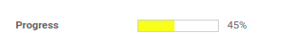
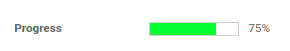
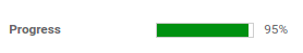
In addition, Yellow color will apply if the width of the progress bar is between 40 and 70, Light green color will apply if the width is between 70 and 90, and Dark green will apply if the width is above 90 as shown in the following images.
By using this method we can change the color on the progress bar. We can give multiple colors based on the value/width change of the progress bar as per your need. Here the color will be changed for all progress bar widgets wherever it is being used.