Welcome to an exciting exploration of ECharts, a JavaScript charting library that opens the door to a diverse realm of data visualization possibilities. In this comprehensive blog, we will delve into an extensive array of chart types offered by ECharts, from the fundamental line charts to intricate Sankey diagrams. Understanding and harnessing the power of these chart types will empower you to create visually stunning and highly informative data representations.
Introduction to ECharts
ECharts, developed by Baidu, stands out as a versatile and user-friendly library for crafting interactive and captivating visualizations. With an extensive selection of chart types, ECharts caters to diverse data representation needs. Let's embark on a journey to uncover the richness of ECharts' charting capabilities.
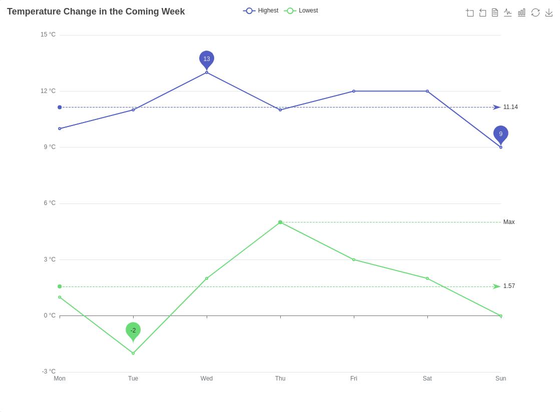
1. Line Charts: Tracing Trends with Precision
Line charts are the bedrock of data visualization, providing a clear depiction of trends over time. ECharts simplifies the creation of line charts, offering customization options for colors, tooltips, and point highlights. This classic chart type is perfect for showcasing continuous data trends with precision.
Usage Tip: Employ line charts for visualizing time-series data, such as stock prices, temperature fluctuations, or population growth.
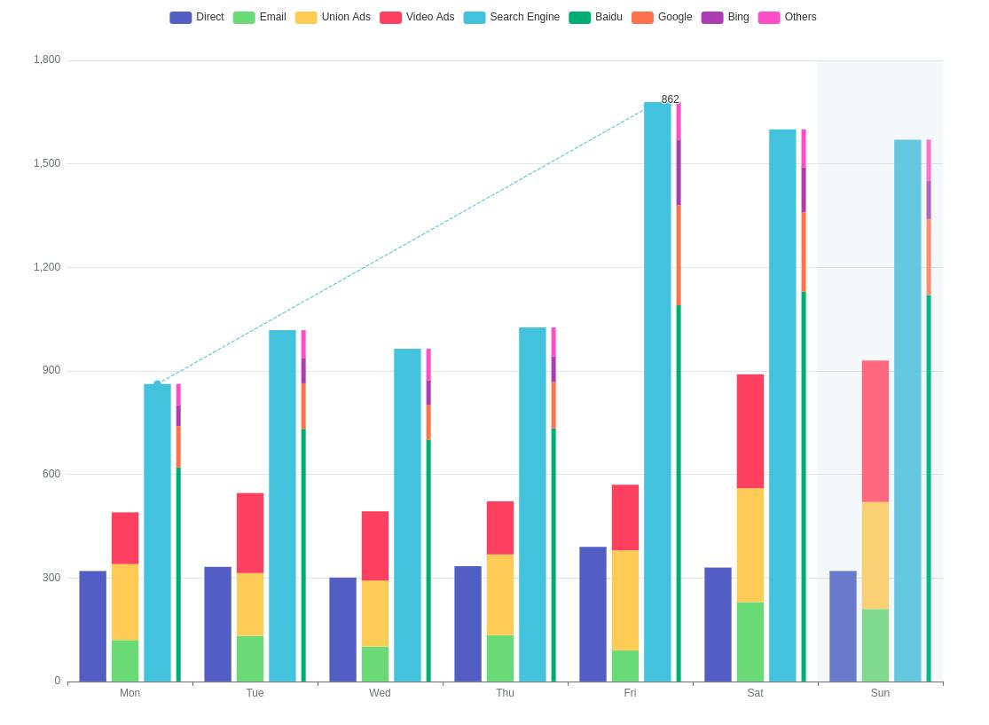
2. Bar Charts: Comparing Categories with Ease
Bar charts are indispensable for comparing values across different categories. ECharts provides both vertical and horizontal bar charts, allowing flexibility in data representation. Explore stacking bars for cumulative values or create grouped bars to present detailed category breakdowns.
Usage Tip: Opt for bar charts when comparing quantities across distinct categories, like sales figures for different products or performance metrics for various teams.
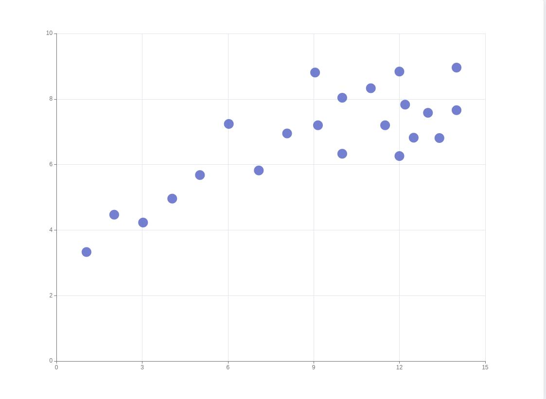
3. Scatter Plots: Uncovering Relationships in Data Points
Scatter plots are essential for revealing relationships and patterns between two variables. ECharts' scatter plot functionality facilitates customization of data point appearance, labels, and color schemes. This chart type is particularly useful for identifying correlations and outliers in your data.
Usage Tip: Use scatter plots to explore the relationship between two variables, such as plotting exam scores against study hours to identify study habits' impact.
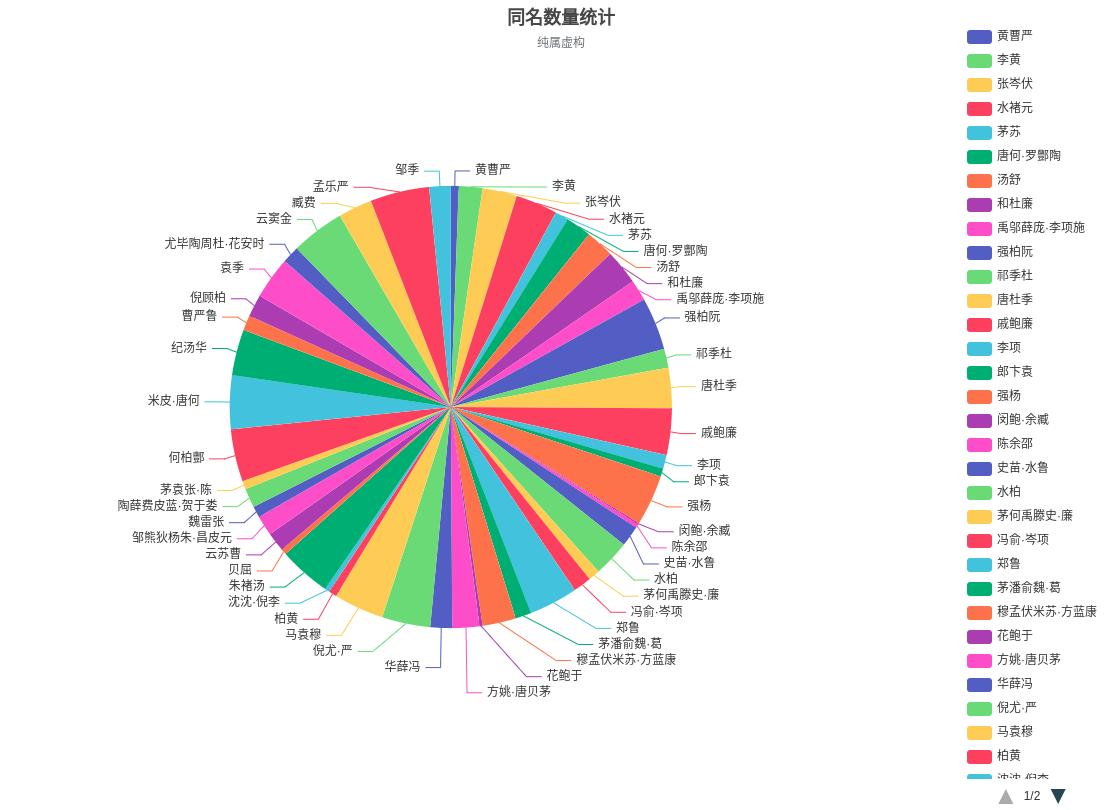
4. Pie Charts: Slicing Data for Quick Insights
Pie charts offer a straightforward representation of the proportion of parts to a whole. ECharts enhances pie charts with interactive features, enabling users to highlight and explode slices for a detailed view. Customize labels, colors, and tooltips for an informative and visually appealing presentation.
Usage Tip: Choose pie charts when representing percentages or proportions, such as a breakdown of expenses in a budget or the distribution of market shares.
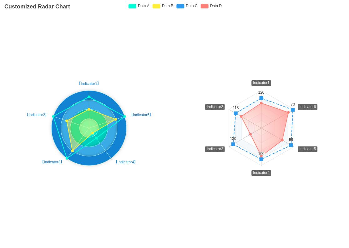
5. Radar Charts: Mapping Multidimensional Data
Radar charts excel at visualizing multidimensional data. ECharts' radar charts support multiple axes, allowing you to compare and contrast several variables simultaneously. Customize the appearance of the radar chart to convey complex information with clarity.
Usage Tip: Leverage radar charts when illustrating the performance of entities across multiple dimensions, like comparing individuals' skills in various categories.
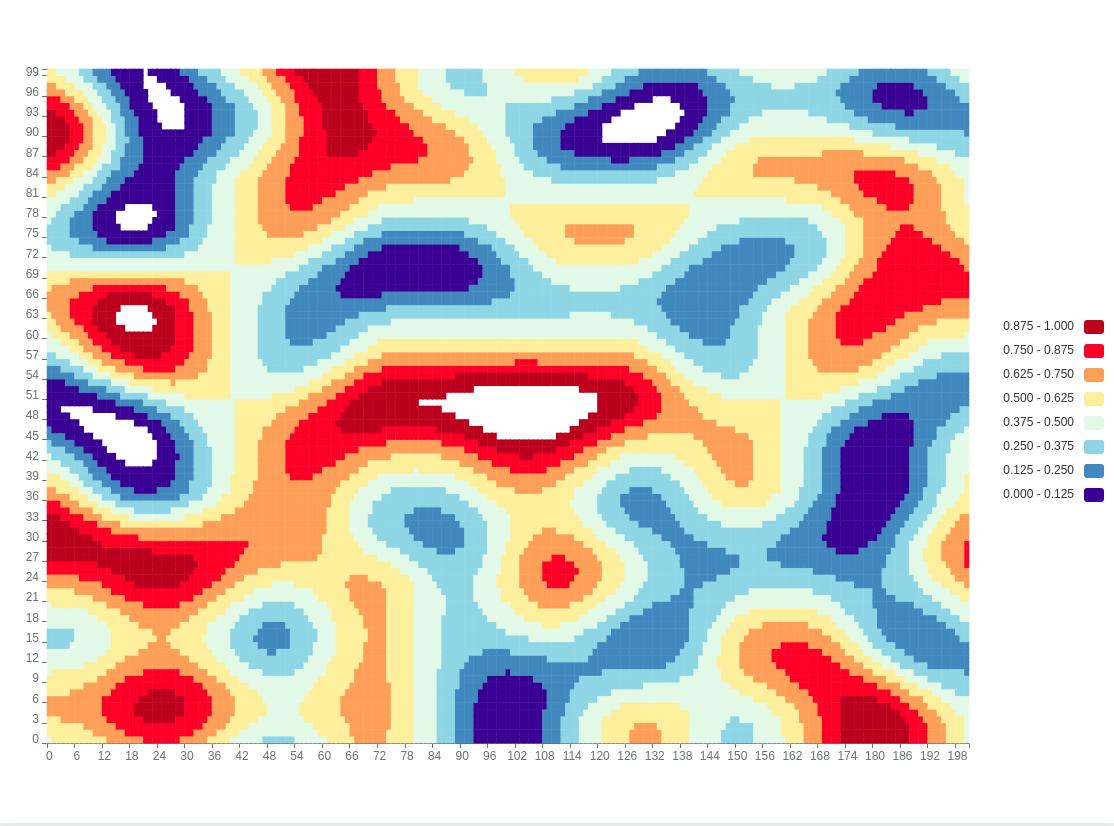
6. Heat Maps: Intensity at a Glance
Heat maps shine in representing data density and intensity. ECharts' heat map functionality allows you to assign colors to different intensity levels, making it easy to identify hotspots. Whether analyzing website user interactions or stock market fluctuations, heat maps offer a visually impactful solution.
Usage Tip: Use heat maps when visualizing data with varying levels of intensity, such as geographical temperature variations or user engagement on a webpage.
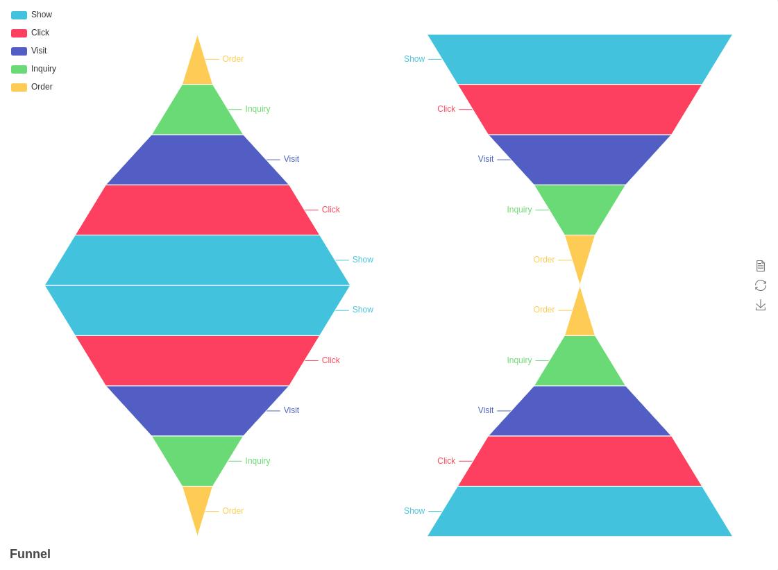
7. Funnel Charts: Visualizing Stages in a Process
Funnel charts are effective for visualizing the stages of a process and identifying potential bottlenecks. ECharts' funnel charts allow you to customize the appearance of each stage, making it easy to highlight critical points in your data flow.
Usage Tip: Opt for funnel charts when illustrating conversion rates in sales pipelines, user engagement funnels, or any stepwise process.
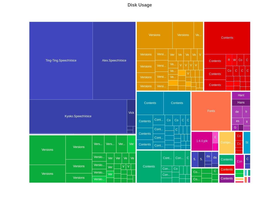
8. Treemap Charts: Hierarchical Representation of Data
Treemaps provide a hierarchical view of data, allowing users to visualize the proportions of categories within larger groups. ECharts' treemap charts support customizable layouts and color schemes, enhancing the clarity of hierarchical data representation.
Usage Tip: Utilize treemaps when presenting hierarchical data structures, such as organizational hierarchies, file structures, or categorical breakdowns.
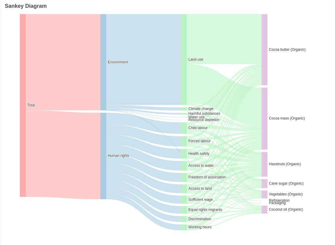
9. Sankey Diagrams: Mapping Flow and Connections
Sankey diagrams are powerful for visualizing flow and connections between entities. ECharts' Sankey diagrams allow for the representation of links between different categories, making it a valuable tool for visualizing complex networks.
Usage Tip: Opt for Sankey diagrams when illustrating the flow of resources, energy, or any interconnected system.
10. Map Charts: Geographic Visualization with Precision
Map charts enable the geographic visualization of data, allowing you to represent information across different regions. ECharts' map charts support customizable color schemes, tooltips, and interactivity, providing a powerful tool for showcasing regional data variations.
Usage Tip: Use map charts when visualizing data with a geographical component, such as sales distribution across different locations or demographic variations.
Conclusion: Elevate Your Data Visualization with ECharts
In conclusion, ECharts offers a versatile toolkit of chart types that cater to a wide range of data visualization needs. Whether you're tracing trends over time, comparing categories, exploring relationships, mapping multidimensional data, or visualizing intensity, ECharts has a chart type to meet your requirements.
Experiment with customization options, leverage interactive features, and let ECharts be your guide to crafting compelling data stories. By mastering the diverse chart types within ECharts, you'll not only enhance the visual appeal of your data but also effectively communicate complex insights to your audience.