List, form, kanban, calendar, and other view kinds are all pre-installed in Odoo. However, what if your business logic calls for something entirely different? Using OWL (Odoo Web Library) components on the front end and a Python model extension on the back end, you may register a completely new view type in Odoo 19.
When the basic list, kanban, or form views in Odoo are insufficient to show data in a business-friendly manner, custom views can be helpful. Developers have complete control over how records are retrieved, organised, and displayed in the user interface by creating a custom view type. Because of this versatility, businesses may design highly engaging, aesthetically pleasing experiences that are customized for their workflows.
We create a module entitled beautiful_view in this guide, which registers a new view type called "beautiful." The end product is a responsive, card-based record display that is compatible with any Odoo models.
Module File Structure
The complete beautiful_view module has the following layout:
beautiful_view/
+-- models/
¦   +-- __init__.py
¦   +-- ir_ui_view.py
+-- static/src/
¦   +-- css/
¦   ¦   +-- beautiful_view.css
¦   +-- js/
¦   ¦   +-- beautiful_arch_parser.js
¦   ¦   +-- beautiful_controller.js
¦   ¦   +-- beautiful_model.js
¦   ¦   +-- beautiful_renderer.js
¦   ¦   +-- beautiful_view.js
¦   +-- xml/
¦       +-- beautiful_templates.xml
+-- views/
¦   +-- beautiful_views.xml
+-- __init__.py
+-- __manifest__.py
Architecture Overview
Every Odoo view in OWL follows a strict separation of concerns across four JS classes plus the arch parser:
- ir.actions.act_window> triggers the view
- beautiful_view.js> view descriptor registered in the OWL views registry
- BeautifulArchParser> reads the XML arch definition
- BeautifulController> top-level OWL component, owns the model
- BeautifulModel> data fetching via orm.searchRead
- BeautifulRenderer> pure display component, renders cards
When the basic list, kanban, or form views in Odoo are insufficient to show data in a business-friendly manner, custom views can be helpful. Developers have complete control over how records are retrieved, organized, and displayed in the user interface by creating a custom view type. Because of this versatility, businesses may design highly engaging, aesthetically pleasing experiences that are customized for their workflows.
Step 1: __manifest__.py
The manifest declares the module metadata, its dependency on web and sale, and registers all frontend assets under web.assets_backend.
{
    'name': 'Beautiful View',
    'version': '19.0.1.0.0',
    'category': 'Technical',
    'summary': 'Custom "beautiful" view type - works with any model',
    'depends': ['web','sale'],
    'assets': {
        'web.assets_backend': [
            'beautiful_view/static/src/js/beautiful_controller.js',
            'beautiful_view/static/src/js/beautiful_renderer.js',
            'beautiful_view/static/src/js/beautiful_model.js',
            'beautiful_view/static/src/js/beautiful_arch_parser.js',
            'beautiful_view/static/src/js/beautiful_view.js',
            'beautiful_view/static/src/xml/beautiful_templates.xml',
            'beautiful_view/static/src/css/beautiful_view.css',
        ],
    },
    'data': [
        'views/beautiful_views.xml',
    ],
    'installable': True,
}
Step 2: Python — Registering the View Type
Before Odoo will accept view_mode="beautiful" in an action, you must register the type at the Python level by extending ir.ui.view and ir.actions.act_window.view.
from odoo import fields, models
class IrUiView(models.Model):
    _inherit = 'ir.ui.view'
    type = fields.Selection(
        selection_add=[('beautiful', 'Beautiful')]
    )
    def _get_view_info(self):
        info = super()._get_view_info()
        info['beautiful'] = {'icon': 'fa fa-picture-o'}
        return info

class ActWindowView(models.Model):
    _inherit = 'ir.actions.act_window.view'
    view_mode = fields.Selection(
        selection_add=[('beautiful', 'Beautiful')],
        ondelete={'beautiful': 'cascade'}
    )
Step 3: Arch Parser
The arch parser reads the view's XML definition (the <beautiful> tag and its child <field> nodes)
and returns a structured archInfo object that the rest of the view stack consumes.
import { visitXML } from "@web/core/utils/xml";export class BeautifulArchParser {
    parse(arch) {
        const archInfo = {
            defaultField: null,
            fields: [],
        };        visitXML(arch, (node) => {
            if (node.tagName === "beautiful") {
                if (node.hasAttribute("fieldFromTheArch")) {
                    archInfo.defaultField = node.getAttribute("fieldFromTheArch");
                }
            } else if (node.tagName === "field") {
                const fieldName = node.getAttribute("name");
                if (fieldName) {
                    archInfo.fields.push(fieldName);
                }
            }
        });        return archInfo;
    }
}
Step 4: Model
The model handles all data fetching. It uses KeepLast, a concurrency utility that automatically cancels
in-flight requests when a newer one is triggered and calls orm.searchRead to load records.
import { KeepLast } from "@web/core/utils/concurrency";export class BeautifulModel {
    constructor(orm, resModel, fields, archInfo, domain) {
        this.orm = orm;
        this.resModel = resModel;
        this.archInfo = archInfo;
        this.domain = domain;
        this.keepLast = new KeepLast();
        this.records = [];
    }    async load() {
        let fieldsToFetch = this.archInfo.fields;
        if (!fieldsToFetch.length && this.archInfo.defaultField) {
            fieldsToFetch = [this.archInfo.defaultField];
        }
        if (fieldsToFetch.length === 0) {
            fieldsToFetch = ['id']; // fallback
        }        this.records = await this.keepLast.add(
            this.orm.searchRead(this.resModel, this.domain, fieldsToFetch)
        );
    }
}
Step 5: Renderer
The renderer is a pure OWL component responsible for displaying the records. It has no data-fetching
logic; it simply receives records, archInfo, and resModel as props and renders each as a card. Clicking
a card navigates to its form view.
import { Component } from "@odoo/owl";
import { useService } from "@web/core/utils/hooks";export class BeautifulRenderer extends Component {
    static template = "beautiful_view.BeautifulRenderer";    setup() {
        this.action = useService("action");
    }    openRecord(props,record) {
        this.action.doAction({
            type: "ir.actions.act_window",
            res_model: props.resModel,
            res_id: record.id,
            view_mode: 'form',
            target: "current",
            views: [[false, "form"]],
        });
    }
}
Step 6: Controller
The controller is the top-level OWL component for the view. It wraps everything inside Odoo's Layout component (which provides the control panel, breadcrumbs, etc.) and owns the model instance. It uses onWillStart to load data before the first render.
import { Layout } from "@web/search/layout";
import { useService } from "@web/core/utils/hooks";
import { Component, onWillStart, useState } from "@odoo/owl";
export class BeautifulController extends Component {
    static template = "beautiful_view.BeautifulController";
    static components = { Layout };
    setup() {
        this.orm = useService("orm");
        this.model = useState(
            new this.props.Model(
                this.orm,
                this.props.resModel,
                this.props.fields,
                this.props.archInfo,
                this.props.domain
            )
        );
        onWillStart(async () => {
            await this.model.load();
        });
    }
}
The controller serves as the central coordinator of the custom view. It initializes services, prepares the model, manages lifecycle hooks, and connects the renderer with Odoo’s standard layout system.
Step 7: View Registration (beautiful_view.js)
This is the entry point that ties everything together. It defines the view descriptor object and adds it to Odoo's view registry under the key "beautiful". The props() function is called by the framework to transform generic view props into view-specific ones.
import { registry } from "@web/core/registry";
import { BeautifulController } from "./beautiful_controller";
import { BeautifulArchParser } from "./beautiful_arch_parser";
import { BeautifulModel } from "./beautiful_model";
import { BeautifulRenderer } from "./beautiful_renderer";
export const beautifulView = {
    type: "beautiful",
    display_name: "Beautiful",
    icon: "fa fa-picture-o",
    multiRecord: true,
    Controller: BeautifulController,
    ArchParser: BeautifulArchParser,   // ? Must match the exported class name
    Model: BeautifulModel,
    Renderer: BeautifulRenderer,
    props(genericProps, view) {
        const { ArchParser } = view;
        const { arch } = genericProps;
        const archInfo = new ArchParser().parse(arch);  // ? Now ArchParser is a constructor
        return {
            ...genericProps,
            Model: view.Model,
            Renderer: view.Renderer,
            archInfo,
        };
    },
};
registry.category("views").add("beautiful", beautifulView);
Step 8: OWL Templates (XML)
The OWL templates define the HTML structure rendered by the controller and renderer. There are two templates: one for the controller (which wraps everything in Layout) and one for the renderer (which outputs the card grid).
<?xml version="1.0" encoding="UTF-8"?>
<templates xml:space="preserve">
    <t t-name="beautiful_view.BeautifulController">
        <Layout display="props.display" className="'h-100 overflow-auto'">
            <t t-component="props.Renderer"
               records="model.records"
               archInfo="props.archInfo"
               resModel="props.resModel"
               fields="props.fields"/>
        </Layout>
    </t>
    <t t-name="beautiful_view.BeautifulRenderer">
        <div class="beautiful-grid">
            <t t-foreach="props.records" t-as="record" t-key="record.id">
                <div class="beautiful-card" >
                    <div class="card-header">
                        <i class="fa fa-user-circle-o" aria-hidden="true"></i>
                        <strong class="record-title"><t t-esc="record[props.archInfo.defaultField || 'display_name'] || 'Record #' + record.id"/></strong>
                    </div>
                    <div class="card-body">
                        <t t-foreach="props.archInfo.fields" t-as="fname" t-key="fname">
                            <div class="field-row" t-if="record[fname]">
                                <span class="field-label"><t t-esc="fname.replace('_', ' ').toUpperCase()"/>:</span>
                                <span class="field-value"><t t-esc="record[fname]"/></span>
                            </div>
                        </t>
                    </div>
                    <div class="card-footer" t-on-click="() => this.openRecord(props, record)">
                        <i class="fa fa-external-link" aria-hidden="true"></i> Click to open
                    </div>
                </div>
            </t>
        </div>
    </t>
</templates>
Step 9: CSS Styling
Styling plays a major role in improving the usability of custom views. A clean and responsive design helps users quickly identify important information while maintaining consistency with Odoo’s modern interface. The stylesheet turns the plain HTML into a clean, card-based grid with hover effects and a branded header per card.
.beautiful-grid {
    display: flex;
    flex-direction: column;
    align-items: center;
    gap: 20px;
    padding: 20px;
    background-color: #f0f2f5;
}
.beautiful-card {
    width: 100%;
    max-width: 600px;          /* comfortable reading width */
    background: #f8f4f4;
    border-radius: 12px;
    box-shadow: 0 2px 8px rgba(0,0,0,0.1);
    transition: all 0.2s ease;
    cursor: pointer;
    overflow: hidden;
    display: flex;
    flex-direction: column;
    &:hover {
        transform: translateY(-2px);
        box-shadow: 0 8px 20px rgba(0,0,0,0.15);
    }
    .card-header {
        background: #E70846FF;
        color: white;
        padding: 12px 16px;
        font-size: 16px;
        font-weight: 600;
        display: flex;
        align-items: center;
        gap: 10px;
        i {
            font-size: 20px;
        }
    }
    .card-body {
        padding: 16px;
        flex: 1;
        .field-row {
            margin-bottom: 8px;
            font-size: 14px;
            display: flex;
            align-items: baseline;
            gap: 8px;
            .field-label {
                font-weight: 600;
                color: #555;
                min-width: 80px;
                font-size: 12px;
                text-transform: capitalize;
            }
            .field-value {
                color: #1f2d3d;
                word-break: break-word;
            }
        }
    }
    .card-footer {
        padding: 10px 16px;
        border-top: 1px solid #e9ecef;
        font-size: 12px;
        color: #7c69a9;
        text-align: right;
        background: #fafafa;
    }
}
Step 10: Data Views XML
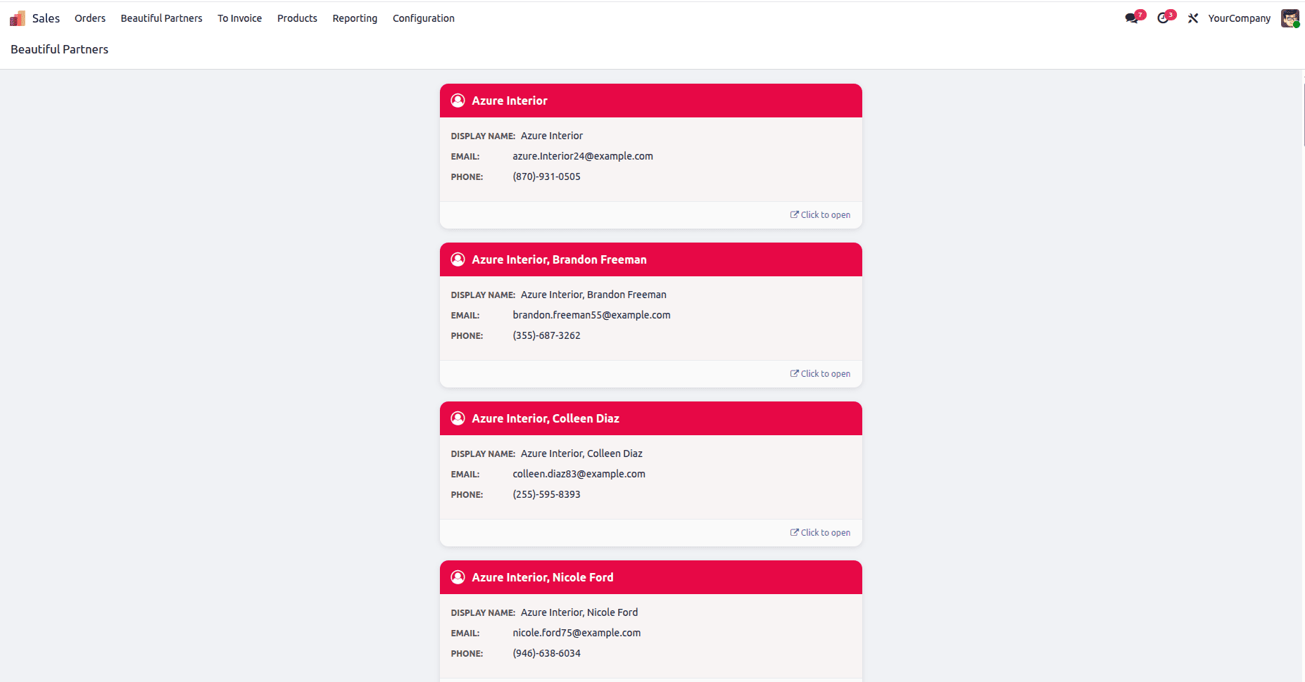
The final piece is the data XML that creates the actual view record, the window action, and a menu item to open it. Here we apply the view to res.partner under the Sales menu.
<?xml version="1.0" encoding="utf-8"?>
<odoo>
    <!-- Beautiful view definition -->
    <record id="beautiful_partner_view" model="ir.ui.view">
        <field name="name">res.partner.beautiful.view</field>
        <field name="model">res.partner</field>
        <field name="arch" type="xml">
            <beautiful>
                <field name="display_name"/>
                <field name="email"/>
                <field name="phone"/>
            </beautiful>
        </field>
    </record>
    <!-- Action to open the beautiful view -->
    <record id="action_beautiful_partner" model="ir.actions.act_window">
        <field name="name">Beautiful Partners</field>
        <field name="res_model">res.partner</field>
        <field name="view_mode">beautiful</field>
        <field name="view_id" ref="beautiful_partner_view"/>
    </record>
    <!-- Menu item under Contacts (base.menu_contacts exists) -->
    <menuitem id="menu_beautiful_partner"
              name="Beautiful Partners"
              parent="sale.sale_menu_root"
              action="action_beautiful_partner"
              sequence="10"/>
</odoo>
Output
Once the module is installed and upgraded, the new custom view becomes available just like any native Odoo view. Users can access it directly through menu items or window actions configured with the custom view mode.
The adaptability of Odoo's OWL framework and modular architecture is demonstrated by creating a custom view type in Odoo 19. Developers can create entirely new user experiences that are suited to business needs by fusing OWL frontend components with Python backend extensions.
This method opens the door for sophisticated interactions, dashboards, analytical layouts, and highly customized workflows in addition to improving visual display. Once the Controller, Model, Renderer, and ArchParser structures are known, developers can leverage the same architecture to create a variety of different creative Odoo view kinds.
To read more about How to Create a New View Type in Odoo 18, refer to our blog How to Create a New View Type in Odoo 18.