In Odoo 19, view widgets allow developers to directly manage the presentation of field information in a list or form view. Instead of using the default presentation offered by Odoo, a custom widget provides the option of adding interactive features, such as a pop-over displaying computed information, to any field within a view. The tutorial will create a live example: a widget on the Sale Order list view displaying a pop-over with order details when clicked.
A full view widget in Odoo 19 is made up of four components: a JavaScript component built using the OWL framework, an XML component describing the presentation of the widget, a Python component defining the computed fields used by the widget, and an XML component defining the view in which the widget is used.
1. The JavaScript Component
The JavaScript file is the core of the widget. It contains the definition of two components: a popover and a widget. It also registers the widget with Odoo's registry of view widgets so that it can be referred to by name within the XML view.
/** @odoo-module **/
import { Component } from "@odoo/owl";
import { _t } from "@web/core/l10n/translation";
import { registry } from "@web/core/registry";
import { usePopover } from "@web/core/popover/popover_hook";
import { standardWidgetProps } from "@web/views/widgets/standard_widget_props";
export class SaleOrderSummaryPopover extends Component {
   static template = "sale_order_summary_widget_demo.SaleOrderSummaryPopover";
   static props = {
       lineCount: { type: Number },
       totalQty: { type: Number },
       close: { type: Function, optional: true },
   };
}
export class SaleOrderSummaryWidget extends Component {
   static template = "sale_order_summary_widget_demo.SaleOrderSummaryWidget";
   static props = { ...standardWidgetProps };
   setup() {
       this.popover = usePopover(SaleOrderSummaryPopover, {
           closeOnClickAway: true,
           position: "bottom-start",
       });
   }
   get lineCount() {
       return this.props.record.data.order_line_count || 0;
   }
   get totalQty() {
       return this.props.record.data.total_product_qty || 0;
   }
   get title() {
       return _t("View order summary");
   }
   showSummary(ev) {
       if (this.popover.isOpen) {
           this.popover.close();
           return;
       }
       this.popover.open(ev.currentTarget, {
           lineCount: this.lineCount,
           totalQty: this.totalQty,
       });
   }
}
export const saleOrderSummaryWidget = {
   component: SaleOrderSummaryWidget,
   fieldDependencies: [
       { name: "order_line_count", type: "integer" },
       { name: "total_product_qty", type: "float" },
   ],
   listViewWidth: 120,
};
registry.category("view_widgets").add("sale_order_summary_widget", saleOrderSummaryWidget);
SaleOrderSummaryPopover: This will be used to render in the popover. It will receive lineCount and totalQty as props and will be closed when clicking out.
SaleOrderSummaryWidget: This will be used in each row of the list view. It will be clicked to call showSummary(), which will open the popover above the icon.
usePopover: This hook comes from OWL. In Odoo 19, it replaces the old pattern of using services for a popover. It will position and clean up automatically.
registry.category("view_widgets").add: This will be used to add a new widget under a given key, which will be referenced in your XML view.
2. The XML Templates
Two templates are needed one for the widget icon that sits in the list row, and one for the popover content that appears on click. Both are linked to their JavaScript class via t-name.
<?xml version="1.0" encoding="UTF-8"?>
<templates xml:space="preserve">
   <t t-name="sale_order_summary_widget_demo.SaleOrderSummaryWidget">
       <button type="button"
               class="btn btn-link p-0 text-nowrap o_sale_order_summary_widget"
               t-att-title="title"
               t-att-aria-label="title"
               t-on-click.prevent.stop="showSummary">
           <i class="fa fa-info-circle me-1" role="img"/>
           <span t-out="lineCount"/>
       </button>
   </t>
   <t t-name="sale_order_summary_widget_demo.SaleOrderSummaryPopover">
       <div class="o_sale_order_summary_popover p-3">
           <div class="d-flex justify-content-between gap-3 mb-2">
               <span class="fw-semibold">Order Lines</span>
               <span t-out="props.lineCount"/>
           </div>
           <div class="d-flex justify-content-between gap-3">
               <span class="fw-semibold">Total Quantity</span>
               <span t-out="props.totalQty"/>
           </div>
       </div>
   </t>
</templates>
t-name: Binds the template to the OWL component class. The value should be identical to the JavaScript code in the static template property.
t-on-click: Binds the showSummary method to the click event of the icon element. OWL handles all event binding without the need for addEventListener.
t-out: Safely renders a value to the DOM. Unlike t-raw, t-out properly escapes HTML, which helps prevent cross-site scripting attacks when rendering field data from the server.
3. The Python Model
The widget reads two computed fields from the record. These fields are defined on sale.order in Python and pushed to the frontend automatically when the list view loads the records.
from odoo import api, fields, models

class SaleOrder(models.Model):
   _inherit = "sale.order"
   order_line_count = fields.Integer(
       string="Order Lines",
       compute="_compute_order_summary",
   )
   total_product_qty = fields.Float(
       string="Total Quantity",
       compute="_compute_order_summary",
   )
   @api.depends("order_line", "order_line.product_uom_qty")
   def _compute_order_summary(self):
       for order in self:
           lines = order.order_line
           order.order_line_count = len(lines)
           order.total_product_qty = sum(lines.mapped("product_uom_qty"))
order_line_count: Returns the count of the lines on the sale order. Recomputes every time the order_line relation changes.
total_product_qty: Adds the product_uom_qty for all the lines. Using mapped() keeps the code clean; no loops over recordsets.
_compute_order_summary: A single compute function for both fields means that the dependency is only checked once instead of twice.
4. The View Definition
The definition of the view is an extension of the standard Sale Order list view with the widget added to a new column. The attribute of the field tag is used to specify the entry of the view_widgets registry to be loaded.
<?xml version="1.0" encoding="UTF-8"?>
<odoo>
   <record id="sale_order_tree_summary_widget" model="ir.ui.view">
       <field name="name">sale.order.list.summary.widget</field>
       <field name="model">sale.order</field>
       <field name="inherit_id" ref="sale.sale_order_tree"/>
       <field name="arch" type="xml">
           <field name="name" position="after">
               <widget name="sale_order_summary_widget" width="120"/>
           </field>
       </field>
   </record>
</odoo>
What You Get
With all four files in place, the Sale Order List View now has a new column. Each row displays an info icon adjacent to the line count value. Clicking the info icon will display a small popover with the order line count and total product quantity for the particular order.
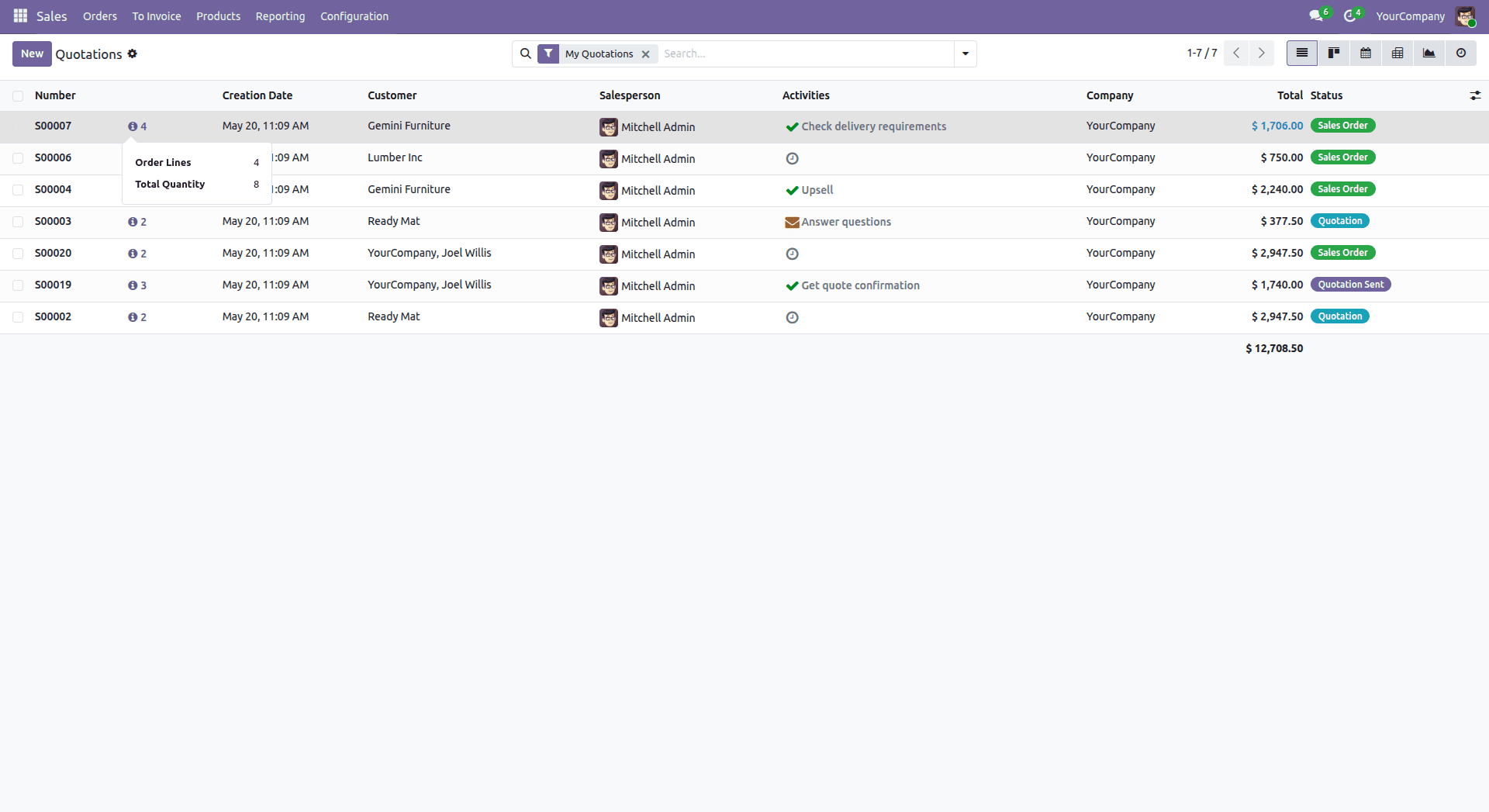
The popover will automatically close when the user clicks anywhere on the page. The computed fields are loaded as part of the normal List View loading. There is no RPC call when the popover is clicked.
With this pattern, any developer can implement a working view widget with Odoo 19. The pattern scales well: you can add more props to your popover, fetch more computed fields from your Python code, or change the icon with any other interactive element. Once you get used to the basic four-piece pattern, making it work with different models or different data is as simple as changing the names of the fields or the content of the template.
To read more about How to create a view widget in Odoo 18, refer to our blog How to create a view widget in Odoo 18.