Odoo 19 Spreadsheet is used to analyze business data and generate reports without exporting to other files. Users can create real-time data into formulas and pivot tables because it connects directly with all Odoo modules, including Sales, Accounting, Inventory, and Projects. It maintains everything centralized within the Odoo database, allowing for collaboration, sharing, and linking features. Businesses can quickly and easily create dynamic dashboards, financial reports, and business data with this spreadsheet, eliminating the need for manual file processing. A Spreadsheet module is provided by Odoo 19 to manage the documentation.
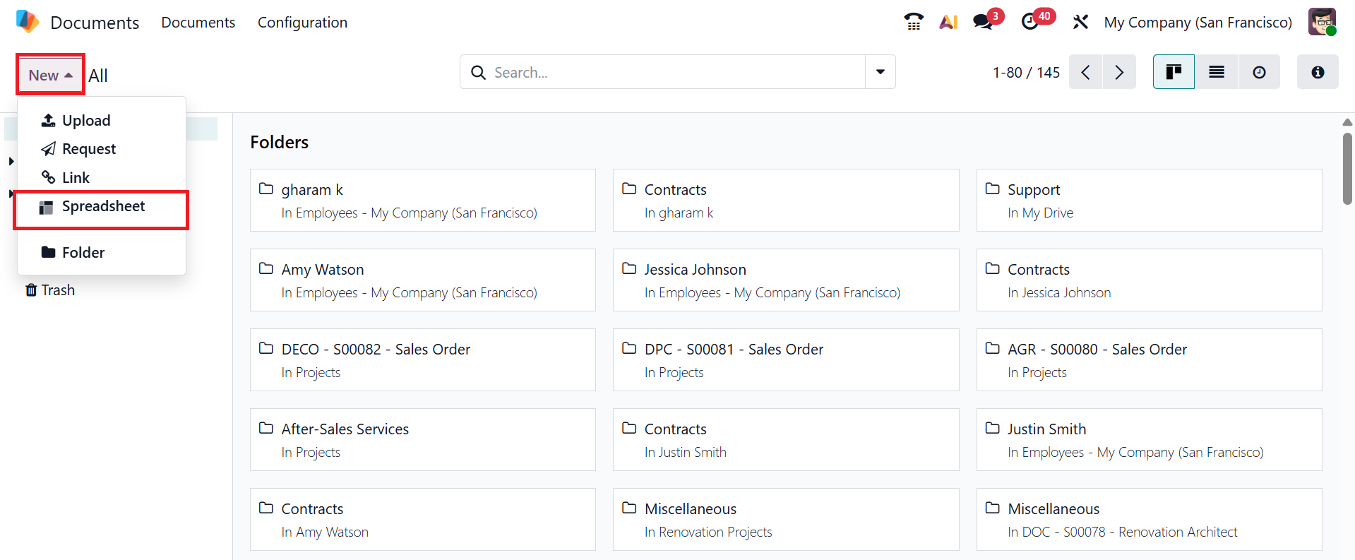
You can manage the spreadsheet option in Odoo 19 by navigating to the Document module. To upload a new spreadsheet to the Document module, click on the New button and select the Spreadsheet option from the list, as shown below:
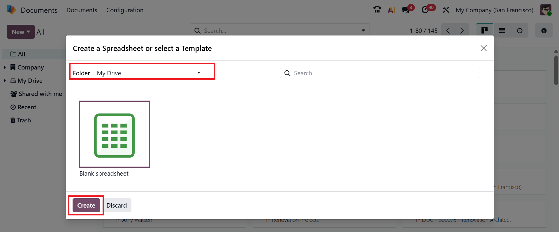
Click on the drop-down menu to select an appropriate spreadsheet template to create a new spreadsheet, and then click on the Create button.
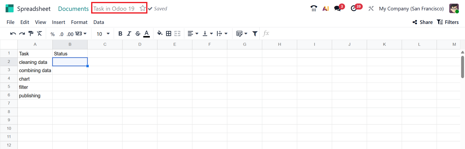
Under the Document module, a spreadsheet will open, where you can start adding the data. You can provide a name for the spreadsheet and mark the star to make it a favorite. Let's now explore the features of the Odoo 19 Spreadsheet.
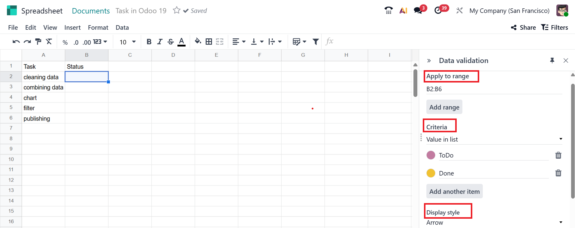
Data Validation in Odoo 19 Spreadsheet enables users to enter only correct and acceptable values by preventing incorrect inputs. To access Data Validation, go to the Data menu; a panel will open on the right side of the spreadsheet. Click Create another rule to add a new data validation rule.
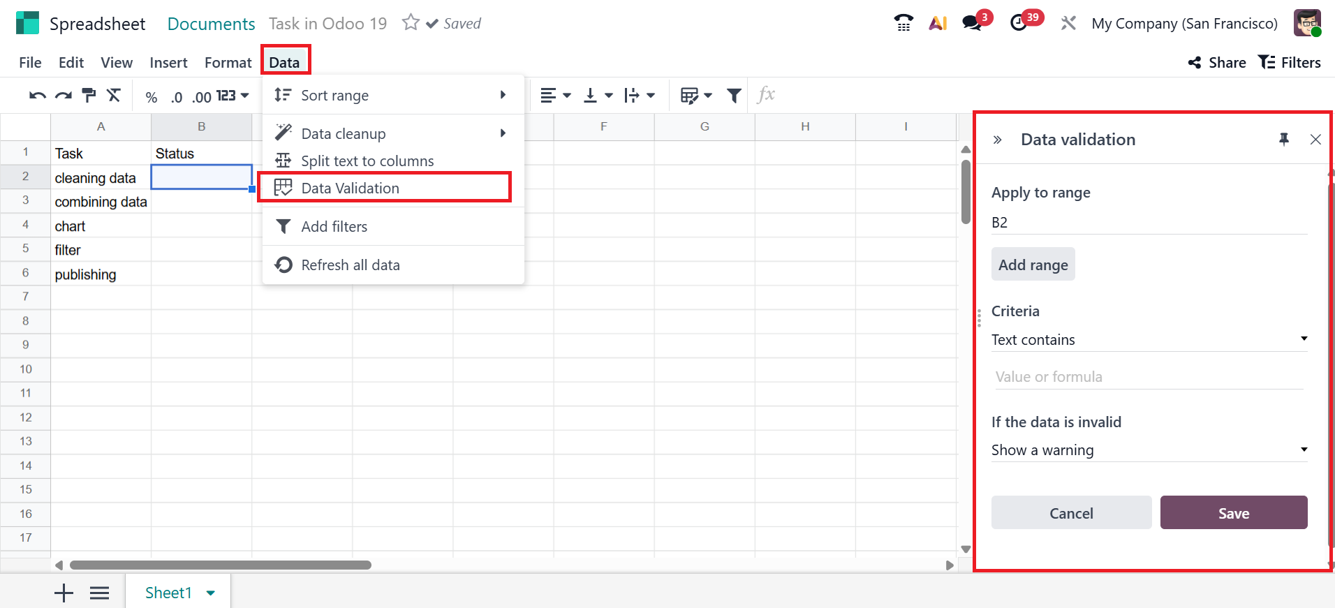
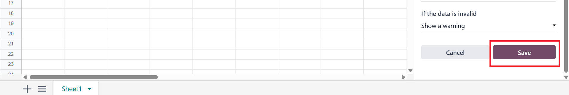
Then, enter the desired cell range in the Apply to range field on the right. Then, select a criterion from the list, Display style, and values. You can add colors to the added values, a new feature in Odoo 19. Next, click the Save button as shown below.
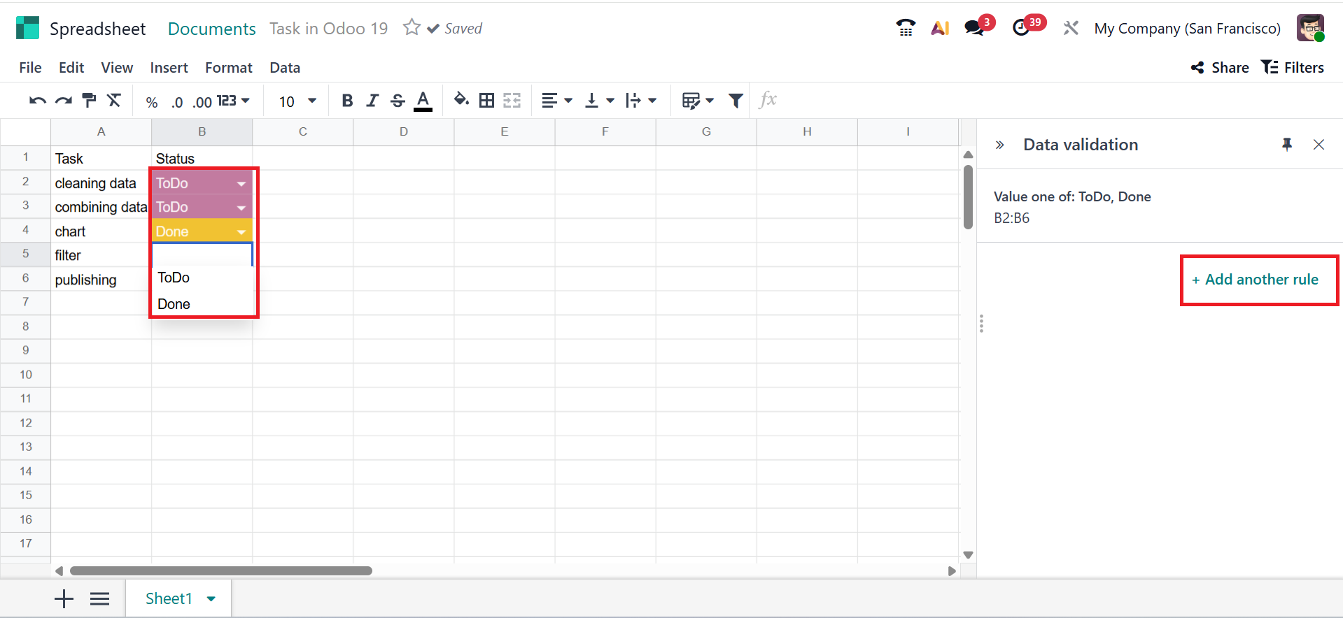
Once saved, the selected cells will display the entered values. Click + Add another rule to insert a new rule.
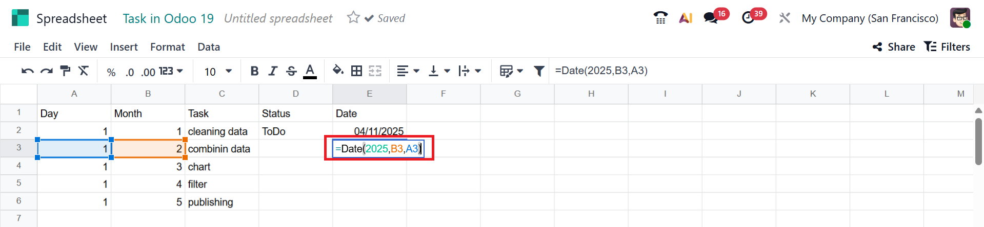
When you add the = sign in a cell, you can easily add dates or sums, as shown below. Then, you can select an appropriate option from the list.
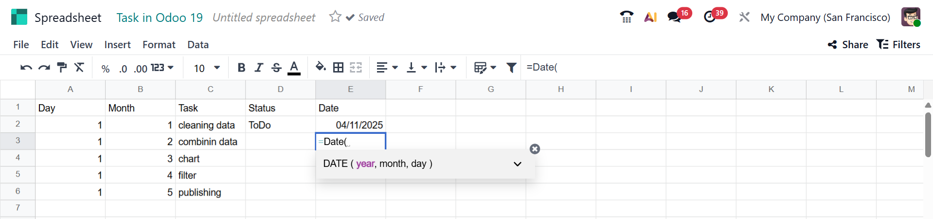
Based on the selected option, you can add the matching cells. Then, the date will change accordingly.
You can split the text into different cells in Odoo. For that, select a cell and then move to the Data menu and select the Split text into Columns option. A new box will appear on the right side of the window, where you can specify the rules and conditions for data validation.
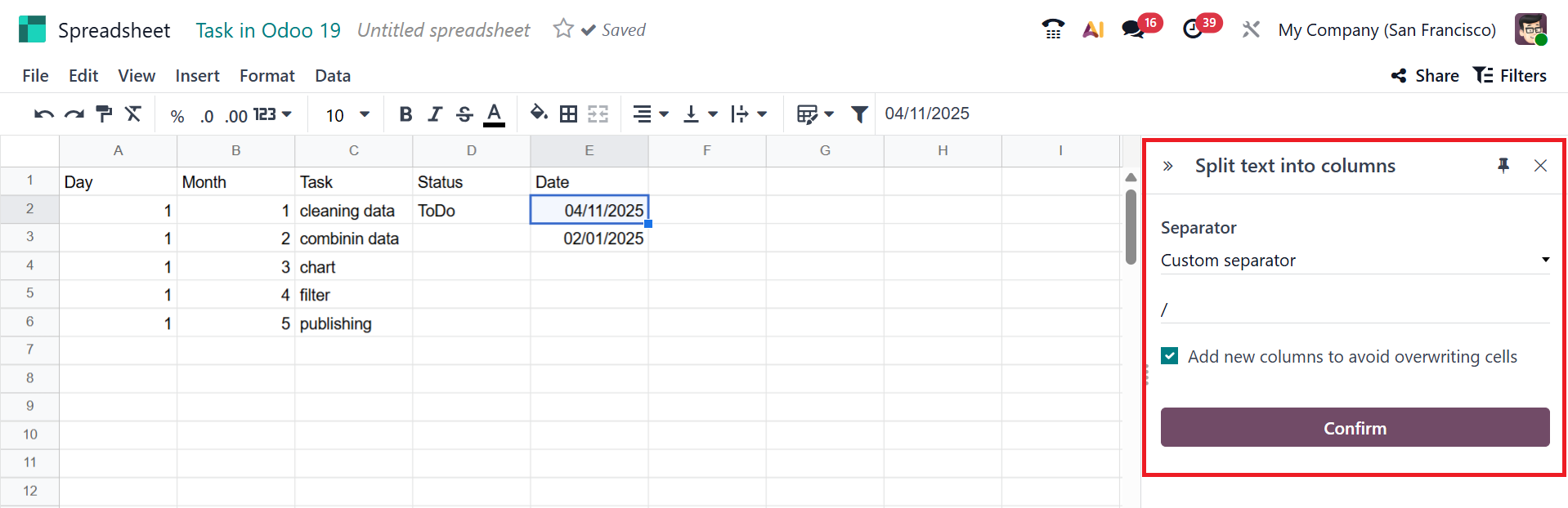
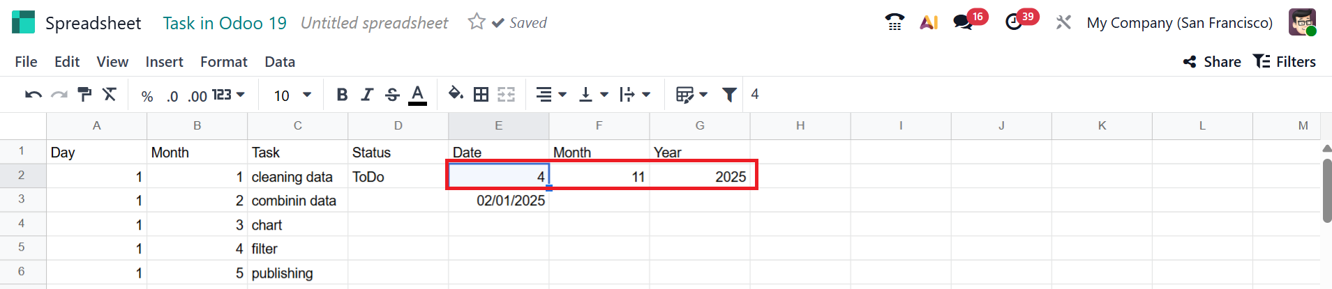
After clicking the Confirm button, you can see the split data as shown below:
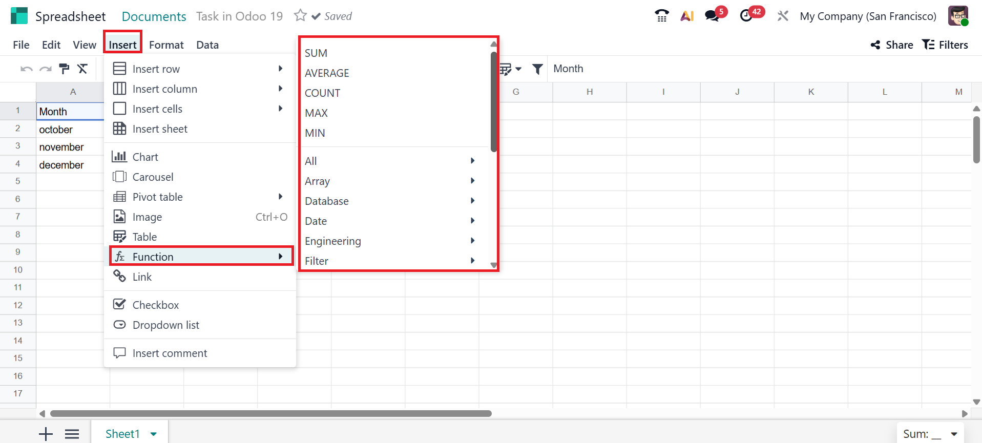
To add various functions to a cell, select the Functions option from the Insert menu. Then, you can select any function from the list.
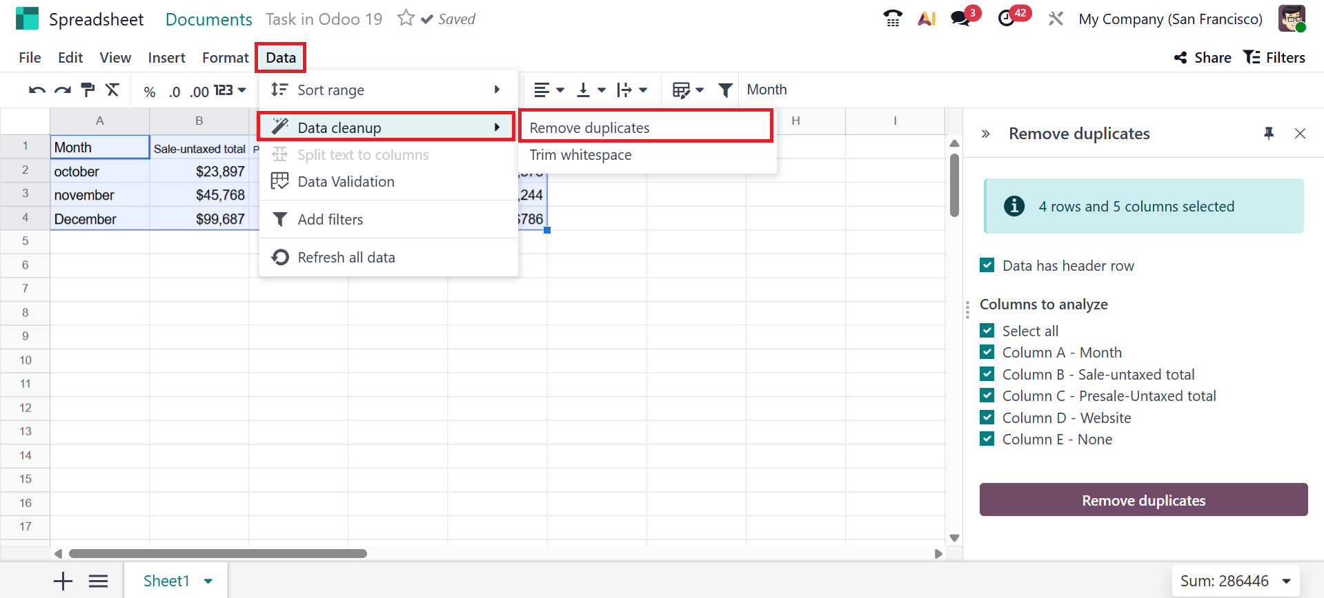
Open the Data menu in Odoo 19 Spreadsheet and select Data Cleanup to organize your data. There, you can see two options for cleaning data, such as Remove Duplicates and Trim Whitespace.
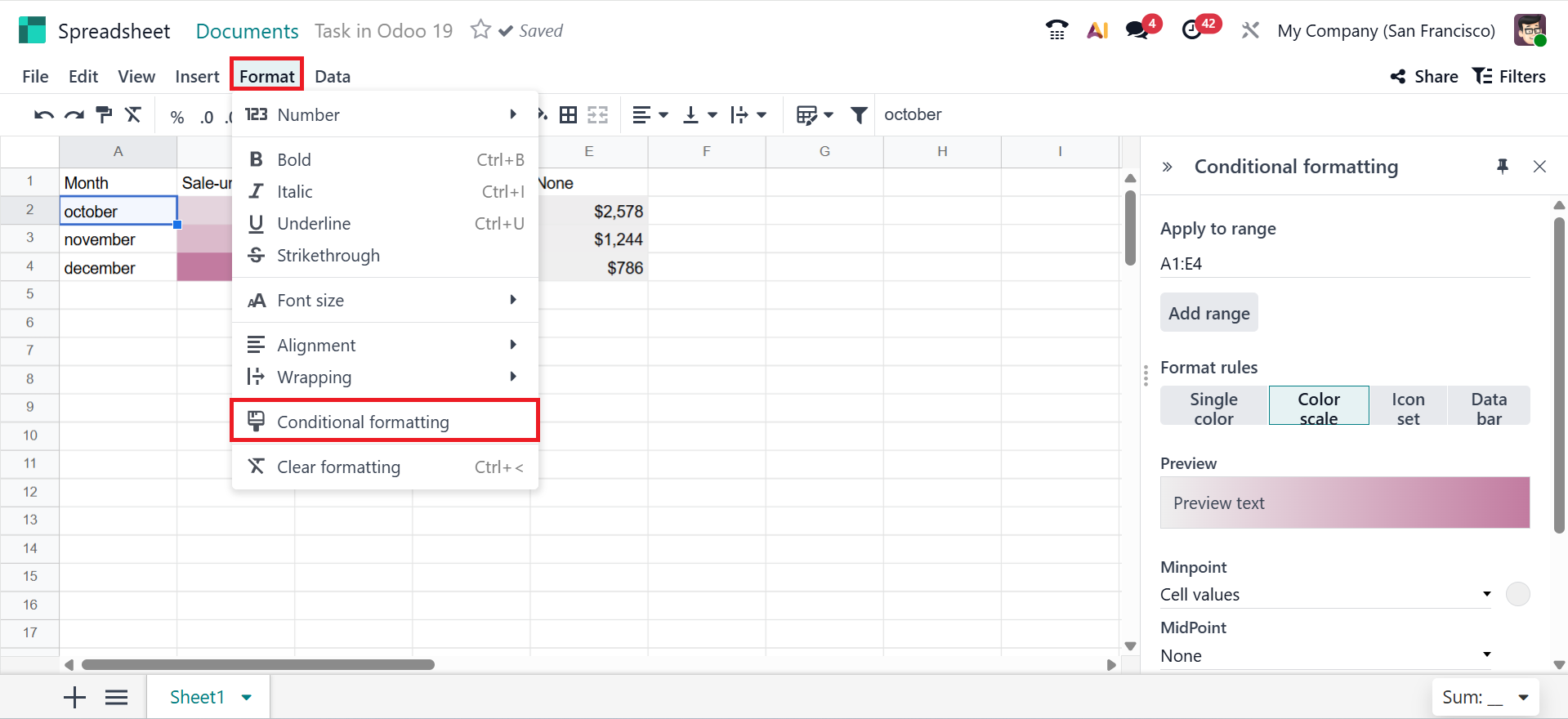
Use Conditional Formatting from the Format menu to highlight specific data in your report. A new box will appear on the right side of the screen, where you can add the cell range, format rule (as Color scale), and select a color to highlight the data, as shown below. After saving, you can view the highlighted data according to the added condition.
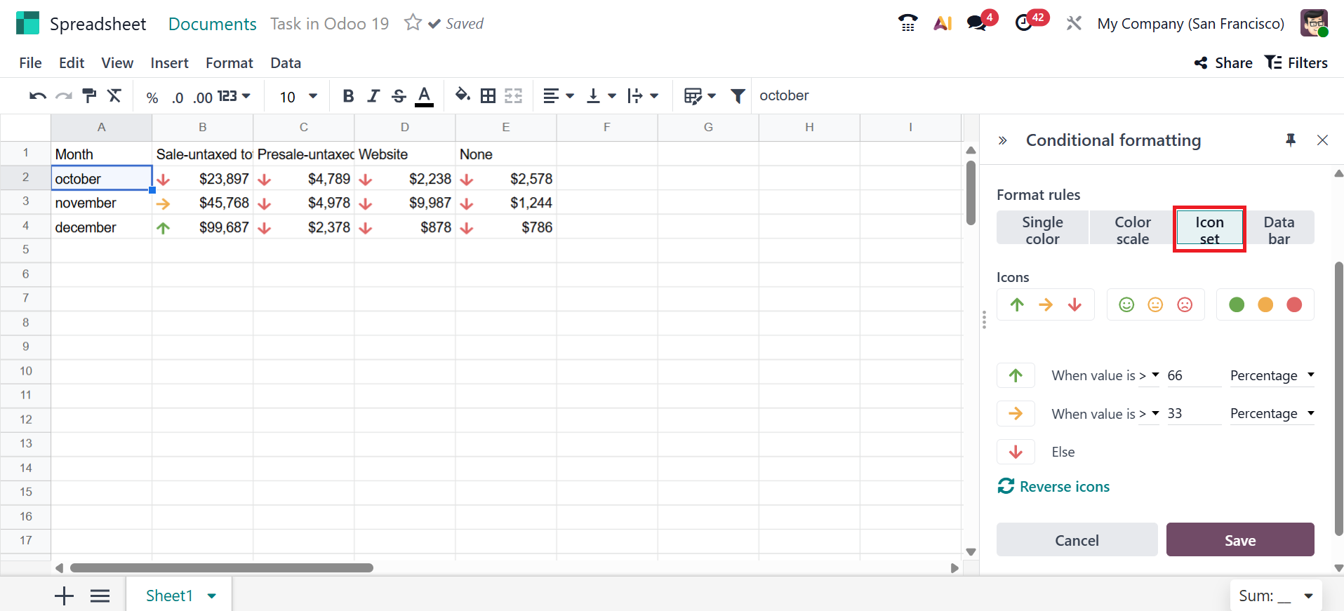
You can also select the Format rule as Single color, Color scale, Icon set, or Data bar. Under Icon set rules, you can view three types of icon sets as shown below:
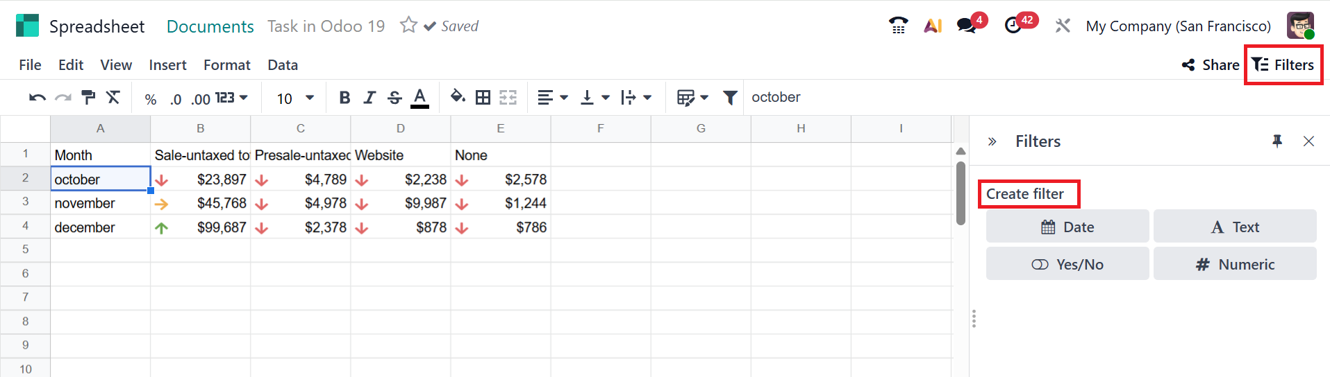
Click the Filter button in the upper-right corner of the screen. There, you can create filters based on Date, Text, Yes/No, and Numeric values. To apply a filter to the sheet, select an appropriate value, add the required data, and save it.
You can use graphs to visually analyze the data in the spreadsheet. In the Chart option under the Insert menu, you can select different forms of graphs to easily understand the long data.
A new section appears on the right side of the screen, where you can view two tabs: Configuration (which displays the chart type and data series) and Design (which helps set the chart's visual appearance).
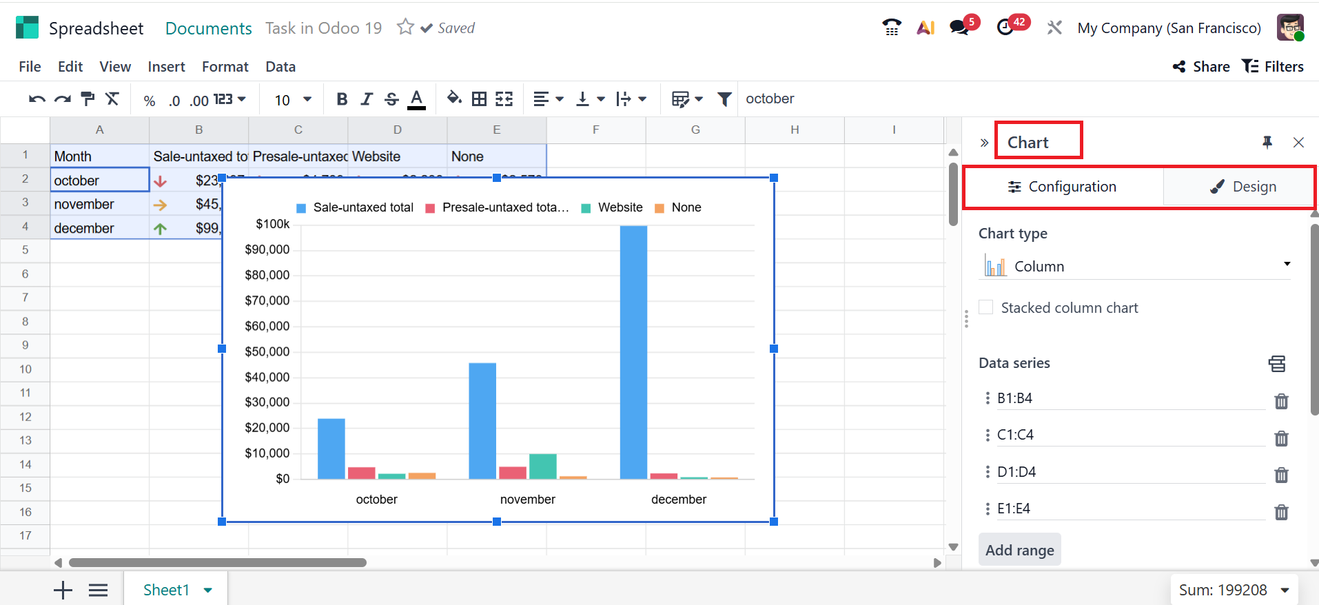
Configuration Tab:
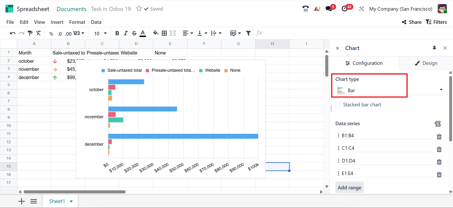
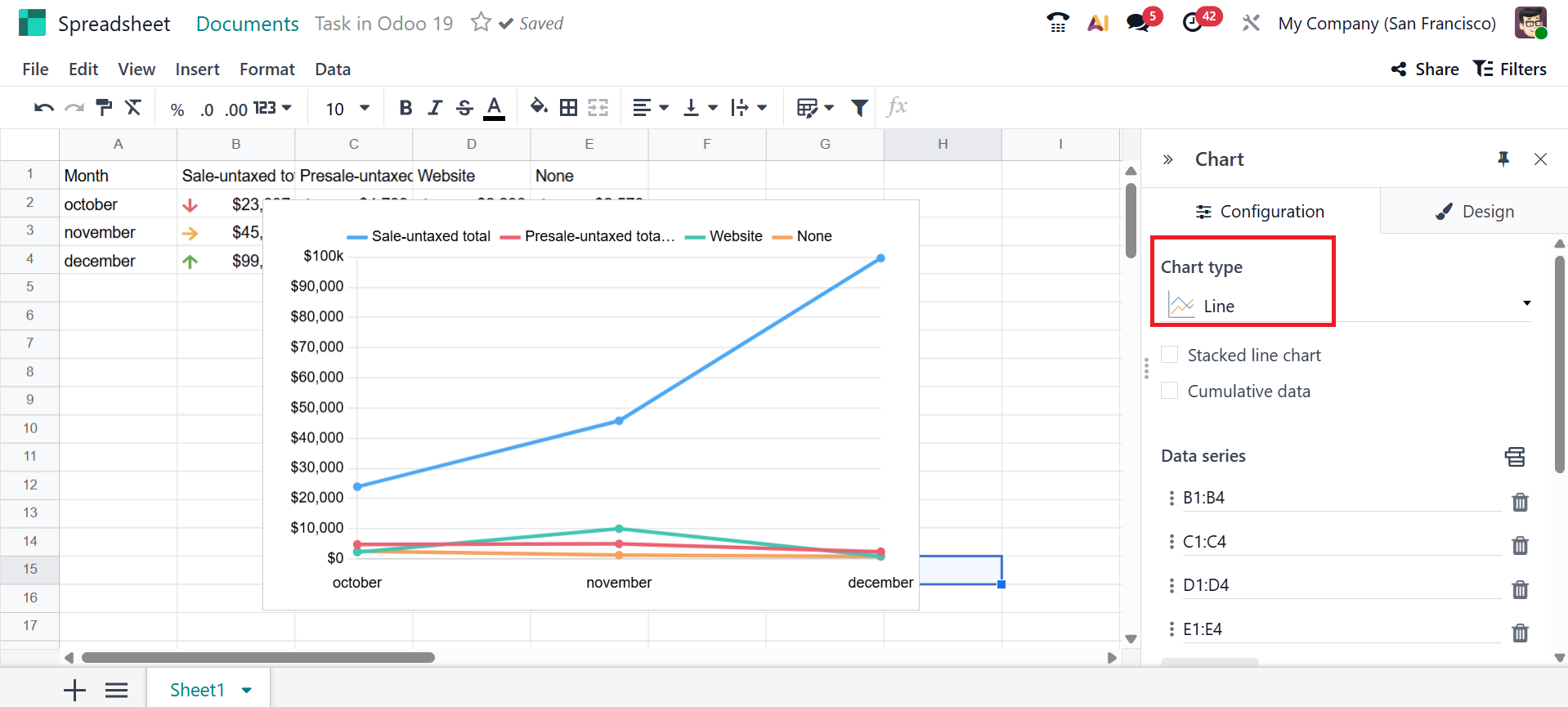
You can choose the chart type, data series, categories/labels, and the link to the Odoo menu under the Configuration tab.
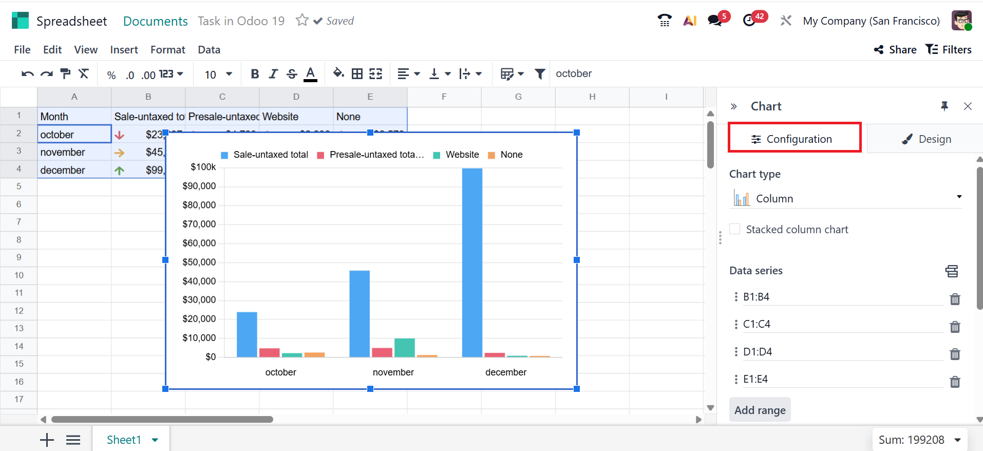
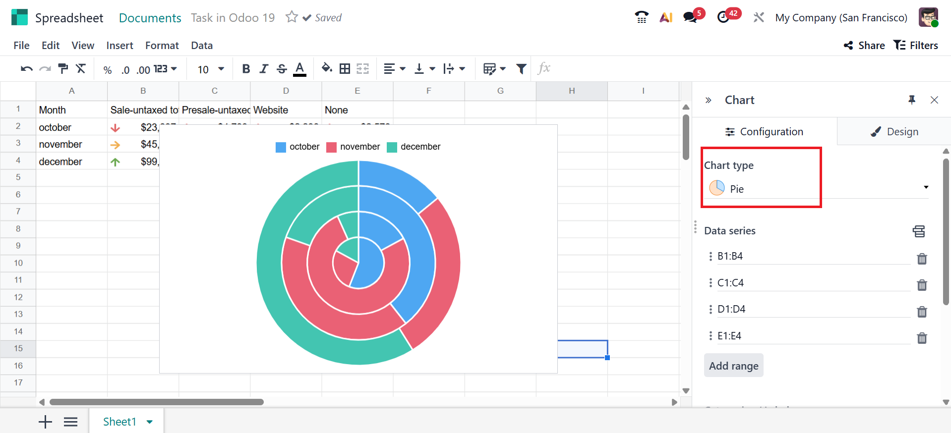
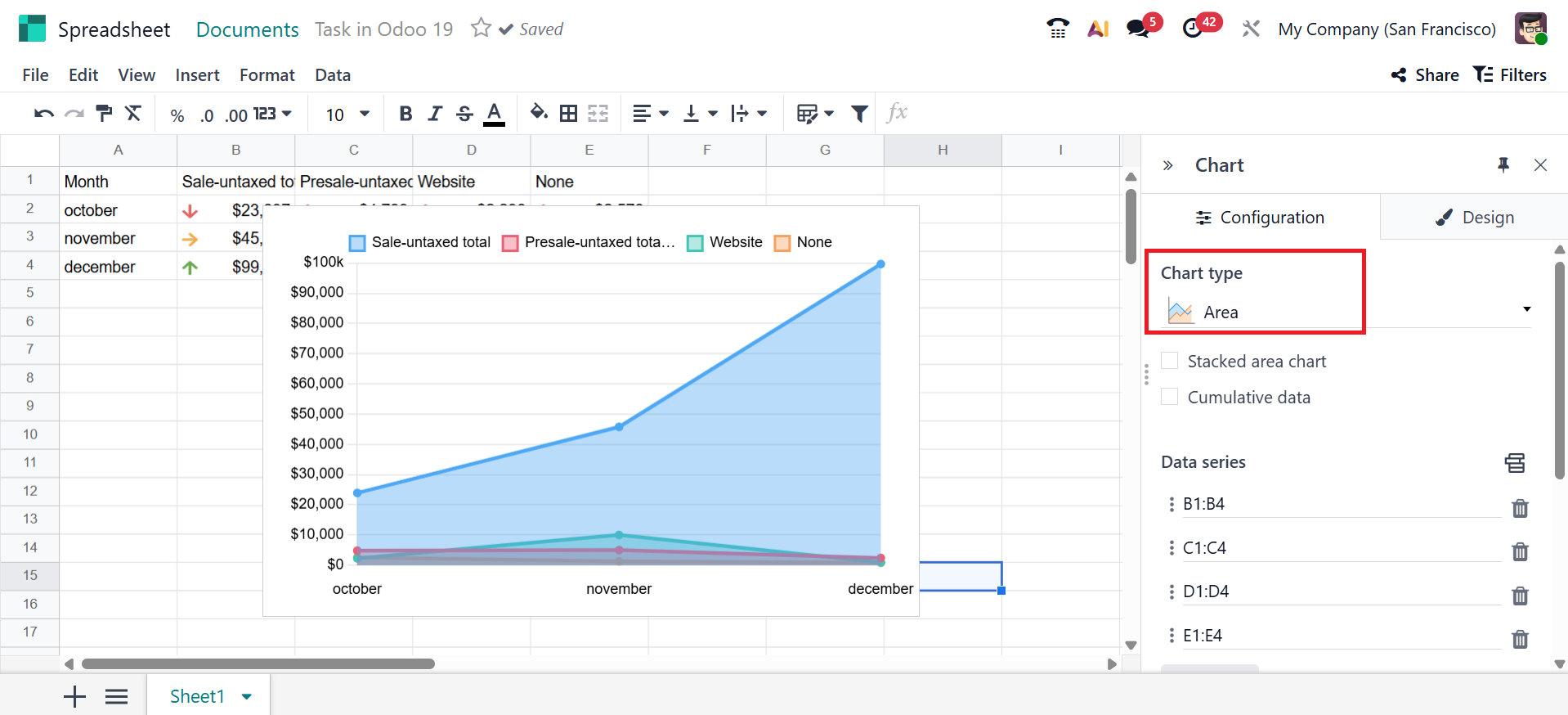
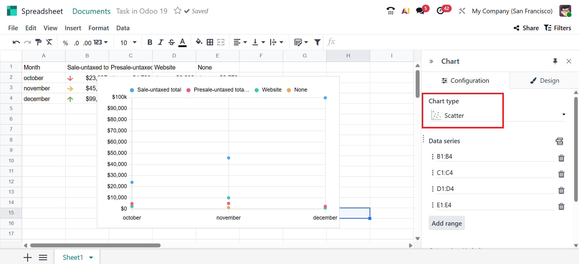
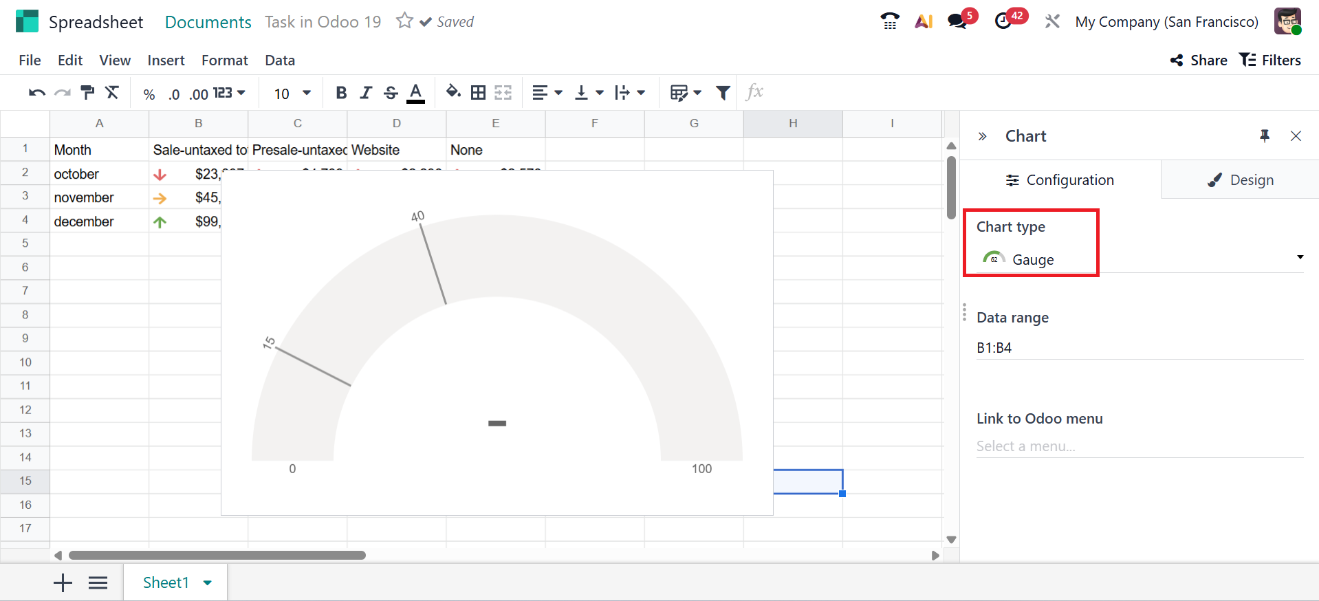
You can select different types of charts, such as;
- *Bar Chart –The graph that shows data using rectangular bars to easily compare values between different categories.
- *Line Chart –A graph that displays data points connected with a line to show how values change over time or sequence.
- Pie Chart – A pie chart visualizes data by dividing a circle into slices, where each slice corresponds to a category's percentage.
- Area Chart – A graph where the space under the line is filled to show how values change over time.
- Scatter: A scatter chart displays individual data points, enabling the identification of relationships or patterns between two numerical variables.
- Gauge: Represents a single value compared to a maximum limit.
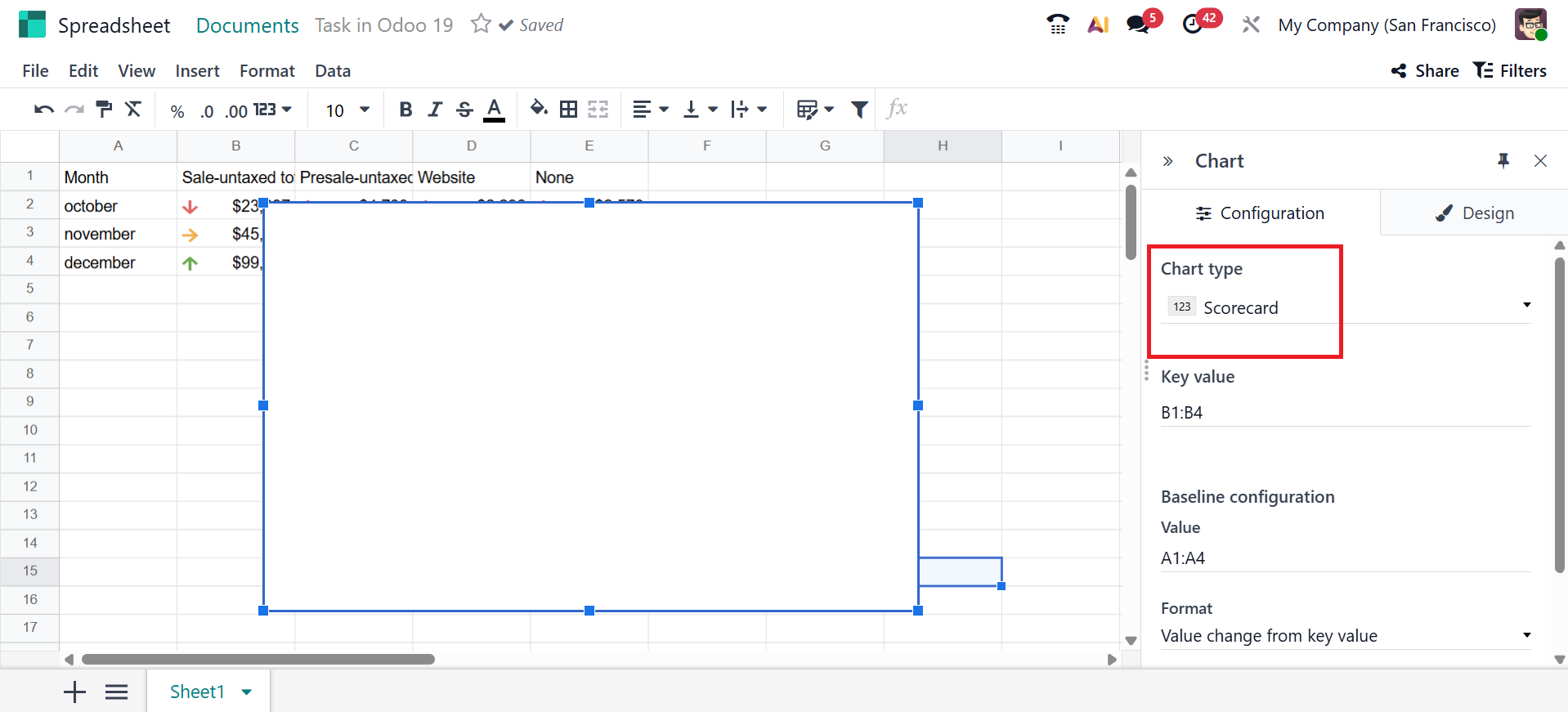
- Scorecard: A visual box that displays one number or KPI to show performance quickly.
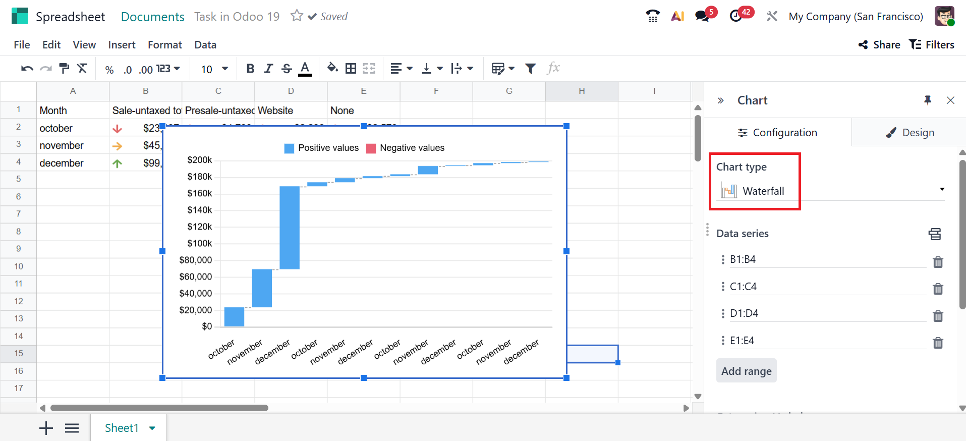
- Waterfall: It illustrates how a starting value increases or decreases in steps until it reaches its final value.
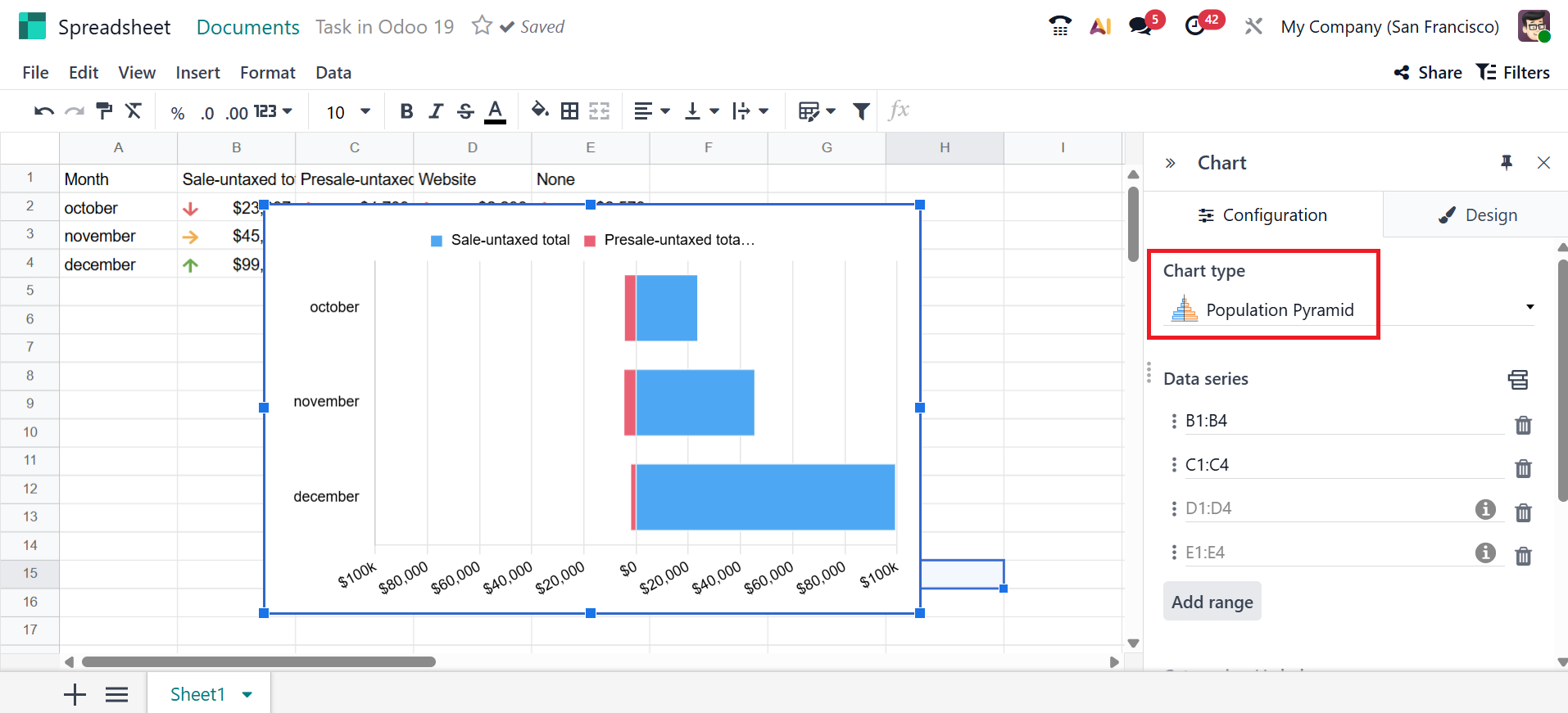
- Population Pyramid– Shows the distribution of a population by age and gender.
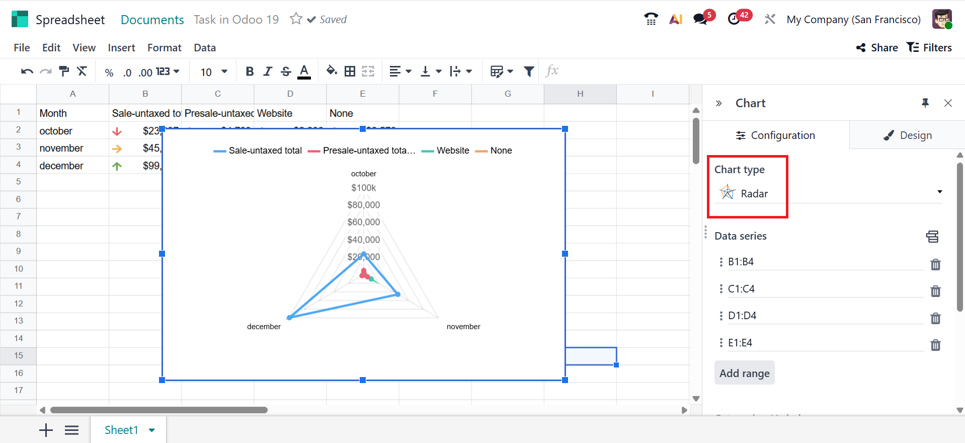
- Radar: Shows how multiple data variables are compared across categories.
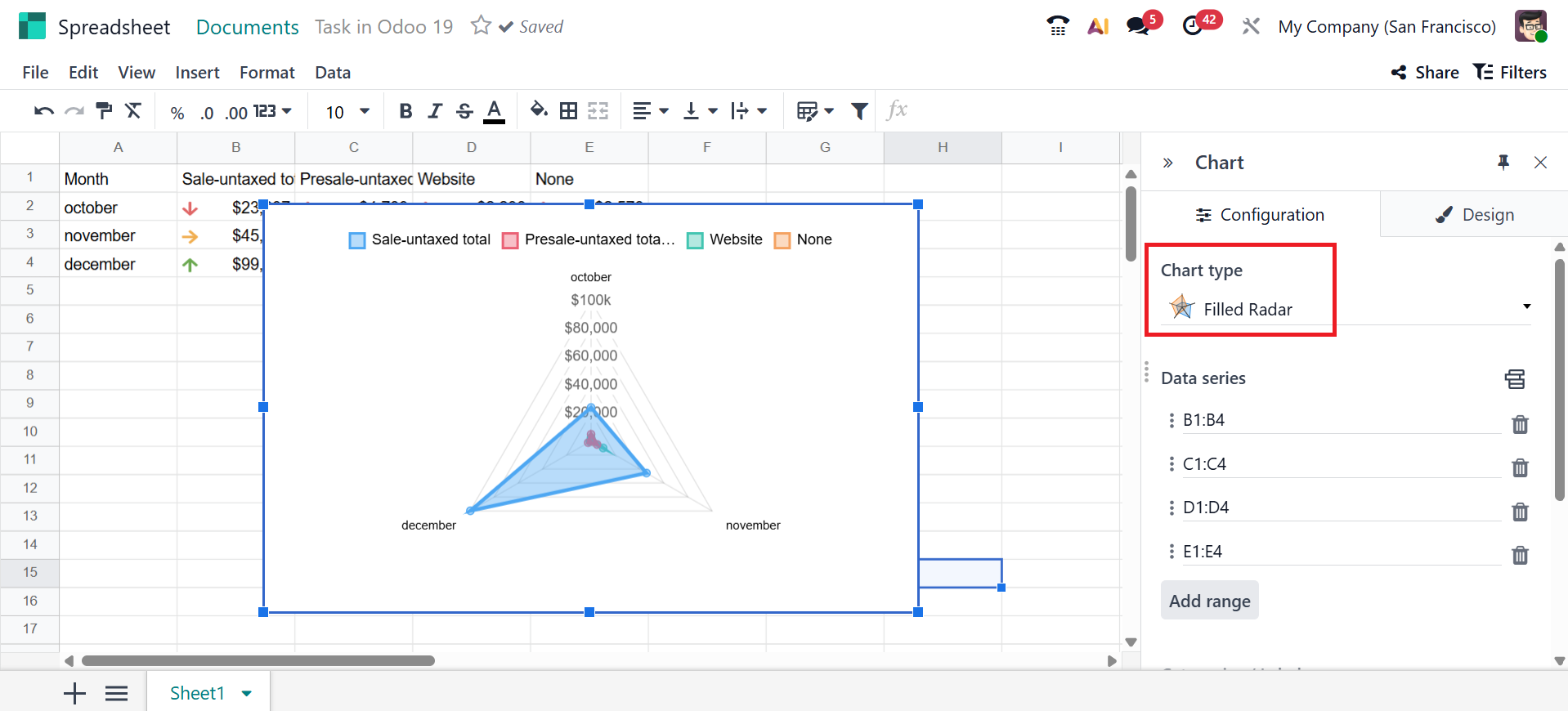
- Filled Radar: In this graph, the area inside the lines is filled with color, making it easier to compare the data.
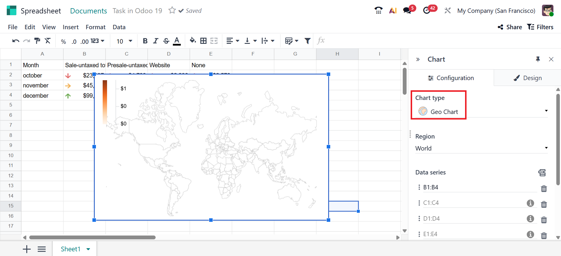
- Geo Chart:It displays data on a world or country map to visually compare values across different geographic locations.
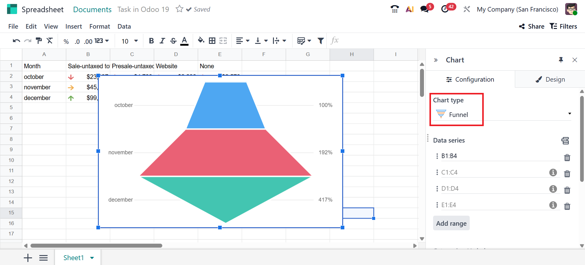
- Funnel:It shows how data is reduced step-by-step through stages.
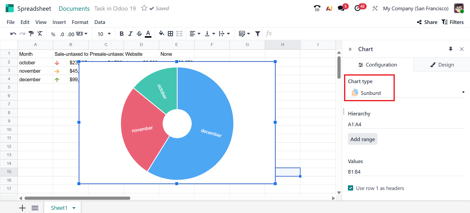
- Sunburst: Displays data in a circular, multi-level format to show how categories are divided into sub-categories.
- Tree Map:Displays data in nested rectangles to show how each category and sub-category contributes to the total based on size.
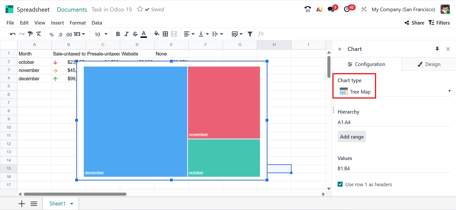
You can add ranges to the chart by clicking the Add Range button under the Data Series field. You can specify the data criteria by selecting the cells under the Categories/Labels field. Under the Link to Odoo menu field, you can select an option from the list to link the chart with Odoo.
Design tab:
The Design tab in Odoo 19 enables you to modify the appearance and formatting of your chart, making visuals clearer and more visually appealing.
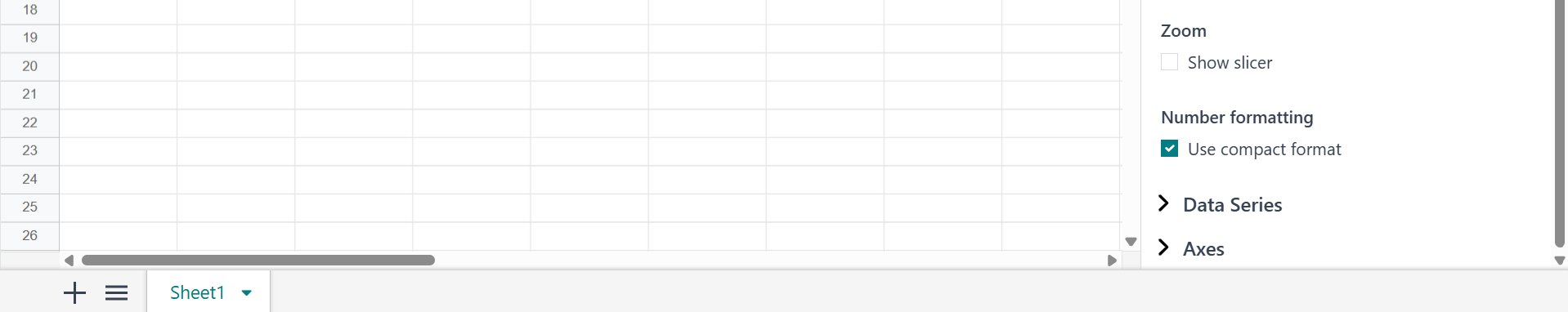
Under the Background Color field, you can add color to the chart background. Use the Chart Title field to give your chart a title and format it with your preferred font, color, and alignment. Under the Legend position field, you can select where the data series labels are placed in the chart. You can enable the Show values option under the Values option to view the numerical values on the chart. Enable the Show slicer option under the Zoom option to keep filtering the data easily, even after changing the zoom level. To show large numbers in short form, enable the Use compact format under the Number formatting option.
Under the Data Series section, you can add a data series name and color. Under the Vertical Axis field, you can select either Left or Right to add the data values. Enable Show trend line under the Trend line option to display a straight line on the charts that shows the overall direction of your data.
Under the Axes section, you can add an Axis Title for the Horizontal Axis or the Vertical Axis. You can also modify the title’s font style, font size, and alignment.

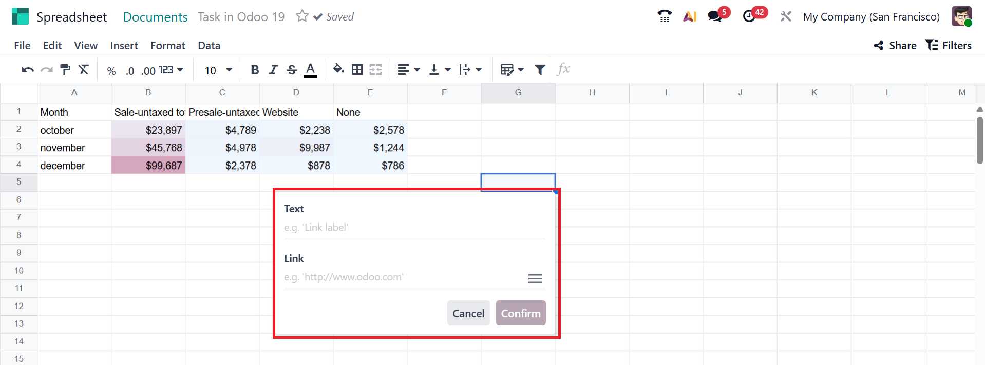
In Odoo 19 Spreadsheet, you can add the link of a file or video by clicking the Link option under the Insert menu. A pop-up screen will appear in the selected cell where you can add a title under the Text option and copy the link of the file under the Link option. Then, click on the Confirm button.
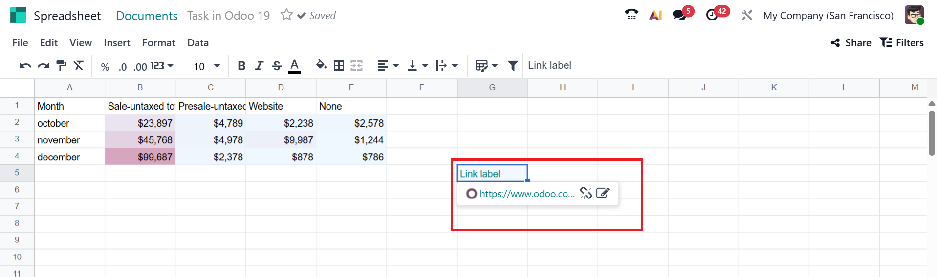
In the screenshot below, you can see the attached link in the spreadsheet.
To view the history of the spreadsheet, select the See version history under the File menu. On the right side of the screen, a new panel will open, displaying the version history.
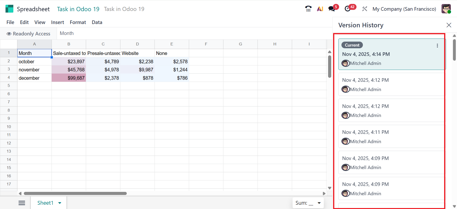
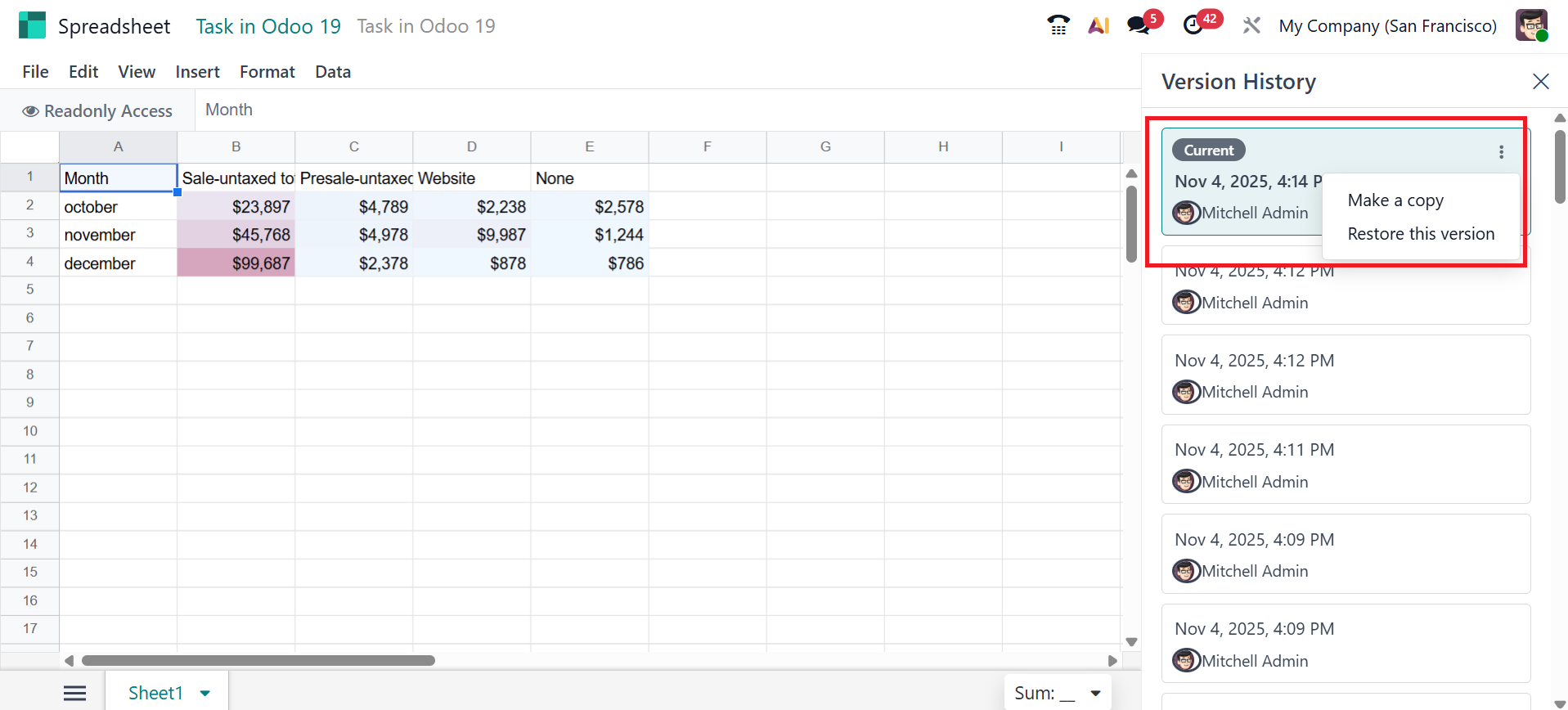
Click the three-dot vertical menu in the upper-right corner of each version to access additional options. There you can see two options: Make a copy and Restore this version.
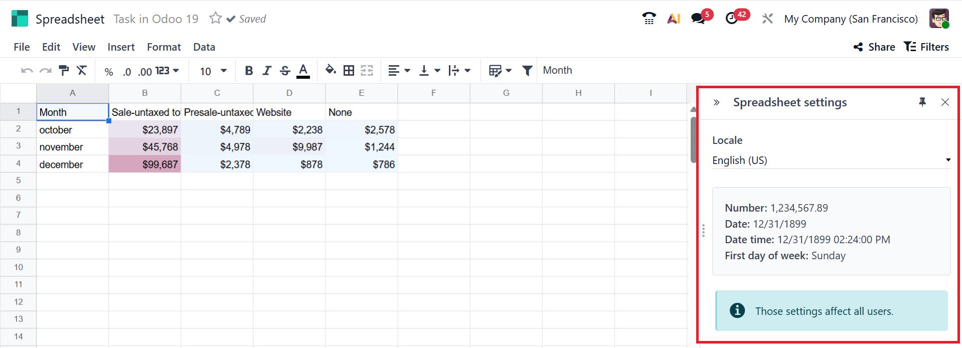
Under the File menu, select the Settings option to view the spreadsheet settings on the right side of the screen. There, you can view the locale, number, date, and time on the right side. You can change the location.
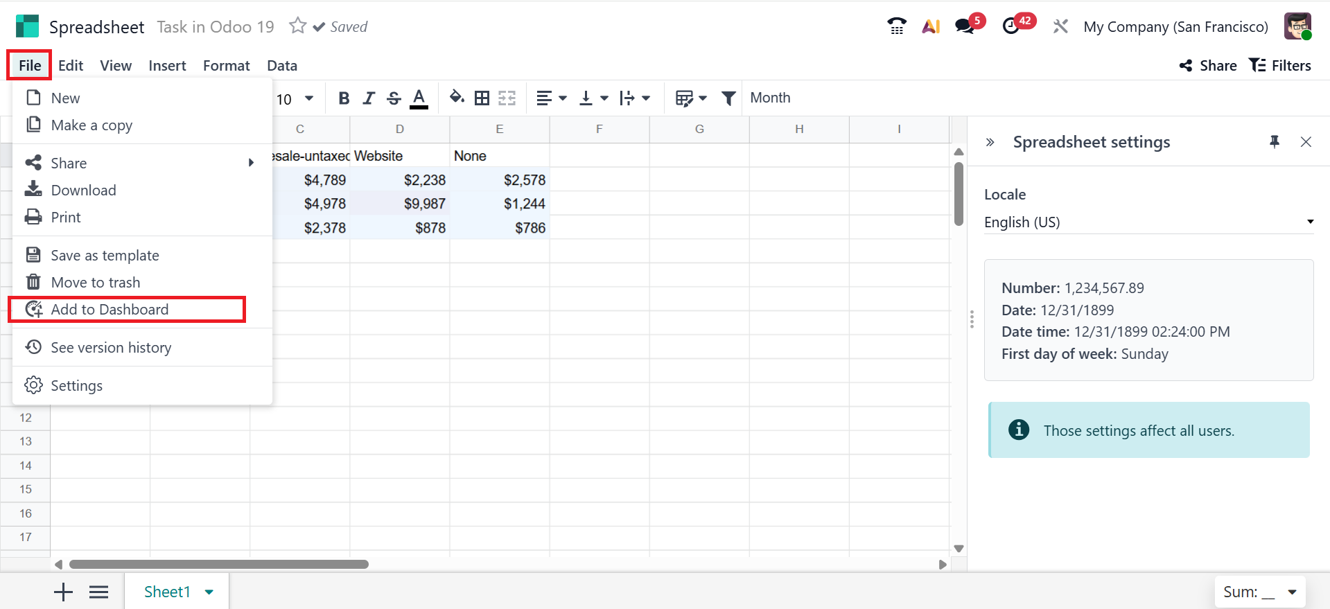
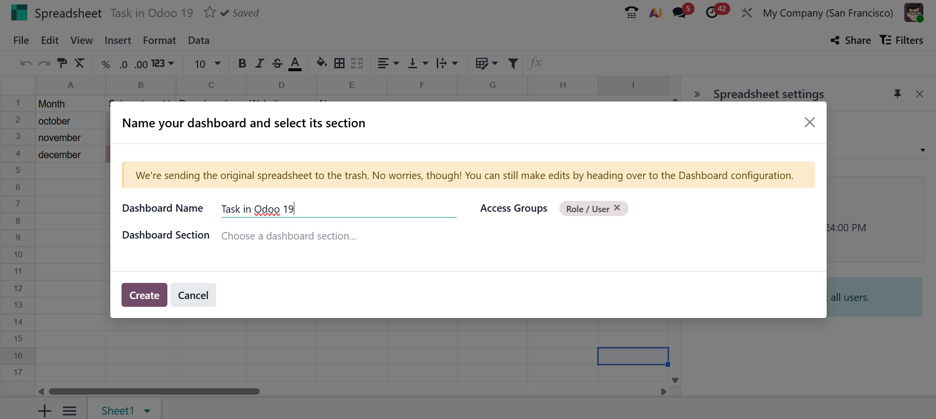
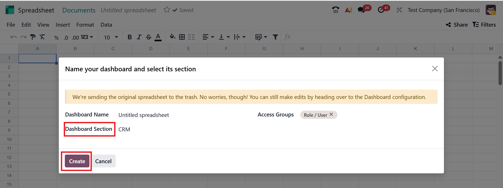
You can add the spreadsheet to the selected dashboard section by selecting the Add to dashboard option from the File menu.
A pop-up window will appear, where you can add the Dashboard Name, Dashboard Section, and Access Groups options. Then, click on the Create button.
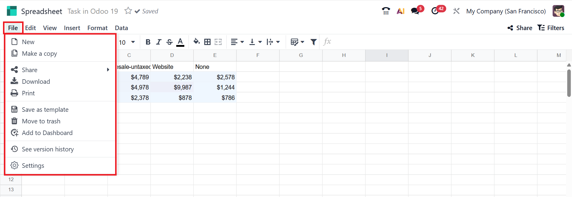
1. File:
You can view the options such as New, Make a copy, Share, Download, Print, Save as template, Move to trash, Add to dashboard, See version history, and Settings under the File menu as shown below:
- New: To create a new spreadsheet, click on the New option in the File menu.
- Make a Copy: You can use this option to duplicate the spreadsheet.
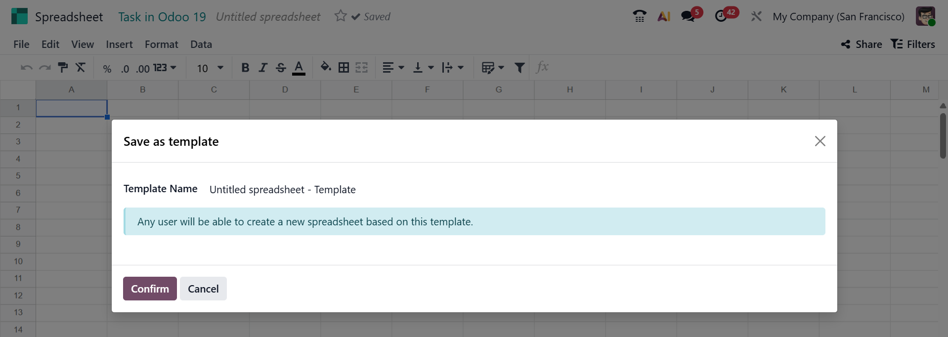
- Save as Template: This option lets you save the spreadsheet as a template. You will see a pop-up window where you can type the Template Name and press the Confirm button.
- Download: You can download the spreadsheet by using the Download option.
- See version history:This option allows you to view previously saved spreadsheets, as mentioned above.
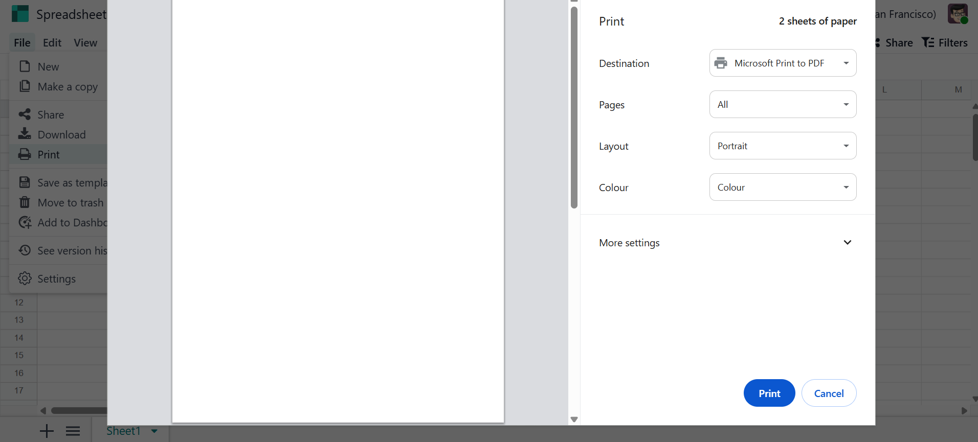
- Print:This option helps you print the spreadsheet.
- Settings: This option allows you to manage the spreadsheet, as mentioned above.
- Add to the dashboard:This option helps you add the spreadsheet to the dashboard.
2. Edit:
The Edit menu in the spreadsheet displays options such as Copy, Cut, Paste, Paste Special, Find and Replace, and Delete.
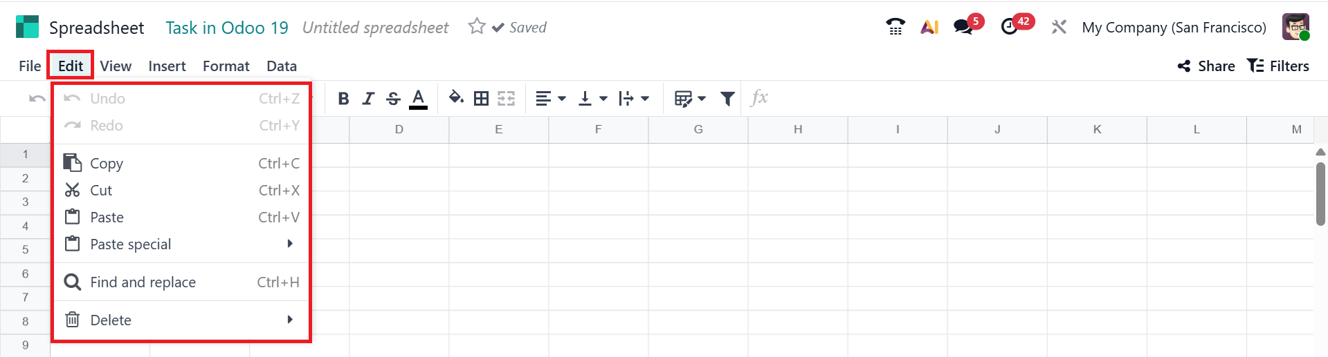
- Copy : This option helps you to copy the selected data.
- Cut : Removes selected content from the data.
- Paste : Replace copied or cut content.
- Paste special : You can paste the data as Paste as value or Paste format only.
- Find and Replace : This feature allows you to search for specific values in the spreadsheet and replace them with new ones.
- Delete : You can permanently delete the selected data.
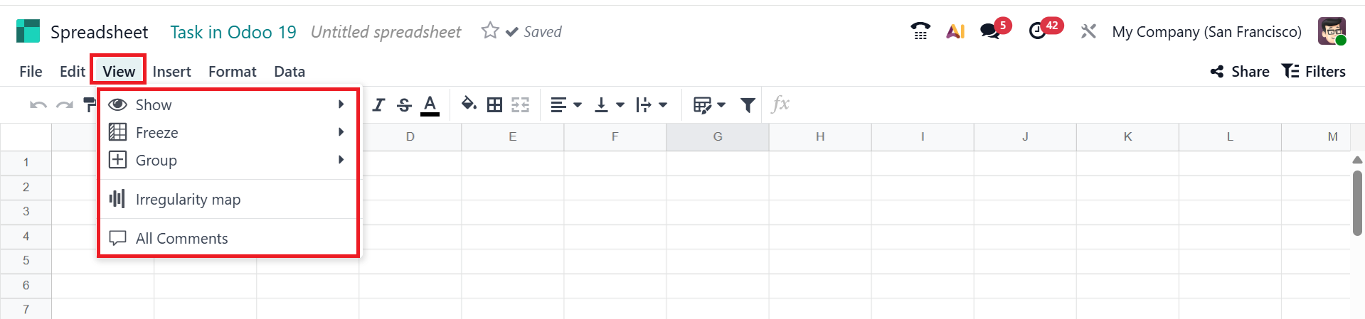
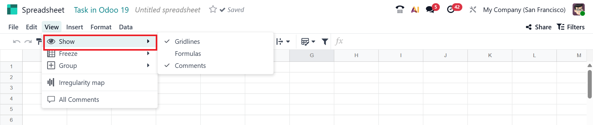
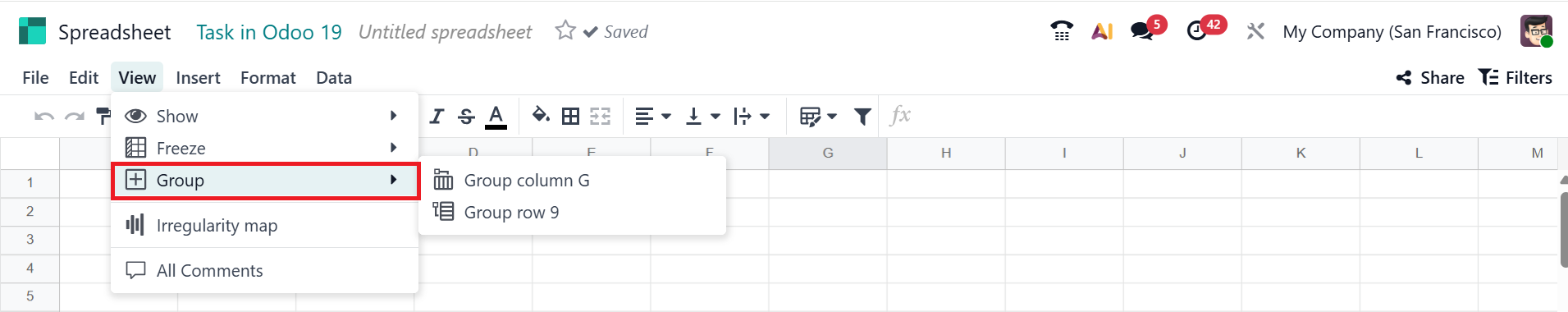
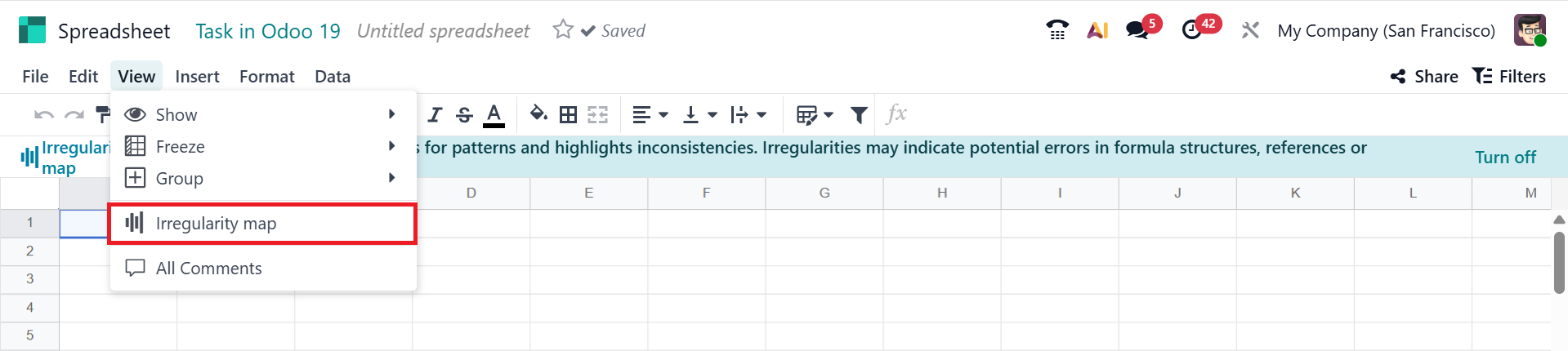
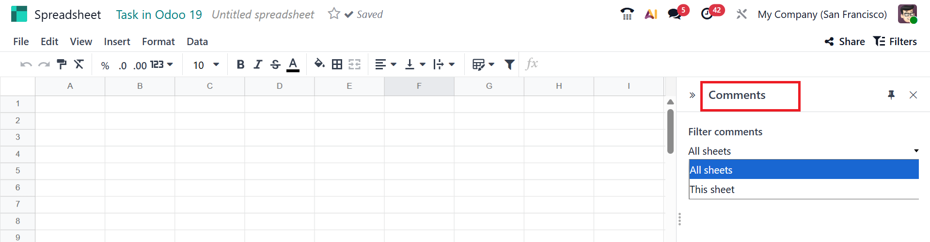
3. View:
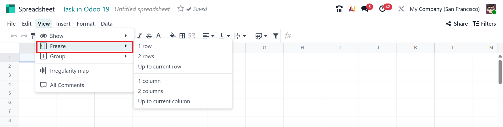
The View menu in the spreadsheet displays options such as Show, Freeze, Group, Irregularity, and All comments.
- Freeze: You can lock or freeze the specific rows or columns for easier scrolling. It can be accomplished using the options illustrated in the screenshot below.
- Show: You can display data as gridlines, formulas, and comments, as in the screenshot below.
- Group: You can group the data as a Group column or a Group row..
- Irregularity map: It shows where data points deviate from the normal pattern, enabling the quick identification of abnormal values.
- All comments: You can filter comments based on All sheets or This sheet options.
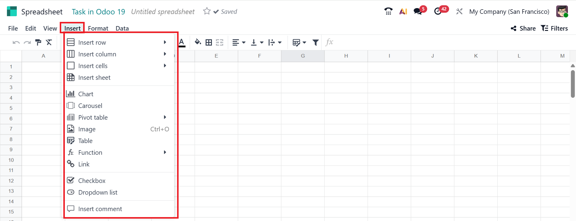
4. Insert:
Under the insert menu, you can view the options such as;
- Insert Rows :You can add a new row.
- Insert Columns : Allows you to add a new column.
- Insert Cell : Allows you to add a new cell.
- Insert Sheet : Allows you to add a new sheet.
- Charts : You can use this to represent data visually through bar, pie, or line charts.
- Pivot Tables : Helps to create summary reports.
- Images : Add images in the spreadsheet.
- Links : Add clickable links.
- Checkbox : A small square box can be added to the data.
- Dropdown list : You can add a dropdown list menu to show multiple options.
- Insert Comment : This feature allows you to add a comment or note to the selected cell.
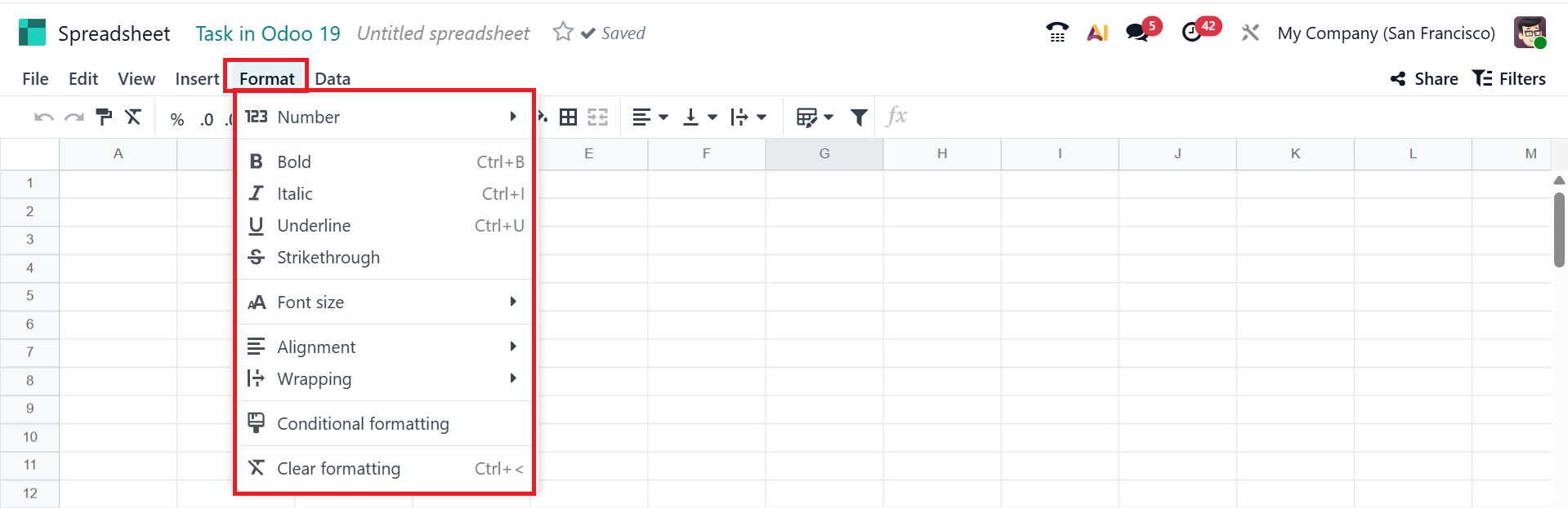
5. Format
Under the Format menu, you can access options such as:
- Bold, Italic, Underline : You can use text formatting to highlight the text.
- Number Formatting : You can adjust how numbers are displayed.
- Font Size : You can modify the text size to suit your preference.
- Alignment : You can adjust the text's position.
- Wrapping : Helps to move the text automatically.
- Cell Borders : Allows you to add or remove borders around the cells.
- Conditional Formatting : You can change the formatting based on values.
- Clear formatting : You can remove all applied styles.
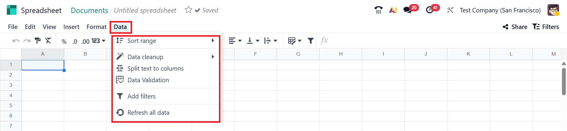
6. Data
Under the Data menu, you can access options such as:
- Sort Range : you can arrange the selected column from smallest to largest or largest to smallest.
- Add Filter : Enables you to apply filters to the selected column.
- Data Validation : You can use this feature to define the data type allowed in a cell.
- Data Cleanup : You can remove duplicate data.
- Split into columns : You can split the text into different cells.
- Refresh all data : You can update or refresh all the data.
Then, you can add the spreadsheet to the dashboard by selecting the Add to dashboard option under the File menu. Then, add a Dashboard Section and select the Create button as shown below:
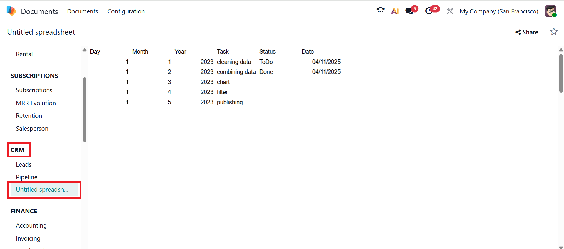
In the screenshot below, you can see that the spreadsheet is now integrated into the CRM dashboard.
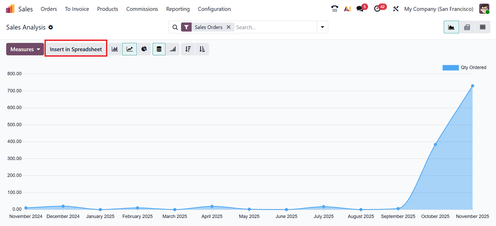
The Insert in Spreadsheet button can be found in the Report menu of the Odoo 19 modules.
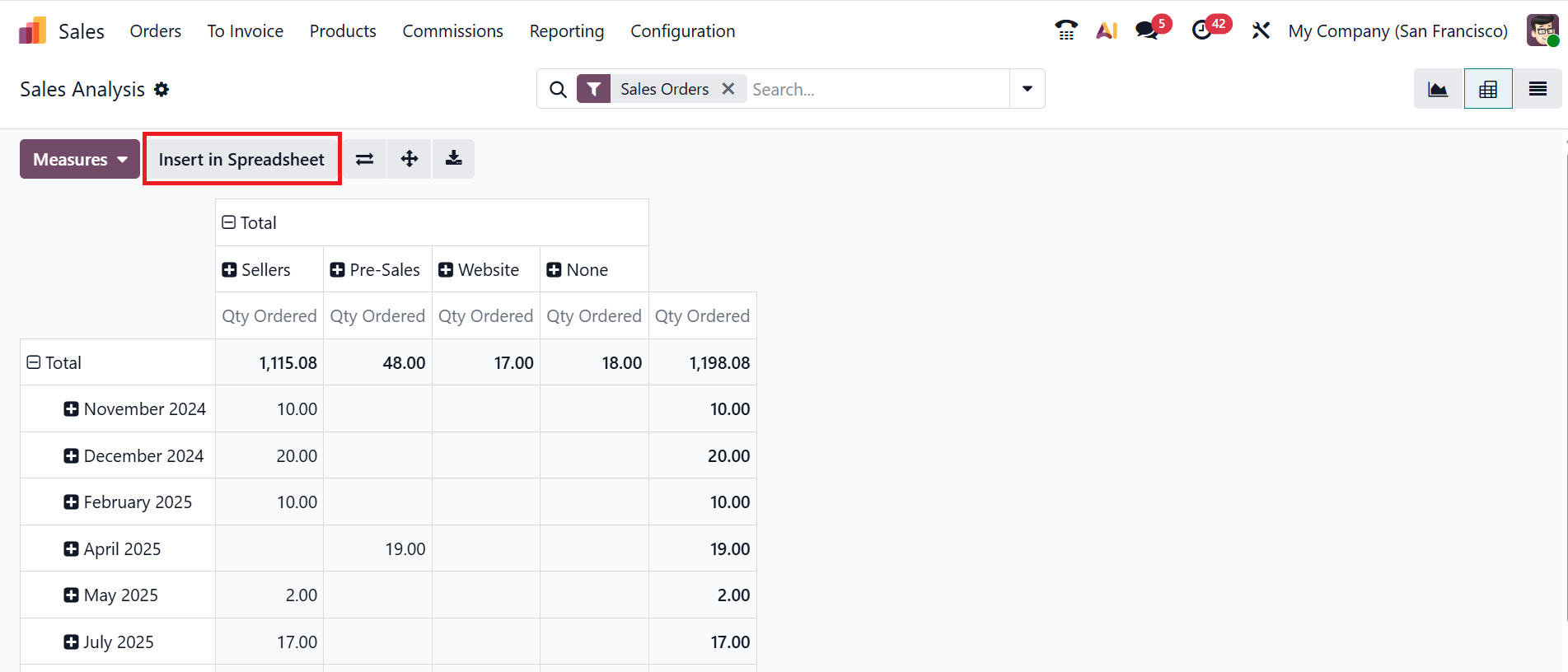
In Odoo 19 modules, the Insert in Spreadsheet button is also available in the Graph view.
Without the need for external software, Odoo 19 Spreadsheet provides a robust and integrated tool for evaluating, computing, comparing, and displaying business data within Odoo. Teams can make decisions more quickly and clearly with the aid of charts, pivot tables, formulas, and filtering. Odoo 19 Spreadsheet significantly enhances data-driven decision-making and reporting quality for all users across the company.