In this instance, we will create a new widget and add it to a
form view. We are currently developing a date picker widget
that allows us to enter several dates at once. We can now
proceed with the creation of a widget.
In this case, the res.partner model is getting a new char
field added.
 from odoo import fields, models


 class ResPartner(models.Model):
      _inherit = 'res.partner'

       test_field = fields.Char()
Add the field in the form view.
<field name="test_field" widget="multiple_datepicker"/>
Next, we define the Qweb template for the field widget
                <?xml version="1.0" encoding="UTF-8"?>
                <templates>
                    <t t-name="DatePickerField" owl="1">
                        <input type="text"
                              class="input_datepicker o-autocomplete--input o_input"
                              t-ref="inputdate"
                              t-on-click="(ev) => this._onSelectDateField(ev)"/>
                    </t>
                </templates>
Next, we are going to add the style for the widget.
.datepicker-dropdown {
  top: 0;
  left: 0;
  padding: 4px
}
.datepicker table tr td,
.datepicker table tr th {
  text-align: center;
  width: 30px;
  height: 30px;
  border: none
}
.datepicker table tr td.day:hover,
.datepicker table tr td.focused {
   background: #eee;
   cursor: pointer;
   border-radius: 18px;
}
.datepicker table tr td.active.active,
.datepicker table tr td.active.highlighted.active,
.datepicker table tr td.active.highlighted:active,
.datepicker table tr td.active:active {
   color: #fff;
   background-color: #7C7BAD;
   border-radius:18px;
   border-color: #7C7BAD;
   background-radius:11px;
}
.datepicker table tr td span {
   display: block;
   width: 23%;
   height: 54px;
   line-height: 54px;
   float: left;
   margin: 1%;
   cursor: pointer;
}
.datepicker table tr td span.active,
.datepicker table tr td span.active.disabled,
.datepicker table tr td span.active.disabled:hover,
.datepicker table tr td span.active:hover {
   color: #fff;
   background-color: #7C7BAD;
   border-color: #2e6da4;
   text-shadow: 0 -1px 0 rgba(0, 0, 0, .25)
}
.datepicker .datepicker-switch {
   width: 145px;
   background:#7C7BAD;
   color:white;
}
.datepicker .datepicker-switch,
.datepicker .next,
.datepicker .prev,
.datepicker tfoot tr th {
   cursor: pointer;
   background:#7C7BAD;
   color:white;
}
Next we need to define the widget component
/** @odoo-module **/

import { registry } from "@web/core/registry";
import { useInputField } from "@web/views/fields/input_field_hook";
import { Component,useRef } from "@odoo/owl";
import { _t } from "@web/core/l10n/translation";
import { standardFieldProps } from "@web/views/fields/standard_field_props";
export class DatePickerField extends Component {
   static template = 'DatePickerField'
   setup() {
       this.input = useRef("inputdate");
       useInputField({
           getValue: () => this.props.record.data[this.props.name] || "",
           refName: "inputdate"
       });
   }
   _onSelectDateField(ev) {
       var dateFormat = "MM/DD/YYYY";
       dateFormat = dateFormat.toLowerCase()
       if (this.input.el) {
           if (this.input.el.value) {
               this.props.record.update({
                   [this.props.name]: this.input.el.value
               })
           }
           $(this.input.el).datepicker({
               multidate: true,
               format: dateFormat,
           }).trigger('focus');
       }
   }
}
DatePickerField.props = {
   ...standardFieldProps,
}
export const datepickerField = {
   component: DatePickerField,
   supportedTypes: ["char"],
};
registry.category("fields").add("multiple_datepicker", datepickerField);
Then define the js, xml and css in the manifest file.
'assets': {
   'web.assets_backend': [
       '/owl_test/static/src/scss/style.scss',
       '/owl_test/static/src/js/owl_test.js',
       '/owl_test/static/src/js/lib/bootstrap-datepicker.min.js',
       '/owl_test/static/src/xml/owl_test.xml',
   ],
},
Next we can select the multiple dates in the field.
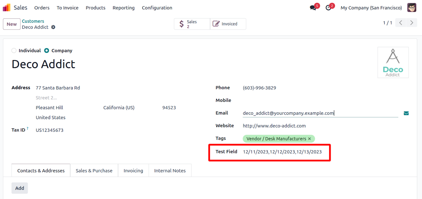
Thus we can add multiple dates using the DatePicker Widget.