1. Search
You can use the Search box to look for objects in this module.
Clicking the search button will open a new pop-up window similar to
the one below.
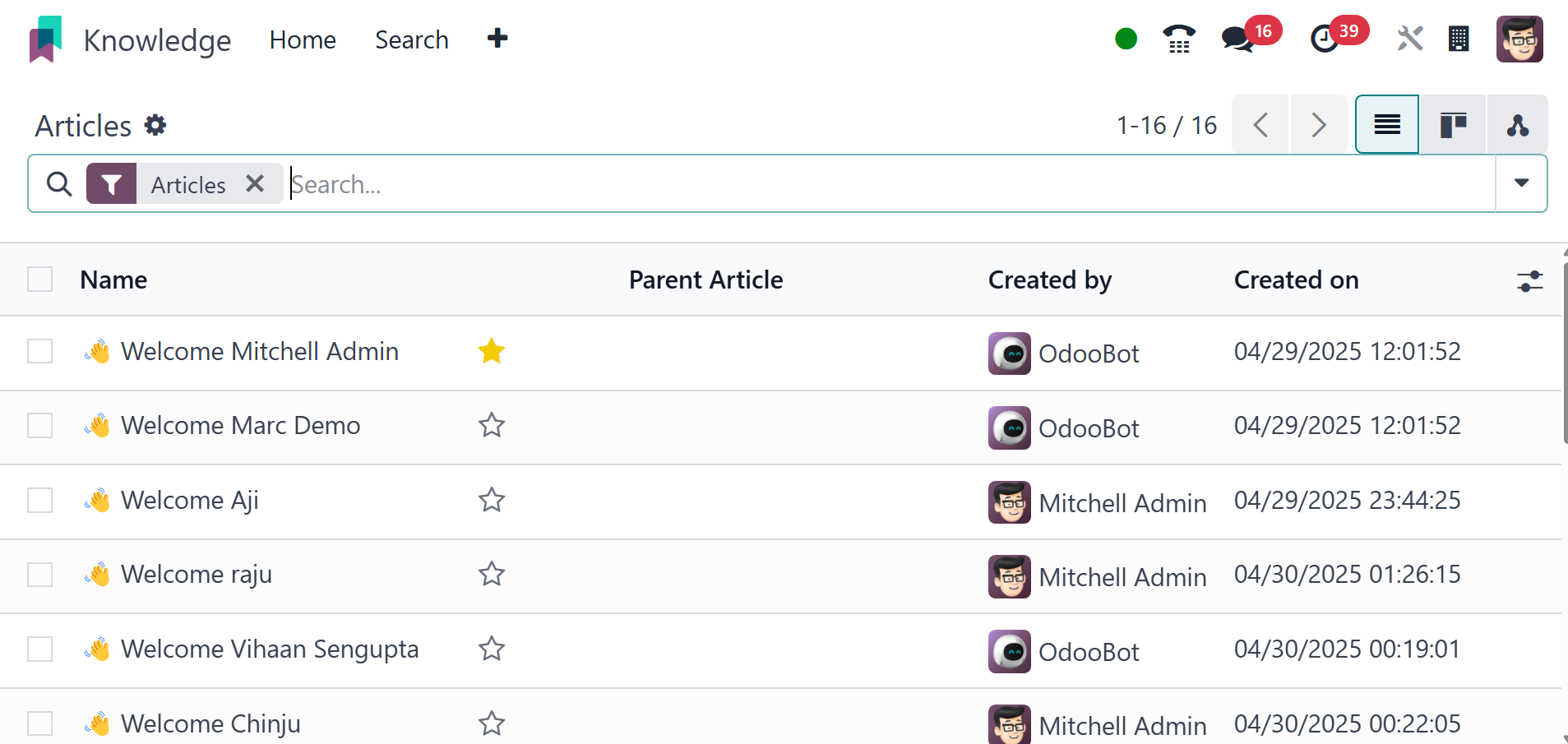
In the list view, you can see the articles' Name, Parent Article,
Created By, and Created on details. You can launch this window by
selecting the Search menu from the main menu bar of the module.
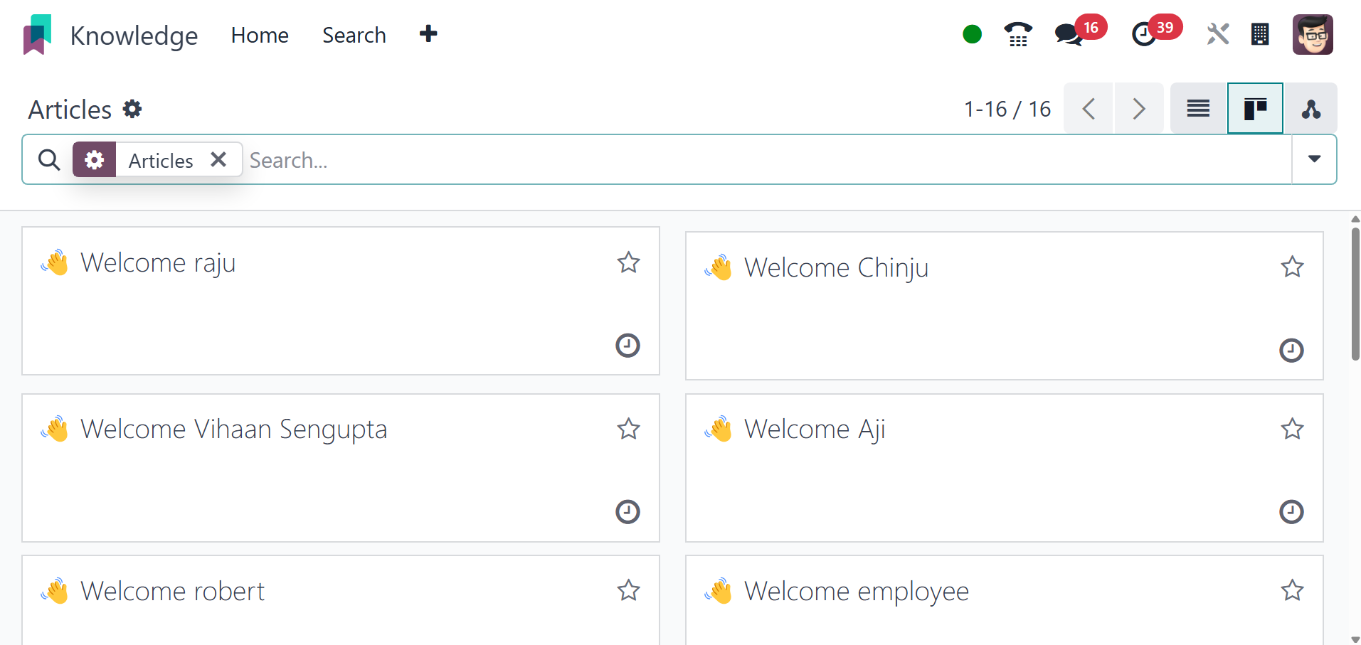
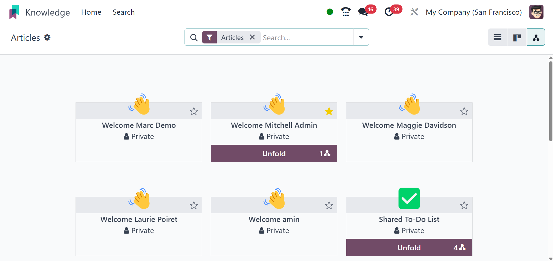
The page can be viewed in list, Kanban, and hierarchy views as well.
The kanban view will be, as in the image below.
And the hierarchy view will be, as in the screenshot below.
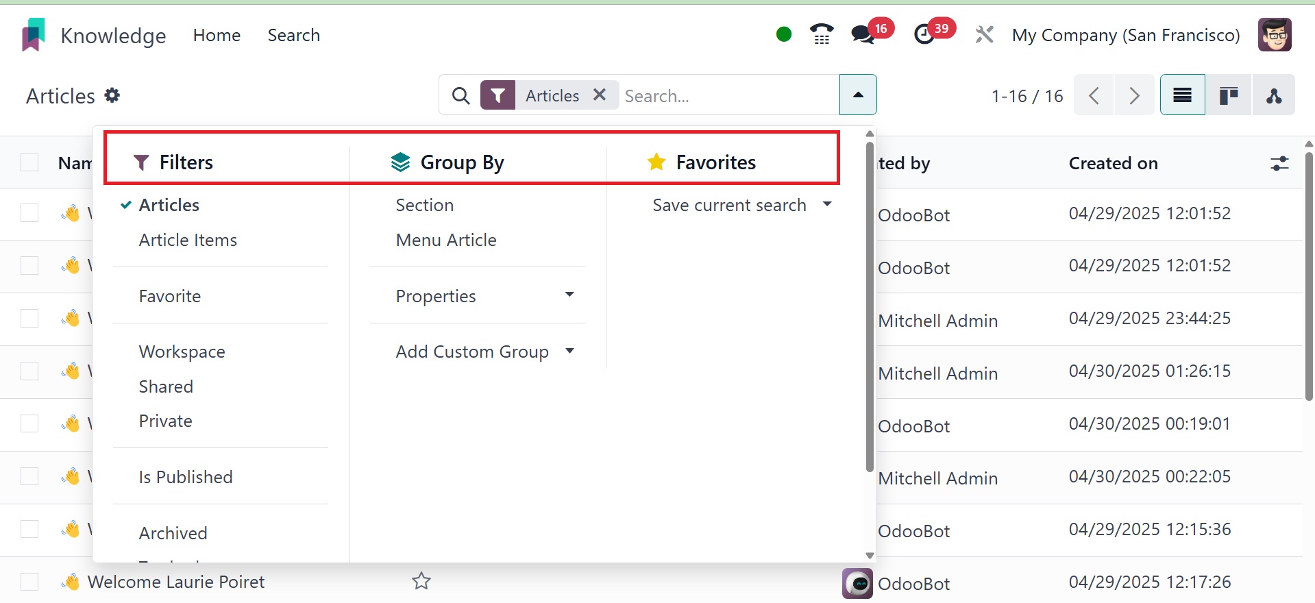
You can use the search bar to find articles. Among the filters for
the articles are Article Items, Favorite, Workspace, Shared,
Private, and Trashed. You may also specify multiple custom filters
for the articles by clicking the Add Custom Filter button. The
articles can be arranged by Section and Menu Article using the
default Group By option. Use the Add Custom Group button to add a
custom grouping option to articles.
By selecting the Star icon that shows up on each item, you can add
articles to your favorite list. You can view a list of your favorite
articles from the home page itself. As shown in the image below, the
Favourites menu on the left side of the screen will show every
article you have selected with the star icon.
There will also be separate choices for workspace, shared, and
private articles.
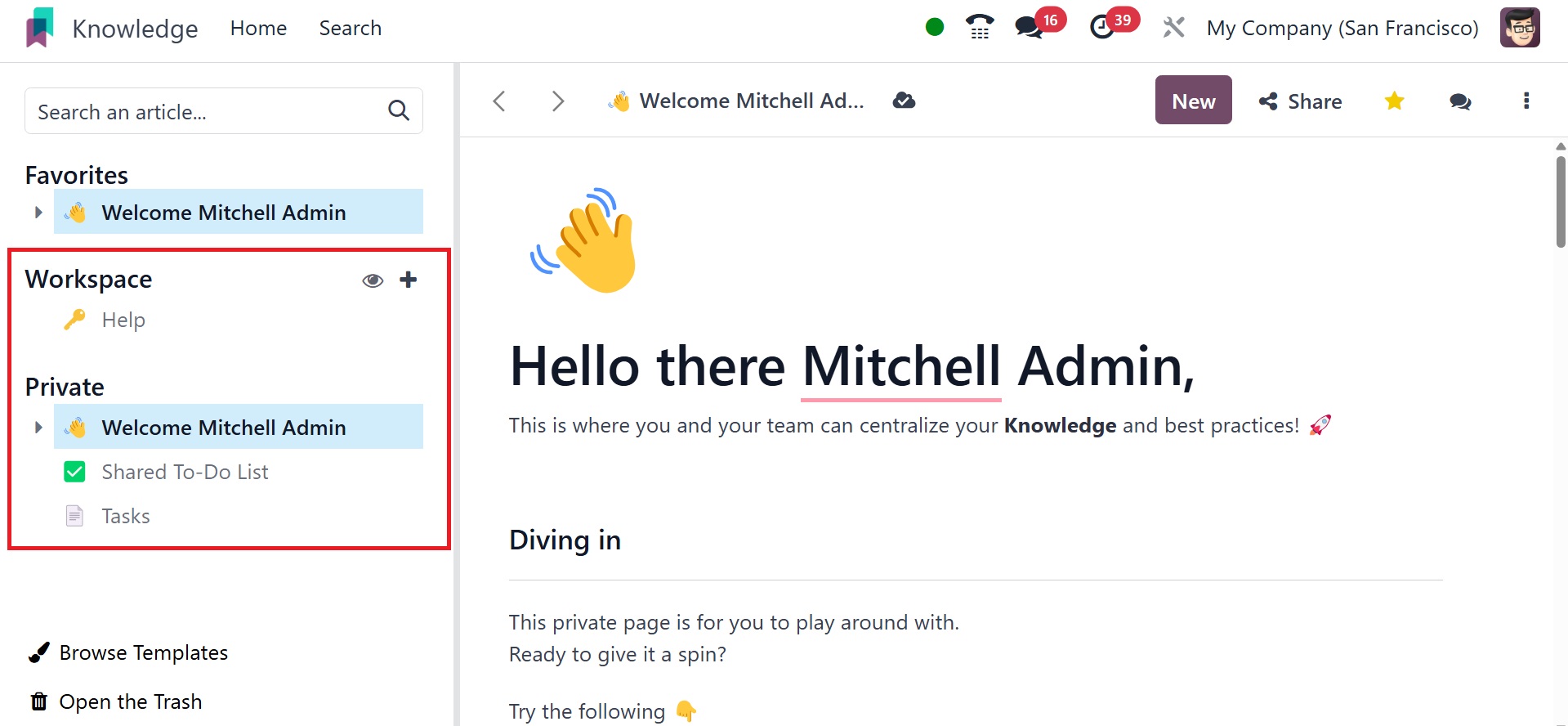
You can also have the browse template and open the trash options.
Browse Templates allows you to select pre-built article templates to
use as a starting point for new articles, while Open the Trash
provides access to a list of deleted articles that can be restored.
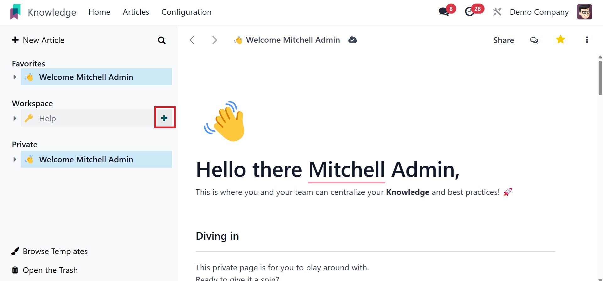
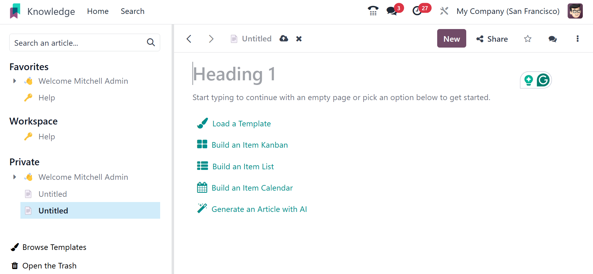
This module has everything organized nicely. To begin a new article
for your workspace, move your cursor near the Workspace menu. A +
icon will appear, as seen below, directing you to a new window where
you can begin writing a new article.
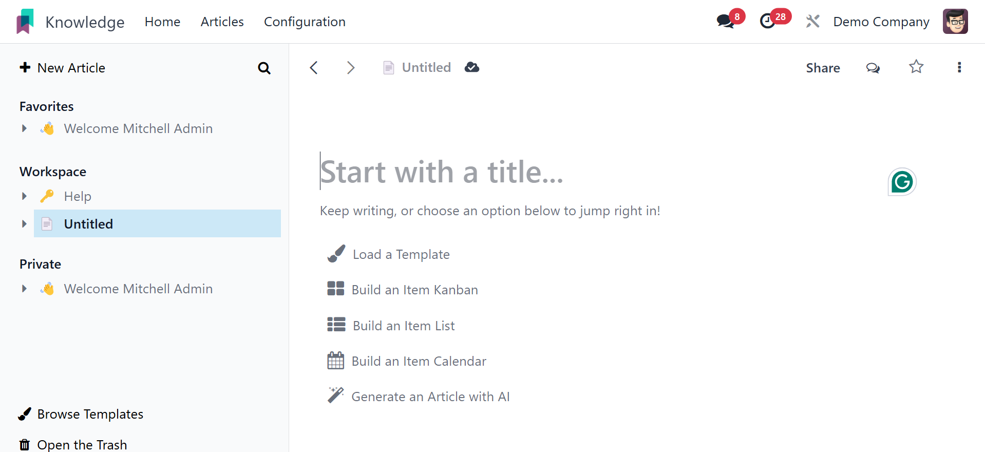
You can write a new article in this box according to your needs.
Additional features can be added by users inside the article box.
The following are some of them: load template, make a list of the
items, make an item kanban, and an item calendar.
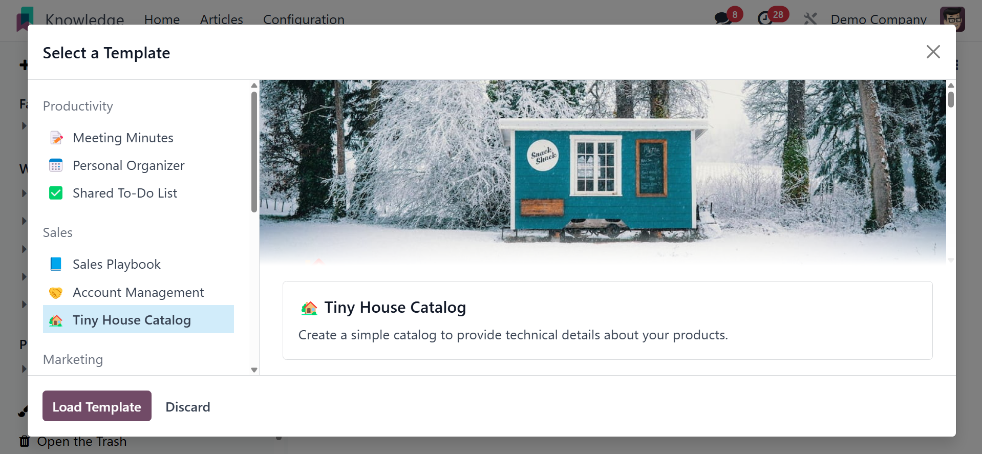
When you select the Load Template option, a new pop-up will show up.
Templates are displayed on the left side of the window in multiple
categories. After selecting a template from the appropriate
category, users can add it by clicking the Load Template button.
The selected template will then be automatically used to expand the
article. It is possible to move, replace, and remove the image and
content of the article..
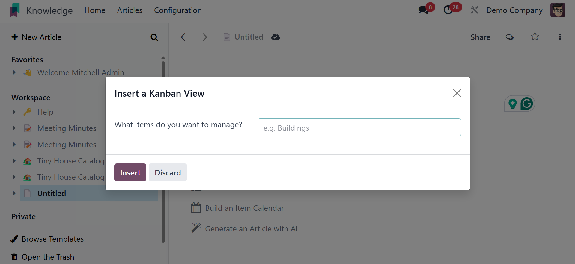
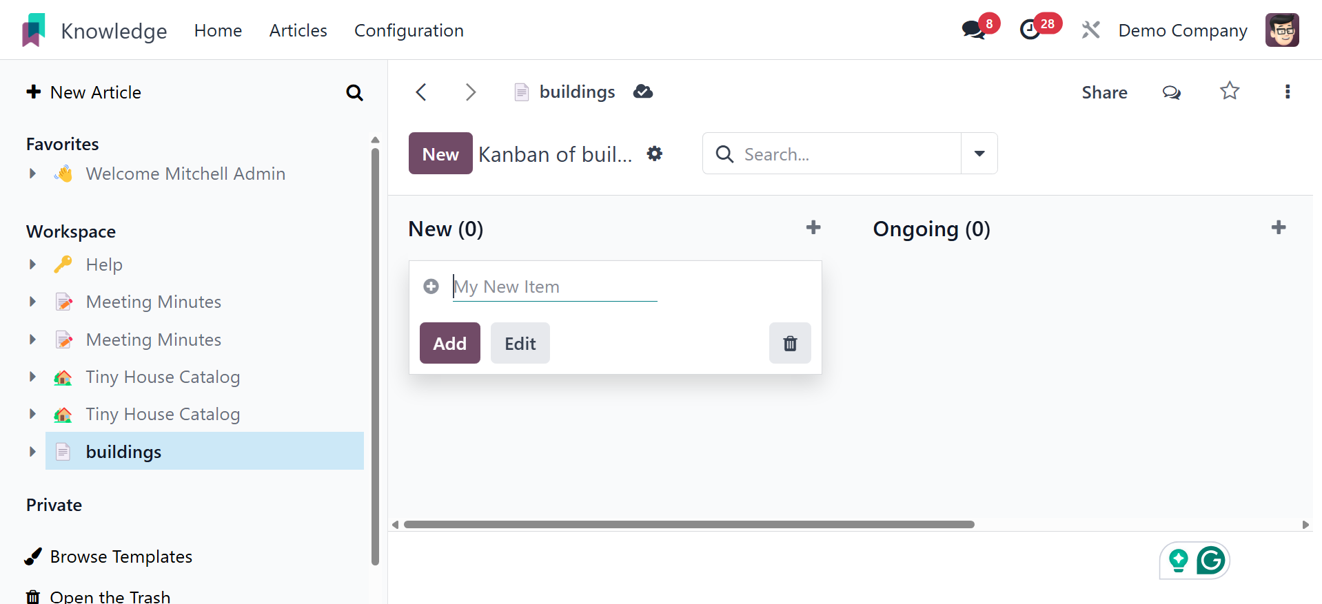
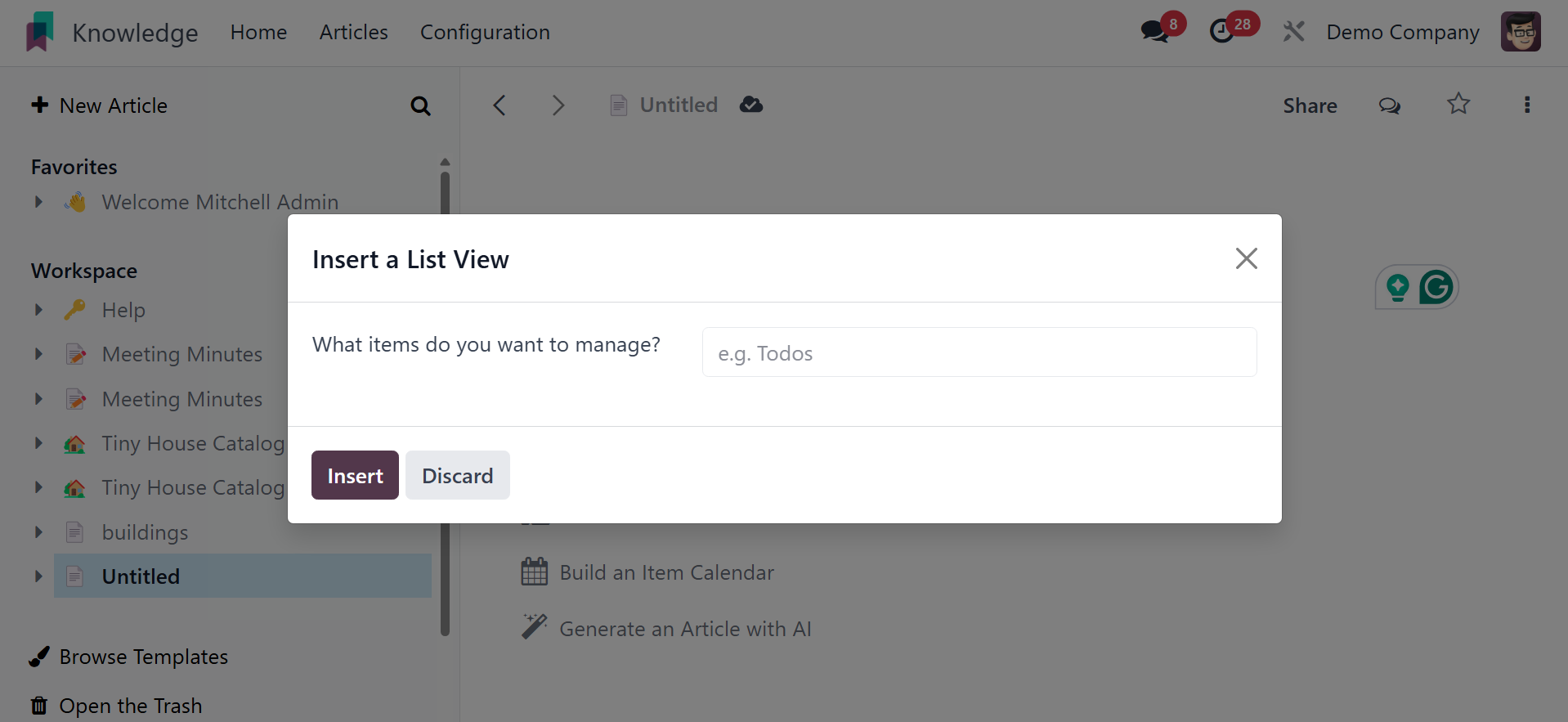
Clicking the Build an Item Kanban button will bring up a dialog box
asking you to add the items you want to manage. As a result, the
Kanban view will be added based on the item when you add it. After
that, click the Insert button.
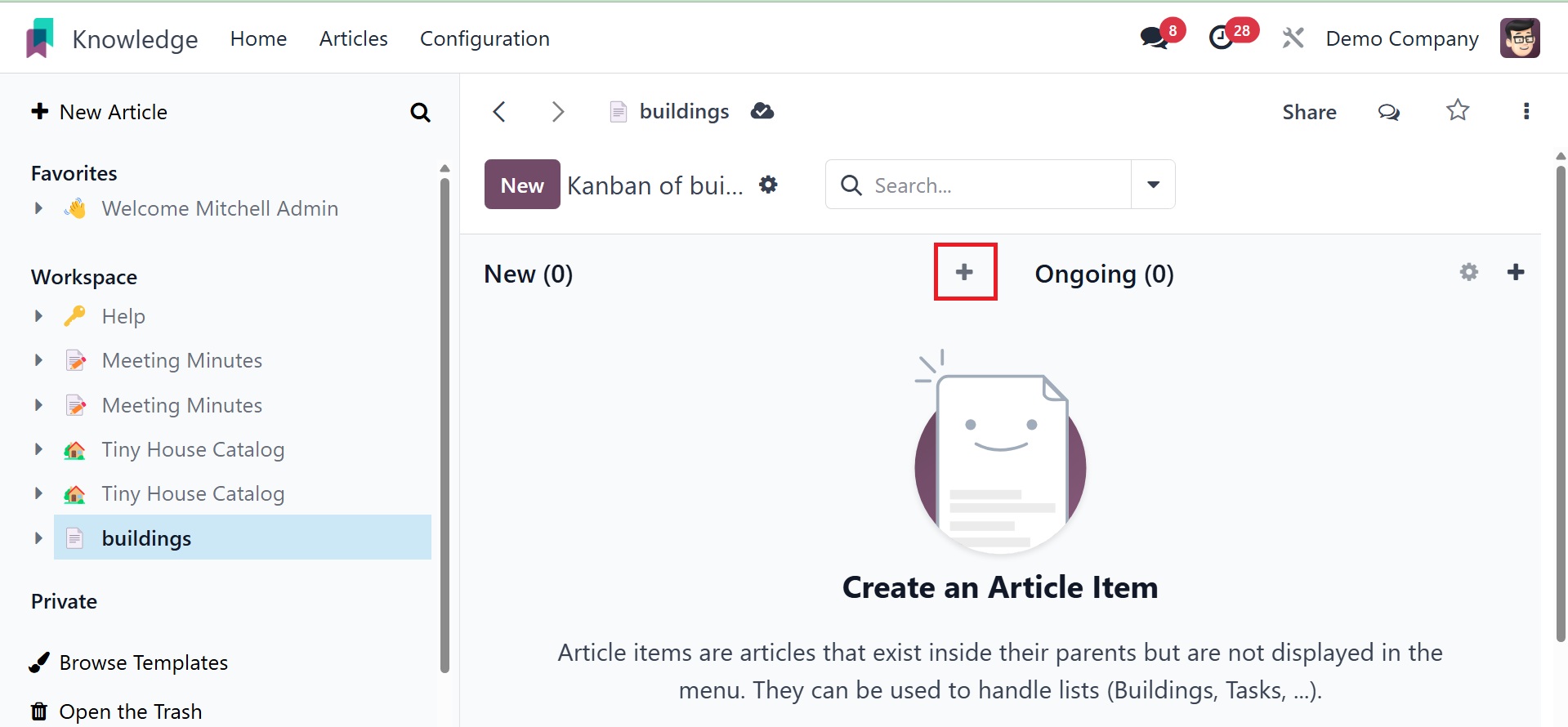
The Kanban perspective will then be included in the paper. By
default, the user-entered name is displayed in the pop-up window. It
can be renamed and opened in full-screen mode using the Open button.
To add new stages to the Kanban display, click the plus icon.
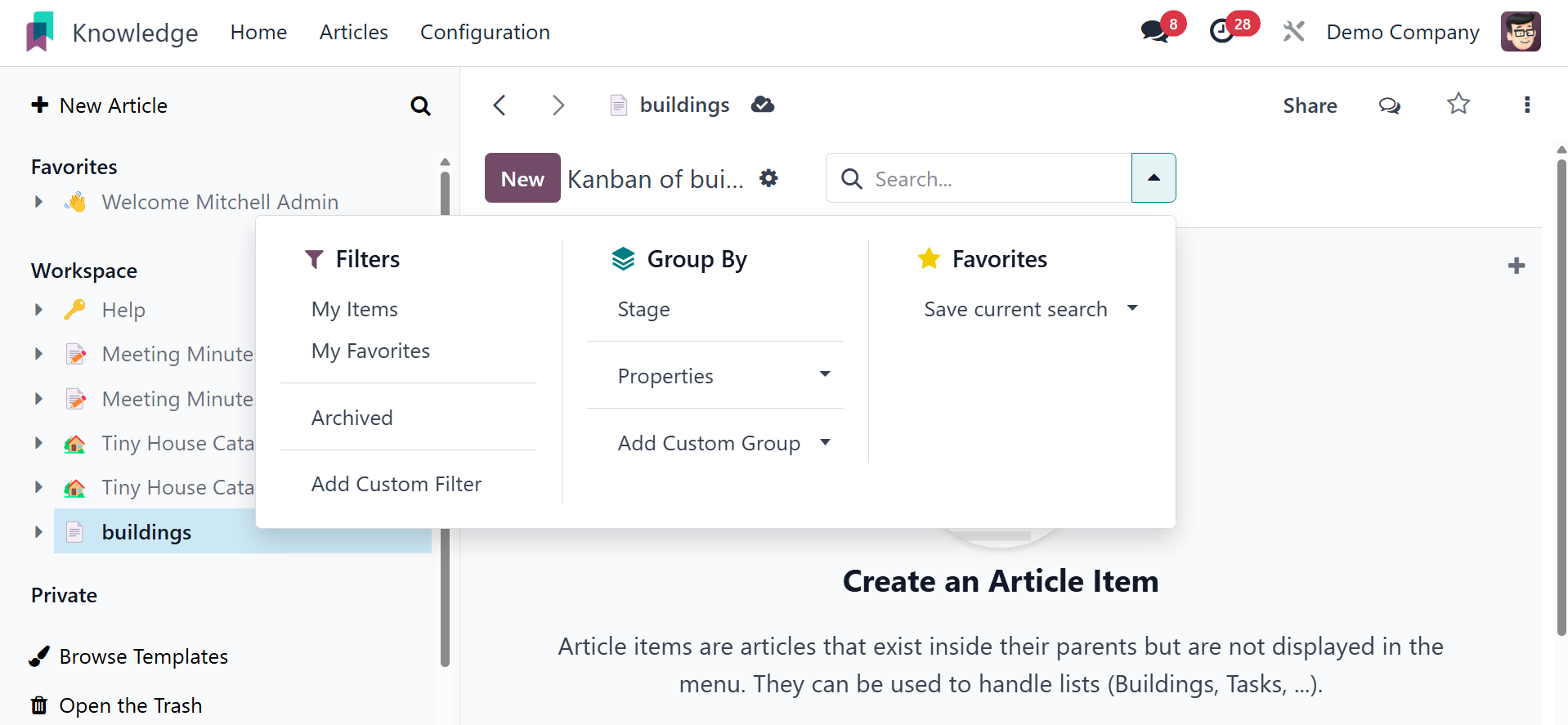
The Filter, Group By, and Favorite choices can be chosen straight
from the Search box.
Next, click the New button to add new items. As shown below, a new
item can be added during the first stage by clicking the New button.
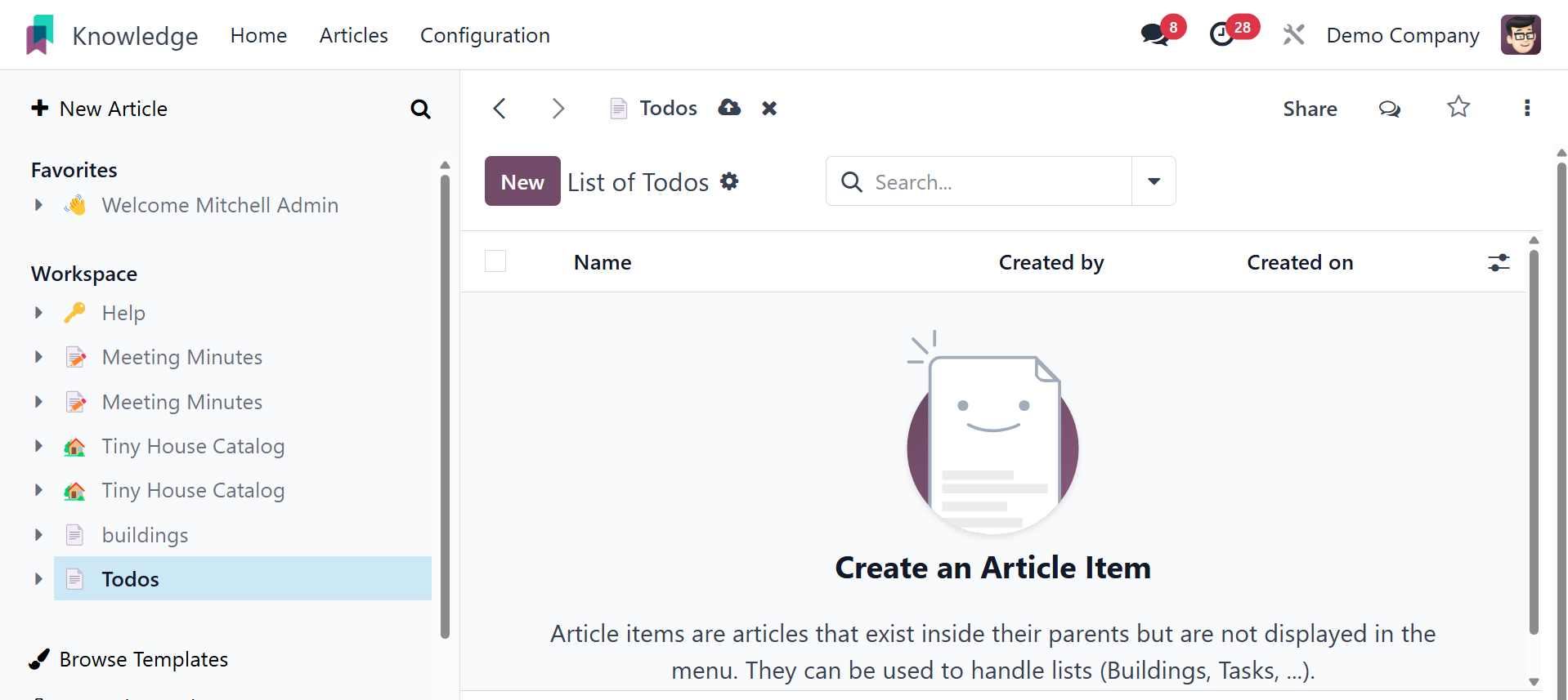
As discussed before, the user can add a new list view by mentioning
the item they want to add inside the pop-up box. After that, click
the Insert button.
A listview that could be renamed and viewed in full-screen mode was
built there. By selecting the New button, you can add new items. The
Search, Group By, and Favorite options are also visible on this
screen.
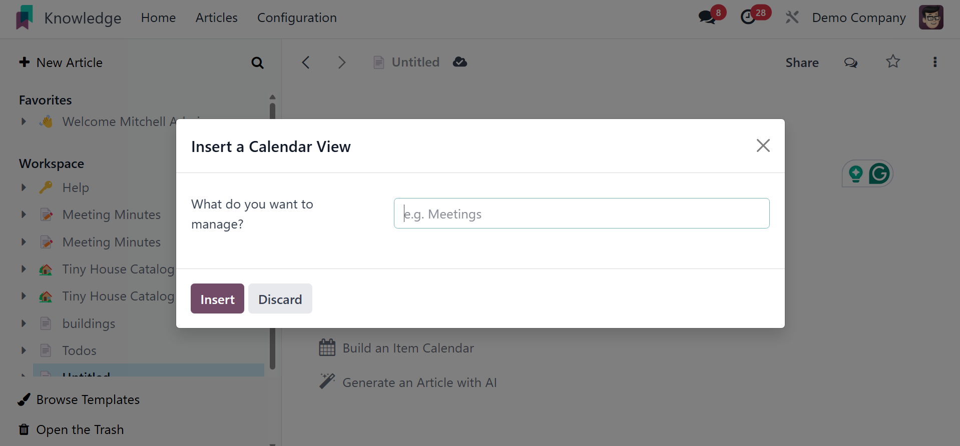
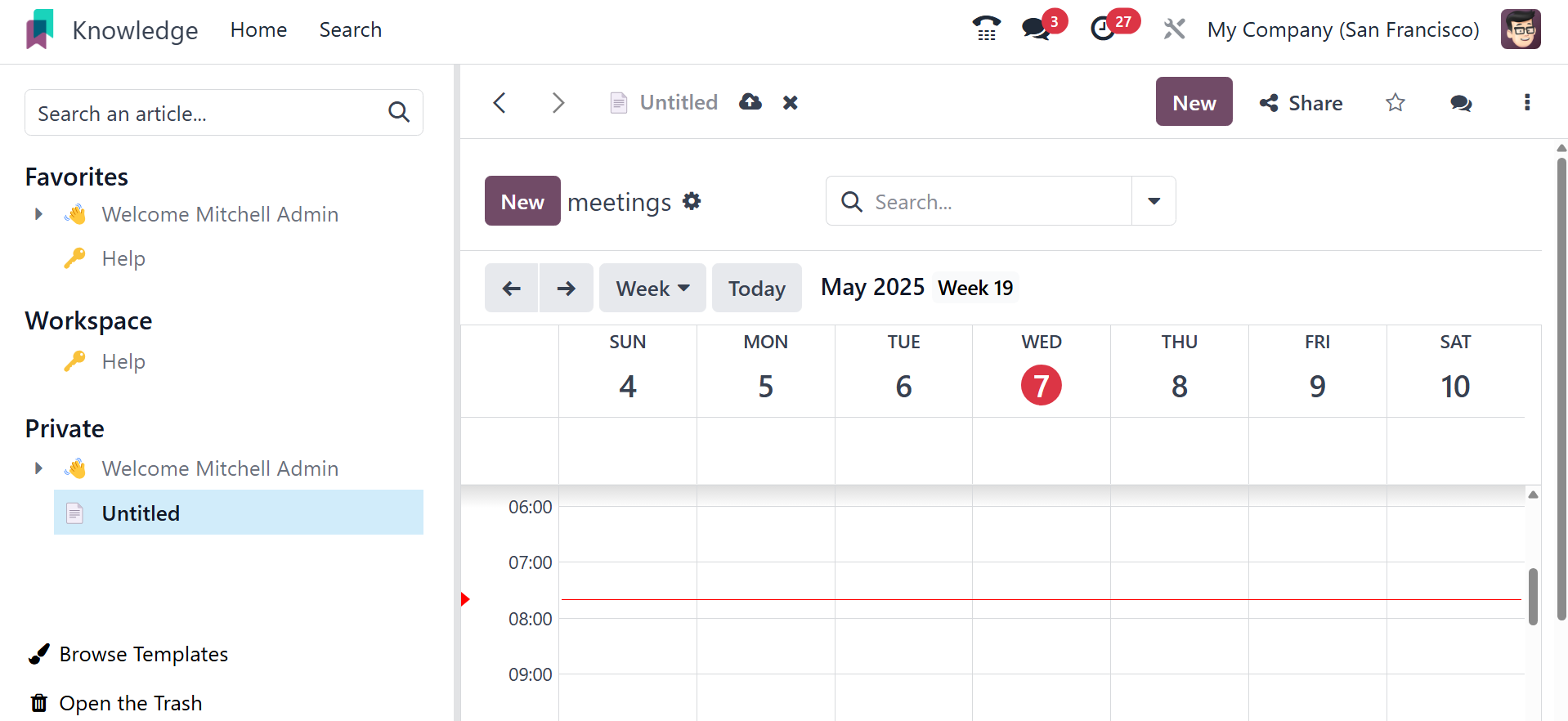
The user must first indicate which item or items they want to manage,
much like when inserting a list view or a kanban view. The newly
added item will determine how the calendar appears. Then click the
Insert button.
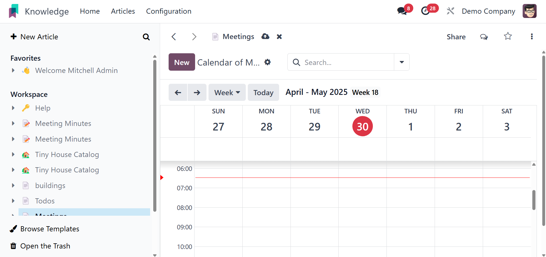
A new calendar will then appear on the screen. You can set the
calendar view to show up every day, every month, or every year. To
add a new meeting, click the New button.
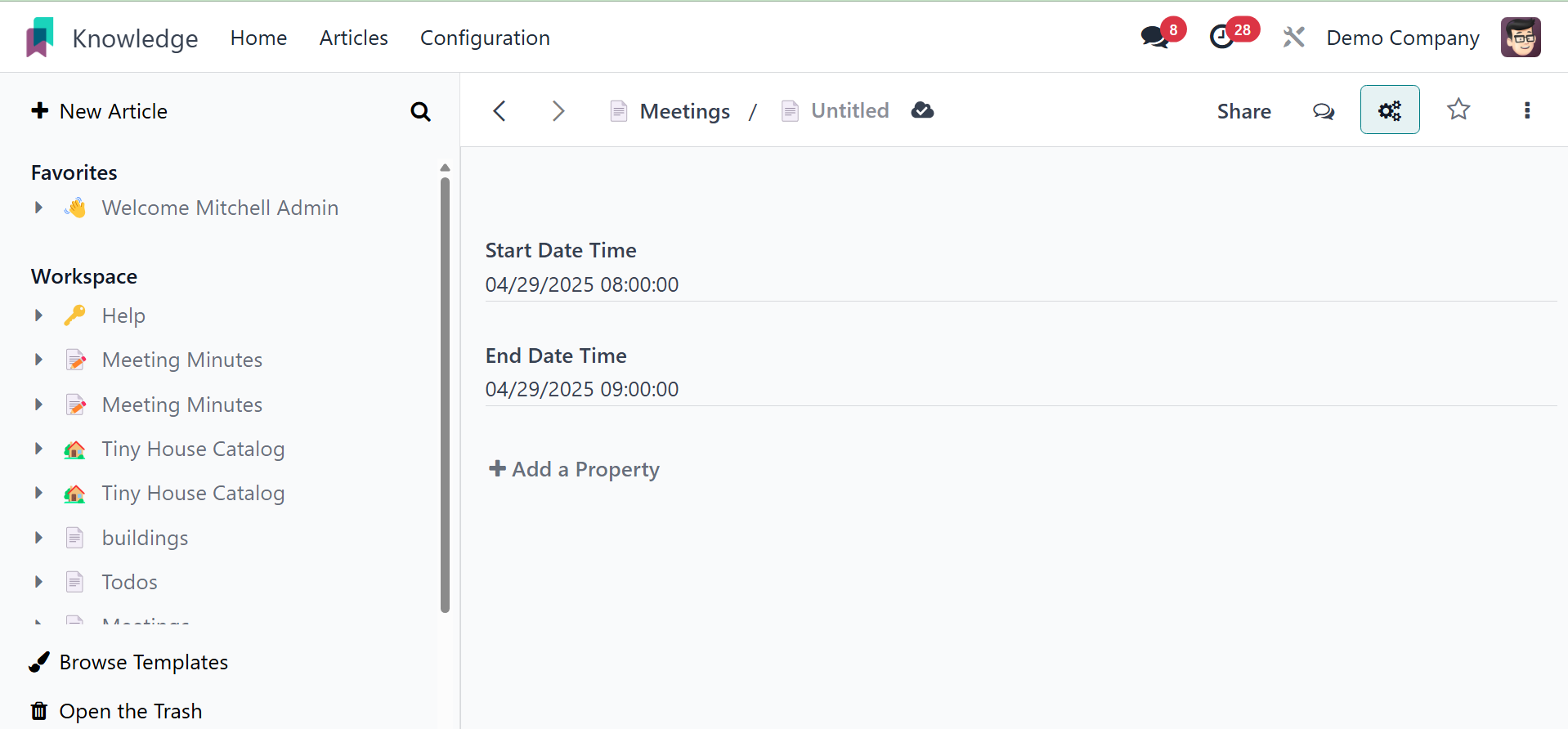
Next, include the start and end hours and dates, along with the
title. To add properties, click the Add Properties button.
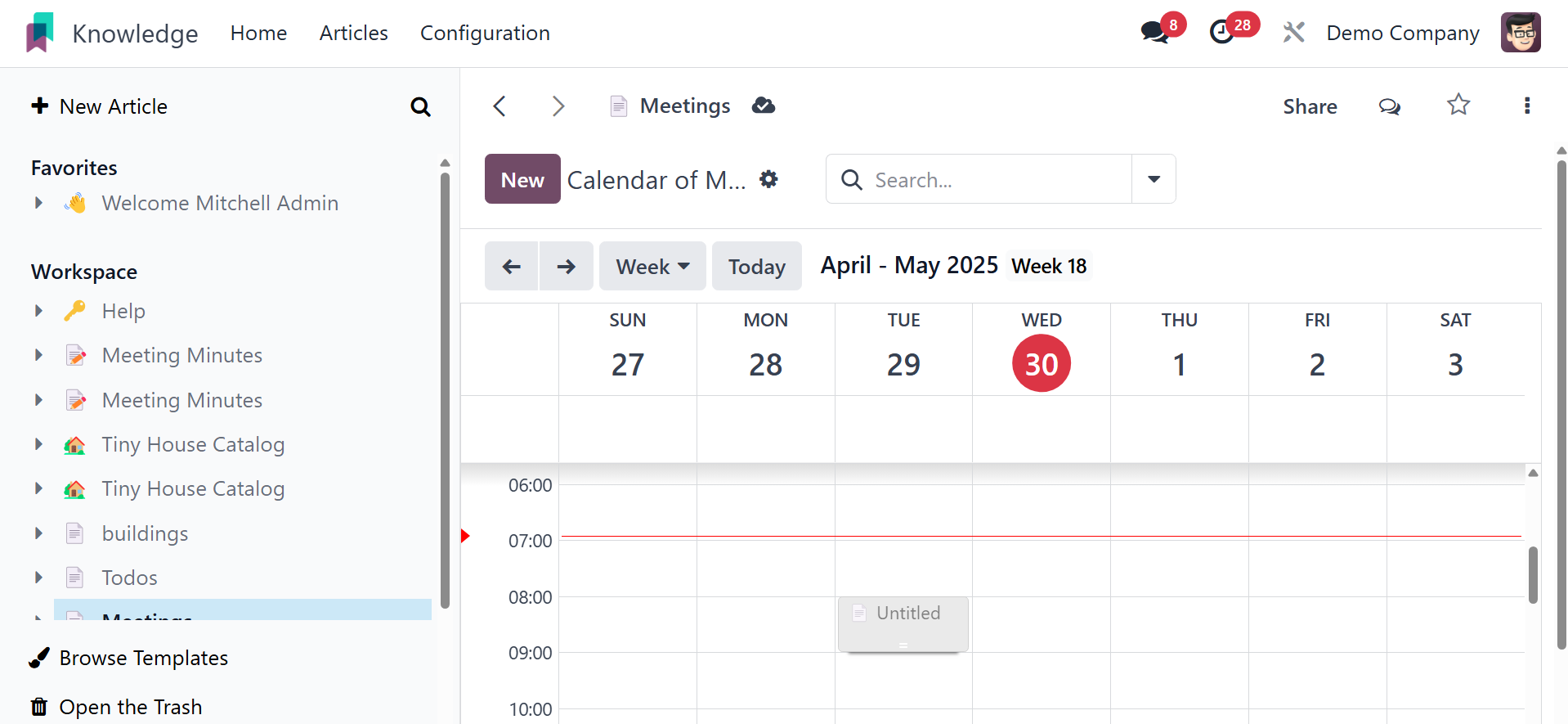
Once saved, the produced meeting will appear on the calendar with the
extra icon and image.
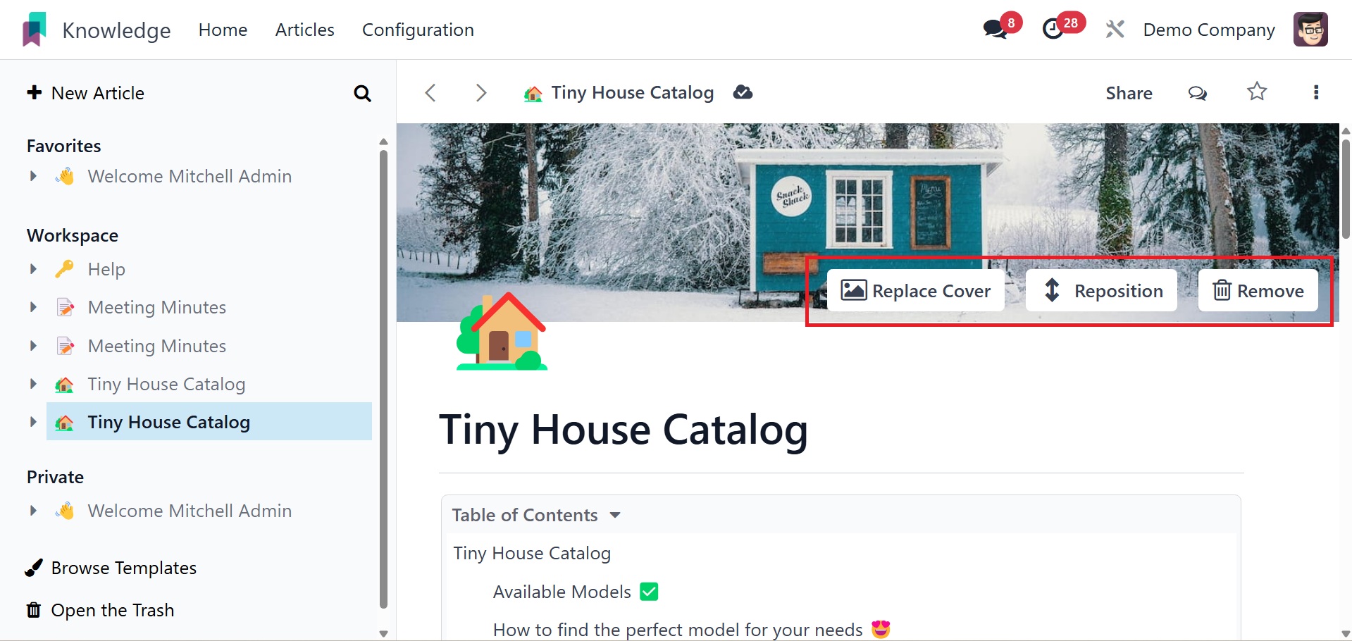
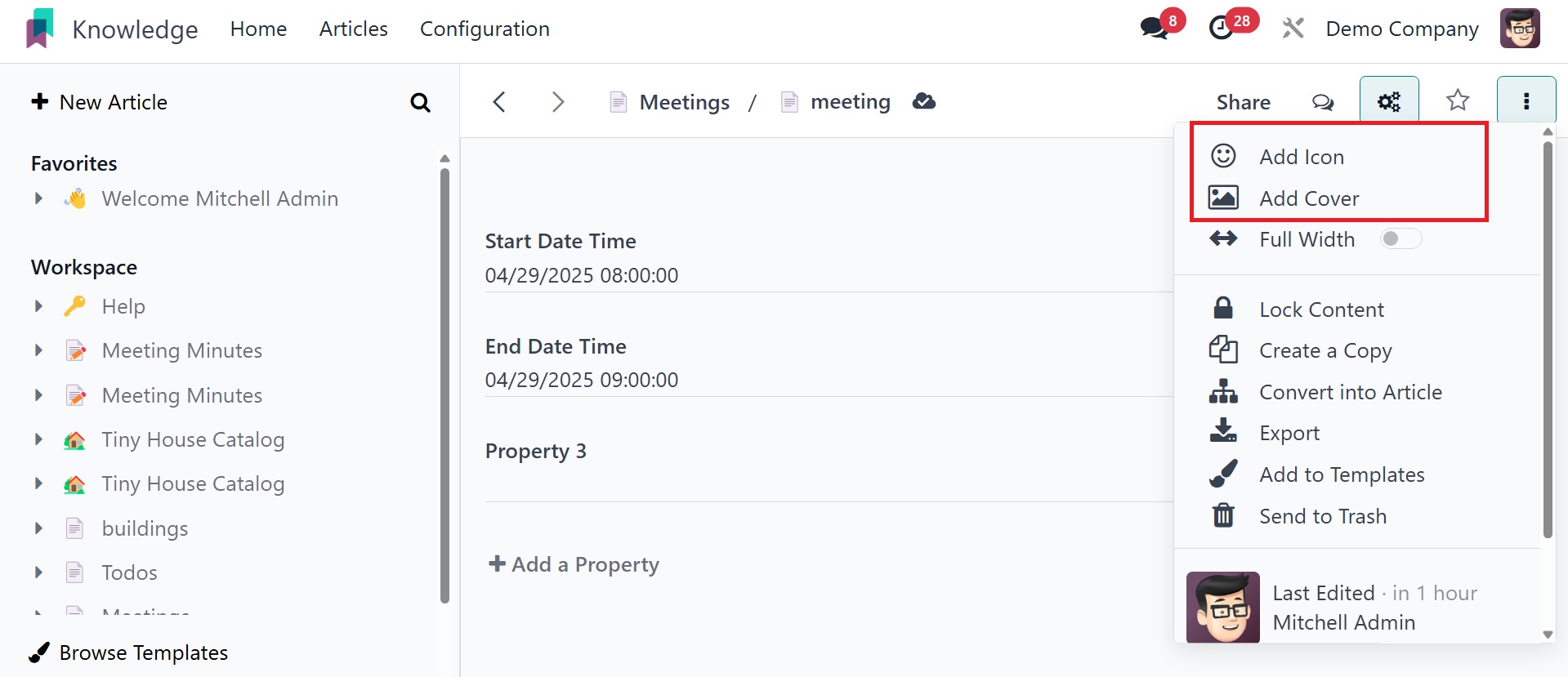
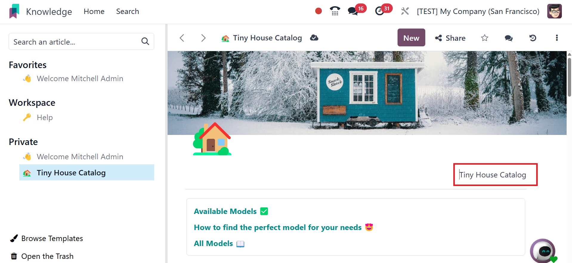
The article can have a title. You can add the attributes, icon, and
cover picture to that new article.
Using the / icon, which provides multiple options, can help you write
better while adding content to your article. The open history option
helps you get the history.
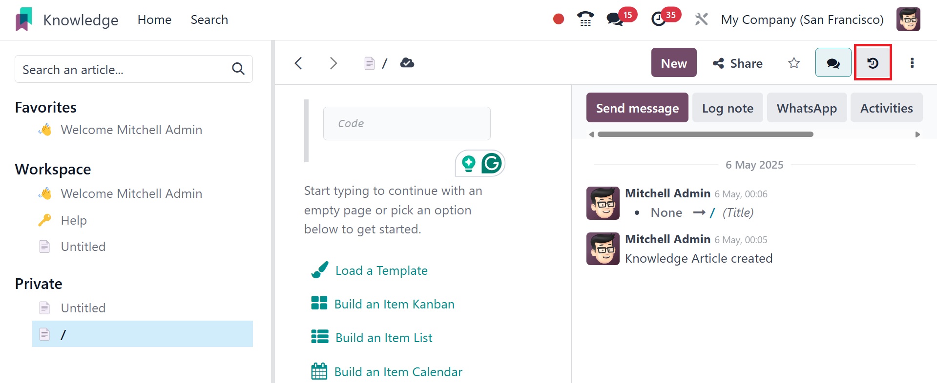
On selecting the option, you get the details, as in the image below.
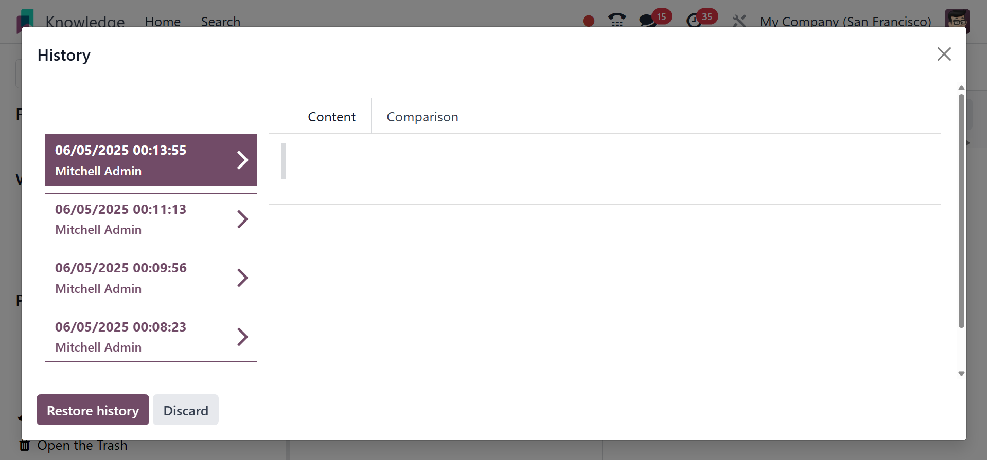
You can restore the history using the restore history option.
Separator tools separate the two sections with a separator line. The
‘/’ separator allows users to add a separator line to an article
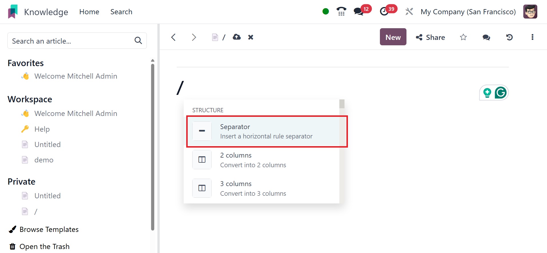
Columns: Columns can be added to article with 2 columns, 3 columns, 4
columns etc.
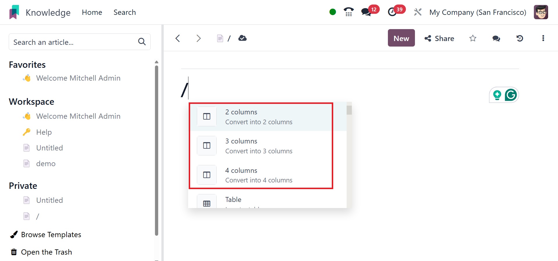
Table: A table is another tool to add a table to your article with
rows and columns since some details should be documented in a
tabular form. The ‘/’ table helps one to add a table to the article.
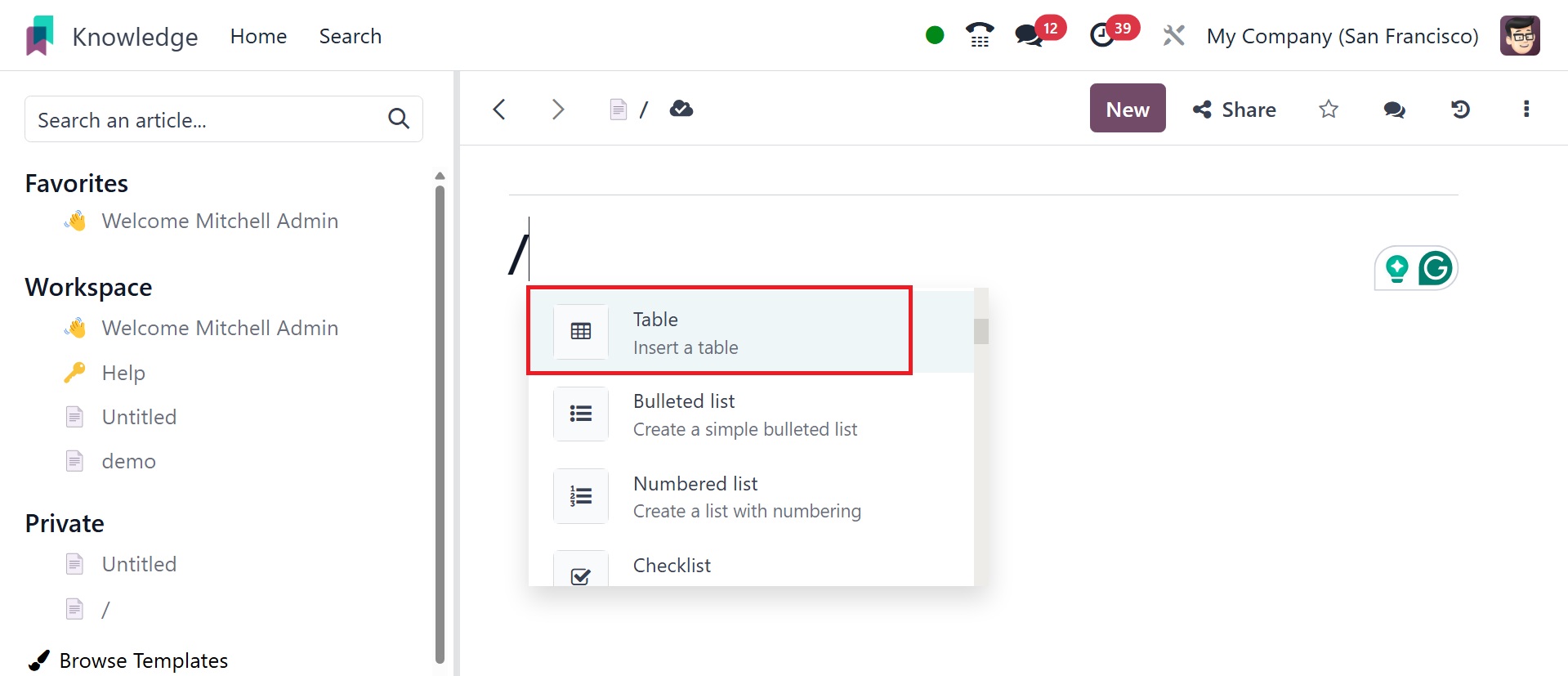
And once it is chosen, one has to select how many rows and columns
are required for the table.
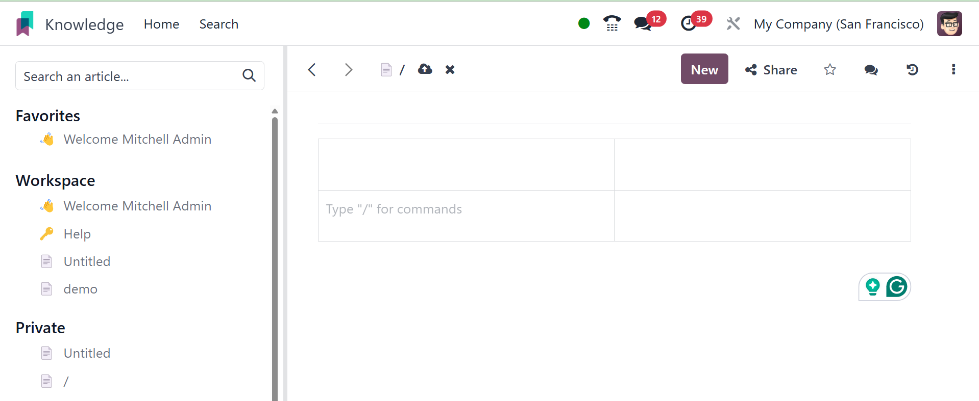
This table will have the specified rows and columns in the structure.
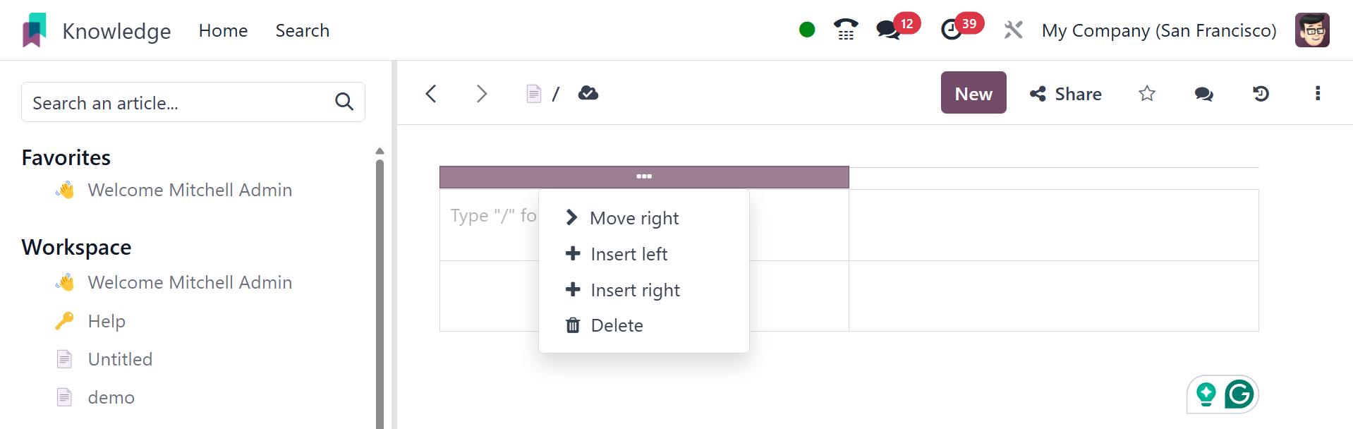
Rows can be moved up or down and, new rows can insert above or below.
Similarly columns as well.
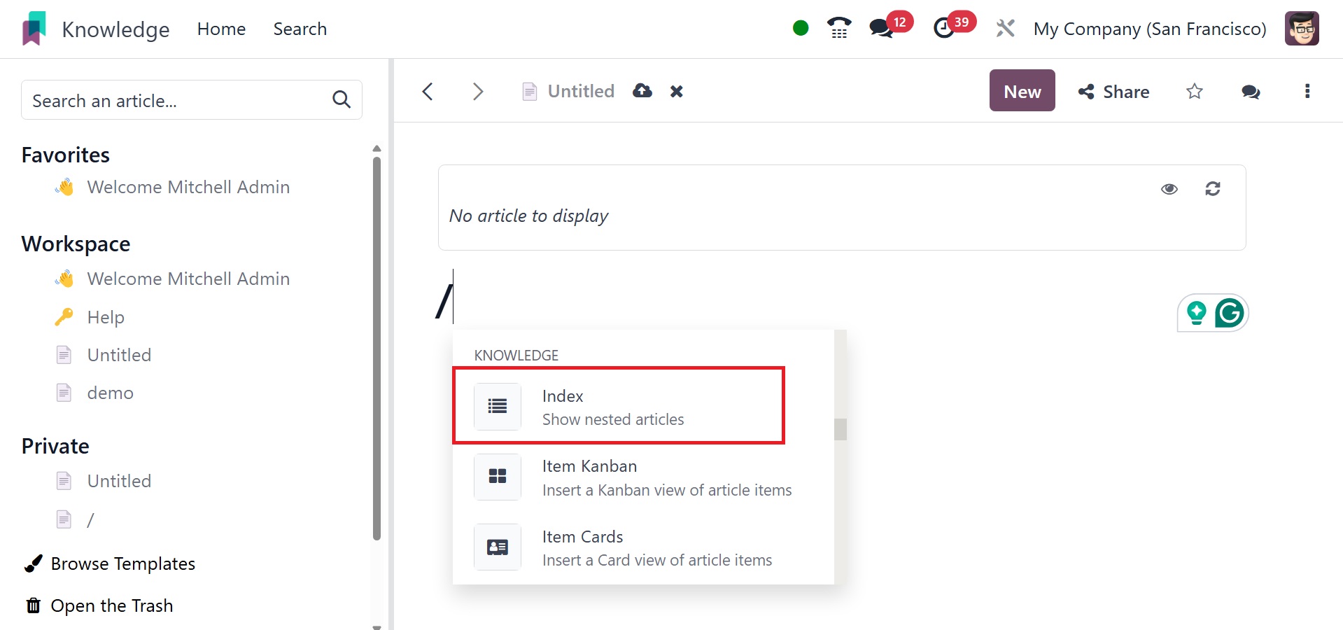
Index: If an article has sub-articles, the / index command
only shows the first level of articles only. Even if the sub-article
has nested with other articles it will not show the nested one.
Item calendar: the option helps you to insert a calendar view
of article item, as in the image below.
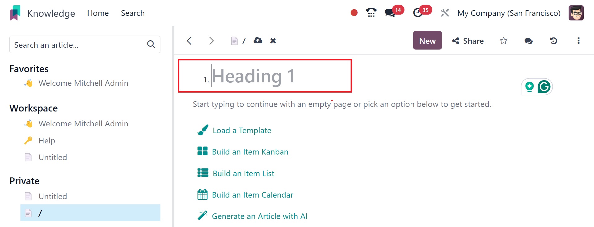
Heading 1: this option allows you to add big headings.
Heading 2: This option allows you to add medium-sized
headings.
Heading 3: this option helps you to write short headings.
Text: the option allows you to add paragraph blocks.
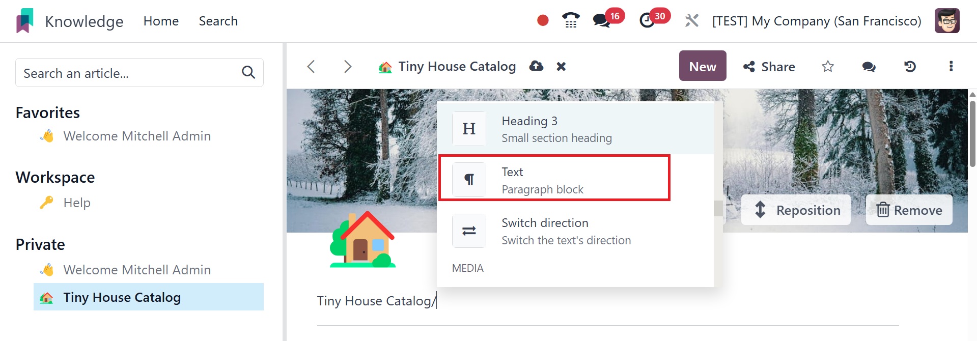
Switch direction: the option helps you to change the direction
of the text.
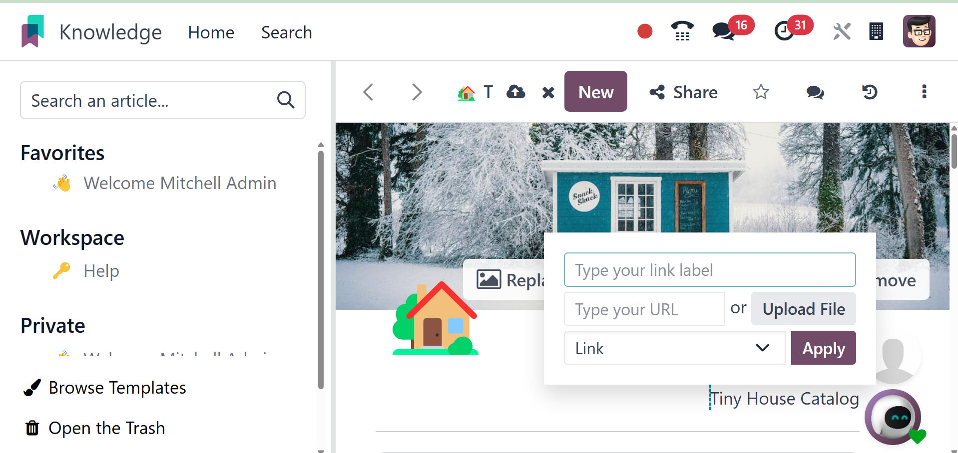
Link: the option helps you to add the link using the pop up
window, as in the image below.
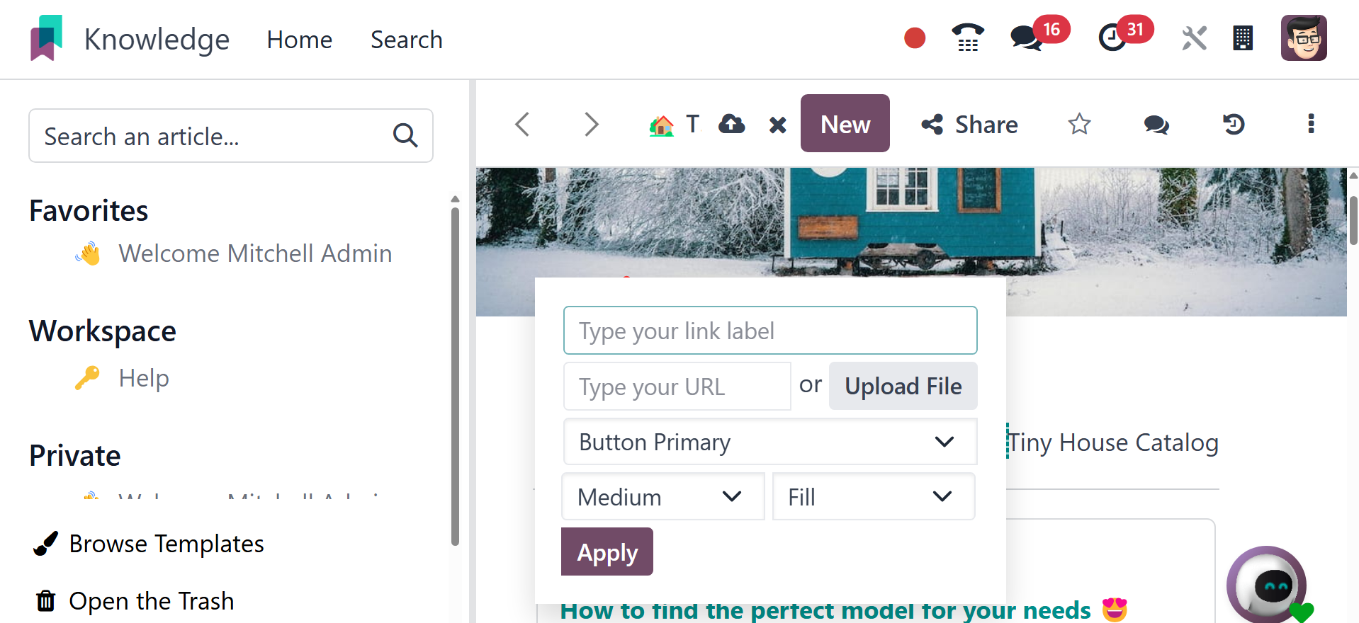
Button: here, you can add buttons to the page using the icon.
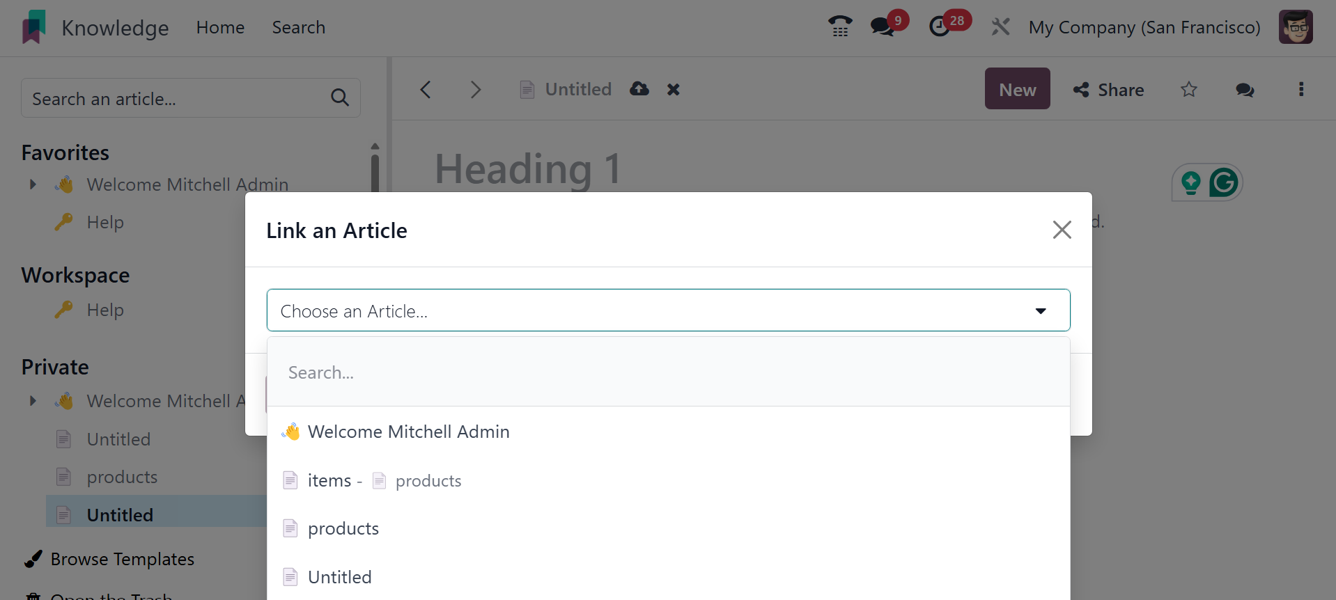
Article: here, you can add article shortcut.
Appointment : Add a specific appointment using this icon.
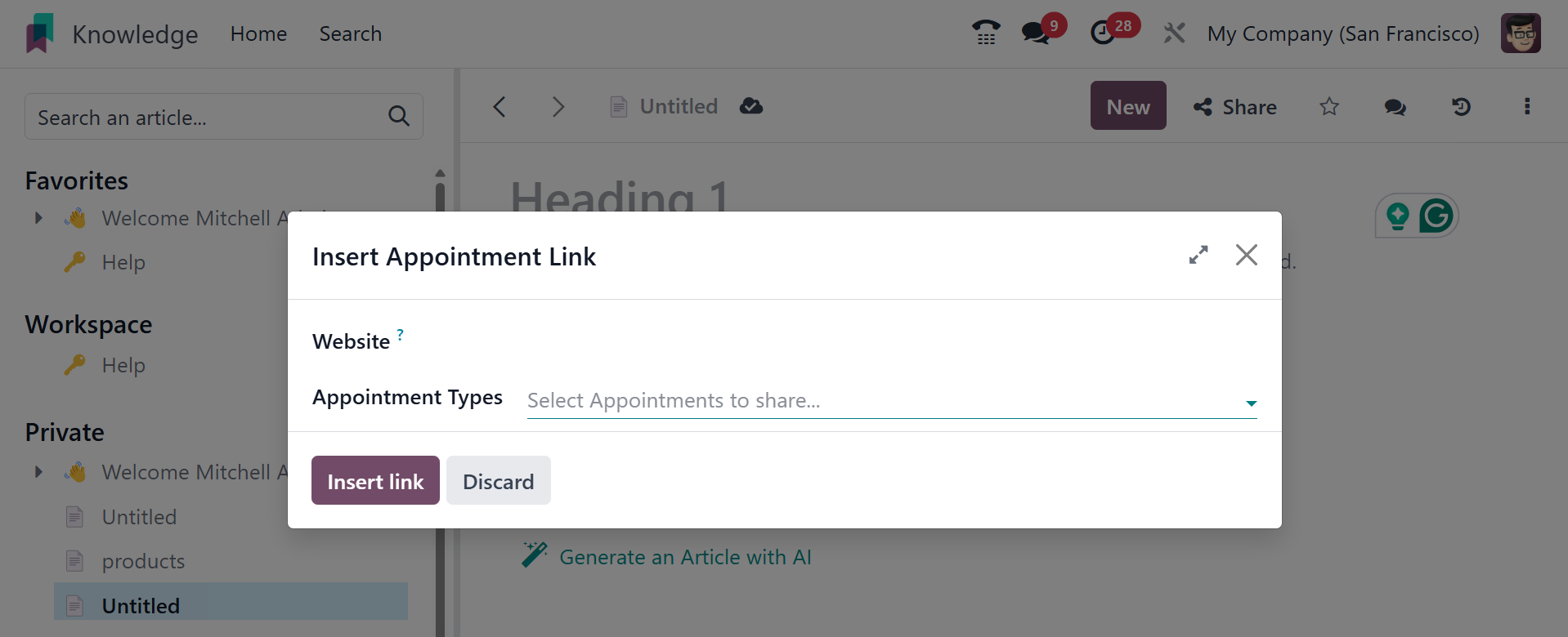
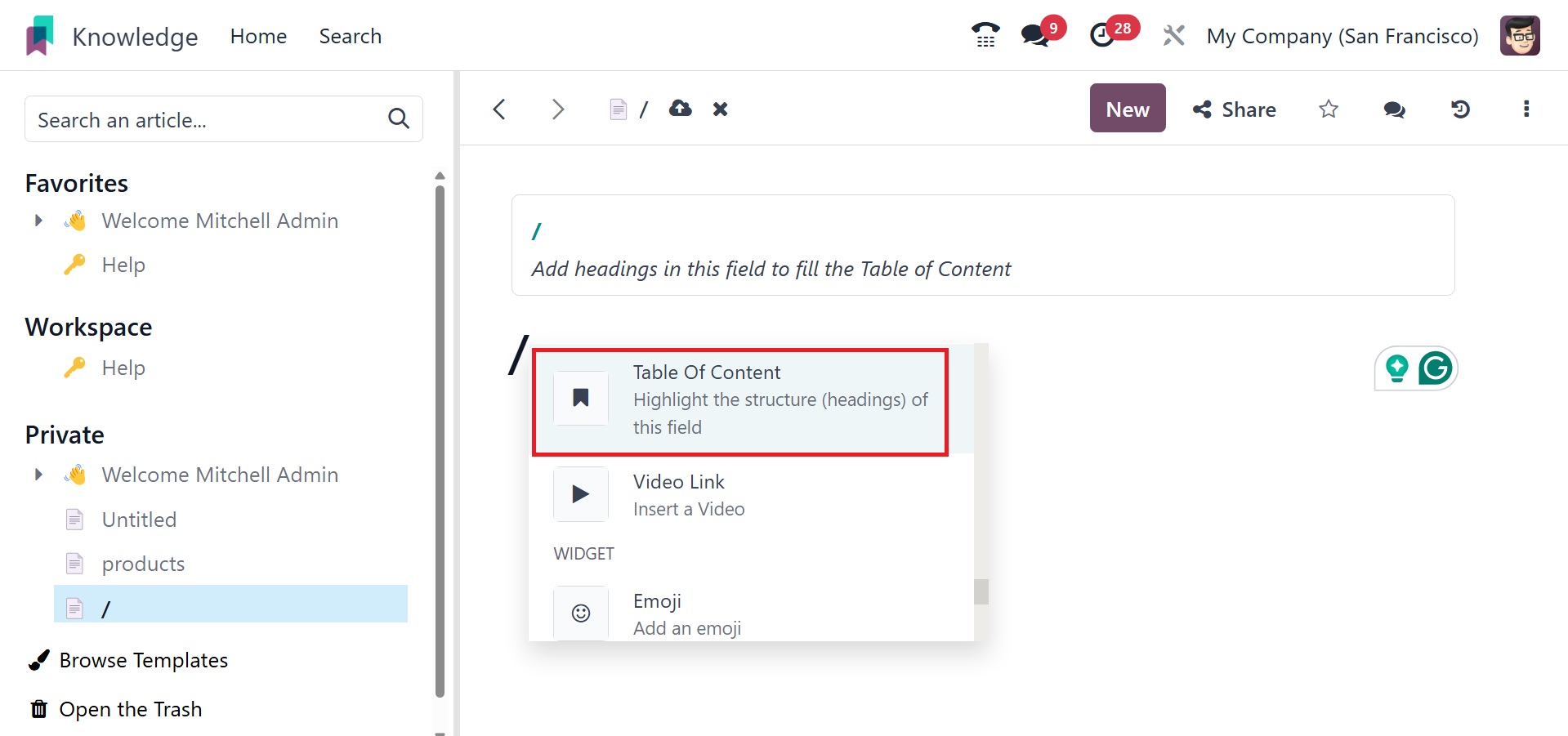
Table of content: Highlight the structure of the heading
field.
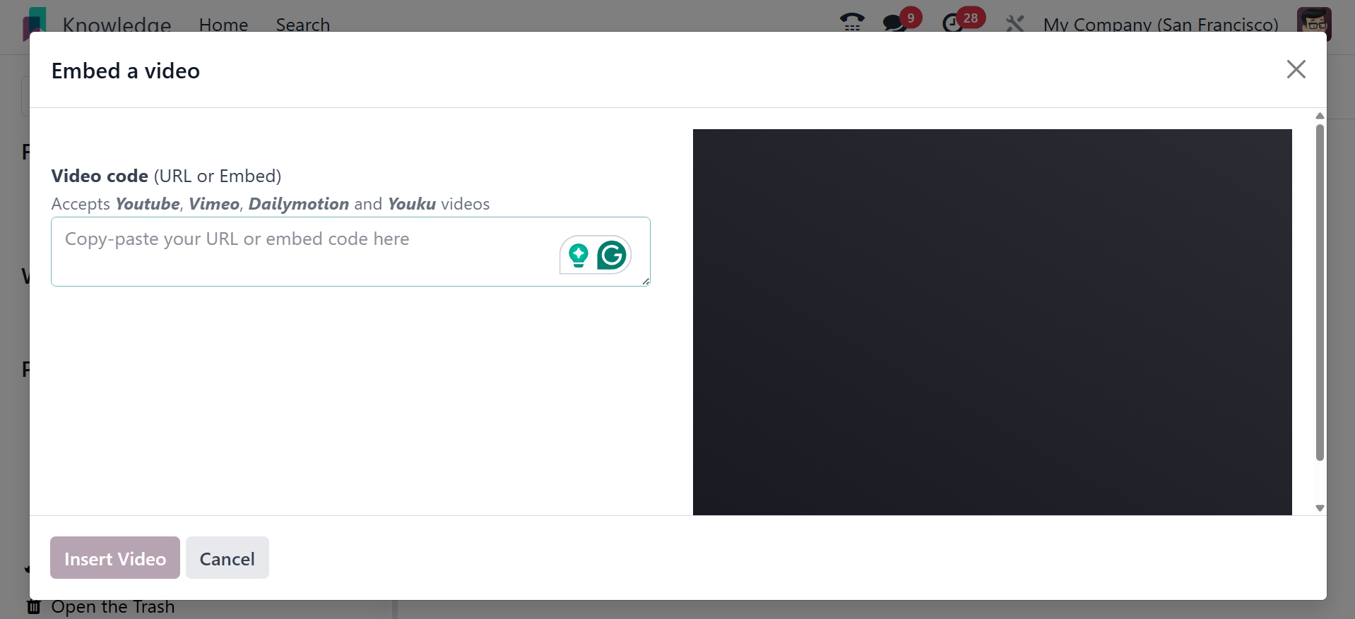
Insert video: You can insert video link if required.
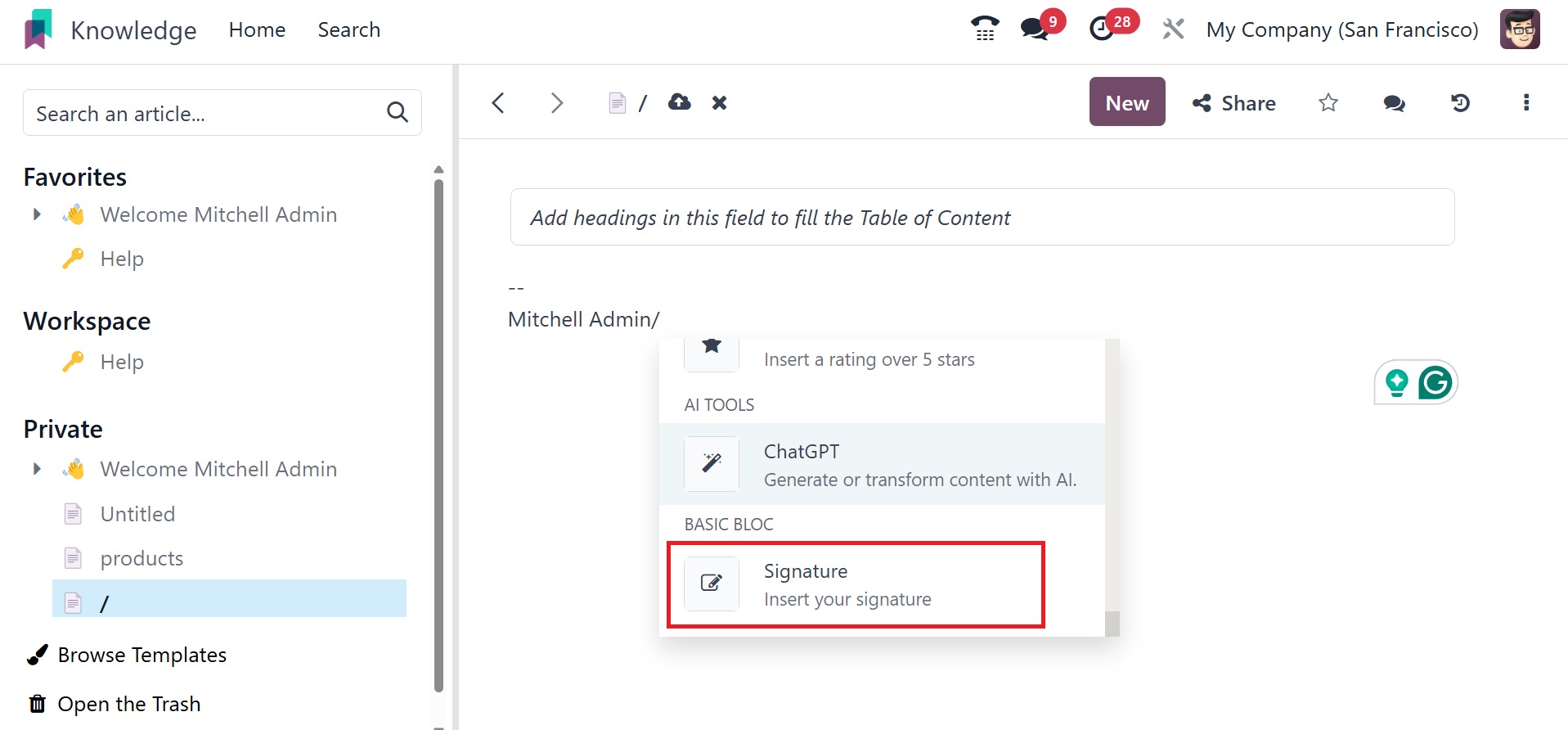
Signature : You can insert your signature.
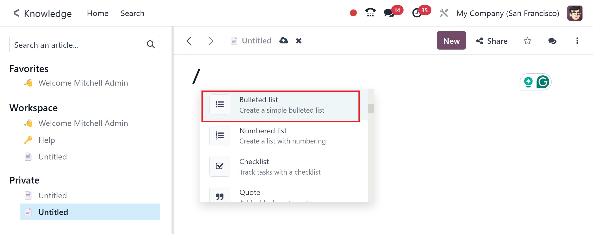
A bullet list, numbered list, checklist, table, quote, separator, and
columns are just a few of the structures that users can include,
with the / attached, as in the image below.
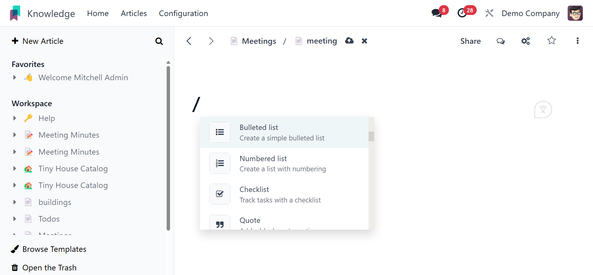
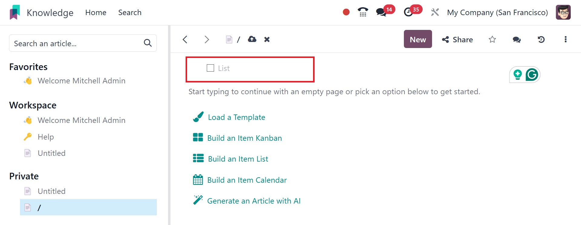
When you select the bullet list, you will have the option to add
bullets, as in the image below.
On selecting the numbered list, you have the space to add numbers, as
in the image below.
The checklist option helps you to add checklist, as in the screenshot
below.
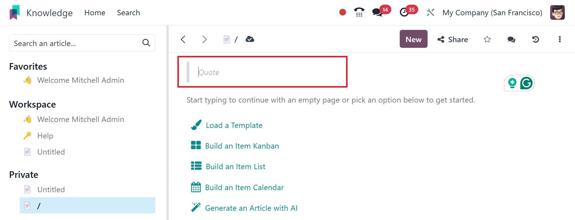
You can add certain quotes using the page, as in the image below.
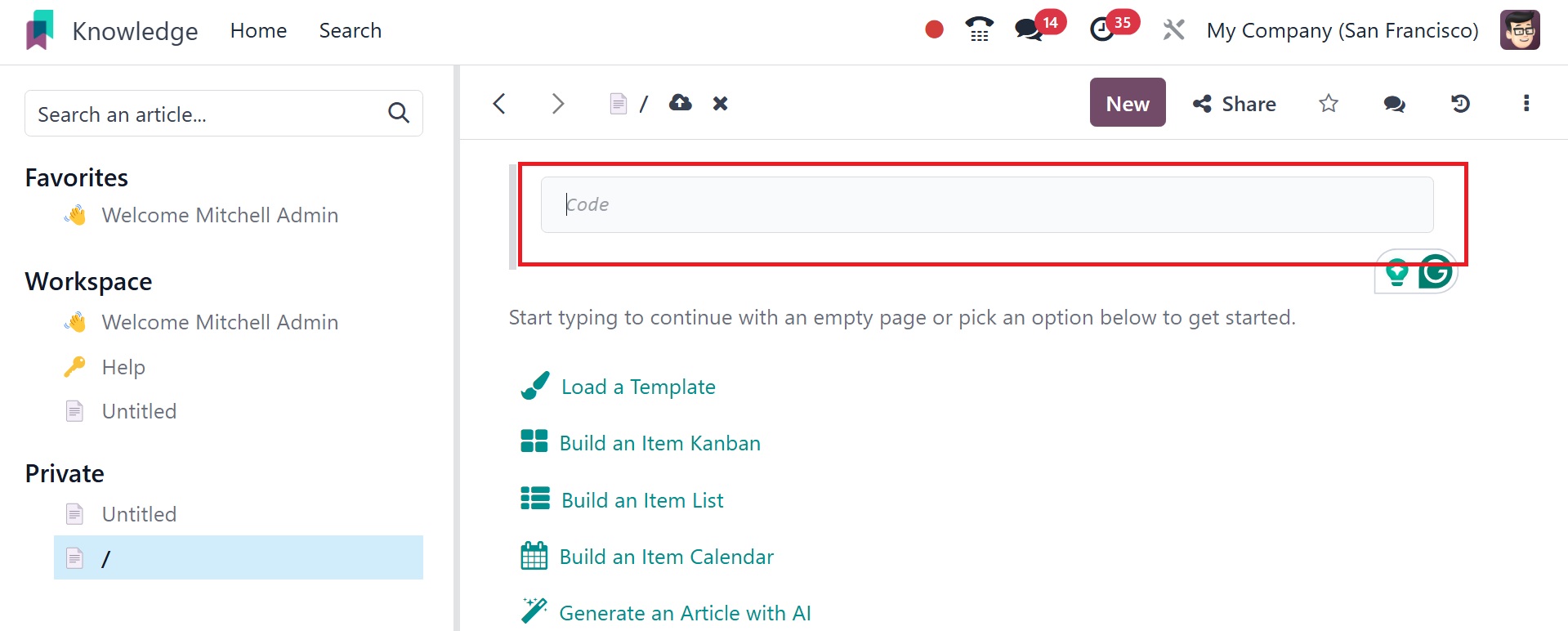
And certain codes can be added using the code option, as in the image
below.
Then, in the Banners area, choose Banner Info to create an
information banner.
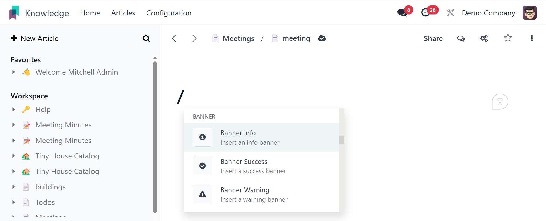
Banner Success can be used to add a success banner. Banner Warning
can be used to add a banner of victory.
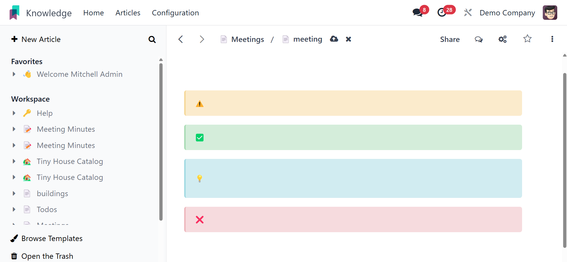
Banner Danger can be used to add a risk banner.
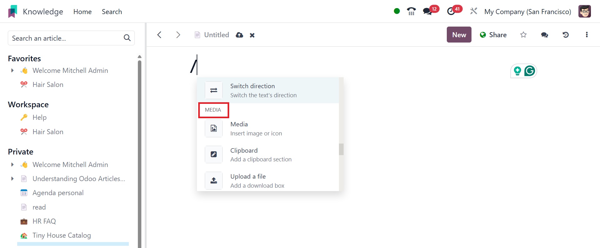
After the headings and content, you can add media, such as
photographs, videos, and articles, by using the ‘/’ slash icon.
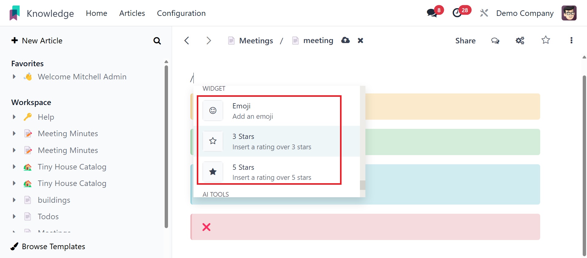
Widgets like emoticons and stars can be included inside the article.
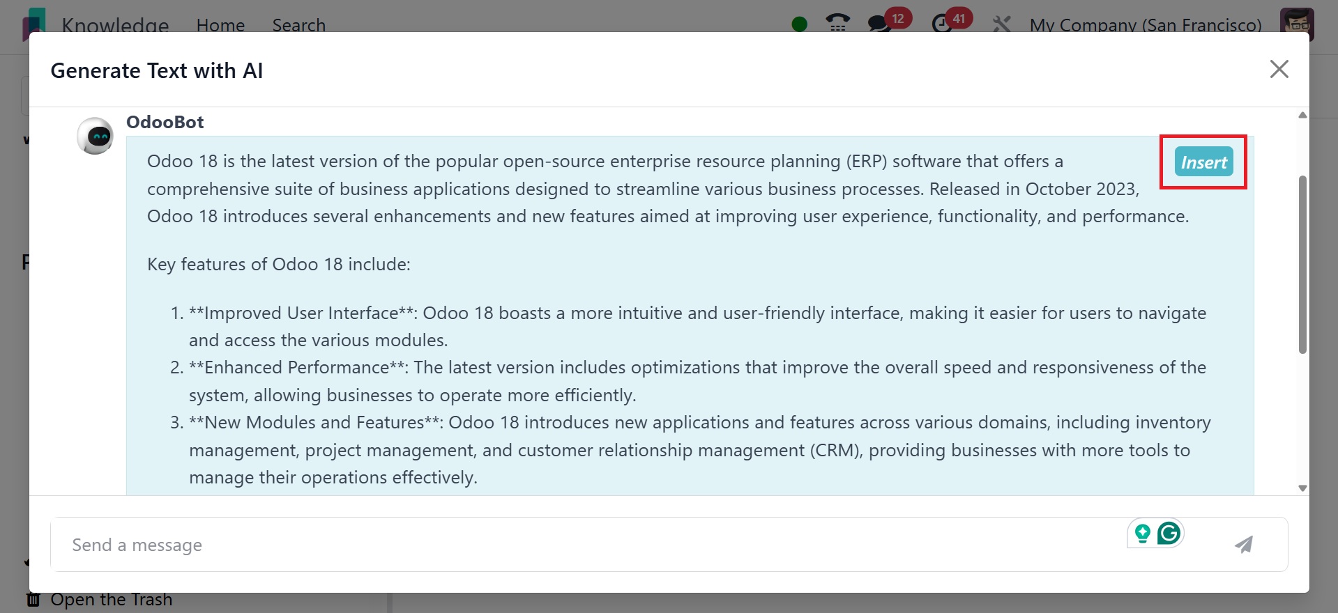
Content can now be added with ChatGPT, an artificial intelligence
tool.
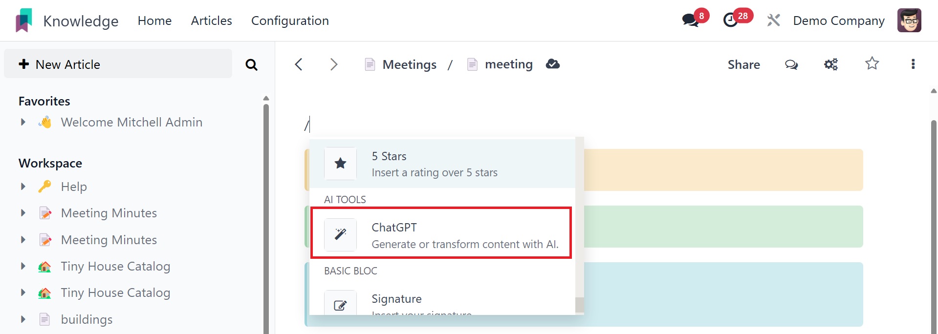
The content can then be added to the article when the required topic
has been added to the search section.
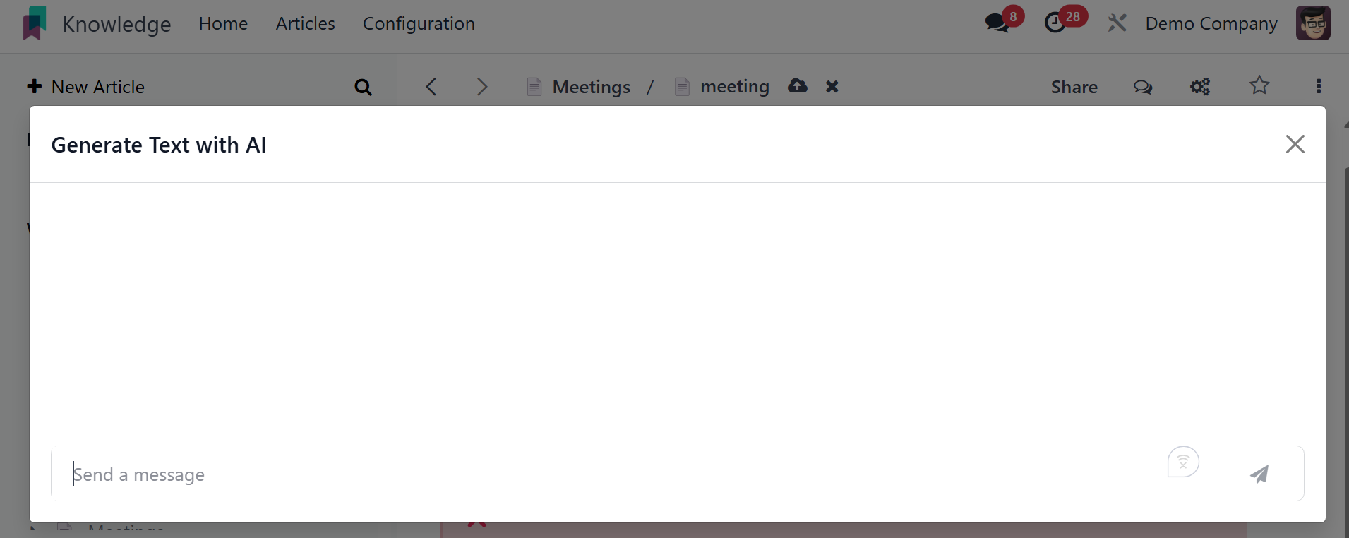
The AI is going to create the material when an appropriate prompt is
added. The content is inserted into the article at the desired
location using the Insert option.
To create a nested article beneath a parent article, utilize the +
New icon in the same manner.
Once an article has been created, you can flag it as a favorite by
using the star icon.
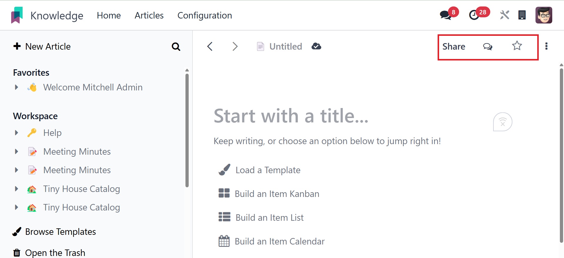
All database internal users will have access to the Workspace
platform article. It's easy to set access rights for an article in
the Knowledge Module. You can click the Share icon in the top-right
corner of the screen after the article is complete.
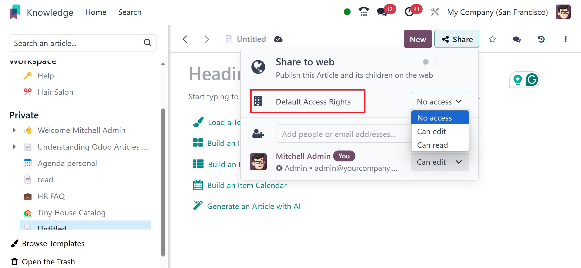
The default access rights option refers to the initial permissions
set for newly created articles or workspaces, determining who can
view, edit, or manage the content by default. Under that, you have
three options: no access, can edit, and can read.
No access: The user or group cannot see the article or workspace at
all.
Can read: The user or group can view the article or workspace, but
cannot make changes.
Can edit: The user or group can edit the content. On selecting the
can edit option, you will get the visibility option, as in the image
below.
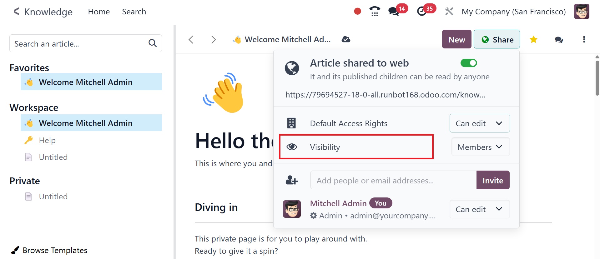
Visibility settings and default access rights work together to
control who can see and edit articles. The visibility can be either
‘Members’ or ‘Everyone’.
By publishing the item on the website and turning on the Share to Web
feature, you may distribute it to everyone.
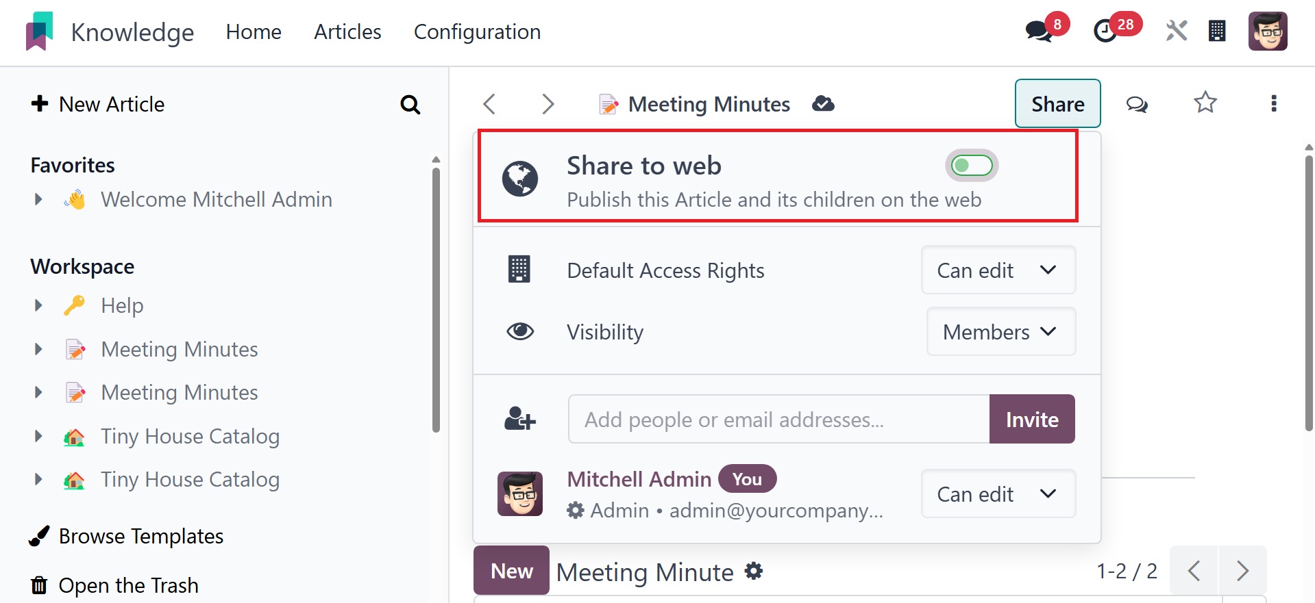
You will receive a link to an article that you may copy and share on
other websites. You can also use the Invite button to invite the
article's editors or readers.
A new wizard will appear, as seen here.
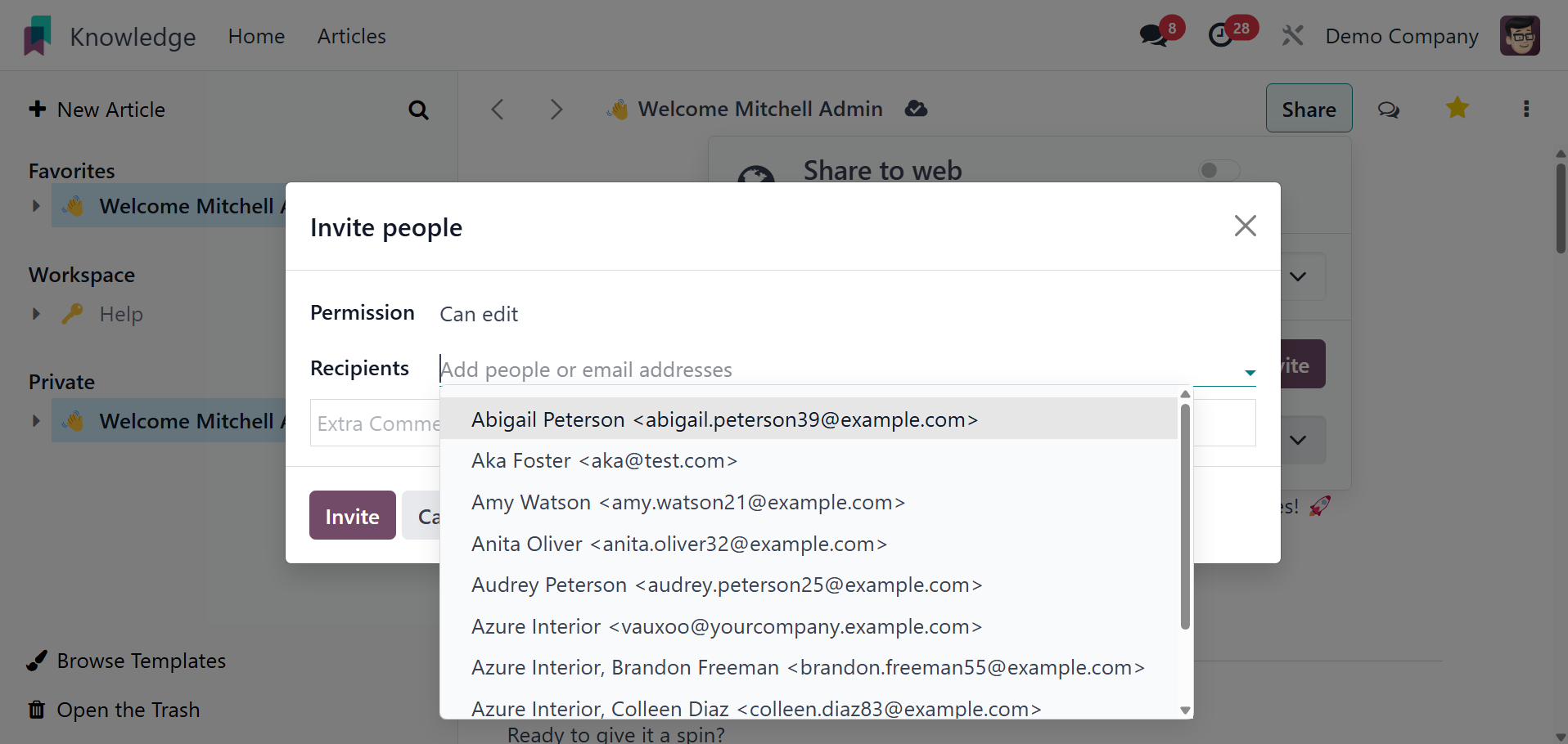
When you invite someone, you can set up their access privileges. If
you want to solely allow reading access and forbid editing of any
kind, you can tick the Can Read option in the Permission column. By
selecting the Can Write option, users will be allowed to read and
amend the article. The aforementioned users will not be able to view
or edit this page if they select the No Access option.
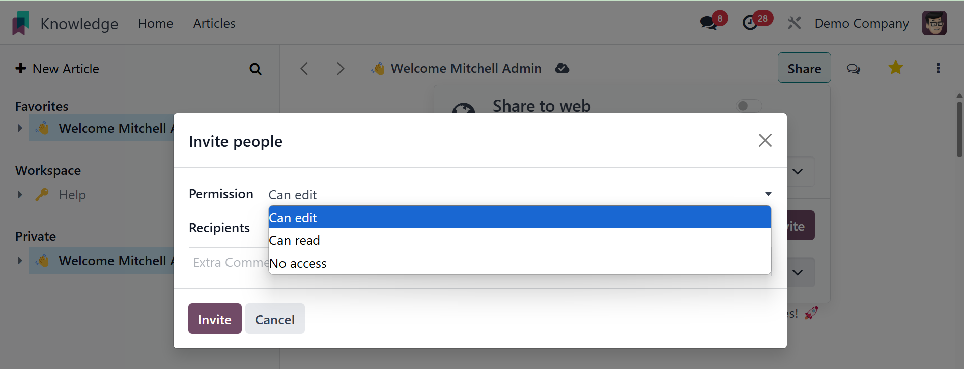
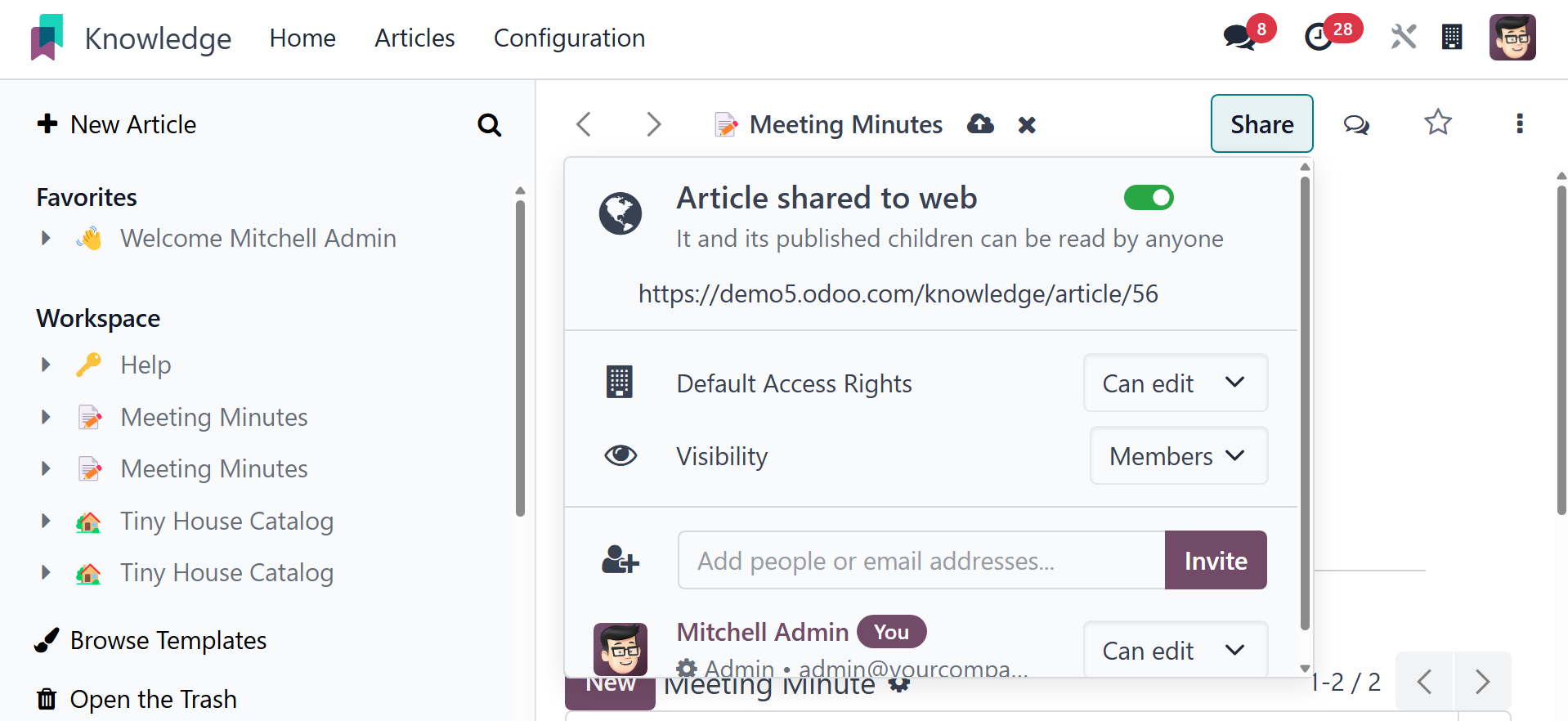
After listing the people in the Recipients section, you can invite
them by clicking the Invite button. Clicking the Share button will
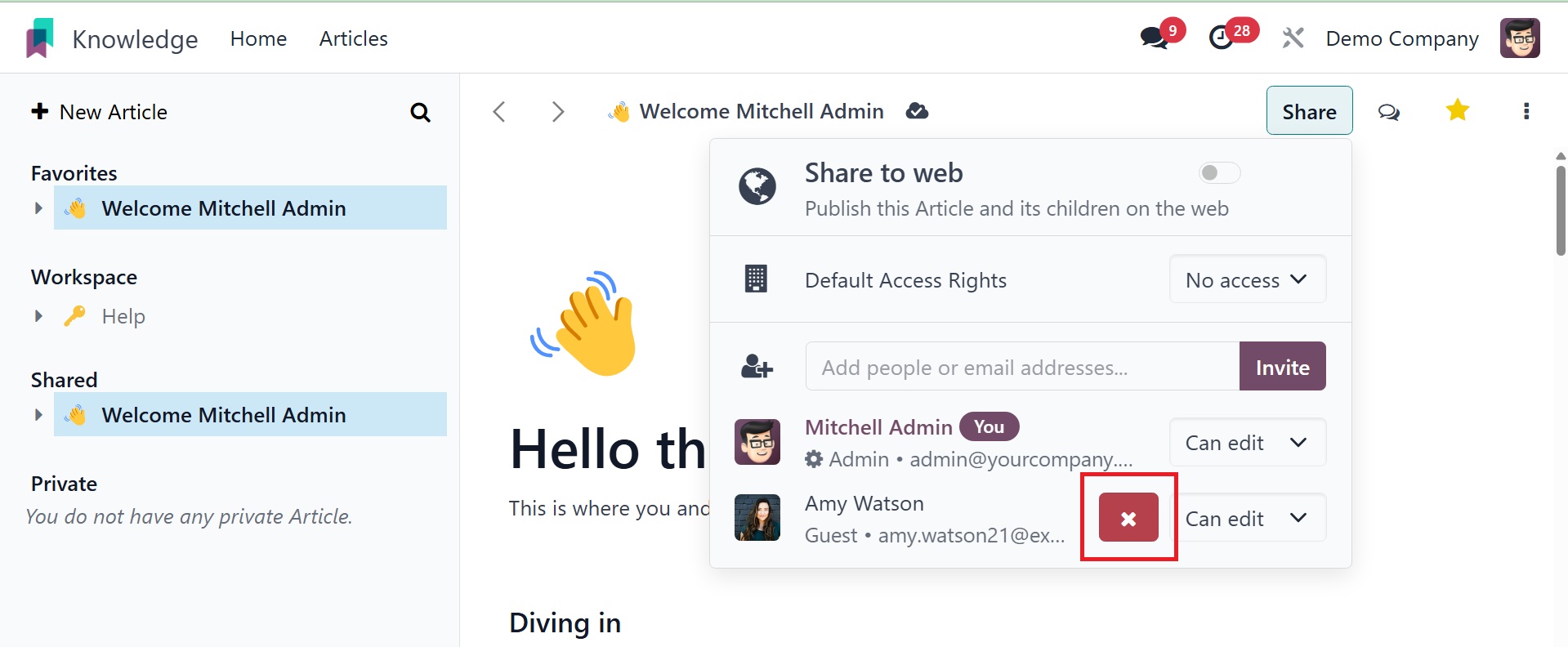
now display the list of users who have access to this post, as shown
in the screenshot below.
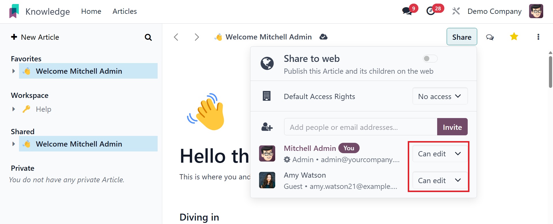
Users can be removed from the list by clicking the ❌ button.
You may also specify the access rights for internal users in this
box.
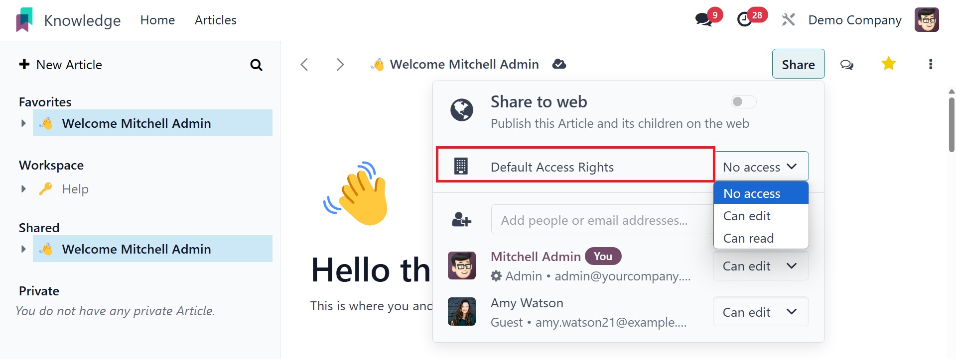
You can set the access right to Can Read, Can Write, or No Access,
depending on your needs.
You may be able to initiate a conversation with the article's users
by using the Open Talk icon.
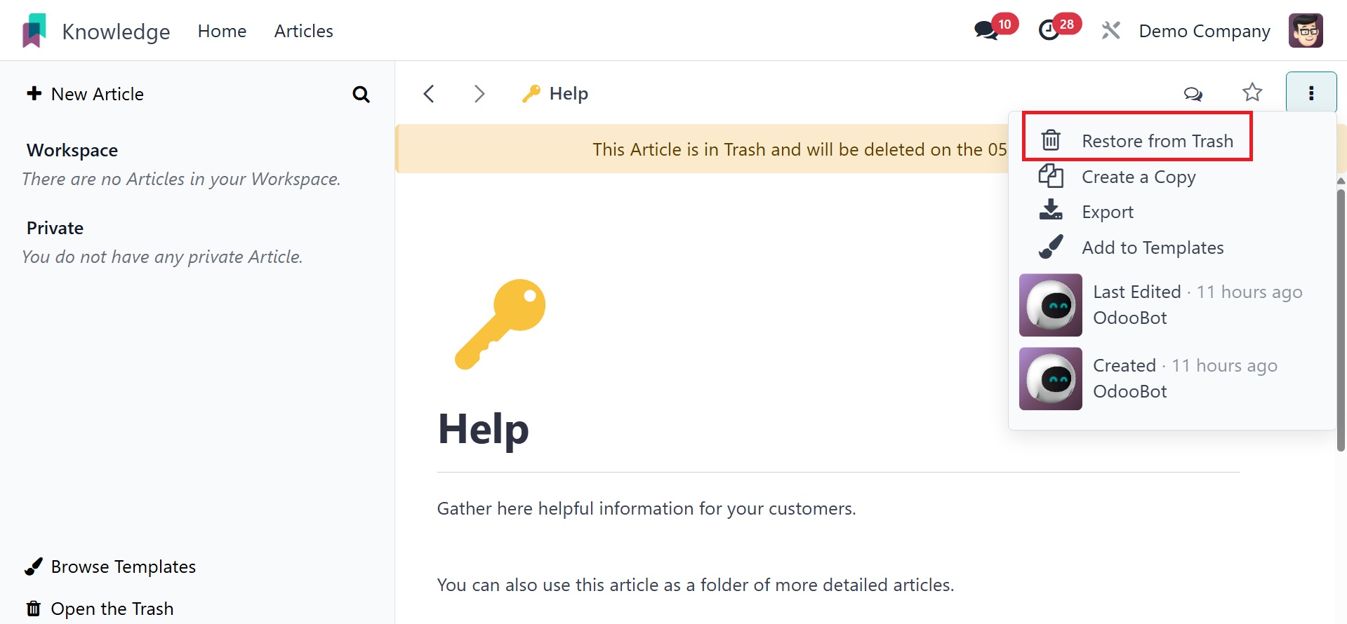
The many operating tools that Odoo offers for an article are
indicated by the three vertical dots in the top right corner of the
screen. There are numerous uses for these tools.
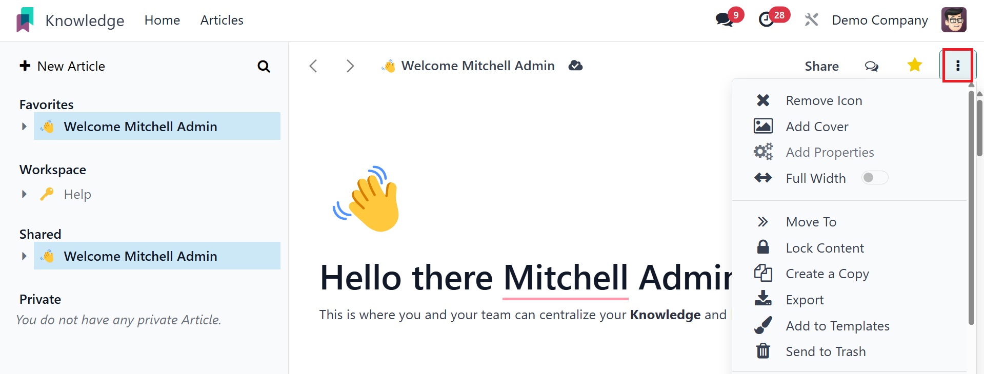
To relocate this article to a different folder, select the Move To
option. As can be seen below, this will cause a pop-up box to appear
where you can select a different parent article or folder.
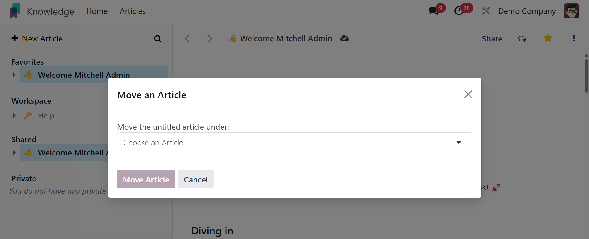
After providing the folder name, you can click the Move Article
button to move this article from the current folder to the
designated folder.
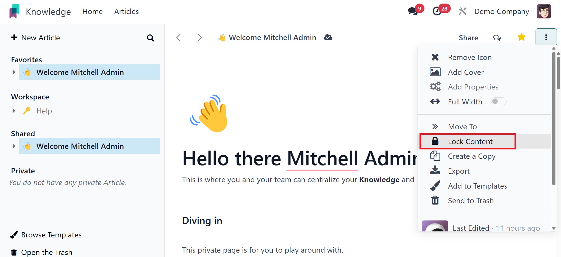
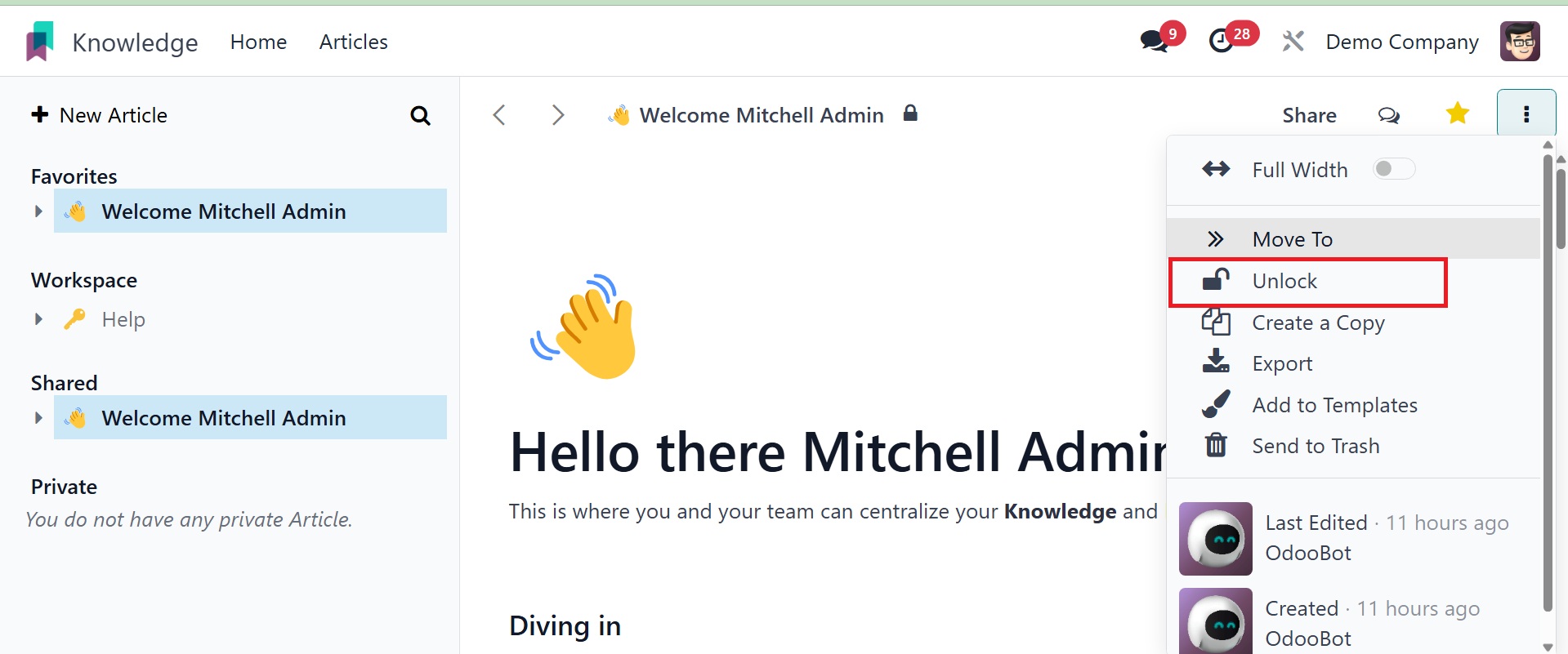
Choose the Lock option to secure your content. Odoo18 will not allow
any kind of edits to be made to a locked article. The Unlock button
can be used to unlock such articles.
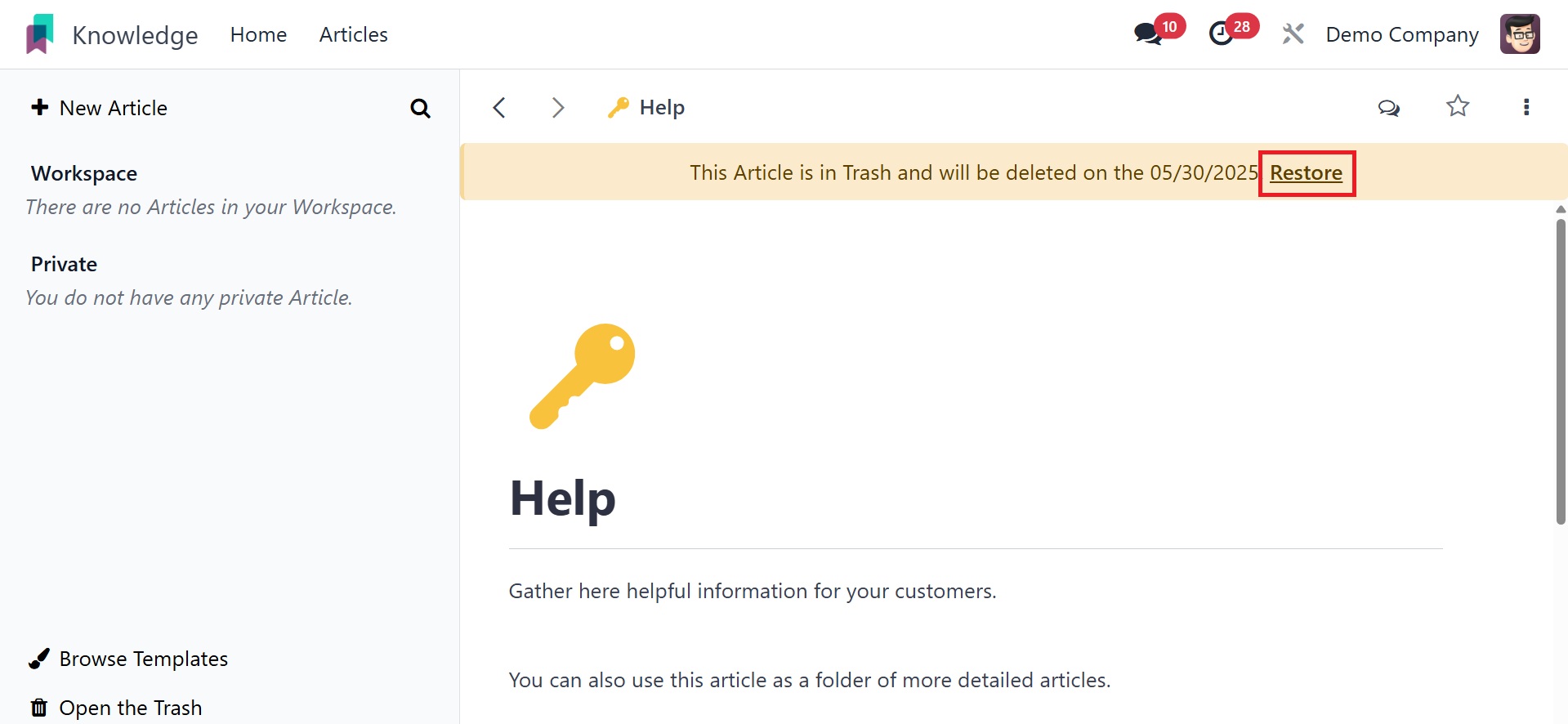
By selecting the send to trash button, you can get rid of the
article. When you click the Delete button, it will be moved to the
Trashed folder, which is visible from the Configuration menu.
The list will include details about each trashed article, including
Name, Parent Article, Last Edited By, Last Edit Date, and Deletion
Date.
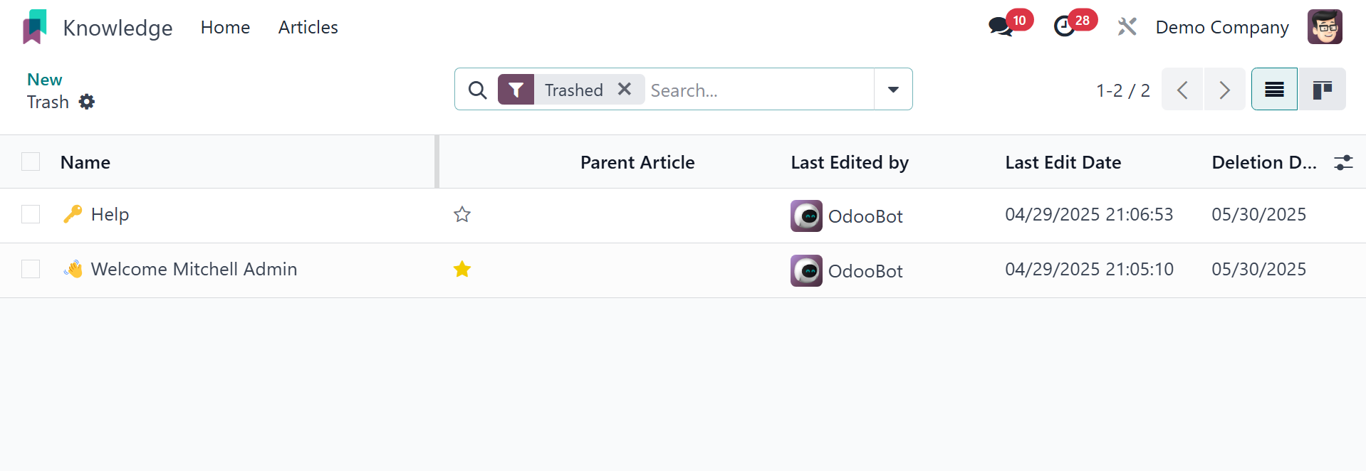
Click on the corresponding article if you wish to take it out of the
trash.
The "Remove from Trash" option will cause Odoo18 to retrieve the
content.
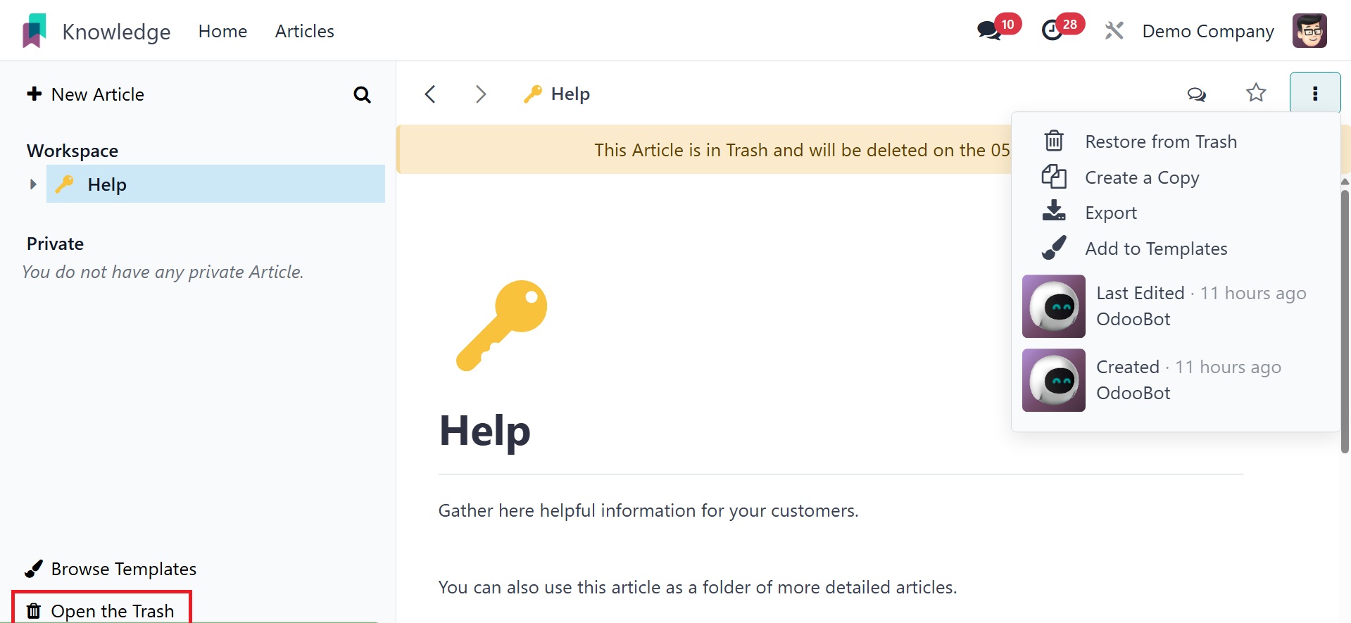
By tapping the "Open the Trash" smart button on the home screen, you
may quickly access the trash list in your Knowledge module.
The deleted articles will remain in your garbage for another thirty
days before being removed entirely from your database.
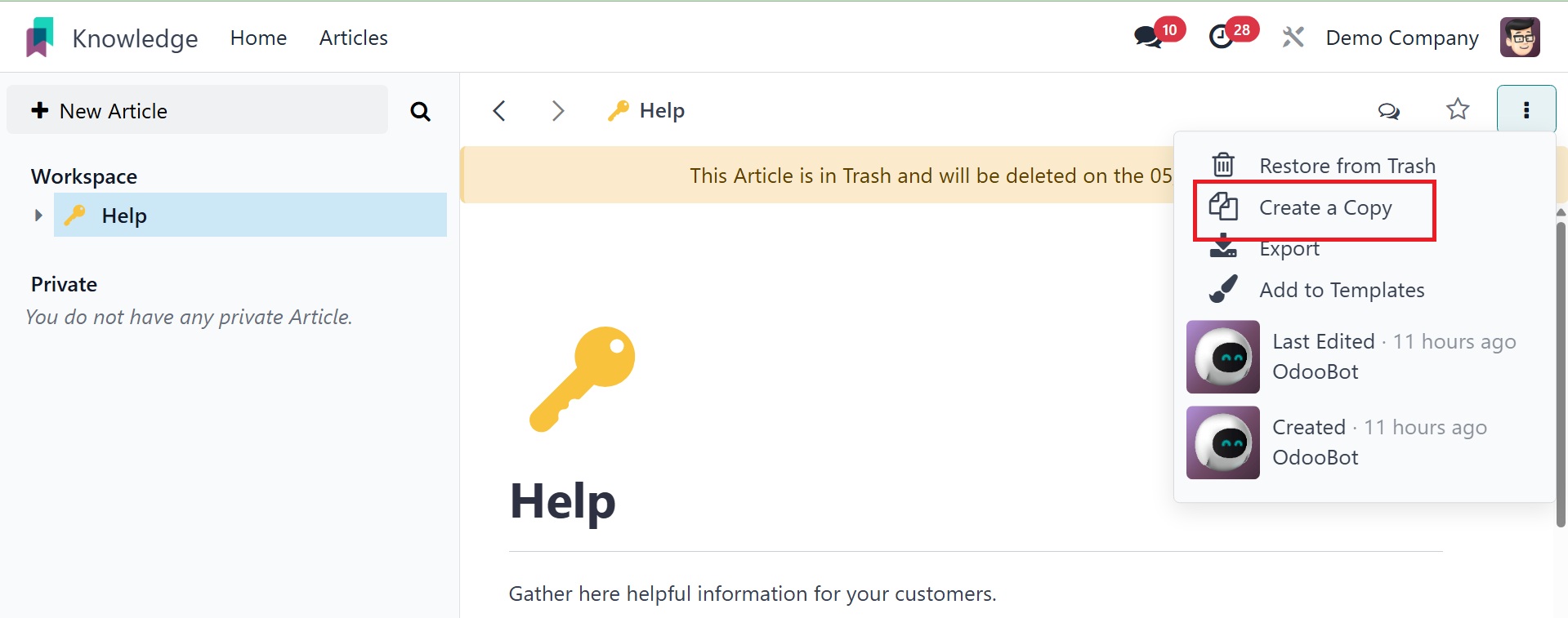
You can copy the article and store it in your private folder by
clicking the Create a Copy option.
If the Full-Width option is selected, the article will display in its
full width. You can also find the Last Edited By and Created By
information for the article in this operation tools menu.
With the new knowledge management system in Odoo 18, you can create
and distribute information with your colleagues in a simple and
systematic manner.