Any firm must have a
comprehensive work analysis.
The right analysis is
essential for a firm to
function effectively. This
enables a company's whole
operational data set to be
easily evaluated on a single
page. Reports are seen as
quite vital in any business.
The reporting criteria and
the additional steps required
to engage with such reports,
such as filtering, may vary
depending on the company.
With Odoo reports, all of
these tasks are simple and
quick to complete. A
Spreadsheet module is
provided by Odoo 18 to manage
the documentation.
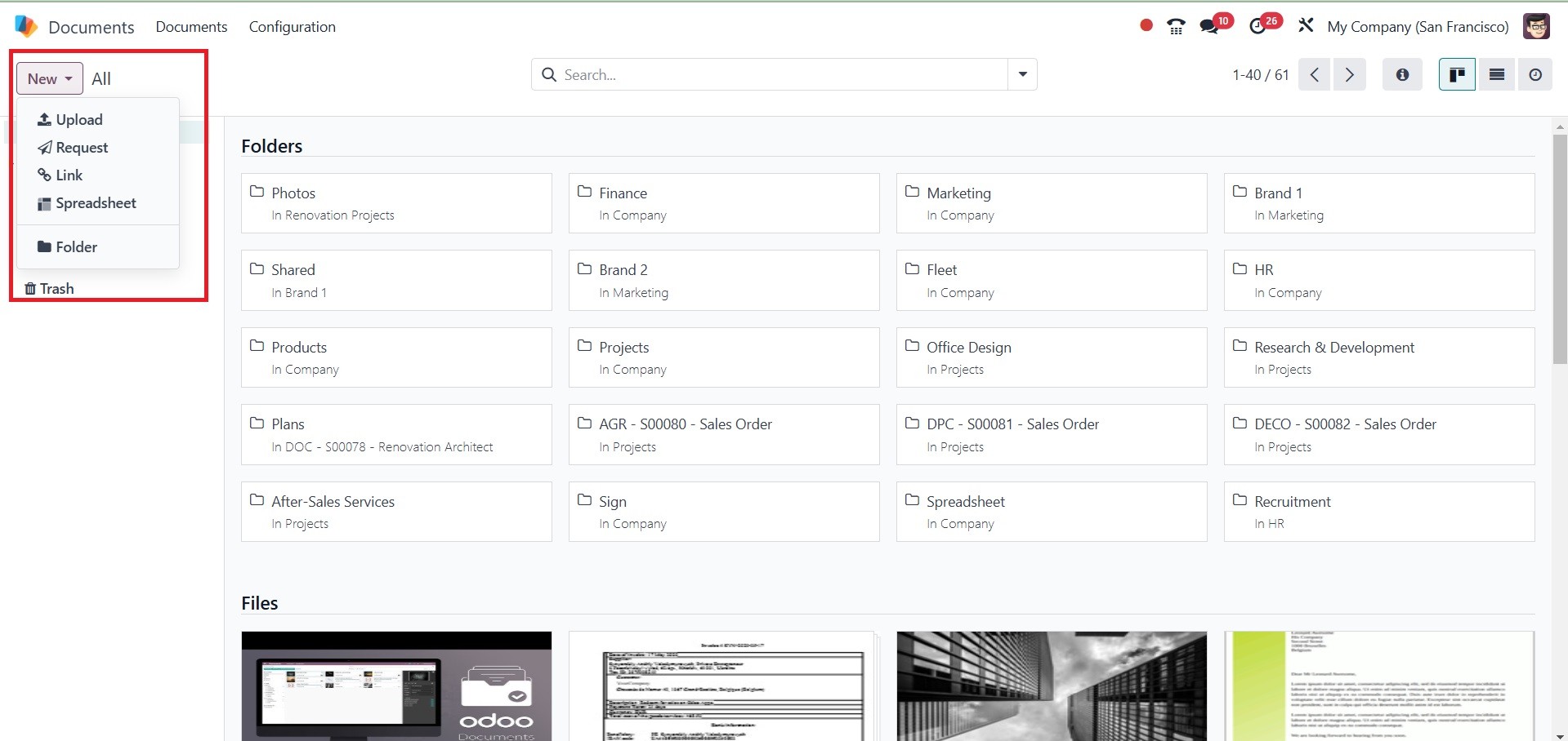
The Document module's dashboard
is displayed in the
screenshot below. Users can
manage spreadsheets from
there as well. You can either
click the New Spreadsheet
button to add a new
spreadsheet or click the New
button to upload a new
spreadsheet document to the
Documents module.
Among the metrics are Tax Amount,
Total, Total Untaxed Amount
in Currency, Tax Amount in
Currency, Count, and more.
The graph is displayed in
line, pie, and bar chart
formats. Click the INSERT IN
SPREADSHEET button if you
need to upload a file.
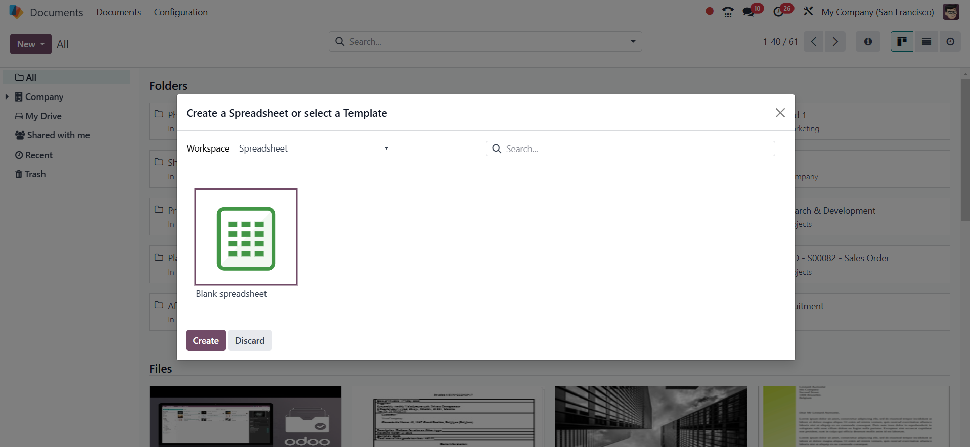
The user can select the required
spreadsheet template from the
following box if they are
creating a new spreadsheet.
After selecting the
appropriate one, press the
Create button.
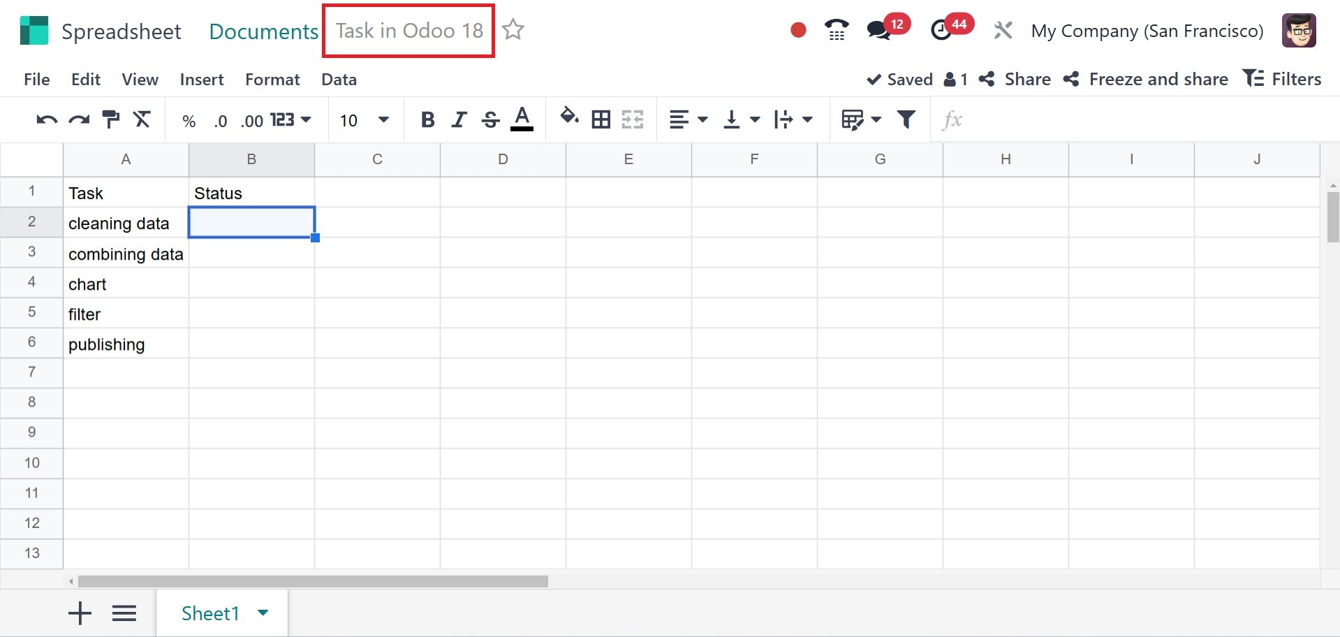
The spreadsheet will then start
up and open in the Documents
module, where it will save
itself immediately. At this
stage, users can quickly add
new data to the spreadsheet.
Give the spreadsheet a name,
and you can add stars to make
it a favorite. Now let's look
at the features that the Odoo
18 Spreadsheet offers.
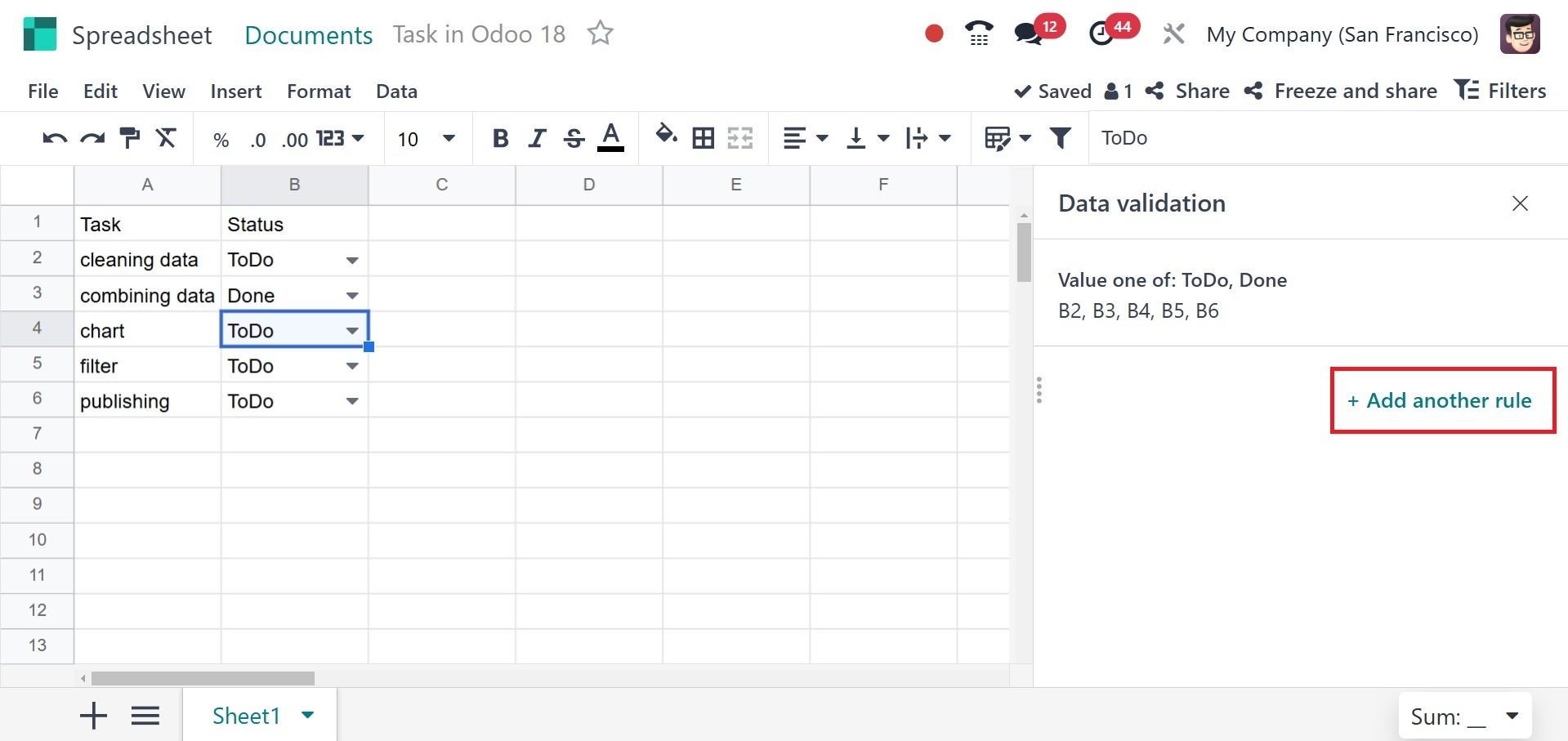
The Data Validation menu is
located in the Data menu. It
caused a small new box to
show up on the right side of
the spreadsheet. To create a
new Data Validation rule,
click the +create another
rule button.
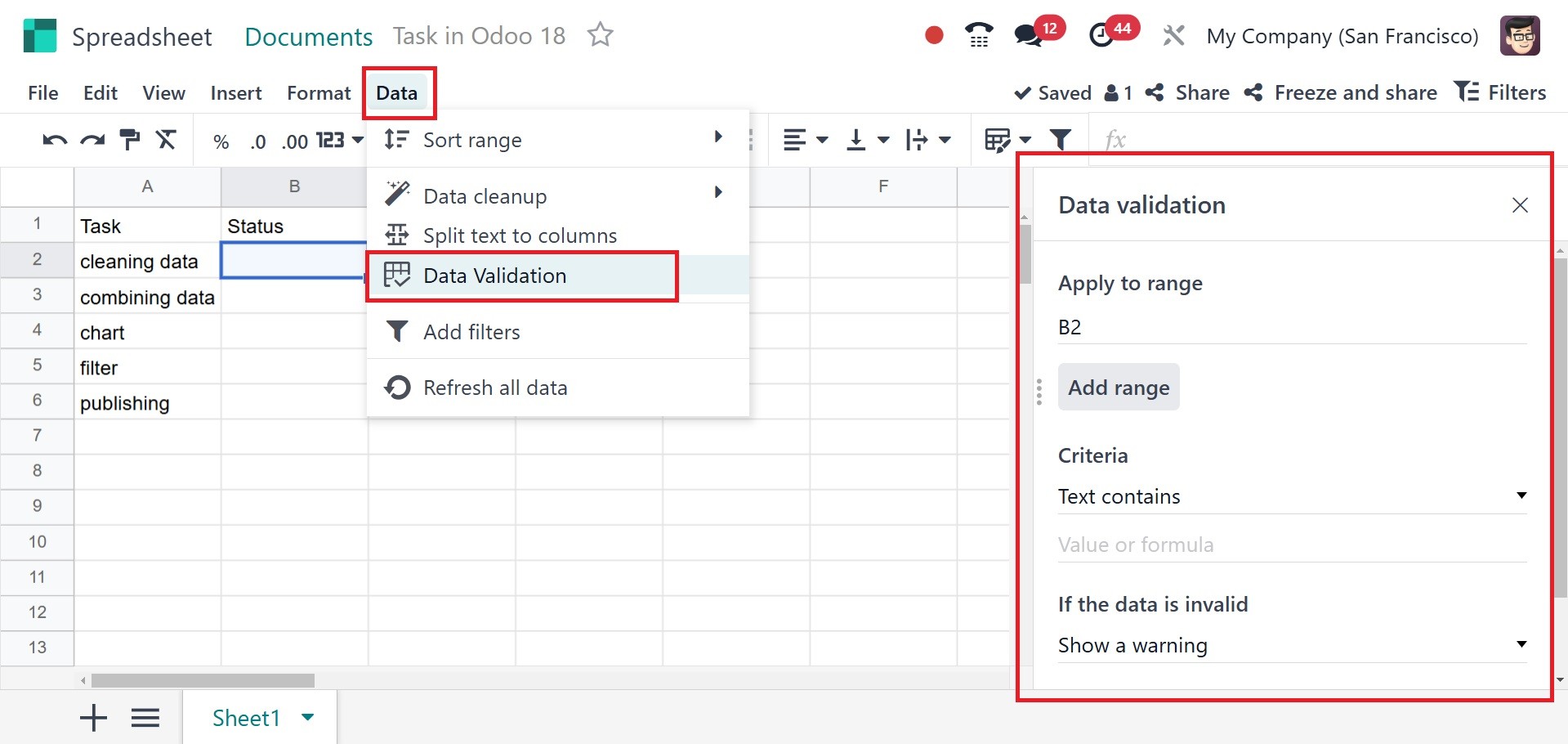
Select the criteria and its
values, display kind, etc.,
and then keep the rule safe
after mentioning the cell
range to which the rule is
applied in that box.
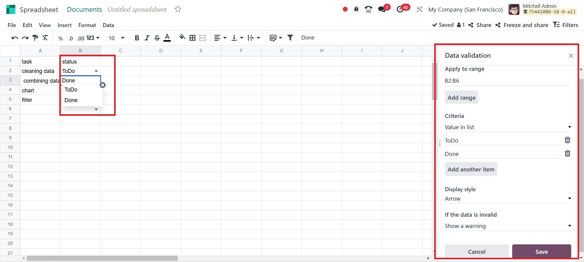
The cell, as mentioned earlier,
then displays the values.
Next, a new rule can be added
by clicking the +Add another
rule button.
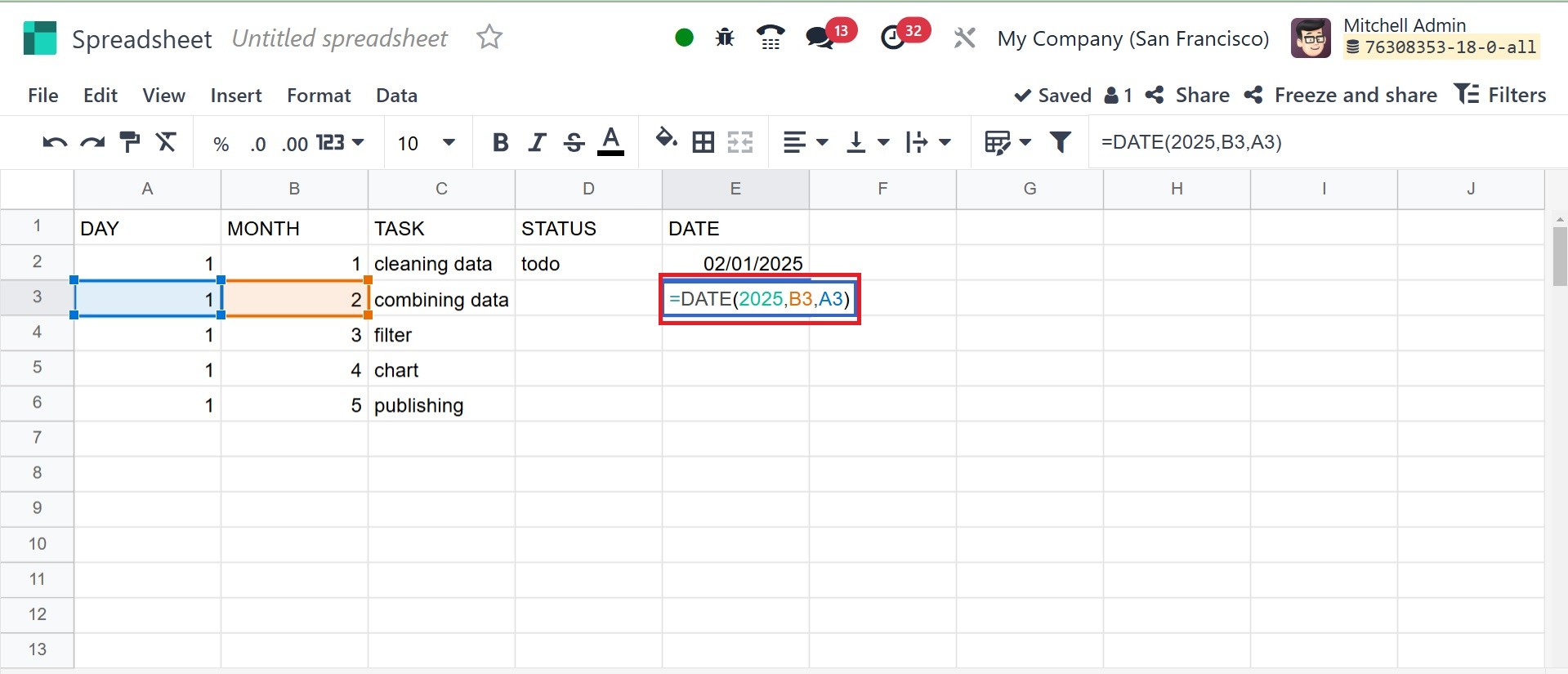
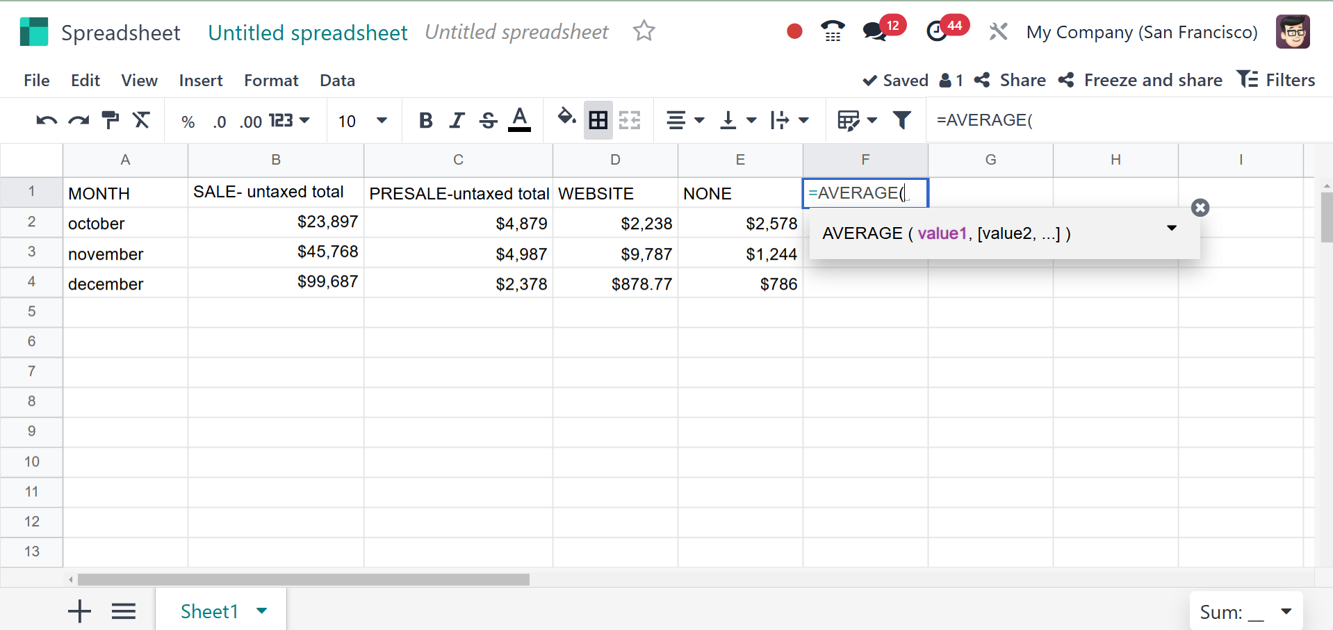
The user can easily enter data
and calculations, like the
date, Sum, etc, by inserting
a = sign in the cell, as
shown in the screenshot
below. From the list, pick
the right option.
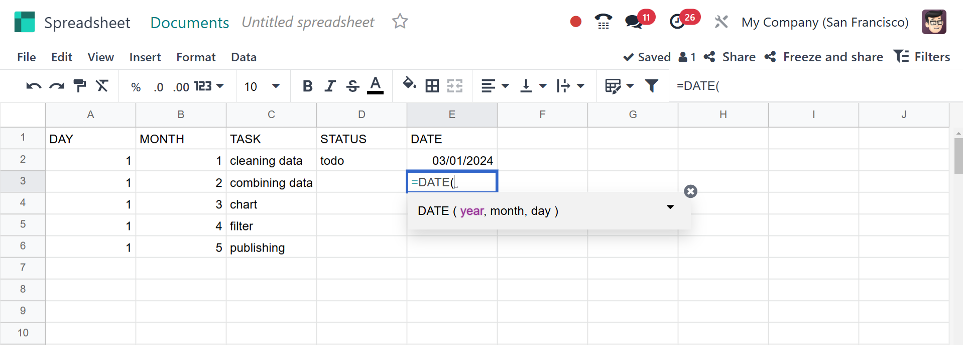
Next, select the cells that
match. Additionally, the date
there will vary based on the
cells you choose. You can
provide the date, month, and
year, respectively.
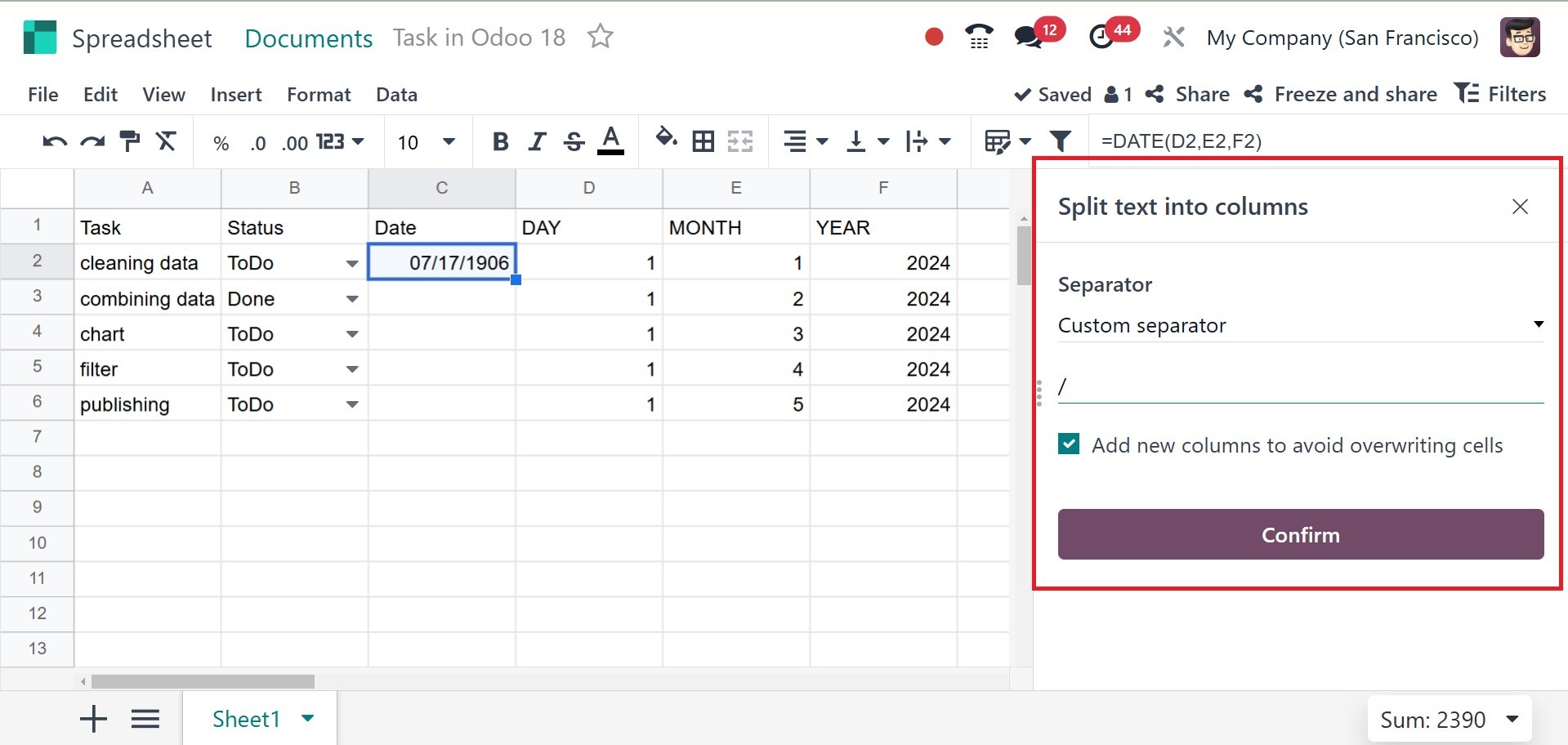
You can now divide the text and
put it in a separate cell. To
accomplish this, choose Split
Text to column from the Data
menu after first selecting
the cells. To the right, the
other box opens again. There,
bring up and reiterate the
norm.
In Odoo 18, a cell can have a
variety of functions added to
it, including Sum and
Average. To do so, click the
Insert menu and choose
Functions from the list.
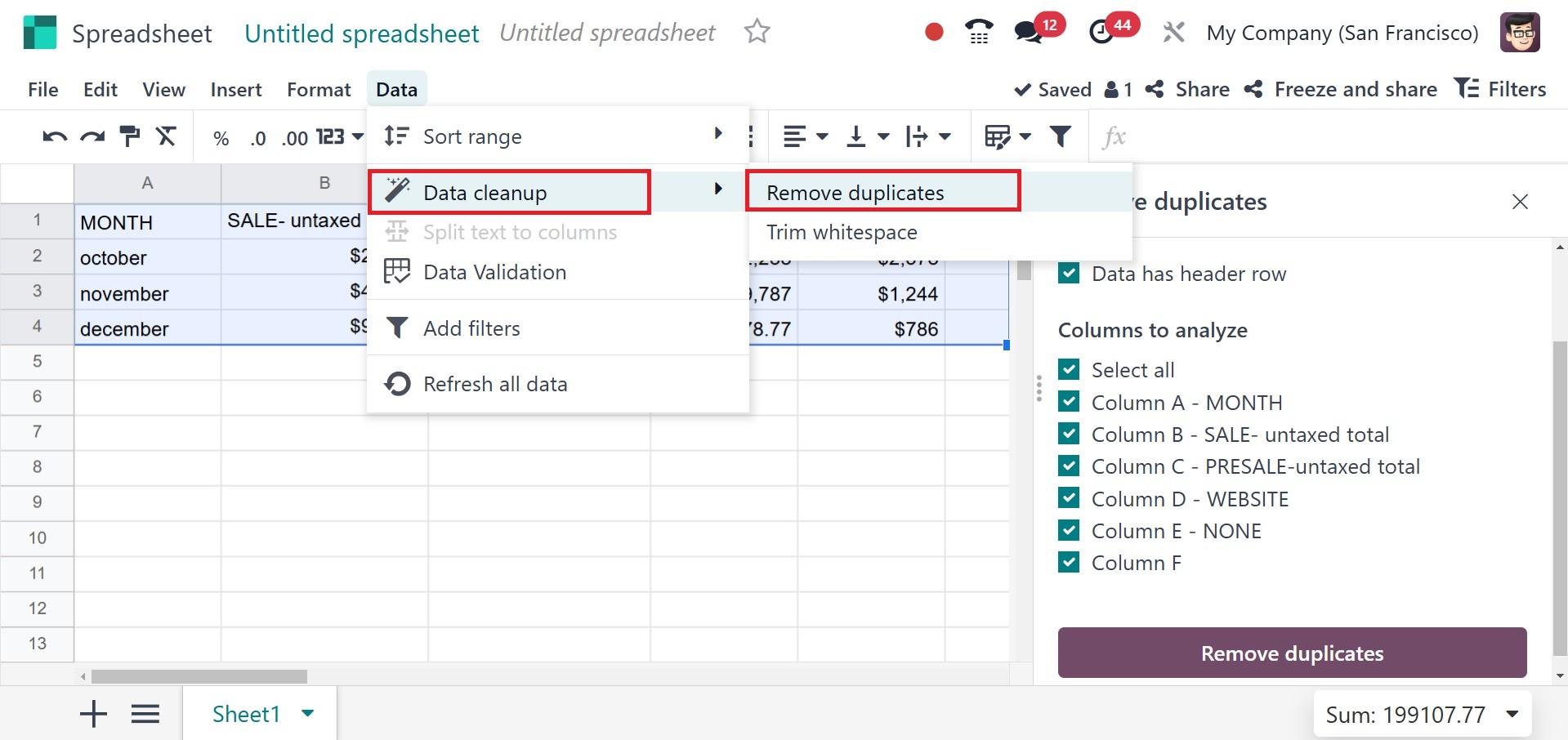
Data can now be cleaned up in the
Odoo 18 spreadsheet. Thus,
preventing data duplication
is now easy. The Data
cleansing option is included
in the Data menu. Whitespace
can be reduced, and
duplicates can be removed.
Some data items may need to be
highlighted in reports.
Rarely, the user may choose
to highlight data based on
its values. This type of
conditional formatting can be
used to format an Odoo 18
spreadsheet. Let's look at
how it works. Choose
Conditional Formatting from
the Data menu to use
conditional formatting. Then
a new side window opens.
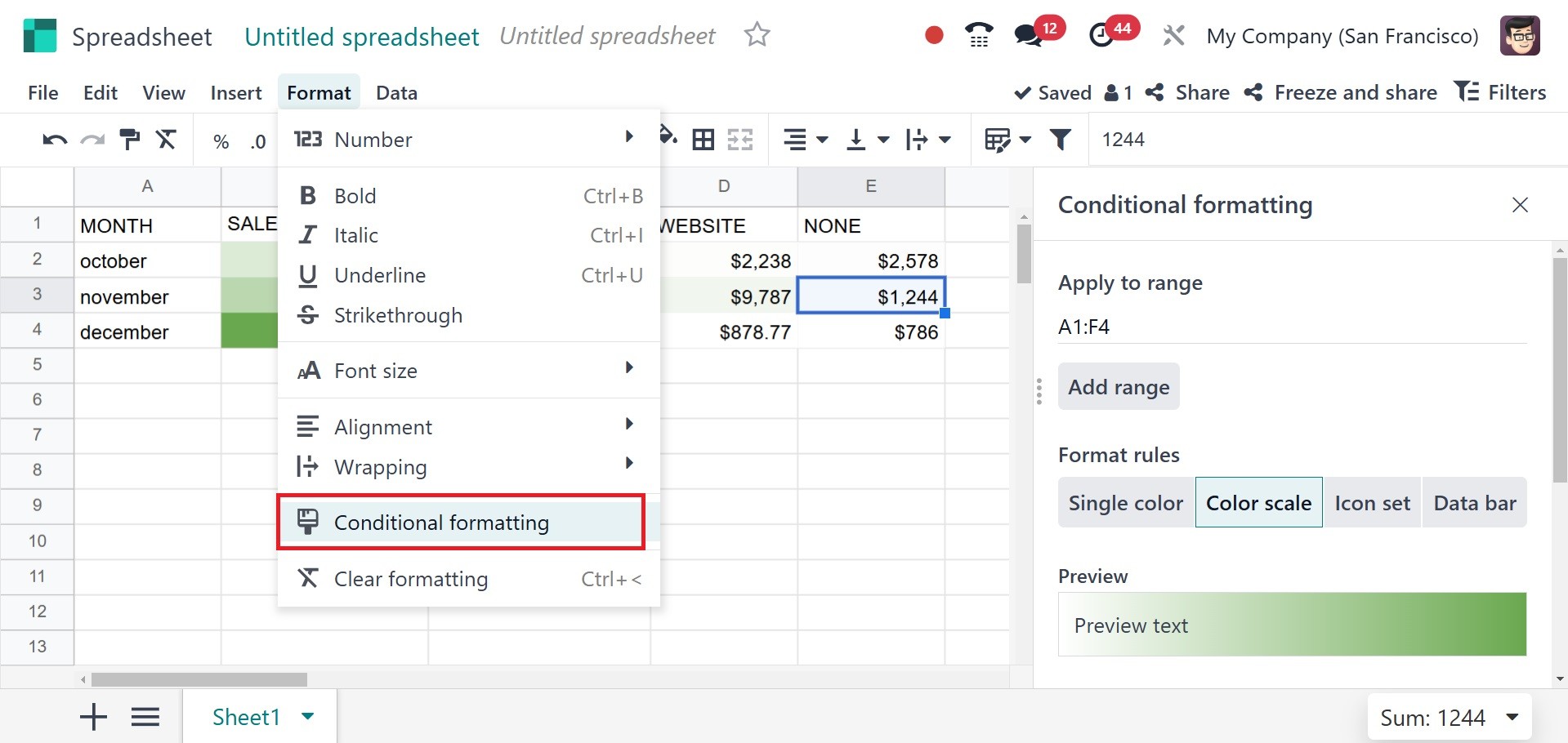
Apply the condition after adding
the cell range. Which format
guidelines to apply is up to
you.
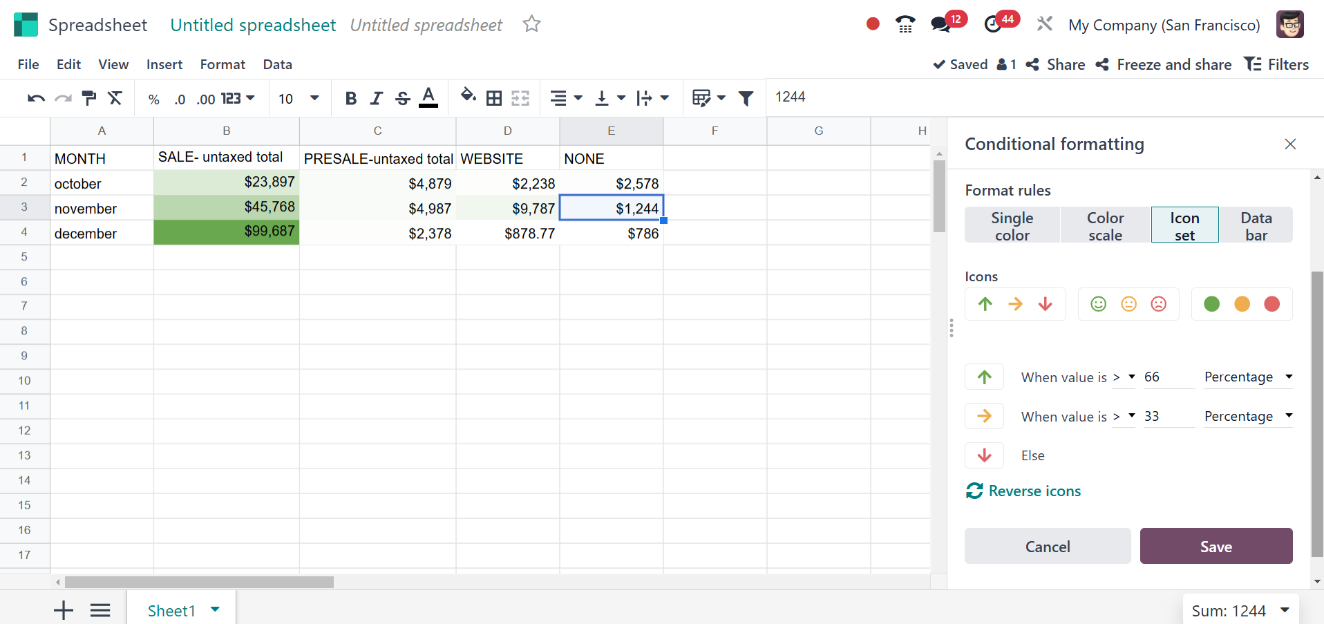
There are three methods to use
this type of formatting. One
method is to use only one
color; another is to use a
color scale or a variety of
icons. There are now three
different types of icon sets
available. Select the best
option that is offered. Then,
fill in the appropriate
fields with the condition.
After that, save it. After
saving, the formatting is
completed according to the
added condition. The same
highlighting can be applied
to any other field. When
adding new ranges,
conditional formatting is
also carried out.
Perhaps the majority of the
reports are too long. If
someone needs to examine a
certain piece of data, it is
too hard to locate in the
report.In these cases, a
filter option is required,
and Odoo18 includes one for
spreadsheet data. Now, let's
look at what happened. The
right-hand corner of the
screen displays a Filter
icon. Click on it if you
want.
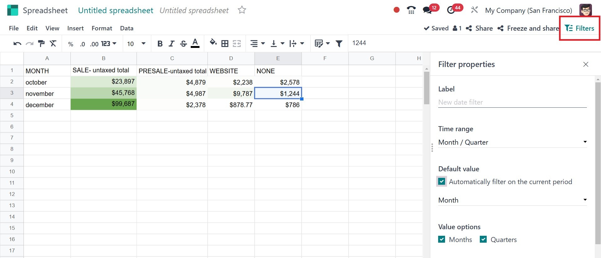
If necessary, a filter may then
be applied. It is possible to
create filters based on Date
and Text. After selecting a
segment and entering the
required data, the filter is
complete and ready to be
applied to the sheet.
Remember to keep the filter
saved.
This section could incorporate a
graph-based analysis. Charts
may be inserted in accordance
with the specified standards.
These graphs can occasionally
be simpler to comprehend than
a long list of numbers. To
add a chart, select one from
the list by navigating to the
Insert menu.
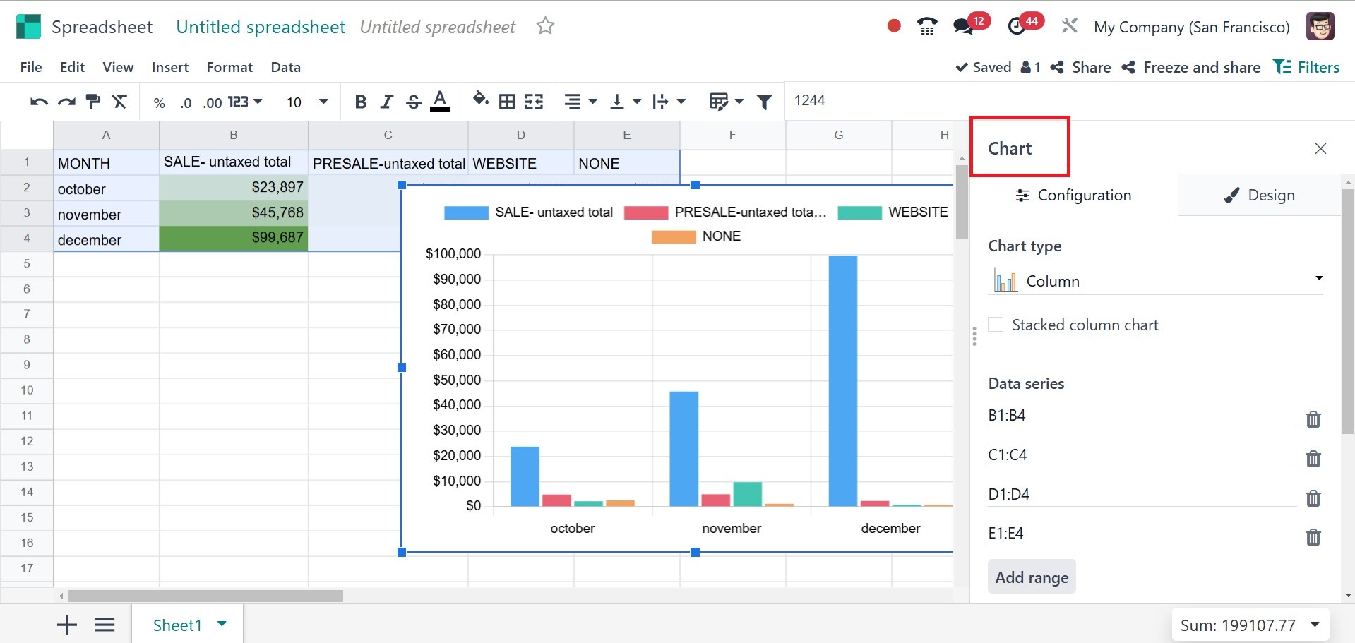
A page is open on the right side
of the window. Numerous graph
types and features are
available for selection. When
inserting or editing a chart
in the Odoo Spreadsheet
Module, users can customize
it using two main tabs:
- Configuration Tab –
Defines the data
structure and values
for the chart.
- Design Tab – Controls the
visual appearance of
the chart.
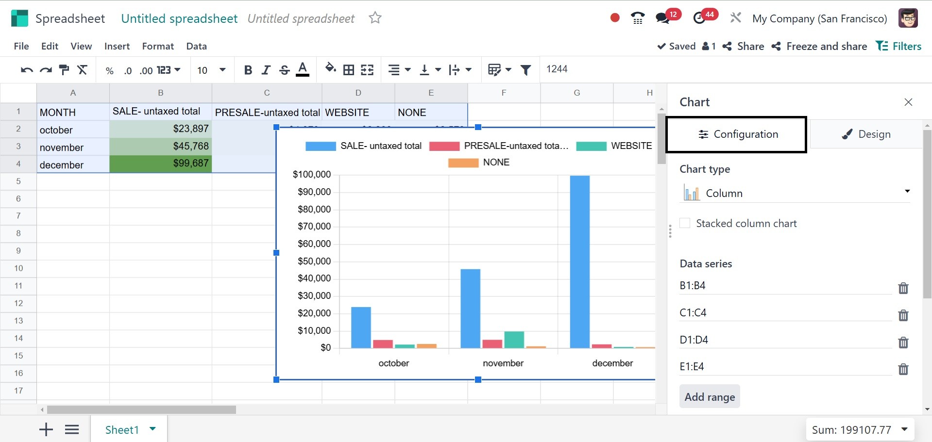
Configuration Tab:
Under the configuration option,
you have options like chart
type, data series,
categories/labels, and link
to odoo menu, respectively.
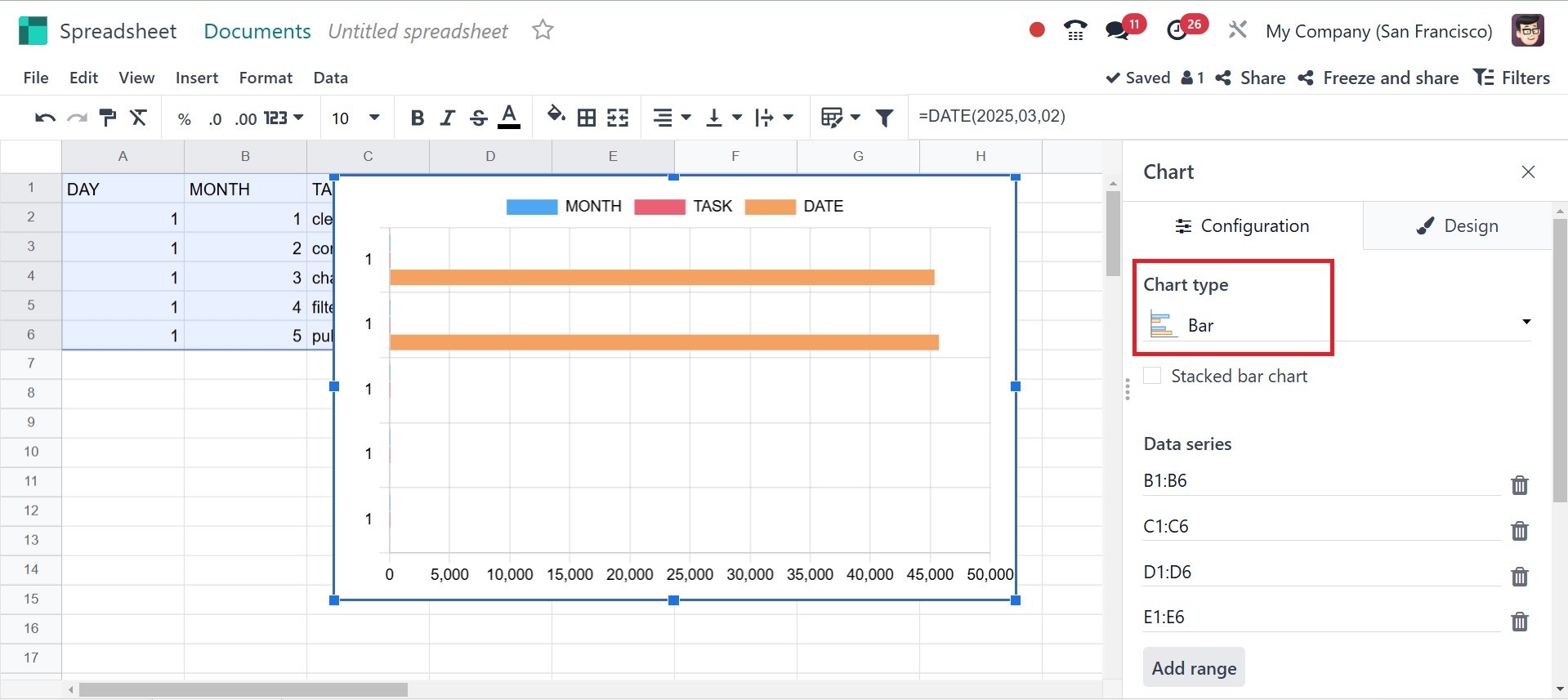
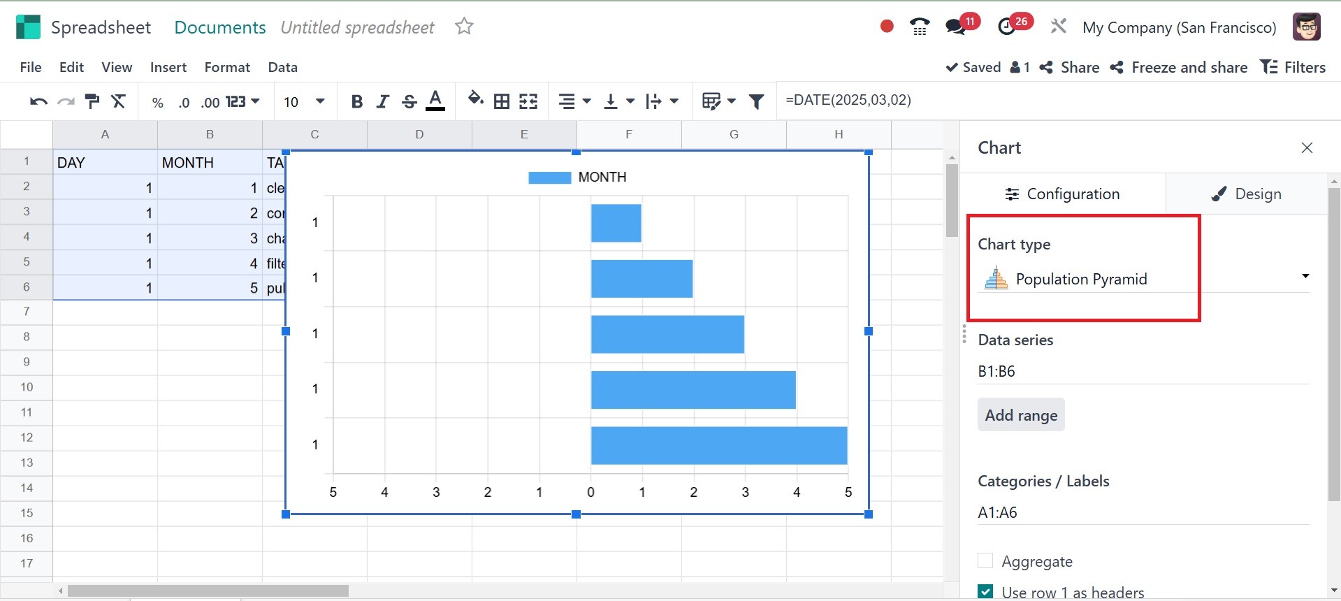
Under the chart type,
Bar Chart – For comparing values
across categories. The graph
will be, as in the image
below.
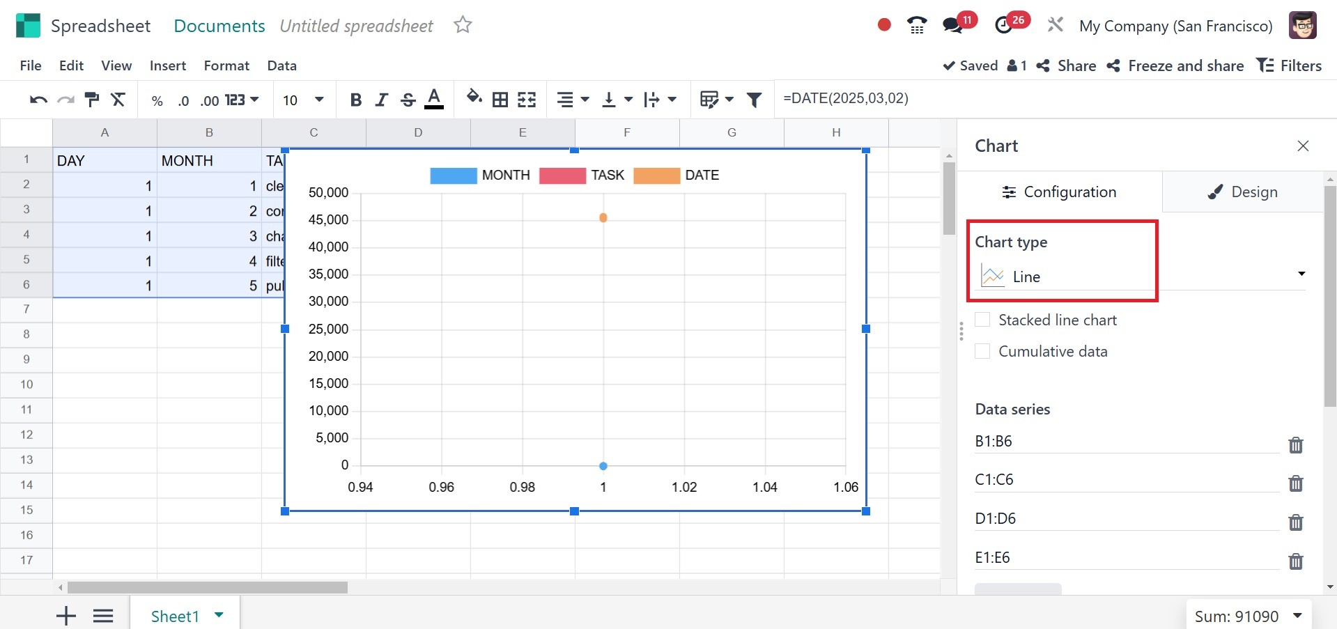
Line Chart – For trend analysis
over time.
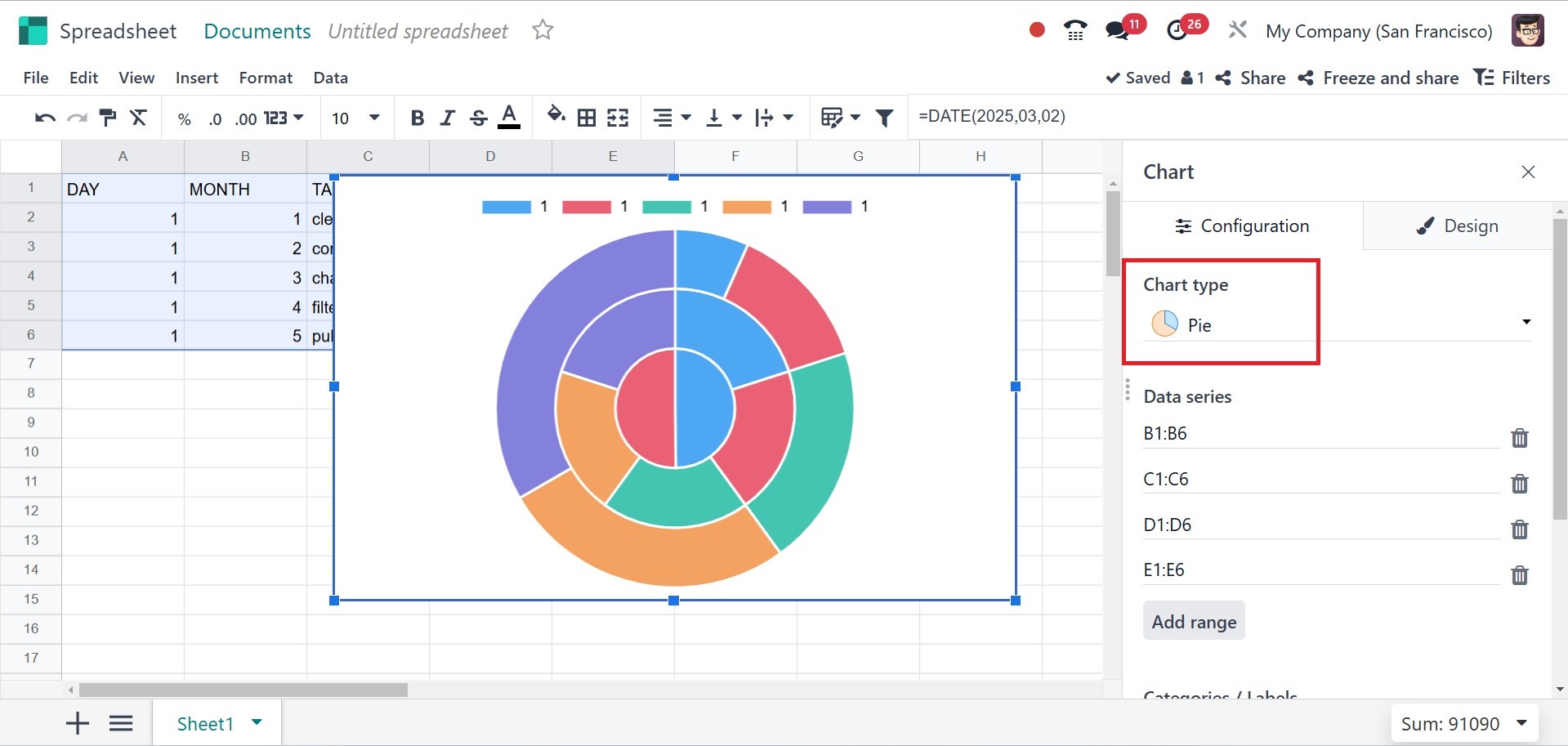
Pie Chart – For proportional data
visualization.
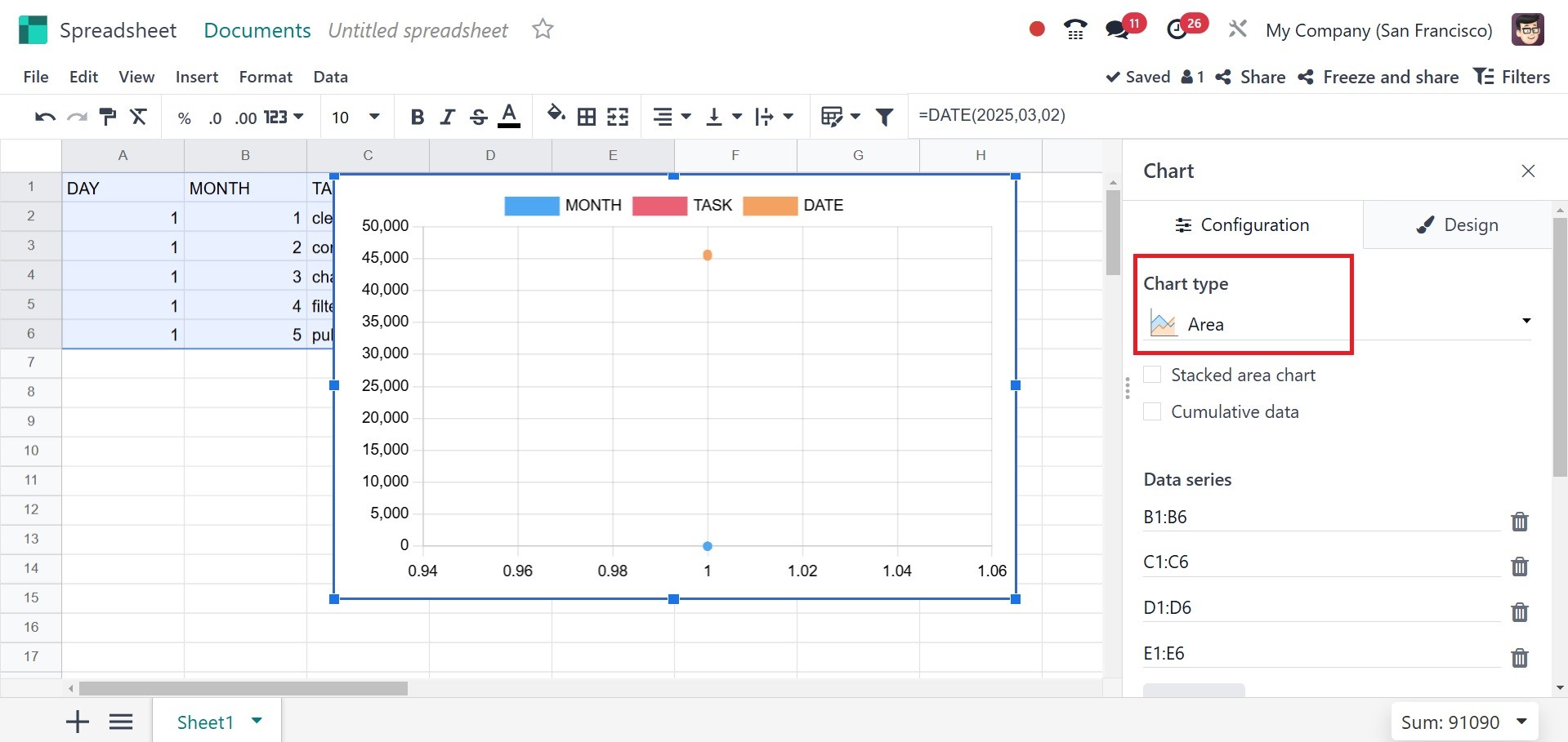
Area Chart – Highlights
cumulative trends.
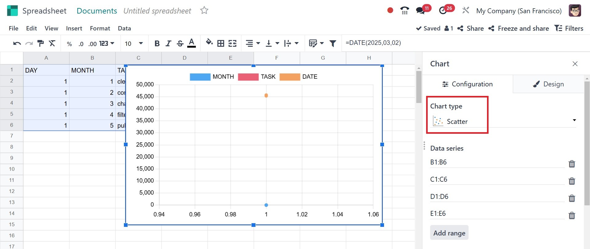
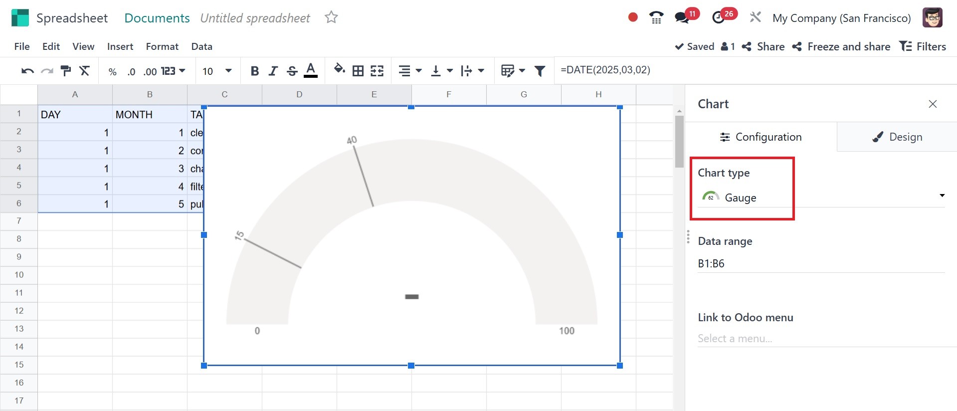
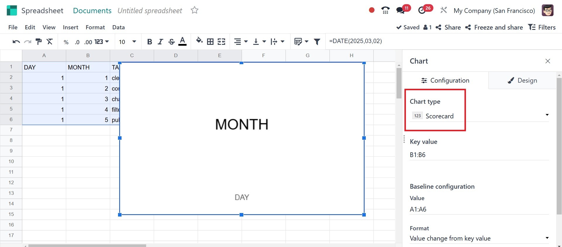
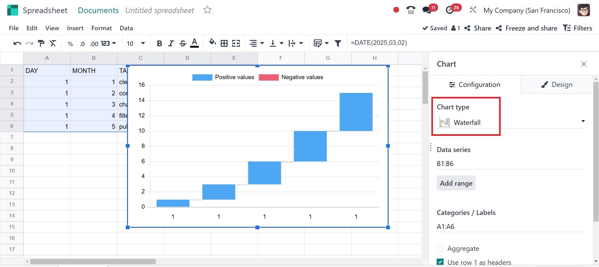
Miscellaneous- the other kinds of
charts, like Scatter, Gauge,
Scorecard, Waterfall, and
Population Pyramid charts.
Scatter: Displaying relationships
between two numerical
variables.
Gauge: Representing progress
toward a goal or KPI.
Scorecard: Summarizing key
metrics at a glance.
Waterfall: Breaking down
cumulative values into
incremental positive or
negative impacts.
Population pyramid: Comparing two
groups (usually age-based
distributions).
Under the data series, you can
add the ranges and make use
of the confirm icon. Under
the categories/labels, it
specifies the grouping
criteria for the data.
Typically used for X-Axis
labels in bar, line, or
column charts.
Link to odoo menu allows users to
link the spreadsheet chart
directly to Odoo’s database.
It pulls up-to-date
information from Odoo models
such as CRM, Sales,
Inventory, Accounting, and
HR, making sure that charts
are updated immediately
anytime data is updated.
Design tab:
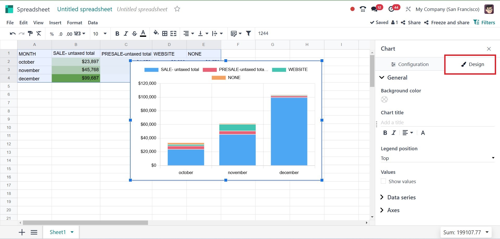
The Design Tab in Odoo’s
Spreadsheet Chart module
allows users to enhance the
chart’s appearance and
readability. Under the design
tab, you have options like
background color, chart
title, legend position, and
values.
The background color allows users
to change the background
color of the chart, helps in
improving chart readability,
and matches the overall
dashboard theme. The chart
title adds a custom title to
describe the chart’s content.
It helps viewers quickly
understand what the chart
represents. The Users can
modify font size, style, and
color for better visibility.
Legend position controls
where the legend (data series
labels) is placed in the
chart. The Values control the
display of actual numerical
values on the chart. It can
be turned on or off depending
on preference. It helps in
precise data interpretation
without needing to hover over
the chart.
Next, talk about the different
types of data series. When
the Data series has a titles
checkbox selected, the title
of the chosen data will be
added.
Sometimes, in addition to this
report, you may need to look
at another file or video. You
can add a link to a different
page in the current report in
an Odoo 18 spreadsheet. To do
this, choose the Link option
from the Insert menu.
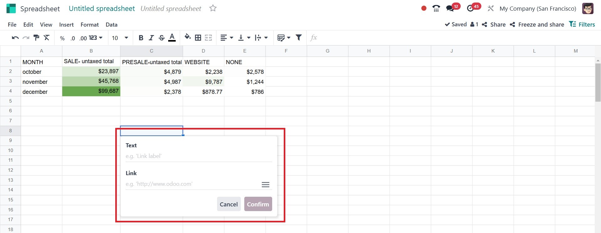
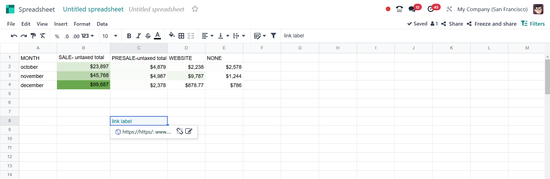
On creating a link, you can
easily create one, as in the
screenshot below.
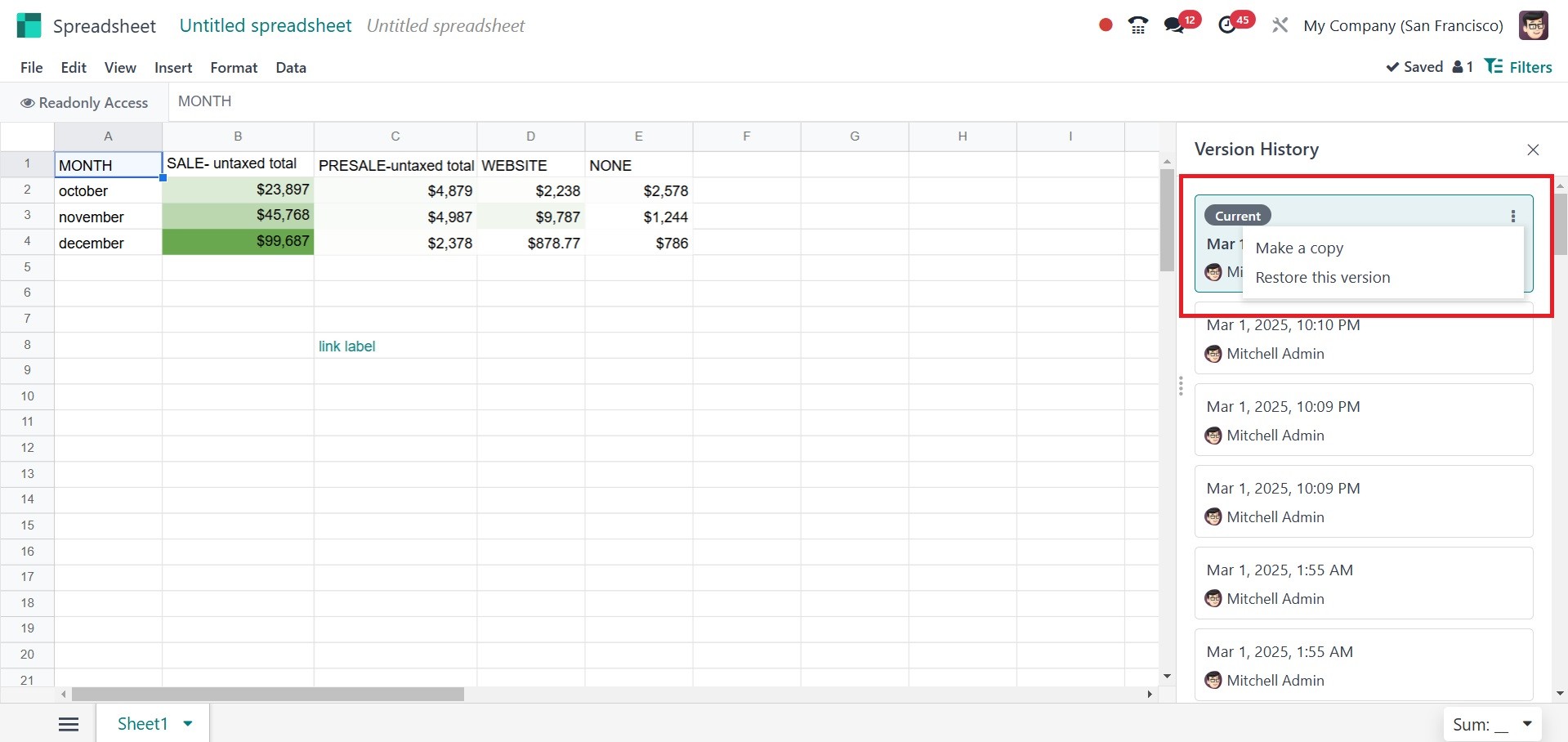
The File menu contains the See
version history option. A new
box will appear on the right
side of the spreadsheet when
you choose the See version
history option.
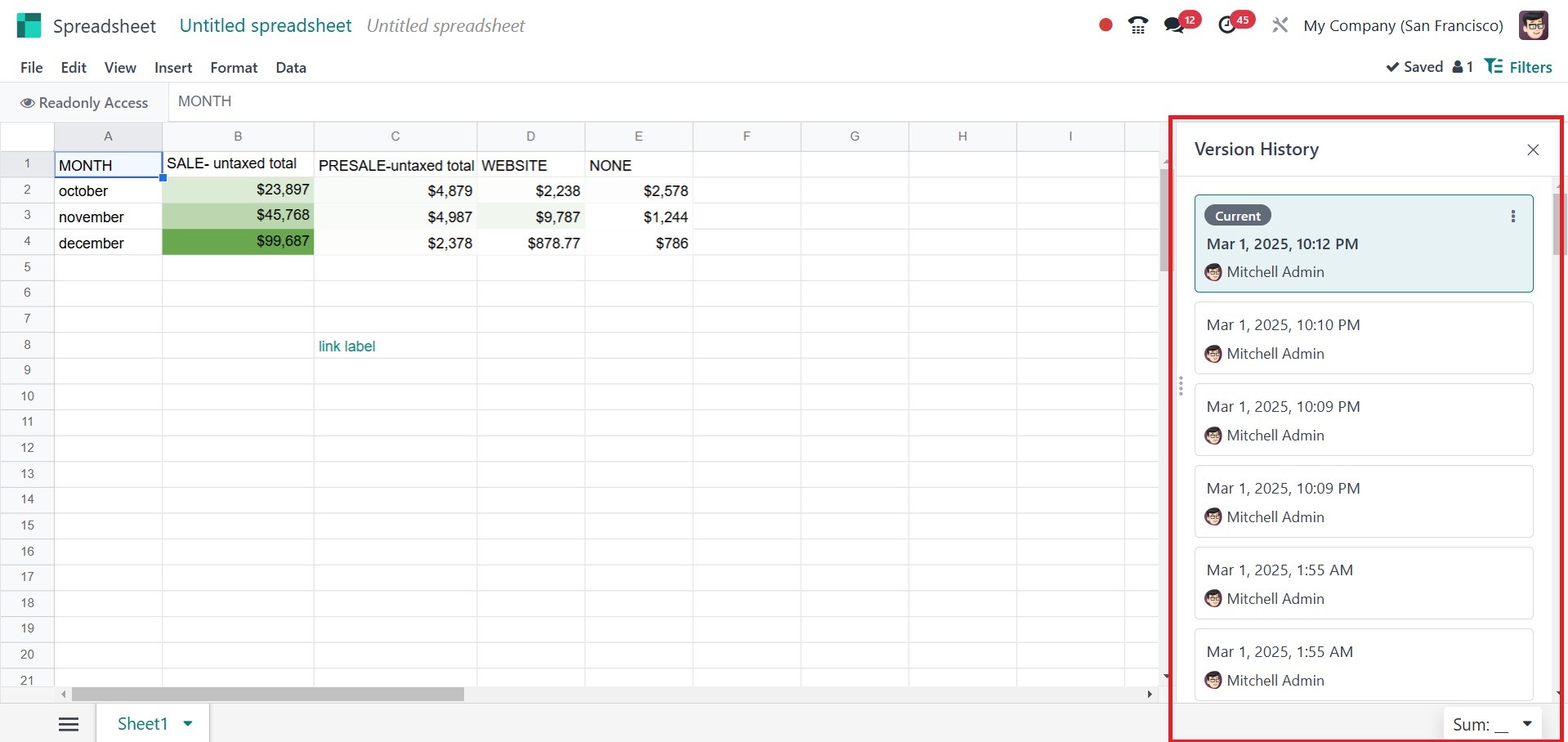
Thereafter, the spreadsheet
versions will be shown. There
are two choices, such as Name
this version and Make a copy.
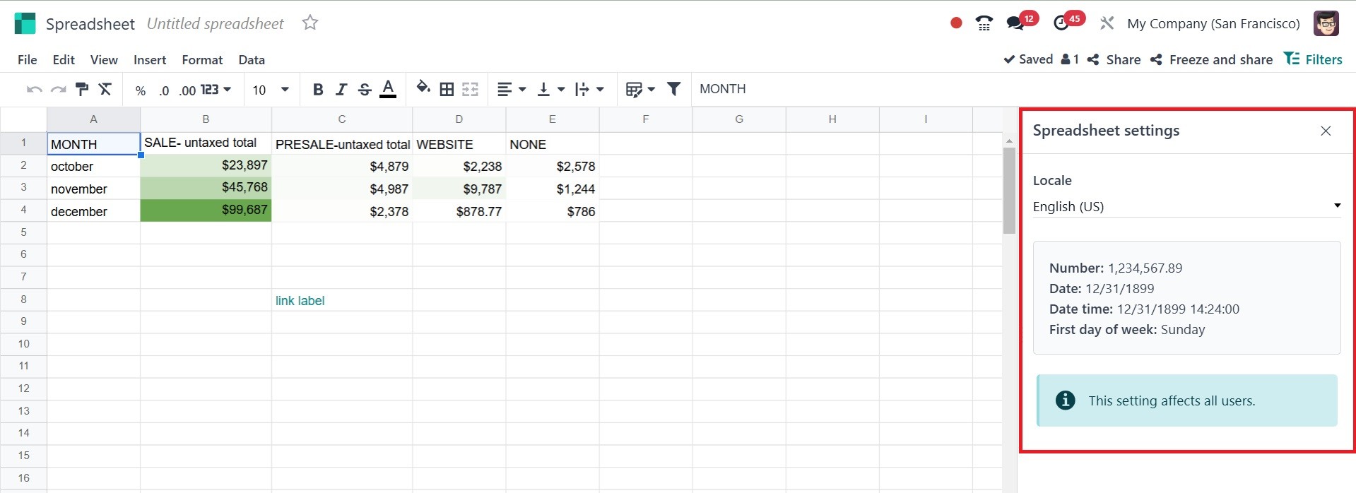
Selecting the Settings option
from the File menu will
display the locale, number,
date, and time on the right
side. You can change the
location.
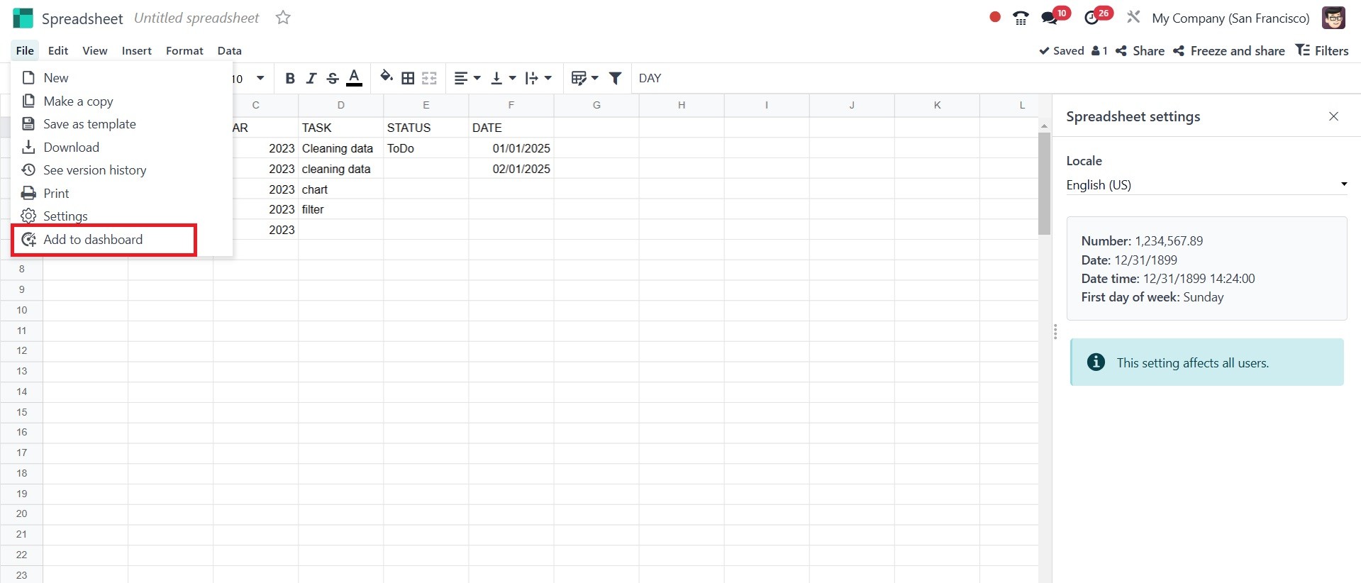
Lastly, the dashboard may be
updated to include the
spreadsheet. Specifically,
the option is seen in the
File menu. A "Add to
dashboard" option will
appear.
After that, a popup window will
appear, as in the screenshot
below.
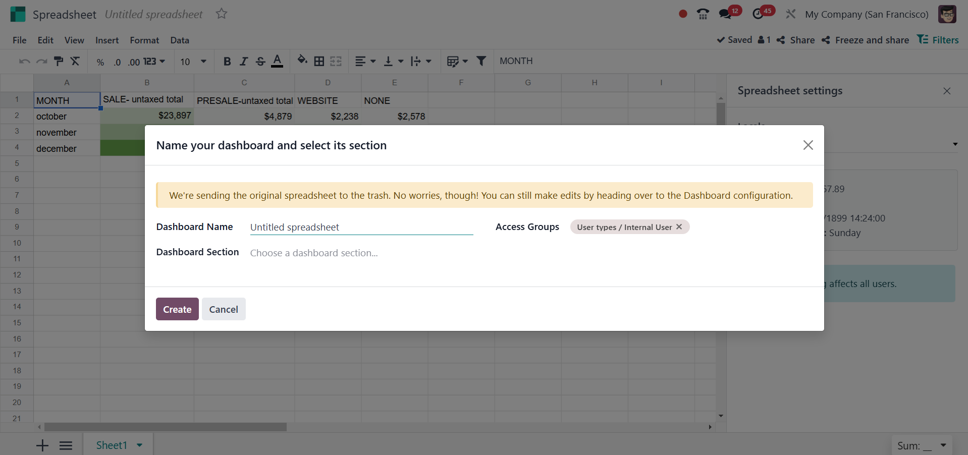
Click "Create" once the name,
section, and access group of
the dashboard have been
entered.
Now, let’s see the features
available in the spreadsheet
in detail.