4.Reporting
The 'Reporting' menu within the Odoo 18 Timesheets module enables the generation
of dynamic reports based on Employee, Project, Task, and Billing Type.
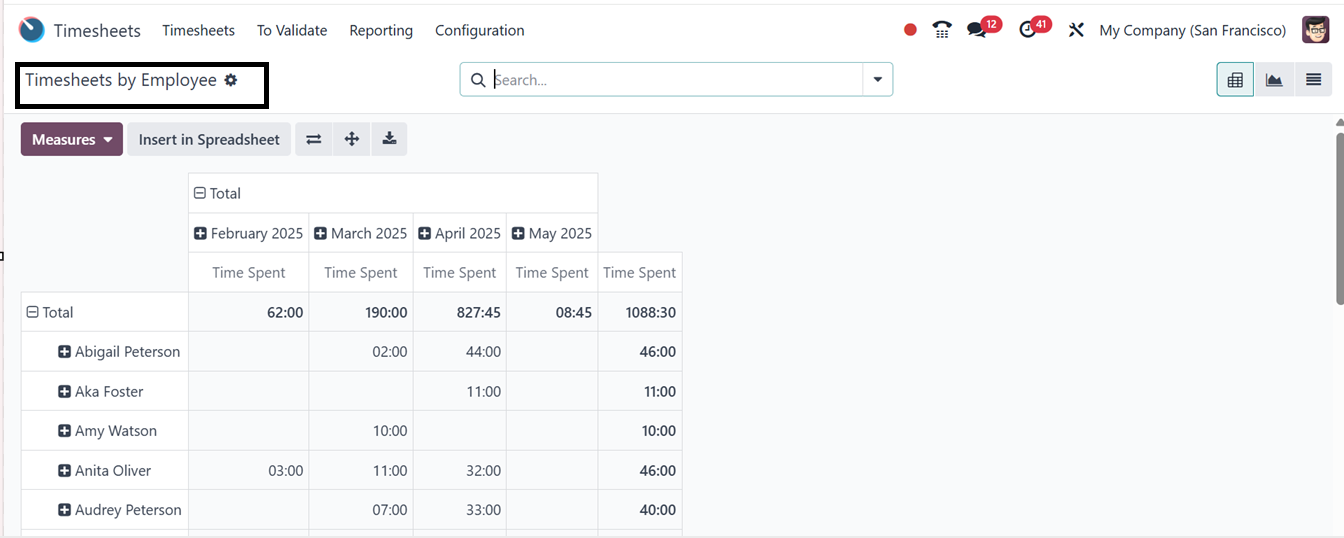
4.1 Timesheets by Employee
This feature presents a comprehensive overview of timesheets categorized by employees.
The interface provides insights into the total hours worked by each employee within
a specific week or month in a Pivot view, as depicted below.
The Pivot view allows for exporting analytical reports to spreadsheets, with various
measurement tools available for precise data retrieval. The reporting data can also
be visualized in multiple formats, including graphical, list, pivot, and Kanban
views. You can see the graphical view of the data with various analytic metrics
in the ‘Measures’ section, as illustrated in the screenshot below.
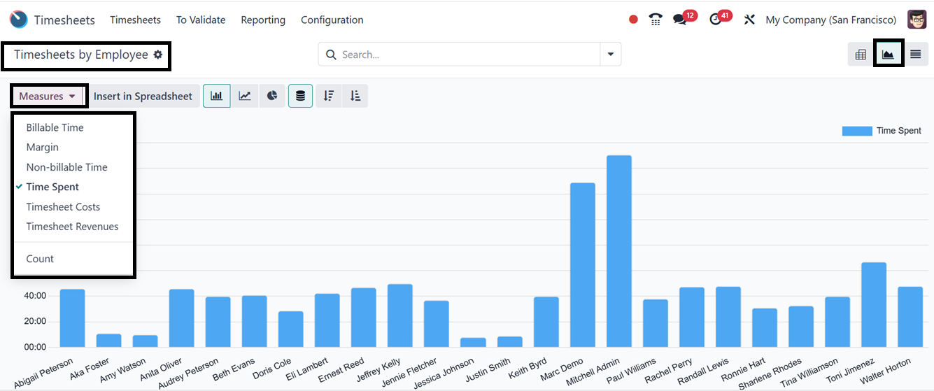
You can change the perspective of the report using the required measure, including
Billable Time, Margin, Non-billable Time, Time Spent, Count etc.
The search bar's Filters, Group By, and Favorites features let you arrange and refine
your data according to specific requirements. By designating frequently used views
as Favorites, you may save them for easy access, apply pertinent filters, and group
related information. To further meet your reporting or analytical needs, you can
also construct custom filters and groups using the "Add Custom Filter" and "Add
Custom Group" buttons.
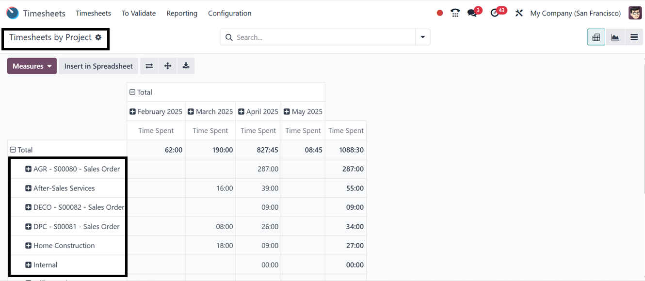
4.2 Timesheets by Project
The 'Timesheets by Project' option within the 'Reporting' menu organizes timesheets
based on projects. This feature enables users to track the number of hours allocated
to a specific project over a defined timeframe. The data can be visualized using
Grid, Kanban, List, Pivot, and Graphical views.
Using the Flip Axis, Expand All, and Download xlsx icons, you can flip the pivotal
axis, expand the rows and columns, and download the excel file of the reporting
data. The remaining functionalities are similar to those in the previous reporting
window, including the Measures section and multiple Filter and Group By options.
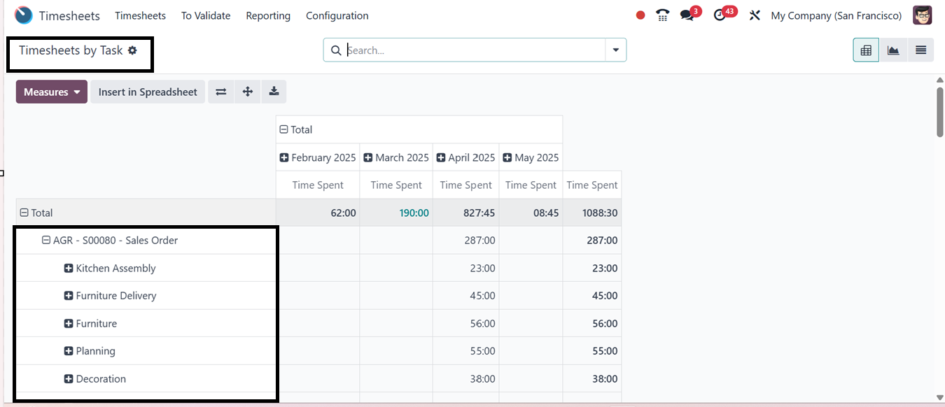
4.3 Timesheets by Task
Odoo 18's Timesheet module's 'Timesheets by Task' reporting window provides a thorough
overview of time entries arranged by individual tasks, making it a crucial tool
for monitoring the amount of time spent on particular assignments across different
projects or team members.
The Pivot view of the report provides customizable Measures like Time Spent, Billable
Time, Non-Billable Time, Count, and Cost, allowing users to view data in the most
relevant format. It also features Filters, Group by, and Favorites for refinement
by employee, project, or time period.
The reporting window is also converted into List and Graphical views according to
your requirements, as shown below.
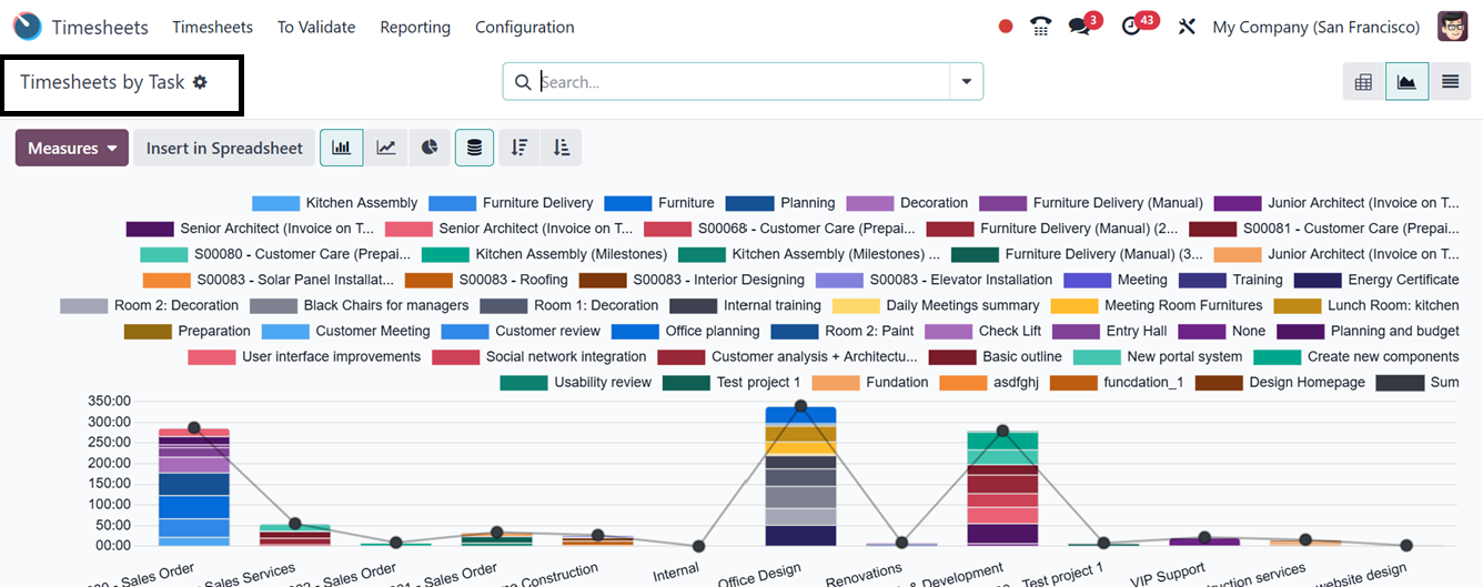
By enabling task-level analysis, users may assess how time is allocated and spot
performance patterns.
4.4 Timesheets by Billing Type
The 'Timesheets by Billing Type' section categorizes reports based on billing methods.
Businesses can choose to bill services based on timesheets or a fixed rate. The
reports present the number of hours logged for each billing type, including non-billable
tasks.
Users can toggle between metrics like Time Spent, Count, Cost, and Margin for different
analytical perspectives. The interface supports advanced filtering, grouping, and
favorites for focused reporting. It also supports invoicing, ensuring accurate accountability
and billing of billable time to clients.
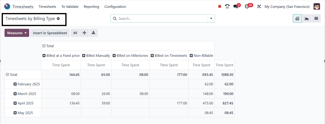
The system organizes recorded time by billing status, enabling businesses to quickly
understand revenue generation and non-billable activities. It also aids in revenue
analysis, enabling accurate forecasting and profitability tracking. It optimizes
resource allocation, helping managers identify areas where too much time may be
spent on non-billable tasks.
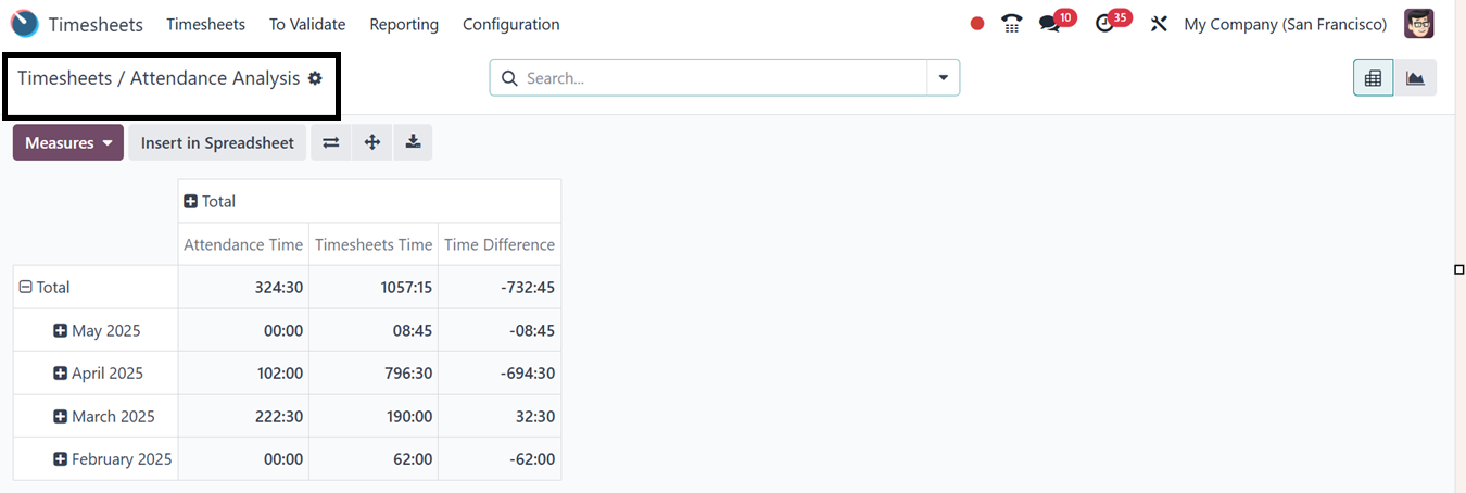
4.5 Timesheet/Attendance
The 'Timesheet/Attendance' reporting option facilitates the analysis of recorded
timesheets and attendance data. The Pivot view displays both total reported hours
and attendance records per month, along with any discrepancies between the two figures.
Additionally, users can analyze data through graphical representations, including
pie, bar, and line charts.
4.6 Timesheet/Planning
The 'Timesheet/Planning' reporting feature provides an in-depth comparison of recorded
timesheets and planned schedules in a pivot view, as illustrated in the screenshot
below.
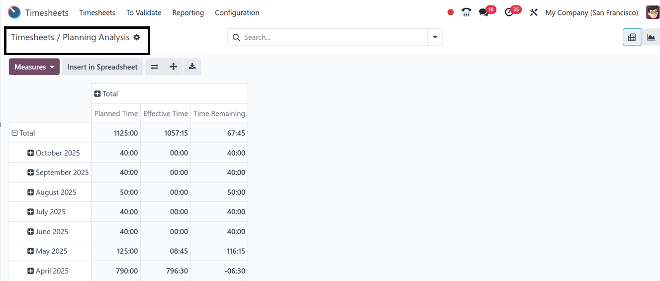
You can visualize data using graphical representations such as pie, bar, and line
charts. Using the ‘Measures’ button, you can change the report perspective according
to various metrics.